
Mixing paints can be a fun and rewarding process, but it can also lead to unexpected results, like muddy colors. Many artists struggle with muddy tones that can dull their vibrant artwork. To avoid this, it’s essential to understand the basics of color mixing and use the color wheel effectively.
Knowing how colors interact can help anyone create more appealing and lively paintings. He or she can learn to identify complementary and analogous colors, ensuring they mix paints in ways that enhance their artwork. With the right techniques, it’s easy to achieve the desired hues without the frustration of muddiness.
In this guide, readers will discover practical tips and tricks that can make a significant difference in their painting experience. Whether using acrylics or other mediums, these strategies will help he or she create beautiful colors that stand out on the canvas.
Understanding Color Theory
Color theory is an important part of painting. It helps artists know how colors relate to each other. By understanding the basics, they can create bright, clean colors instead of muddy mixes.
Primary Colors
Primary colors are the foundation of all other colors. They include red, blue, and yellow. These colors cannot be made by mixing other colors together.
Artists use primary colors to mix a wide range of hues. For example, mixing red and blue makes purple. By knowing how to use these colors, they can create vibrant and bold artwork.
Understanding primary colors is vital. They offer a base for exploring other color combinations without muddying the results.
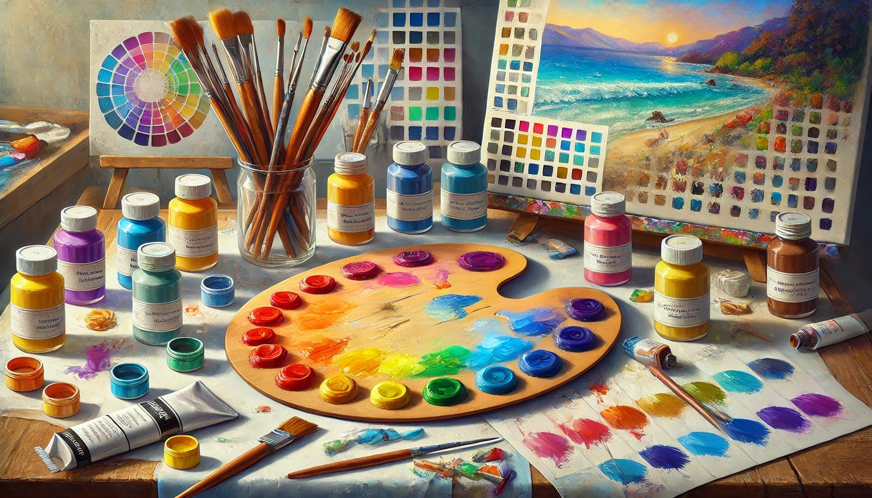
Color Wheel Basics
The color wheel is a helpful tool for artists. It displays the relationships between colors in a circular format. The wheel includes primary, secondary, and tertiary colors.
Secondary colors are created by mixing two primary colors. For instance, mixing yellow and blue produces green. Tertiary colors come from mixing primary colors with secondary colors.
Artists use the color wheel to find harmonious color combinations. This visual guide makes it easier to choose colors that work well together and avoid muddiness in their paintings.
Complementary and Analogous Colors
Complementary colors are opposite each other on the color wheel. When placed together, they create strong contrast. This can make art visually striking. For example, red and green are complementary colors.
On the other hand, analogous colors are next to each other on the wheel. These colors blend well together. For instance, blue, blue-green, and green create a soothing effect. Understanding these relationships helps artists mix colors more effectively.
By using complementary and analogous colors, painters can avoid muddying their mixes. They can create depth and balance in their artwork, leading to more appealing results.
The Role of Light and Shadow
Light and shadow are essential elements in painting. They help define shapes and create depth. This allows the viewer to see objects more clearly.
When mixing colors, understanding how light affects them is crucial. Light can make colors appear brighter or darker. Shadows, on the other hand, can change a color’s tone by adding depth.
Key Points:
- Local Color: This is the color of the object itself.
- Complementary Color: Adding a color that is opposite on the color wheel can create richer shadows.
- Blue Adds Depth: For many colors, a touch of blue can enhance shadow effects.
For example, a yellow object will need both its complementary color (purple) and blue for realistic shadows. An orange object might require just blue for shadow mixing. Each color reacts differently under light, so adjustments will vary.
Knowing how to mix paints with these concepts in mind helps avoid muddy colors. A limited palette also assists in maintaining clarity in color mixing. By focusing on light and shadow, artists can create more vibrant and lifelike images.
Selecting Your Paints
Choosing the right paints is crucial for achieving vibrant colors without creating muddy mixes. The types of paint, the quality of pigments, and the consistency of the paint all play significant roles in the mixing process.
Types of Paint
There are several types of paint available, each with its unique properties. The most common types are acrylic, oil, and watercolor.
- Acrylic paint dries quickly and is versatile. It is perfect for beginners and allows for easy mixing.
- Oil paint takes longer to dry, which can help in blending colors smoothly.
- Watercolor provides a transparent effect, ideal for layering.
Knowing the strengths and weaknesses of each type helps in selecting the right one for a specific project. This choice will affect how colors mix and the final outcome.
Pigment Quality and Transparency
The quality of the pigments in the paint directly impacts the final color. High-quality pigments provide better coverage and vibrancy.
- Opaque pigments cover well and can help prevent muddy colors.
- Transparent pigments allow for more layering but can sometimes lead to dull mixes if not managed carefully.
It’s essential to check labels or descriptions when buying paint. Understanding which pigments are used helps prevent muddy mixes, leading to brighter results.
Paint Consistency
Paint consistency is another key factor in achieving clean colors.
- Thicker paints may blend less easily, making it challenging to create smooth transitions.
- Thin paints can be more fluid, helping with mixing but may lose their vibrancy.
Artists often adjust consistency by adding mediums. Finding the right balance helps maintain color integrity and reduces the risk of creating unintended muddy hues.
Tools for Mixing Paint
Using the right tools makes mixing paint easier and helps avoid muddy colors. Various palettes, surfaces, and mixing tools can significantly impact the final results.
Palette Types
When mixing paint, choosing the right palette is important. Plastic palettes are lightweight and easy to clean, making them popular among artists. They can hold various paint types and dry quickly, allowing for efficient use.
Wooden palettes offer a professional feel and can absorb some moisture, which helps keep paints workable longer. Many artists prefer these for oil paints.
Glass and ceramic palettes provide a smooth, non-porous surface. This type helps keep colors pure because they don’t absorb pigments. Artists often choose these for their easy cleanup.
Mixing Surfaces
The surface where paint is mixed also influences color mixing. A smooth surface allows better control and blending of colors. Using paper plates or disposable palettes can be convenient for quick projects.
Some artists prefer glass sheets, as they provide a stable and easy-to-clean area. They allow the artist to see colors clearly and prevent the paint from sticking.
Tempered glass or acrylic sheets can be used for a more durable option. These surfaces tolerate a variety of mediums and make color mixing an enjoyable experience.
Brushes and Knives
Mixing tools play a vital role in how paint blends. Palette knives are perfect for mixing because of their flexibility and broad edges. These tools allow artists to scrape and blend colors without damaging the paint.
Soft-bristled brushes can also mix paint effectively. They can help incorporate colors smoothly, especially when working with acrylics or oils. Choose brushes that are easy to clean for the best results.
Using the right tools can ensure a smooth and effective mixing process, leading to vibrant, clear colors.
Mixing Techniques
Mixing paints effectively is essential to achieving vibrant colors and preventing muddy results. Key techniques involve layering colors and mastering blending methods. Each technique plays a crucial role in a painter’s ability to create clean, vivid hues on the canvas.
Layering Colors
Layering colors is a powerful technique that helps maintain brightness. By applying one color on top of another, artists can create depth and richness without muddying the paint.
Steps for Layering:
- Start with a Base Color: Apply a light color as a base. This provides a good foundation.
- Use Transparent Paints: Choose acrylics that are transparent for upper layers. These allow the base color to show through.
- Drying Time: Ensure each layer dries completely before applying the next. This prevents smudging and keeps colors distinct.
This method is especially useful for landscapes or skin tones, where subtle variations bring the artwork to life.
Blending Methods
Blending colors skillfully can enhance the overall look of a painting. Proper techniques ensure that the colors mix smoothly without turning brown or gray.
Common Blending Methods:
- Wet-on-Wet: This involves applying wet paint onto wet paint. It creates smooth transitions and soft edges.
- Dry Brush: Using a dry brush to gently mix colors helps maintain texture and vibrancy.
When blending, it is important to use clean brushes and work quickly. This ensures colors stay fresh and lively. With practice, blending becomes a natural skill that enhances artistic expression.
Controlling Color Intensity
Controlling color intensity is essential for creating vibrant paintings. Understanding how to adjust colors can help avoid muddy hues. This involves using white, black, and gray effectively to enhance desired shades without losing clarity.
Utilizing White and Black
Adding white or black paint is a straightforward way to control color intensity. White can brighten colors and make them appear lighter and more vibrant. For instance, mixing white with red produces a soft pink, perfect for highlights or pastel effects.
On the other hand, black can darken colors, providing depth and richness. When used sparingly, black can create dramatic contrasts. For example, adding a little black to purple can produce a deep, rich shade, ideal for shadows.
It’s important to remember that both white and black can quickly alter a color’s character. Therefore, they should be used gradually, mixing in small amounts to find the right balance.
Incorporating Gray
Using gray can help soften colors without washing them out. This can be especially beneficial when an artist wants to tone down a vibrant hue. By mixing colors with gray, the result can be a more muted version without compromising the original hue’s essence.
A gray palette can be beneficial for this process. It allows for a more accurate judgment of color tones during mixing. Gray helps to evaluate how colors will look alongside one another and ensures they don’t become too bright or dull.
Incorporating gray into specific combinations creates a sophisticated palette. It enables an artist to maintain color integrity while achieving the desired intensity. This technique can improve overall color harmony in the artwork.
Preventing Muddy Colors
Muddy colors can ruin a beautiful painting. There are effective ways to prevent this issue. By understanding muddy colors, maintaining color purity, and limiting your palette, artists can create brighter, cleaner paintings.
Understanding Muddy Colors
Muddy colors occur when too many pigments are mixed together. This often happens when complementary colors are combined, such as blue and orange. Instead of staying vibrant, these colors can create dull, grayish tones.
To avoid this, artists should pay attention to the color wheel. Complementary colors are opposite each other and don’t work well when mixed. Keeping them separate while painting helps maintain clarity and vibrancy in the artwork.
Maintaining Color Purity
Keeping colors pure on the palette is crucial. Artists can achieve this by cleaning their brushes frequently and using separate mixing spaces for different colors.
When mixing, artists should only combine colors that work well together. It is helpful to use a limited amount of colors at any given time.
This practice reduces the chances of creating muddy shades and keeps the painting bright. A clean palette also makes it easier to see the true colors being used, allowing for better decisions.
Limiting Your Palette
Using a limited palette can be a great strategy. Fewer colors mean less chance of mixing unwanted shades. A basic palette might include primary colors like red, yellow, and blue, plus black and white.
With this selection, artists can create a wide range of shades without overwhelming their mixtures. They can also experiment with different combinations, leading to unique, fresh colors.
By focusing on quality over quantity, artists can keep their work vibrant and avoid the pitfalls of muddy colors. It’s about being strategic in choices to make painting a more enjoyable process.
Practical Exercises to Improve Your Skills
Improving paint mixing skills is essential for any artist. Practical exercises can help in mastering color matching, blending gradients, and creating a reference chart. These tasks encourage hands-on practice and understanding of color relationships.
Color Matching
Color matching is an important exercise. It helps an artist to see how different hues interact. To try this, choose a paint chip or a color from a photo.
Here’s how to proceed:
- Select a Color: Pick a color you want to match.
- Mix Paint: Use primary colors to mix until you achieve the desired shade.
- Feedback: Compare the mixed color to the original. Adjust if necessary.
This exercise sharpens an artist’s ability to mix accurately and avoid muddy colors.
Gradient Blending
Creating smooth gradients is another helpful activity. This teaches control over paint when transitioning from one color to another.
To perform this:
- Choose Two Colors: Start with two colors, like blue and yellow.
- Mix: Apply one color on the canvas, then introduce the other.
- Blend: Use a clean brush to blend the two colors together in the middle.
The goal is a seamless transition. This exercise is great for understanding how colors mix without graying out.
Creating a Color Chart
A color chart acts as a visual guide for artists. It shows the results of various mixes, which aids future projects.
To create a color chart:
- Select Colors: Use a set of primary colors.
- Create Mixing Pairs: Choose pairs of colors to mix and paint swatches.
- Label Each Swatch: Clearly label the colors used for each mix.
This chart will serve as a great reference. Artists can see how different colors react with each other. Keeping it handy can reduce the chances of mixing muddy colors during actual projects.
Tips for Color Preservation
Preserving mixed paint colors is essential for maintaining vibrant shades and preventing muddiness. Proper storage techniques and knowing how to revive dry paints can make a significant difference in an artist’s workflow and results.
Storing Mixed Colors
To keep mixed colors fresh, it is important to store them correctly. Using airtight containers can help seal in moisture. Small containers or even plastic wrap can cover palettes.
When using a palette, artists can sprinkle a little water on top of the paint to keep it wet. Additionally, storing mixes in a cool, dark place will prevent them from drying out too quickly.
Labeling containers with the color names and mixing dates can assist in tracking each mix. This way, artists can easily recreate colors later on.
Reviving Dry Paints
Dry paint can still be useful with proper techniques. For acrylics, adding a few drops of water or a medium can help rehydrate the paint. Stir it well to achieve a smooth consistency.
If oils are dry, using a compatible thinner or medium can reactivate the paint. Always test a small amount first to avoid ruining the mixture.
For gouache or watercolor, a spray bottle filled with water can lightly mist the surface. Let it sit for a few minutes before using the paint again.