
Gradients are a powerful tool in graphic design, adding depth and vibrancy to any project. Creating an eye-catching gradient effect involves understanding color combinations, layering techniques, and application methods that can elevate designs. With the right approach, anyone can transform ordinary graphics into stunning visuals that draw the viewer’s attention.
Many designers utilize gradients in various applications, from website backgrounds to social media graphics. They help in guiding the viewer’s eye and creating a polished, professional look. By exploring different types of gradients, such as linear and radial, a designer can enhance their creative toolkit and stand out in a crowded digital space.
Whether working in Adobe InDesign, Canva, or other design software, learning how to effectively use gradients is essential. As they experiment with this technique, designers will find their projects looking more dynamic and engaging. With a few tips and tricks, anyone can master the art of gradient design.
Understanding Gradients
Gradients add depth and interest to designs, making them visually appealing. They create smooth transitions between colors and can enhance the overall aesthetic of a project. Here’s a closer look at gradients and their role in graphic design.
Definition of Gradient
A gradient is a gradual transition from one color to another. It can move smoothly in various directions and can vary in length or intensity. Gradients can be linear, where colors shift along a straight line, or radial, where colors radiate from a central point.
These effects help break the monotony of solid colors. They can bring a 3D illusion to flat designs. A well-placed gradient can catch the viewer’s eye and guide it through the composition.
Types of Gradients
There are several types of gradients used in graphic design. Each type serves a different purpose and fits various design needs.
- Linear Gradients: Colors transition along a straight line. They are simple and easy to use.
- Radial Gradients: Colors spread out from a center point, creating a circular look. They add depth and focus.
- Angular Gradients: Colors change around a central point, often creating a swirling effect. This can add a dynamic feel.
- Diamond Gradients: Colors transition in a diamond pattern, adding a unique touch.
Each type can enhance specific elements in a design and contribute to the visual hierarchy.
Importance in Design
Using gradients strategically is important in graphic design. They can improve the visual hierarchy, ensuring key elements stand out. With proper color choices, gradients can create a mood or evoke an emotion.
Gradients are also useful in creating textures and background effects. They provide a sense of depth, making designs feel more three-dimensional. Designers often use them to guide the viewer’s attention where it’s needed most.
When applied thoughtfully, gradients can transform an ordinary design into something extraordinary. They help in creating a cohesive look that ties different elements together harmoniously.
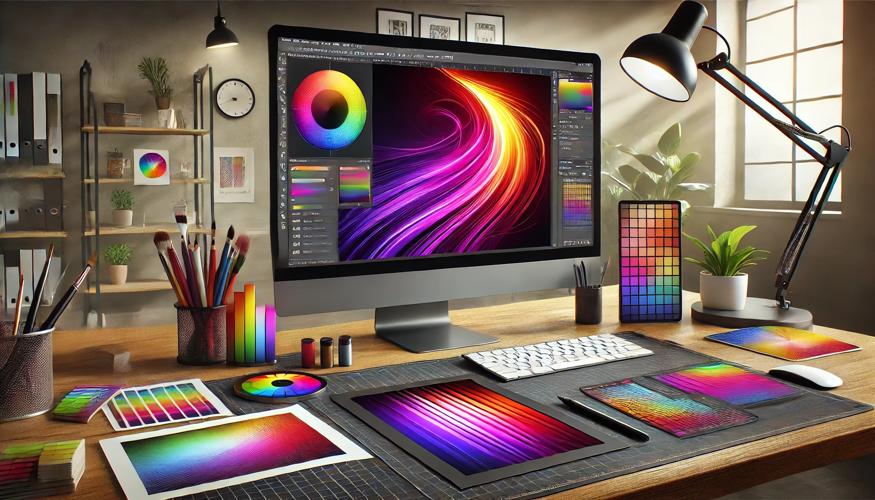
Tools and Software for Creating Gradients
Creating stunning gradient effects requires the right tools and software. Each option offers unique features that help designers achieve their desired look. Here are some essential tools to consider.
Vector Graphics Editors
Vector graphics editors are ideal for creating scalable graphics with gradients. Programs like Adobe Illustrator and CorelDRAW allow users to create and customize gradients seamlessly.
These tools enable designers to manipulate colors, adjust angles, and apply gradients to shapes and text. Users can also use gradient meshes for complex designs.
Working with layers makes it easy to experiment. Designers can preview changes instantly, ensuring their gradients look just right. With vector tools, gradients remain crisp, regardless of the image size.
Raster Graphics Editors
Raster graphics editors work well for detailed images and complex gradients. Adobe Photoshop is a popular choice among graphic designers.
Photoshop allows users to create gradients using the Gradient Tool and Gradient Fill. Users can blend colors smoothly and apply different styles, such as linear or radial gradients.
Layer styles add depth, enabling more intricate designs. Options like opacity and blending modes also let designers adjust how gradients interact with other images.
For those who prefer alternatives, programs like GIMP or Paint.NET provide robust gradient creation tools that can fit various budgets.
Online Gradient Generators
Online gradient generators are perfect for quick and easy gradient creation. Websites like Infyways Gradient Generator and OpenArt Gradient Generator provide user-friendly interfaces.
These tools allow users to customize colors, set angles, and instantly generate CSS code. They often come with pre-made gradient options that simplify the design process for beginners.
Using these generators can save time in the creative workflow. Designers can quickly copy and paste the generated code into their projects, making them convenient for web applications or digital art.
Design Considerations
When creating eye-catching gradient effects, it’s essential to consider how color choices impact the overall design. Thoughtful color selection can evoke emotions and lead the viewer’s eye. Finding the right balance and contrast can enhance the gradient’s effect while ensuring clarity and appeal.
Color Theory Basics
Understanding color theory is the foundation for any design work. Colors are often categorized into primary, secondary, and tertiary groups. Primary colors (red, blue, yellow) mix to create secondary colors (green, orange, purple).
Additionally, color harmony plays a crucial role in gradients. Complementary colors (opposite each other on the color wheel) enhance contrasts, while analogous colors (next to each other) create a more soothing appearance. Designers should leverage these relationships to create visually appealing gradients that align with the intended message.
Selecting the Right Colors
Choosing the right colors is vital for an effective gradient. Designers should consider their audience and the emotions they want to evoke. For instance, blue hues can instill calmness and trust, while reds can convey energy and excitement.
Using color palettes like cool and warm colors enhances depth. He should explore tools like Adobe Color Wheel to find complementary or triadic color schemes. Testing different combinations can help identify which colors resonate best with the intended audience.
Balancing Colors and Contrast
Achieving balance is critical when working with gradients. It involves considering color saturation and brightness to avoid overpowering the design. High contrast can make key elements stand out, while lower contrast creates a more subtle effect.
Designers can use contrast effectively by placing light colors against dark backgrounds. This technique guides the viewer’s eye and emphasizes important areas. Testing the gradient in different formats, such as print and digital, ensures that it maintains its visual appeal across platforms.
Gradient Creation Techniques
Creating eye-catching gradients can enhance any design. This section explores various gradient types, such as linear, radial, angular, and reflective gradients, each with its unique application and look.
Linear Gradients
Linear gradients transition colors along a straight line. Designers can control the direction, which could be horizontal, vertical, or diagonal, creating depth and movement.
To create a linear gradient, start by selecting two or more colors. Set the gradient angle to determine the color flow direction. For example, a transition from blue to green gives a fresh, cool feel.
Using tools like Adobe InDesign, select the object and open the Gradient panel. Choose the colors, then adjust the angle until it fits the design. This technique looks great for backgrounds or adding texture to text.
Radial Gradients
Radial gradients spread from a central point outward. This creates a subtle sense of dimension, making objects appear more three-dimensional.
To apply a radial gradient, pick a center color and one or more outer colors that blend outwards. This type can give the effect of light shining onto an object, making it feel alive.
In graphic design, radial gradients are commonly used for buttons or highlights. By setting the focal point right, it draws the eye directly to important elements.
Using the Swatches Panel can make radial gradients easily reusable across projects.
Angular Gradients
Angular gradients are less common but very effective. They rotate colors around a central point, creating a dynamic and eye-catching effect.
To design with angular gradients, start by selecting a color wheel for the transition. Adjust the angle to create a unique look that changes with each rotation.
These gradients are great for modern designs, as they can resemble a more complex color arrangement. Designers often use them in logos or promotional materials to stand out.
They encourage a sense of movement and flow, guiding the viewer’s gaze through the design.
Reflective Gradients
Reflective gradients create a mirrored effect around a central line. This design technique can offer a polished, professional look.
To use a reflective gradient, choose a color scheme and set the mid-point where the reflection occurs. This allows for a smooth transition, making the design symmetrical and balanced.
It’s especially useful for creating effects in product mockups or illustrations. Reflective gradients enhance the visual appeal and give depth to flat designs, making them pop.
By experimenting with various color combinations, designers can achieve striking results that emphasize brand identity.
Applying Gradients in Designs
Gradients can breathe life into various design elements, enhancing visual appeal. This section explores different ways to effectively use gradients in backgrounds, text, and user interface elements.
Backgrounds and Overlays
Using gradients in backgrounds adds depth to a design. A simple gradient transition can transform a flat background into something dynamic. Designers often choose complementary colors to create smooth blends.
For overlays, using a translucent gradient can help highlight important content. This method allows the background to be visible while keeping text readable. When selecting colors, it’s key to think about contrast and harmony.
Examples of Gradients for Backgrounds:
- Cool Blue to Light Blue
- Sunset Orange to Soft Yellow
These combinations can set different moods and help focus attention.
Text Effects
Applying gradients to text creates eye-catching titles or headings. This makes text standout against a uniform background. Designers can use linear or radial gradients for different effects.
For a bold look, try using a two-color gradient that contrasts with the background. Gradients can make text feel more three-dimensional without overwhelming the reader.
Tips for Text Gradients:
- Keep it simple: Avoid overly complex patterns.
- Pair with a solid color for smaller text for readability.
Choosing the right colors for text gradients is essential for clarity and style.
UI Elements and Buttons
Gradient effects in user interface (UI) elements can enhance usability while looking appealing. Buttons with gradients attract clicks and engage users. A gradient that transitions from darker to lighter can create a sense of depth.
Designers should ensure that gradients used for buttons are consistent with the overall color scheme. This maintains brand identity and visual cohesion.
Best Practices for UI Gradients:
- Use subtle transitions for professional designs.
- Test color combinations for accessibility and visibility.
Incorporating gradients here can guide users’ attention effectively without being distracting.
Advanced Techniques
Exploring advanced techniques in gradient design can elevate a project to the next level. Techniques such as gradient meshes, noise and texture integration, and combining gradients with images can add depth and interest to any design.
Gradient Meshes
Gradient meshes are a powerful tool for creating complex color transitions. They allow designers to define multiple color points across a shape, which results in smooth blending and intricate depth.
To create a mesh, the designer starts with a basic shape. By adding points on the shape, they can manipulate each point’s color independently. This creates a more realistic effect, making elements look three-dimensional.
For example, using gradient meshes on illustrations of fruit gives them a lifelike quality. The subtle shifts in color can mimic natural shadows and highlights.
Noise and Texture Integration
Incorporating noise and textures into gradients can enhance visual appeal. Textured gradients prevent a flat look and can make designs feel more organic and engaging.
Designers can use various noise patterns, such as grain or fabric, to overlay the gradient. This adds complexity and interest. By adjusting opacity, these textures integrate smoothly without overwhelming the color transitions.
A textured gradient can create a sense of depth that captures attention. This works well in backgrounds or as overlays on text and graphics.
Combining with Images
Blending gradients with images can produce striking visual effects. This technique helps focus the viewer’s attention on specific elements within a design.
When combining, designers often use clipping masks or adjustment layers. This allows the gradient to interact with the underlying image, creating a harmonious blend.
For instance, a blue gradient over a city skyline can evoke a calm evening atmosphere. This method invites viewers to explore the imagery while enjoying the gradient effect.
Best Practices for Gradient Use
Using gradients effectively can enhance graphic design. Keeping a few best practices in mind helps in achieving the desired visual impact without overwhelming the design.
Avoiding Common Mistakes
When working with gradients, avoiding common mistakes is crucial. One mistake is using too many colors, which can create a chaotic look. Instead, choosing a limited color palette helps maintain focus.
Another issue is applying gradients excessively. Using gradients for every element can lead to clutter. It is best to apply them selectively to draw attention to important areas like buttons or headers.
Finally, ensure that gradients are smooth and harmonious. Harsh transitions can be jarring. Using tools like gradient generators can help create pleasing blends and prevent these mistakes.
Testing Across Different Mediums
Testing gradients in various mediums is essential for ensuring their effectiveness. Colors may appear differently on screens compared to printed materials. Therefore, it is important to check how a gradient displays on both.
Designers should consider viewing the gradient on different devices, such as smartphones, tablets, and monitors. What looks good on one may not translate well to another, so cross-platform testing is necessary.
Additionally, always evaluate gradients in both light and dark backgrounds. A gradient that pops against a white background might become dull on a darker surface. This testing helps ensure the design remains striking in various contexts.
Accessibility Considerations
Accessibility is key when using gradients. Designers should ensure that color contrasts meet guidelines for visibility. Low contrast gradients can be hard for some users to distinguish, which could affect usability.
Using tools to check contrast ratios can be very helpful. These tools allow designers to ensure that text overlaid on gradients remains readable. Consider adding outlines or shadows to enhance text visibility if necessary.
Moreover, testing with users who have visual impairments can provide valuable feedback. Their insights can guide adjustments to gradients, ensuring a more accessible design for everyone.
Inspiration and Resources
Finding inspiration can spark creativity for designing eye-catching gradients. Various successful examples and websites can guide anyone looking to incorporate gradient effects in their work.
Successful Examples of Gradient Use
Many artists and designers effectively use gradients in their projects. For instance, brands like Instagram and Spotify have popularized gradients in their logos and app designs. These examples show how gradients can create a modern and appealing look.
In digital art, gradients add depth. Artists use them to enhance backgrounds, making subjects pop. Websites, packaging, and promotional materials can all use gradients to attract attention and convey mood.
Successful gradients often blend colors smoothly. Designers may choose complementary or contrasting colors to create dynamic visual effects. Understanding how top brands utilize gradients can inspire one’s unique designs.
Websites to Find Gradient Inspirations
Several websites offer a treasure trove of gradient inspirations for designers. One popular option is Coolors. This site allows users to generate color palettes, including gradient options based on user preferences.
Gradient Hunt is another great resource. It features various gradients submitted by users, making it easy to find ideas that resonate with style.
For those who enjoy social sharing, platforms like Dribbble and Behance showcase work from various creators. Browsing these sites can reveal innovative gradient applications and techniques, providing an endless supply of ideas.
Using these resources helps designers build their skills and create stunning visuals with gradients.