
Using complementary colors in photography can truly make images stand out. By pairing colors that are opposite each other on the color wheel, photographers can create striking contrasts that draw the viewer’s attention. This technique not only adds visual interest but also enhances the emotional impact of the photograph.
Photographers often find that these color combinations can transform an ordinary shot into something extraordinary. Bold colors can evoke different feelings, making the viewer feel a deeper connection to the image. Understanding how to effectively use complementary colors can bring a new level of creativity to any photo shoot.
Whether a photographer is working with vibrant landscapes or intimate portraits, mastering this concept allows for greater expression. Exploring complementary colors opens up exciting possibilities in their work and helps them communicate their artistic vision.
Understanding Complementary Colors
Complementary colors are key to creating visually striking images in photography. They can enhance each other and draw the viewer’s eye. Understanding the basics of the color wheel and the definition of complementary colors will help photographers use these colors effectively.
The Color Wheel Basics
The color wheel is a tool that organizes colors in a circular format. It consists of primary colors (red, blue, and yellow), secondary colors (green, orange, and purple), and tertiary colors. Each color on the wheel is positioned in a way that shows relationships with others.
By using the color wheel, photographers can see which colors are opposite each other. When these opposite colors are combined, they create a vibrant contrast. This contrast makes images pop and helps subjects stand out in photographs.
Defining Complementary Colors
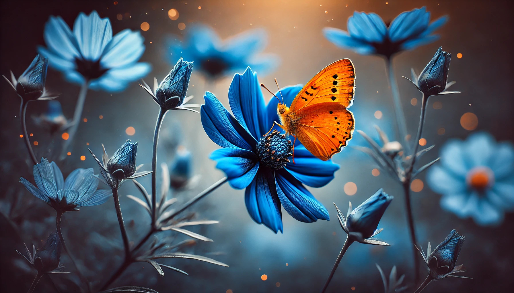
Complementary colors are pairs of colors that lie opposite each other on the color wheel. For example, red and green, blue and orange, or yellow and purple are all complementary pairs. When used together, these colors create a dynamic and visually appealing effect.
They can enhance the brightness of an image when placed side by side. Photographers often use these colors to draw attention to specific elements within a photo. Knowing which colors complement one another allows for thoughtful and impactful compositions.
The Impact of Complementary Colors in Imagery
Complementary colors significantly influence how images are perceived. They can create emotional connections and enhance the overall composition of a photograph.
Emotional Responses to Color Combinations
Colors can evoke strong feelings in viewers. For instance, the pairing of red and green may stimulate feelings of excitement and tranquility simultaneously. Each color in the combination plays a role in shaping the emotion conveyed.
In photography, artists use these emotional responses to their advantage. By selecting complementary colors, they can communicate mood and intent. This deliberate choice can engage viewers and make images more memorable.
Color combinations can also enhance storytelling. For instance, a warm background may highlight cooler subjects, drawing attention where it matters. This technique ensures that the intended message is clear and impactful.
Complementary Colors in Composition
Using complementary colors in composition can elevate the visual appeal of an image. Colors opposite one another on the color wheel, like blue and orange, create balance and dynamism. This contrast makes each color appear more vibrant, enhancing overall visual clarity.
Incorporating these colors effectively guides the viewer’s eye through the image. It directs focus to key elements of the composition. Photographers often place complementary colors strategically to create depth and interest.
Another method involves using accents of complementary colors. A small splash of a contrasting color can create focal points that grab attention. This adds layers to the image while maintaining harmony.
Camera Settings for Capturing Vibrant Colors
Choosing the right camera settings is essential for capturing vibrant colors in photography. By adjusting the white balance and understanding exposure settings, anyone can enhance the richness of colors in their images.
White Balance and Color Temperature
White balance plays an important role in how colors are rendered in photographs. This setting adjusts the color temperature of the light entering the camera, helping to eliminate color casts that can make images look unnatural.
Photographers can use presets like “daylight” or “shade” depending on the conditions. It’s also helpful to manually set the white balance using a gray card, ensuring colors appear accurately. For warmer or cooler tones, adjusting the color temperature in either direction can create different moods.
Incorrect white balance settings can lead to dull or exaggerated colors. Always double-check settings to ensure the desired effect is achieved.
ISO, Shutter Speed, and Aperture Considerations
ISO, shutter speed, and aperture work together to control exposure and color vibrancy. A lower ISO setting (100-200) is ideal for bright conditions, resulting in clearer images with less noise. Higher ISOs may be necessary in low light, but can introduce graininess.
Shutter speed is crucial for capturing movement without blur. A faster shutter speed (1/500 sec or faster) freezes action, while a slower speed can create artistic effects. Choosing the right shutter speed also affects how light interacts with colors.
Aperture settings (f-stop) impact depth of field and light intake. A wide aperture (like f/2.8) lets in more light and softens backgrounds, making the subject stand out. This helps in highlighting vibrant subjects against softer colors in the background.
Lighting Considerations for Color Photography
Lighting plays a crucial role in how colors appear in photography. Both natural and artificial light sources can significantly affect the vibrancy and perception of complementary colors. Understanding these lighting conditions helps photographers make better choices for their images.
Natural vs. Artificial Lighting
Natural lighting, like sunlight, provides a broad spectrum of colors. This type of light can create vibrant and true-to-life colors in photographs. The angle of the sun changes throughout the day, affecting shadows and highlights. Photographers often prefer shooting during the “golden hour” when the light is soft and warm, enhancing the richness of complementary colors.
Artificial lighting, on the other hand, offers more control but can alter colors depending on the light source. Incandescent lights can give a warm yellow tone, while fluorescent lights often cast cool blue shades. Using correct white balance settings can help mitigate these effects and maintain color accuracy. Photographers should experiment with different artificial lights to find the best fit for their desired outcomes.
The Golden Hour Effect
The golden hour occurs shortly after sunrise and before sunset. During this time, the light is softer and warmer, making it perfect for capturing colors vividly. The warm tones during the golden hour can create stunning contrasts between complementary colors. This not only adds depth but also enhances the emotional impact of the photograph.
Photographers can maximize this effect by positioning subjects strategically in relation to the light source. Using reflectors can also help bounce warm light onto subjects, intensifying color contrasts. Planning shoots around the golden hour can lead to more compelling and visually appealing photographs.
Post-Processing Techniques to Enhance Colors
Post-processing plays an essential role in making colors in photographs pop. Various techniques can sharpen the hues and balance the overall look of an image. Here are some effective ways to enhance colors in post-production.
Color Grading in Post-Production
Color grading is a powerful tool in digital photography. It allows photographers to adjust the overall tone and mood of their images. Using software like Adobe Lightroom or Photoshop, they can modify shadows, mid-tones, and highlights.
Creating a specific atmosphere is key. For example, warm tones can evoke a joyful feeling, while cool tones may give a calm effect. They can also use presets to apply color grades quickly. Combining different grades can lead to unique visual styles, complementing subjects effectively.
Selective Color Adjustment
Selective color adjustment enables precise control over specific colors in an image. This technique helps photographers enhance particular hues without affecting the entire picture.
Using tools like the HSL (Hue, Saturation, Lightness) panel allows adjustments per color. For instance, increasing the saturation of red can make a sunset more vivid. Conversely, reducing the blue can soften a sky’s harshness.
This detailed color tuning creates a personalized touch, making images distinctly appealing. It also helps in achieving harmony with complementary colors, drawing viewer attention where it matters.
Using Filters and Effects
Filters and effects add flair to photographs and enhance colors dynamically. Many editing programs offer a range of filters to give images different looks.
For example, a polarizing filter can deepen the blue of the sky and reduce glare. On the other hand, a vignette effect can focus the viewer’s gaze on the center of the image, enhancing the colors there.
Experimenting with these options can lead to exciting results. Photographers should try various combinations to see what resonates with their vision. Using gradients can also smooth transitions between colors, adding depth to the overall image.
Creative Projects to Practice Using Complementary Colors
Exploring complementary colors in photography can lead to exciting results. Here are three engaging projects to help develop skills and creativity. Each project highlights specific techniques to effectively incorporate these color dynamics.
Still Life Photography
In still life photography, using complementary colors can create striking contrasts. A simple arrangement of objects like fruits can showcase this well.
For instance, a bowl of oranges can be placed against a deep blue fabric or background. This setup allows the colors to pop.
Consider arranging items that have different textures. The soft skins of oranges will contrast nicely with the smoothness of a blue vase. This adds depth and interest to the image.
Lighting is also important. Natural light can enhance these colors without overpowering them. Experimenting at different times of the day will yield different results.
Portrait Photography with Color Blocking
Color blocking adds drama to portrait photography by using complementary colors in clothing and backgrounds. For example, a person wearing a vibrant red dress against a green backdrop creates a captivating visual.
Using color blocking means strategically planning wardrobe choices. Photographers can communicate with subjects before the shoot to decide on colors. This ensures the combination will be effective.
Additionally, using props that align with the color scheme can enhance the scene. For instance, pairing yellow accessories with purple outfits can create a strong aesthetic.
Working with lighting techniques can enhance features and colors. Soft light can be balanced with highlights to make the colors stand out even more.
Landscape Photography and the Role of Natural Colors
In landscape photography, nature often provides beautiful complementary colors. Photographers can look for scenes where warm and cool colors naturally contrast.
A beach sunset with orange and blue skies is a fantastic example. The contrast between the warm sun and the cool ocean enhances the beauty of the shot.
Adding foreground elements, like rocks or plants, in contrasting colors can lead to stunning compositions. This will draw the viewer’s eye and create interest.
Photographers should pay attention to the time of day. Golden hour provides rich warm tones that can be complemented by cool shadows. These moments are perfect for capturing dynamic landscapes.
Tips for Achieving Harmony and Contrast
Using complementary colors in photography requires a thoughtful approach to create exactly the right balance and impact. By focusing on the intensity of colors and their relationships, photographers can enhance the visual appeal of their images.
Balancing Color Intensity
Color intensity matters a lot in photography. When using complementary colors, it is essential to consider how vibrant or muted each color is. A photograph filled with one intense color can overpower the other, losing the intended harmony.
To achieve balance, adjust the saturation levels. Use a color wheel to identify complementary pairs. For example, if you have a bright orange, pairing it with a soft blue can create balance. Photographers can also use editing software to tweak the intensity after the shot.
By ensuring both colors stand out without competing, the overall image gains depth and interest.
Color Relationships and Proportion
Understanding how colors relate to each other is key. Complementary colors sit opposite each other on the color wheel, creating contrast when used together. It helps to determine how much of each color to include in the frame.
Proportion matters for effective compositions. A common rule is to use one color as the dominant hue and the other as an accent. For example, a field of vibrant purple flowers with a small splash of yellow can be eye-catching.
Mixing colors also works well. Including shades or tints can provide variety without losing the core balance. This dynamic gives the image a harmonious yet lively feel. Choosing the right proportion embraces both harmony and contrast effectively.
The Role of Context in Color Perception
Context plays a crucial role in how colors are perceived. Factors such as cultural meanings and psychological effects can significantly influence the impact of color choices in photography.
Cultural Significance of Colors
Colors carry different meanings in various cultures. For example, white often symbolizes purity in Western cultures but can represent mourning in some Eastern cultures. Such cultural nuances can affect how viewers interpret a photograph.
When using complementary colors, understanding their cultural significance is essential. Photographers may use colors thoughtfully based on their audience. A vibrant red and green combination may evoke excitement in some cultures while appearing aggressive in others.
Being aware of these cultural differences can help photographers connect better with their audience, making their work more impactful.
Psychological Effects of Color Combinations
The combination of colors can create specific emotional responses. Warm colors, like red and orange, can evoke feelings of warmth and energy. In contrast, cool colors, such as blue and green, often create a sense of calm.
Complementary color schemes enhance these psychological effects through contrast. For instance, a blue and orange pairing can stimulate excitement and interest. It draws the viewer’s eye and encourages engagement with the image.
Photographers can use these effects to their advantage by carefully selecting color combinations that align with the emotions they wish to evoke. Understanding these psychological factors can improve the overall impact of their work.