
Choosing the right colors can greatly impact the look and feel of any space. Warm colors like reds, oranges, and yellows create a cozy and inviting atmosphere, while cool colors such as blues and greens tend to have a calming effect. Understanding the difference between these color temperatures can help anyone transform a room to match their desired mood.
When someone wants to redesign their living area, color selection is key to achieving the right ambiance. Warm hues are often perfect for gathering spaces, fostering a sense of comfort and closeness. On the other hand, cool tones work wonderfully in places intended for relaxation and focus, like home offices or bedrooms.
With a few simple choices, it is possible to create a home that reflects personality and invites comfort. The excitement of exploring warm versus cool palettes can inspire creative design ideas for anyone ready to refresh their space.
Understanding Color Psychology
Color psychology plays a significant role in how spaces feel and function. Choosing the right hues can influence mood, productivity, and comfort levels. Below are some insights into warm and cool colors, highlighting their unique effects on environments.
Warm Hues and Their Effects
Warm colors like red, orange, and yellow evoke feelings of energy and excitement. These hues are often used to create inviting and cozy atmospheres. For instance, adding a splash of red in a dining room can stimulate conversation and appetite.
Warm colors are also great for social spaces, encouraging interaction and warmth. In offices, an accent wall in orange or yellow can promote creativity and enthusiasm. However, too much warmth can lead to feelings of aggression or restlessness.
Balancing warm colors with neutral tones can create a more harmonious environment. This mix helps avoid overwhelming feelings while still maintaining an inviting space.
Cool Hues and Their Influences
Cool colors such as blue, green, and purple have calming effects on people. These hues are ideal for areas where relaxation and focus are desired. For example, light blue tones in a bedroom can encourage a sense of tranquility and restfulness.
Green shades are often associated with nature and can promote balance and healing. They work well in home offices to enhance concentration while reducing stress. A touch of lavender might add a subtle sophistication to a quiet reading nook.
It’s essential to use cool colors wisely, as excessive coolness can lead to feelings of detachment. Pairing cool colors with warmer accents creates a balanced and inviting atmosphere in any room.
Design Principles for Color Selection
Selecting the right colors for a space involves more than just picking favorite shades. It requires understanding how colors interact and affect the overall atmosphere. This section explores essential principles to help make informed decisions.
Harmony and Contrast
Color harmony creates a sense of balance in a room. Designers often use color schemes that combine similar hues, such as shades of blue and green, to promote a tranquil environment.
On the other hand, contrast adds visual interest. Pairing warm colors like reds and oranges with cool colors like blues can create a lively atmosphere. It’s important to find the right balance between harmony and contrast to achieve the desired effect.
A well-chosen color palette can enhance the style of any space, making it feel unified or dynamic, depending on the goals.
Color Intensity and Room Size
Color intensity refers to how bright or muted a color appears. In smaller rooms, using lighter, more subdued colors can make the space feel larger and more open. Darker and more intense shades can create a cozy atmosphere but may make small rooms feel cramped.
Larger spaces can benefit from bolder colors. Bright and vibrant hues can help fill the space without overwhelming it.
Choosing the right intensity for the room size plays a crucial role in how comfortable and inviting a space feels.
Lighting and Color Perception
Lighting significantly affects how colors are perceived. Natural light brings out the true essence of colors, while artificial light can alter it. Warm light tends to enhance warm colors, making them appear richer, while cool light can make cool colors feel airy.
It’s best to test colors in different lighting conditions before making final decisions. Paint swatches can look different in morning sunlight than in evening glow.
Understanding the relationship between light and color can help create the perfect ambiance in any space.
Creating Mood with Warm Colors
Warm colors can significantly influence the feel of a space. They evoke feelings of comfort, joy, and energy, making them perfect for various areas in the home.
Cozy and Inviting Atmospheres
Warm colors, such as reds, oranges, and yellows, help create cozy environments. These hues mimic the warmth of sunlight and fire, making rooms feel welcoming.
In living rooms or bedrooms, soft warm tones, like a rich terracotta or sunny yellow, can make the space seem snug. They invite people to relax and unwind, encouraging intimate conversations. Accent walls painted in warm shades can draw attention and create a focal point without overwhelming the senses.
Also, adding warm-colored accessories, such as cushions and throws, enhances this inviting feel. This strategy allows homeowners to enjoy the mood-boosting effects of warm colors without drastic changes.
Stimulating Social Interactions
Warm colors are known to stimulate social interactions. Shades like red and orange can energize a space, encouraging conversation and engagement among guests.
In dining areas, warm colors can create a vibrant atmosphere that makes meals more enjoyable. A warm orange tablecloth or red dinnerware can set the tone for lively discussions and shared laughter.
Using warm-colored lighting, such as soft amber bulbs, further enhances this effect. It casts a flattering glow, making people feel comfortable and open, inviting them to connect and have fun. This thoughtful use of color can transform gatherings, helping create lasting memories.
Incorporating Cool Tones
Cool tones can enhance a space by introducing tranquility and focus. These hues, ranging from blues to greens, help create an atmosphere that is both refreshing and calming. Mindful incorporation of these shades can transform areas into havens of peace and productivity.
Soothing and Calming Spaces
Cool tones are ideal for creating soothing environments. Colors like soft blue and gentle green can bring a sense of calm to any room. They are perfect for spaces like bedrooms and bathrooms, where relaxation is key.
To enhance this effect, consider pairing cool colors with soft textures. Materials such as cotton or linen in pale blue can evoke a serene feeling. Adding plants can also complement these tones, bringing nature indoors while promoting tranquility.
Using artwork featuring cool tones can also serve as a focal point. It adds interest without overwhelming the senses. The overall impact is a peaceful retreat that invites relaxation.
Focus and Productivity
Incorporating cool tones can significantly boost focus and productivity. Shades like teal or cool gray are excellent for home offices and study areas. These colors create a calm yet stimulating environment that can help maintain concentration.
To maximize benefits, combine cool tones with good lighting. Natural light works best, but soft artificial lighting can also help. Accent with functional items in complementary cool hues.
Furniture in these shades can also promote a sense of spaciousness. This can help keep distractions at bay, improving overall effectiveness in work or study.
The Impact of Color in Different Rooms
Color plays a crucial role in defining the mood and feel of each room in a home. Different colors can create specific atmospheres that influence daily activities, emotions, and interactions in various spaces.
Kitchen and Dining: Energy vs. Serenity
In kitchens, colors such as yellow, orange, and red can stimulate appetite and energy. These warm tones bring vibrancy, making the kitchen feel lively and inviting. However, cooler shades like blue or green can create a serene environment.
When choosing colors for dining areas, consider the effect on social gatherings. A balance of both warm and cool colors can enhance conversation while still providing a calm backdrop. Soft blues or greens paired with warm wooden accents can create an ideal setting for family meals.
Bedrooms: Restfulness vs. Warmth
In bedrooms, soft and muted colors are often the best choice. Shades like lavender, light blue, and soft greens promote relaxation and restful sleep.
On the other hand, warm colors like beige or soft peach can add a cozy touch. These hues create a welcoming environment that feels safe and secure.
For a balanced space, a combination of both warm and cool colors can work well. Cool tones can dominate the walls, while warmer pillows, throws, or artwork can provide accents that enhance comfort.
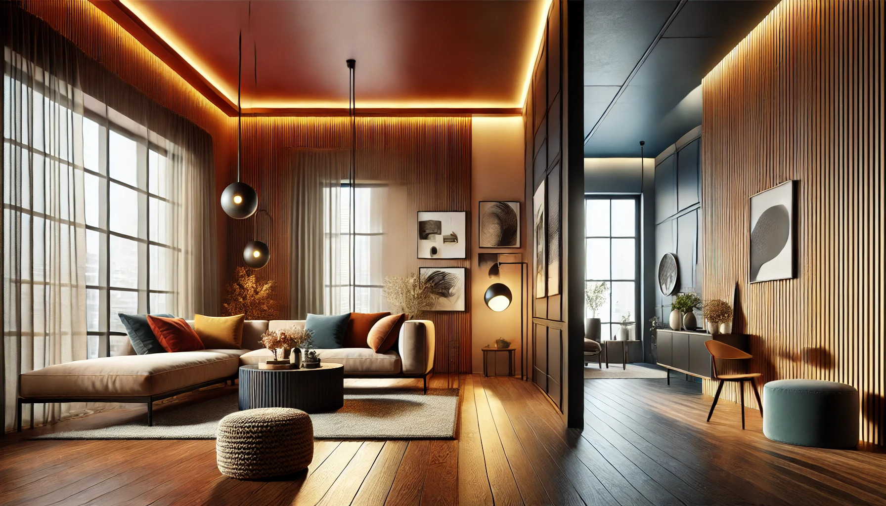
Living Areas: Balancing Warmth with Coolness
Living areas often serve multiple purposes, requiring a thoughtful approach to color selection. Warm colors such as amber, terracotta, and peach can make spaces feel cozy and inviting.
In contrast, cool colors like teal or seafoam green can create a refreshing atmosphere. These tones can help to balance social interactions in the space, making it feel open and airy.
A good strategy is to use a dominant warm color for the walls and incorporate cool tones through accessories like cushions and rugs. This creates harmony and maintains an inviting ambiance.
Bathrooms: Cleanliness and Spa-like Qualities
Bathrooms are often associated with cleanliness and relaxation. Colors like soft white, pale blue, and mint green can enhance the feeling of freshness. These hues create a spa-like quality that can transform the routine of daily cleansing into a relaxing experience.
Alternatively, deeper colors like navy or earthy tones can evoke warmth and comfort. These colors, when used wisely, can create a retreat-like feel, perfect for unwinding after a long day.
Incorporating natural elements, such as plants, can add splashes of green, enhancing both cleanliness and tranquility. A balance of colors will ensure a refreshing yet calming bathroom space.
Seasonal and Trend Considerations
Color choices in home design often change with the seasons and current trends. It’s essential to pay attention to these factors to create a space that feels timely and refreshing.
Seasonal Color Shifts
As the seasons change, so do color palettes. Spring typically brings soft pastels, evoking feelings of renewal. Colors like light pink, mint green, and soft yellow can brighten any space.
In contrast, summer favors vibrant shades like turquoise and sunny yellow. These colors create a lively atmosphere perfect for gatherings.
Autumn introduces warm, earthy tones such as burnt orange, deep red, and mustard yellow, promoting a cozy vibe. Winter often calls for cool colors like icy blue and crisp white, reflecting the season’s chill.
Homeowners can use seasonal shifts to make small updates. Even changing throw pillows or artwork can bring a fresh feel to any room.
Trends in Interior Design Colors
Trends in colors also play a significant role in interior spaces. Current popular colors often emerge from cultural influences, design fairs, and forecasts by color authorities.
For example, neutral tones have gained traction as a backdrop for statement pieces. Shades like beige, taupe, and soft gray are becoming popular for walls and large furniture.
Bold colors, like deep green and navy blue, are also trending. These hues can add depth and sophistication, especially when used in smaller details like accents and accessories.
Incorporating trendy colors can keep spaces feeling modern. This isn’t about overhauling an entire room but rather finding ways to blend these trending colors into existing décor.
Mixing Warm and Cool: A Comprehensive Approach
Combining warm and cool colors effectively can create a lively yet balanced atmosphere in any space. It is essential to apply specific techniques and understand the significance of palette balance to achieve the desired results.
Color Layering Techniques
Layering colors means using various hues to add depth. A good approach is to start with a neutral base like beige or gray. This foundation allows warm and cool tones to pop without clashing.
When choosing colors, blend warm tones like orange or yellow with cool colors like blue or green. For example, place a warm orange throw on a cool-toned blue couch. This combination creates contrast while keeping the space inviting.
Using different textures can enhance this layering. A soft wool blanket can add warmth, while silk cushions bring in coolness. It’s essential to keep the balance by not overloading one color type.
Balanced Palettes for Harmonious Interiors
Creating a balanced palette involves selecting colors that complement each other. A popular method is the 80/20 rule. This means using 80% of one color type and 20% of the other to avoid overwhelming the space.
For instance, choose a warm palette as the base, then introduce cool accents. This can be achieved with decor items like paintings or rugs. A warm beige wall can be paired with cool-toned artwork, providing a pleasing contrast.
It’s vital to consider lighting when working with colors. Natural light can change how colors appear, making them look warmer or cooler. Testing colors in different lighting at various times of the day will help find the right balance.