
Choosing the right colors for outdoor photography can make a big difference in how photos turn out. Colors that contrast with the natural background enhance the subject and make it pop in pictures. By selecting shades that complement the surroundings while still standing out, individuals can create stunning visuals.
Many find that seasonal changes affect their color choices. Light and vibrant colors work well in sunny settings, while deeper tones can add warmth during fall. Understanding the environment contributes to making better color selections, ensuring the subject remains the focus.
With the right palette, anyone can elevate their outdoor photography. By exploring various color combinations and understanding how they interact with nature, they can achieve eye-catching results. This blog will guide readers through the best choices for colors that stand out beautifully in outdoor settings.
Understanding Color Theory
Color theory is essential for photographers who want to make their outdoor images more engaging. By grasping how colors interact and affect emotions, photographers can make better choices in their compositions.
The Color Wheel
The color wheel is a visual tool that shows how colors relate to one another. It contains primary colors: red, blue, and yellow. These colors create secondary colors, like green, orange, and purple, when mixed.
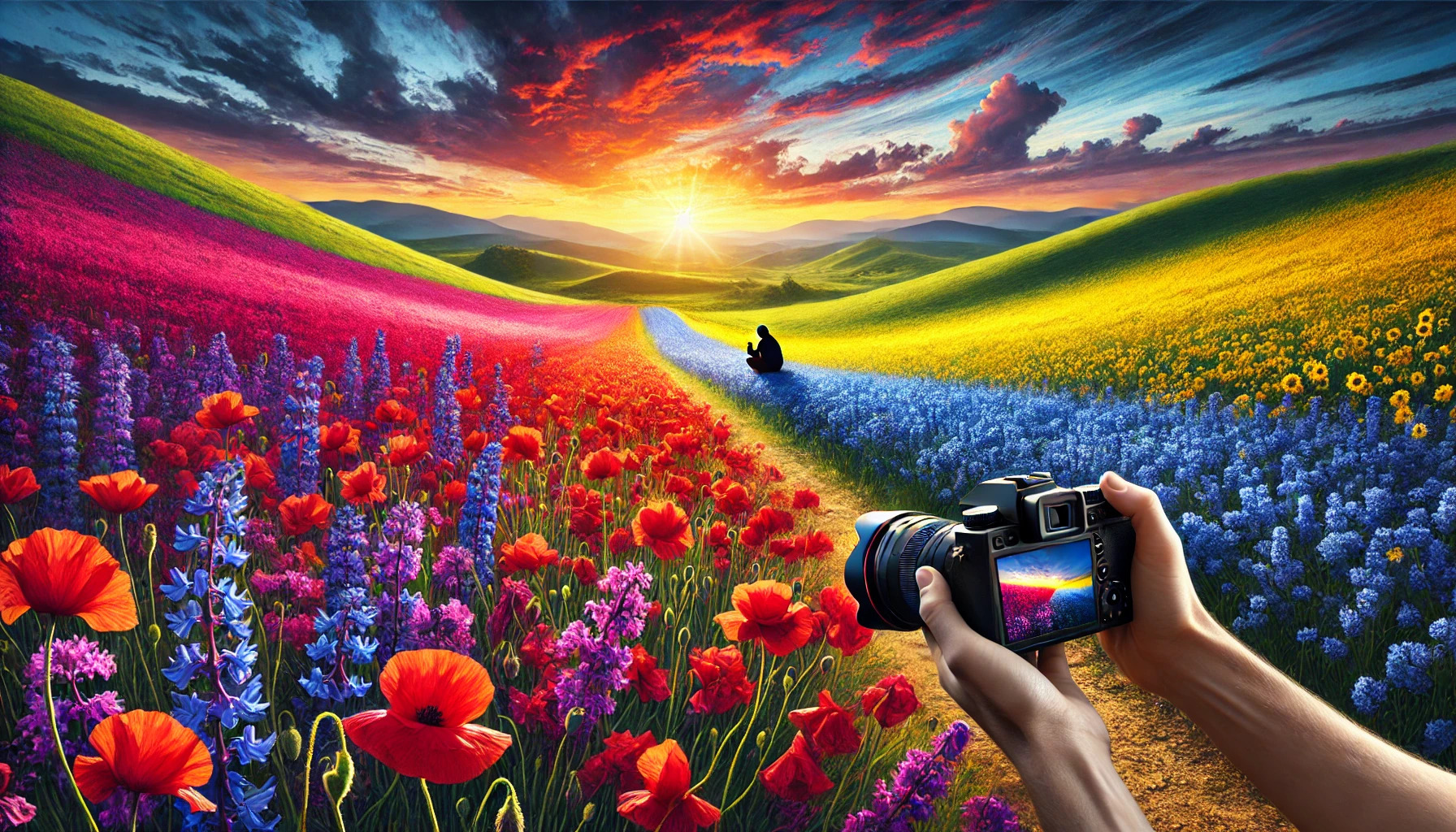
Tertiary colors come from mixing primary and secondary colors. Understanding this wheel helps photographers choose complementary colors, which are opposite each other on the wheel. Using complementary colors can create strong contrast and draw attention to the main subject. For instance, pairing blue skies with golden sunsets makes the image pop.
Color Harmony
Color harmony involves selecting colors that work well together in an image. There are several schemes photographers can use:
- Complementary colors: Opposite colors on the color wheel create strong visual contrast.
- Analogous colors: Colors next to each other provide a more harmonious look.
- Triadic colors: Three colors evenly spaced on the wheel offer balance and vibrancy.
Using these harmonies helps maintain a cohesive feel. Photographers can experiment with various combinations to find what best suits their style and enhances the overall impact.
Color Psychology
Color psychology explores how colors influence feelings and perceptions. Different colors can evoke specific emotions. For instance, red often represents passion or urgency, while blue is calming and serene.
When photographing landscapes, colors can set the mood. Warm colors like orange and yellow can create a sense of happiness. Cool colors like green and blue may promote tranquility.
Photographers should consider these effects when choosing colors. By selecting the right hues, they can enhance the story they want to tell with their image, making it resonate more with viewers.
The Role of Light
Lighting is crucial in outdoor photography. It affects how colors appear and can enhance the overall mood of an image. Understanding different aspects of light helps photographers choose colors that truly stand out.
Golden and Blue Hours
The golden hour occurs shortly after sunrise and before sunset. During this time, the sun casts a warm, soft light that enhances colors in a beautiful way. Photographers can capture rich, vibrant hues in their images.
The blue hour happens just before sunrise and after sunset. The sky turns deep blue, creating a striking contrast with warmer colors. This period is perfect for capturing dramatic landscapes that make colors pop against a serene backdrop.
Direction of Light
The direction from which light comes greatly influences a photograph. Front lighting can illuminate a subject uniformly, making colors bright and even. This is great for capturing detailed shots.
Side lighting creates depth and texture. It highlights the shape of objects and can produce interesting shadows. This method can enhance colors by giving them a three-dimensional feel.
Backlighting can create beautiful silhouettes. While it might wash out colors, it also allows colors to glow, especially in translucent subjects like flowers. Understanding the direction of light helps photographers choose colors that complement their subject effectively.
Quality of Light
The quality of light refers to how harsh or soft it is. Soft light, such as during overcast days, reduces contrasts and creates gentle colors. This is ideal for portraits or close-up shots where subtlety is key.
Harsh light, often seen at noon, can create stark shadows and bright highlights. This can lead to overly bright colors that may distract from the subject. Using reflectors or diffusers can help manage harsh light and balance colors, leading to a more pleasing image.
Scouting Your Location
When planning for outdoor photography, scouting the location is crucial. The right environment can enhance color choice and help create stunning images. Understanding the time of day, the natural surroundings, and any cultural elements can greatly influence the final outcome.
Researching Time and Season
Timing is key in outdoor photography. The quality of light changes throughout the day and with the seasons.
Morning and late afternoon, known as the “golden hours,” offer soft, warm light that can enhance colors.
In contrast, midday sun can create harsh shadows and overexposed areas. Checking the weather and planning shoots in different seasons can also provide diverse backdrops. For example, winter’s snow can neutralize colors, while autumn’s foliage offers rich, warm tones.
Analyzing Natural Elements
Natural elements play a significant role in how colors appear in photos. Features like trees, water, and mountains provide context and depth.
A vibrant blue sky can complement warmer colors in clothing, making the subject stand out.
It’s also important to consider surrounding plants and flowers. Certain colors can either clash or blend with the environment. A pop of color against green foliage can create a striking image. Observing the site at different times can help in deciding how to use these elements effectively.
Considering Cultural Aspects
Cultural elements can add depth and meaning to outdoor photography. The colors and styles prevalent in the local culture can guide choices in wardrobe.
For example, in urban settings, vibrant street art might influence color selection for outfits.
Traditional attire in certain areas could also inspire unique palettes that honor the culture. Seeking inspiration from local events or festivals can enhance the visual storytelling of a photo shoot. Being aware of these aspects can lead to more impactful images that resonate with viewers.
Equipment Insights
Selecting the right equipment can significantly improve color vibrancy in outdoor photography. Using filters and lenses appropriately allows photographers to enhance their images and make colors pop effectively.
Filters for Color Enhancement
Filters are essential tools for improving color in outdoor photography. A polarizing filter can reduce glare from reflective surfaces, like water or wet leaves. This helps colors appear deeper and more saturated.
Another effective option is a color filter, which can add warmth or coolness to an image. For example, a warm filter enhances reds and yellows, making nature scenes stunning during golden hours.
Using filters correctly not only enhances colors but also helps in achieving the desired mood for the photos. Photographers should choose filters based on the environment and the look they want to create.
Choosing the Right Lens
Choosing a lens is crucial for capturing vibrant colors outdoors. Wide-angle lenses allow for expansive landscapes, bringing more colors into the frame. They are excellent for capturing expansive fields of flowers or sunsets.
On the other hand, a macro lens is perfect for close-up shots of flowers or insects. It reveals intricate details and brings out colors that may be overlooked.
A fast lens with a wide aperture helps achieve a shallow depth of field, isolating the subject against a blurred background. This contrast can make colors stand out even more. Photographers should select lenses based on the scene and type of subject matter for optimal results.
Composition and Framing
In outdoor photography, composition and framing are vital for creating striking images. Attention to details like the placement of elements can significantly enhance the photo’s visual appeal.
Foreground, Middleground, Background
In photography, the use of foreground, middleground, and background can add depth. The foreground captures a viewer’s attention first, so choosing interesting elements is key. For example, placing vibrant flowers or rocks in the foreground can create an inviting scene.
The middleground often holds the main subject, like a tree or a person. It helps to connect the foreground and background. A balanced middleground allows for a smooth transition.
The background should complement the subject. Blurring it with a shallow depth of field can keep the focus on the main element. Each layer contributes to a well-structured composition.
Utilizing Negative Space
Negative space refers to the empty area around the main subject. Using it effectively can enhance the importance of the subject. It allows the viewer’s eye to rest and emphasizes the focal point.
When photographing, consider how much space to leave around your subject. For instance, a solitary tree in a vast field can evoke feelings of loneliness or freedom.
Using negative space helps draw attention to the subject without distractions. It creates a balanced look and can make the photograph feel more intentional.
Leading Lines and Shapes
Leading lines guide the viewer’s eye through the image. They can be natural elements, like roads or rivers, that draw attention to the subject. For example, a winding path leading to a mountain creates a sense of direction.
Shapes also play a critical role. Triangles, circles, and lines can guide the viewer’s perception and create harmony. A well-placed tree can frame a mountain in the background, uniting the elements.
Combining leading lines and shapes in a composition adds dynamism. Using these tools thoughtfully can turn a simple scene into a captivating photograph that captures attention.
Color Adjustments Post-Processing
Making color adjustments in post-processing can greatly enhance outdoor photography. Important techniques to consider include adjusting saturation and vibrance, balancing colors, and using histograms and sliders effectively. Each technique contributes to bringing out the best in a photograph.
Saturation and Vibrance
Saturation increases the intensity of all colors in an image, making them more vivid. It’s important to be cautious, as too much saturation can result in unnatural-looking photos.
Vibrance is a more subtle adjustment that enhances muted colors without affecting skin tones as much. This means it can add depth without overwhelming the entire image. A photographer can boost vibrance to make an image pop while maintaining a natural feel.
Balancing both can lead to stunning results. For example, adjusting saturation to 20% and vibrance to 30% can create a great harmony.
Color Balancing
Color balancing is vital for achieving accurate and pleasing colors in photographs. This process involves removing color casts, which can occur due to different lighting conditions.
Using tools like the white balance settings allows photographers to adjust the warmth or coolness of their images. A photo taken in the shade might need a warmer adjustment, while sunlight might require a cooler balance.
By tweaking color balance, they can create mood and enhance emotion in the image. For instance, a warm balance can evoke a cozy feeling, while a cool balance may create a serene atmosphere.
Using Histograms and Sliders
Histograms are valuable tools in post-processing. They visually represent the tonal range in an image, helping identify overexposed or underexposed areas.
To adjust colors effectively, photographers should focus on the midtones, shadows, and highlights within the histogram. Making slight adjustments to sliders can rectify issues and enhance the overall look.
Sliders in editing software allow for direct manipulation of each color channel. For example, increasing the blue channel in shadows can add depth to the sky. Keeping a “soft touch” on sliders ensures that adjustments appear natural and cohesive.