
Creating a mood board is an exciting way for anyone to express their vision and style. By gathering images, colors, and textures, they can visually display their ideas. A well-crafted mood board not only showcases a chosen color scheme but also sets the tone for any project, be it personal or professional.
To make a mood board that truly reflects their color preferences, one can start by collecting inspiration from various sources, such as magazines or online platforms. Next, selecting the right colors that resonate with their theme helps create a cohesive look. This process allows for exploring different combinations until they find the perfect match that embodies their desired aesthetic.
Crafting a mood board is more than just a fun activity; it serves as a powerful tool to guide creative projects. By understanding how to incorporate color schemes effectively, they can ensure their final outcome aligns with their original vision. Engaging with the process of designing a mood board can lead to a clearer and more focused creative journey.
Understanding Mood Boards
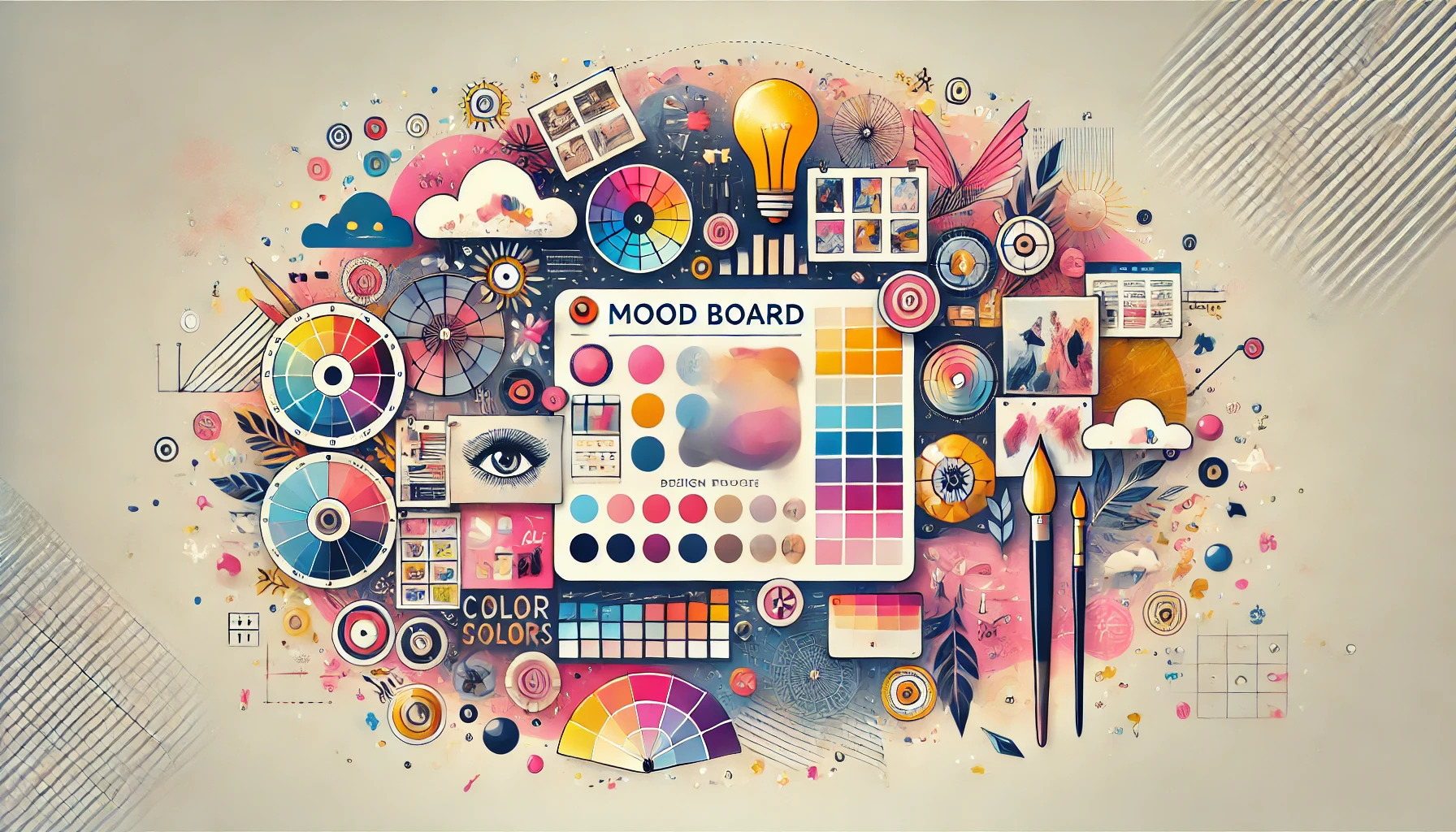
Mood boards are essential tools for visualizing ideas and concepts in design projects. They bring together colors, images, and materials to create a cohesive representation of a theme or style. This section explores the definition, purpose, and benefits of mood boards in the design process.
Definition and Purpose
A mood board is a collage of visual elements that convey a specific design idea. It typically includes colors, textures, images, and other materials. The primary purpose of a mood board is to provide a tangible representation of the intended mood, style, or concept.
Designers often use mood boards as a starting point for projects. They help to clarify ideas and guide the design process. By presenting a visual summary, they can communicate their vision effectively to clients or team members.
Benefits for Design Projects
Using a mood board offers several advantages in design projects. First, it fosters creativity by allowing designers to explore different color schemes, textures, and styles. By seeing all the elements together, they can better understand how they interact.
Additionally, mood boards help in decision-making. They serve as a reference point throughout the project, ensuring that the design remains on track. Clients can also visualize and give feedback on the concept before actual work begins. This collaboration can lead to a more satisfying outcome for everyone involved.
Setting Your Color Scheme
Creating a mood board starts with a strong color scheme. Choosing the right colors can set the tone and impact the message of the design. Understanding how colors work together is essential for a cohesive look.
Choosing a Color Palette
When selecting a color palette, it’s helpful to focus on a limited number of colors. Typically, a palette should have around five colors. This will help maintain balance and prevent clashing.
A popular method is to use color generation tools like Coolors. These apps can suggest color combinations based on one base color. Using an image related to the mood board can also inspire color choices.
Once the colors are chosen, it’s important to test them on the mood board. This will ensure the palette conveys the desired emotion or style.
Color Psychology Basics
Colors have a significant influence on emotions and perceptions. For example, blue often evokes feelings of calm and trust, while red can represent passion or urgency. Understanding these effects helps in setting the right mood for the audience.
Using color psychology can shape how a viewer reacts to the design. For a project aimed at relaxation, cooler shades like green or blue might be ideal. They create a peaceful atmosphere.
Before finalizing the colors, it’s beneficial to think about the audience and purpose. This can guide the choice of colors effectively.
Color Harmony and Contrast
Color harmony is crucial in design. It involves finding colors that work well together. There are several harmonies, including complementary, analogous, and triadic schemes.
Complementary colors are opposite each other on the color wheel and create strong contrast. This can be eye-catching and dynamic. Analogous colors sit next to each other and often match well, creating a calming effect.
Contrasts can highlight important elements. For instance, using light shades against dark backgrounds can make text stand out. Balancing harmony and contrast is vital for an effective mood board, helping communicate the intended message clearly.
Gathering Inspiration
Finding the right inspiration is essential for creating an effective mood board that reflects a chosen color scheme. This process involves exploring various sources of creativity and understanding how color plays a role in visual elements.
Research and Exploration
To start, it’s important to explore different sources of inspiration. She can look at interior design magazines, websites, or even nature for ideas. Visiting local art galleries or design exhibits can also spark creativity.
Using platforms like Pinterest is helpful. She can browse through countless images that showcase various color schemes and styles. By saving favorite images, she builds a visual library that can guide her choices later.
Additionally, creating a scrapbook with fabric swatches or paint samples can make the research process tangible. This hands-on approach allows her to see how colors work together in real life.
Using Color in Inspiration Imaging
Color is a key element in designing a mood board. They should start by selecting a dominant color that sets the tone. Next, they can choose complementary colors that enhance the main shade. This creates a balanced look.
She can explore color theory to see how different colors interact. For example, warm colors like reds and yellows create energy, while cool colors like blues and greens promote calmness.
Using color palettes from online sources or apps can simplify this process. Many tools generate color schemes based on a selected shade, making it easier to visualize combinations. It’s all about selecting colors that resonate and tell a cohesive story.
Tools and Materials
Creating a mood board requires specific tools and materials, whether opting for a physical or digital approach. Each method has its own essentials that can help bring a color scheme to life effectively.
Physical vs Digital Boards
Physical mood boards involve tangible materials that can be touched and rearranged. They typically require a base like a poster board or corkboard where various elements can be pinned or glued.
On the other hand, digital mood boards utilize software or apps to create a visually appealing layout. This method allows for easy adjustments and access to a wider variety of images and colors without the mess of physical supplies. Both options offer unique advantages. The choice depends on personal preference and the desired level of flexibility.
Essential Supplies for Physical Mood Boards
For physical mood boards, a few essential supplies will help in creating an effective display. First, a sturdy base like a poster board, corkboard, or canvas is necessary.
Next, gather scissors, glue, and push pins to attach images and materials. Collecting various magazines, fabric swatches, paint chips, and printed images related to the chosen color scheme will also be helpful.
Other supplies might include washi tape for decoration and markers to add notes or quotes. A clear workspace will enhance the creative process and allow better organization of materials during assembly.
Software Options for Digital Mood Boards
When creating a digital mood board, several software options can streamline the process. Canva is popular for its user-friendly interface and a wide range of templates, making it easy to design visually appealing boards.
Another great option is Adobe Spark, which offers advanced design tools for more skilled users. For collaborative projects, platforms like Milanote allow multiple users to edit and share boards seamlessly.
Lastly, Pinterest is a fun way to collect and organize inspiration. Users can compile images and links that relate to their color scheme in one place, making it easy to visualize ideas.
Arranging Your Mood Board
Arranging a mood board is essential to expressing a chosen color scheme effectively. The layout, use of color theory, and balance of visual elements play crucial roles in creating a visually appealing and inspiring board.
Layout Techniques
When it comes to layout, several techniques can enhance the mood board’s effectiveness. A grid layout keeps things organized and orderly, making it easy to compare colors and visuals. An asymmetrical layout creates dynamic energy, drawing the viewer’s eye in different directions.
Using a consistent alignment helps to create a clean look. It’s also a good idea to leave some white space between elements. This space can help prevent the board from feeling overcrowded.
Experimenting with different layouts can lead to a unique arrangement that best represents the color scheme.
Incorporating Color Theory
Understanding color theory is crucial when creating a mood board. The color wheel shows primary, secondary, and tertiary colors that work well together. Choosing complementary colors can create a vibrant contrast.
Analogous colors, which sit next to each other on the wheel, promote harmony. It’s also important to use the right balance of colors.
A common method is the 60-30-10 rule: 60% of the dominant color, 30% of a secondary color, and 10% for an accent. This helps maintain interest while ensuring that the chosen scheme is cohesive.
Balancing Visual Elements
Balancing visual elements is key to a successful mood board. Each element, whether it’s a color swatch, image, or texture, should contribute to the overall feel without overwhelming the viewer.
Focusing on scale can help achieve balance. For example, large images can anchor the board while smaller elements can float around them.
Repetition also strengthens cohesion. Using similar shapes or patterns throughout the board ties everything together.
Finally, step back and review the board as a whole. This ensures all parts work harmoniously with each other, creating a unified look that reflects the chosen color scheme.
Final Touches
At this stage, it’s essential to make sure the mood board truly reflects the desired color scheme and overall vision. This involves careful reviewing and refining of the elements. It’s also important to think about how to present the mood board in a way that highlights its strengths.
Reviewing and Revising
Reviewing the mood board is key to ensuring it aligns with the intended design concept. Taking a step back allows for fresh eyes to catch any colors or images that do not quite fit.
Start by checking if the colors complement each other. Remove any elements that feel out of place.
Incorporating feedback from friends or colleagues can provide valuable insights. Different perspectives might spot inconsistencies one may overlook.
Revising the board can involve adjusting layouts or swapping images until it feels just right. This process can be repeated as needed throughout the design journey.
Presenting Your Mood Board Effectively
When it’s time to show the mood board, presentation matters. A clear and visually appealing display can enhance the viewer’s understanding.
Consider the layout of the mood board. Group similar colors and images together to create harmony.
Using labels or captions can help explain the choices made. Describing how each element relates to the overall vision adds context.
Digital presentations offer options for interactive features. For printed boards, high-quality images and thoughtful placements create a polished look.
A well-presented mood board communicates vision clearly and professionally. It invites collaboration and discussion about the design direction.