
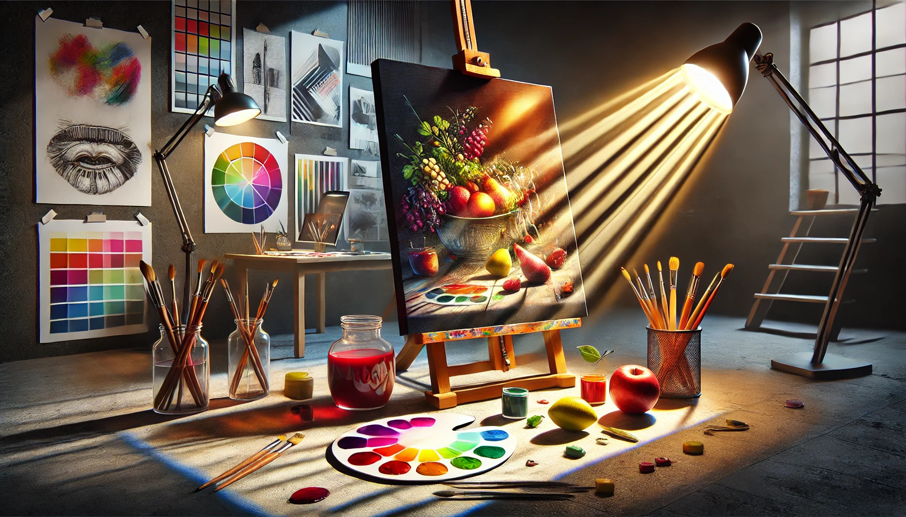
Light and shadow are essential tools for any artist looking to enhance their work. By skillfully manipulating these elements, artists can significantly alter how colors are perceived, creating depth and emotion in their pieces. Understanding this relationship allows for a richer, more engaging artistic expression.
In painting, shadows can deepen colors, making them appear more vibrant and alive. They help in highlighting the nuances of shades, revealing textures and forms that might otherwise go unnoticed. Mastering light and shadow not only improves a piece’s realism but also draws the viewer’s eye to the intended focal points.
Exploring the effects of light and shadow can turn a simple composition into a compelling visual story. Artists who identify the interplay between these elements unlock new dimensions in their work, leading to greater emotional responses from their audience. This exploration can empower artists to create memorable and impactful art that resonates well beyond the canvas.
Understanding Color Theory
Color theory helps artists and designers make better choices about color in their work. It includes the color wheel, color harmony, and the difference between warm and cool colors. Each of these concepts plays a vital role in how color interacts and how it can be used effectively.
The Color Wheel
The color wheel is a visual tool that shows the relationship between colors. It starts with three primary colors: red, blue, and yellow. These colors mix to create secondary colors like green, orange, and purple.
Colors that are opposite each other on the wheel are called complementary colors. For example, red and green are complementary. They create strong visual contrast when used together, which can make artwork stand out.
Color Harmony
Color harmony is about creating a pleasing arrangement of colors. It helps ensure that colors work well together. Common schemes include analogous colors, which are next to each other on the color wheel, and triadic colors, which form a triangle on the wheel.
Using color harmony can make a piece more visually appealing. A well-chosen color scheme can evoke emotions and convey messages effectively.
Warm vs. Cool Colors
Colors are often categorized as warm or cool. Warm colors, like red, orange, and yellow, tend to create feelings of energy and excitement. They can make a space feel cozy and inviting.
Cool colors, such as blue, green, and purple, have a calming effect. They can create feelings of peace and tranquility. Understanding these differences helps artists choose colors that set the right mood for their work.
The Role of Light in Color Perception
Light plays a crucial role in how colors are perceived. Factors such as light quality, intensity, and color temperature affect this perception significantly. Understanding these aspects helps in creating the desired visual effects when working with color.
Light Quality and Intensity
Light quality refers to the characteristics of the light source, including its spectral composition. This influences how colors are seen. For example, natural sunlight provides a full spectrum of light, helping colors appear vibrant and true to their nature.
Intensity also matters. A bright light can enhance colors, making them look more vivid. In contrast, dim lighting may wash out colors, leading to a muted appearance. The intensity of light interacts with the surface properties of an object to produce more defined contrasts.
Color Temperature of Light Sources
Color temperature, measured in Kelvin (K), describes the appearance of light from a source. It impacts color perception directly. For instance, light with a lower temperature (around 2700K) appears warm and yellowish, creating a cozy atmosphere. This can make certain colors, like reds and oranges, seem richer.
On the other hand, higher color temperatures (5000K and above) produce a cooler, bluish light. This can make colors appear sharper and more accurate, often used in art galleries and photography. Choosing the right color temperature is key to achieving the desired look and feel in any space.
Shadow: Adding Depth and Dimension
Shadows play a crucial role in creating depth and dimension in art. Understanding the types of shadows and how their density and color can influence perception is essential for any artist looking to enhance their work.
Types of Shadows
There are several types of shadows that an artist can create, each contributing to the perception of depth.
-
Cast Shadows: These occur when an object blocks light from hitting a surface. They help define the object’s position in relation to the ground.
-
Form Shadows: These shadows appear on the object itself and indicate its shape. They provide detail about the object’s contour and volume.
-
Projected Shadows: These occur when a shadow from an object is cast onto another surface. They can create an interesting interplay between different elements in a composition.
Different types of shadows can evoke various feelings or atmospheres. Choosing the right type is crucial for the desired artistic outcome.
Shadow Density and Color Influence
The density of a shadow influences how the viewer perceives depth and dimension. Darker shadows can create dramatic effects, emphasizing certain aspects of the artwork. Softer shadows tend to suggest gentler transitions and a lighter overall feel.
Color also plays an important role in shadow perception. Cooler shadow colors can create a sense of distance, while warmer shadows can bring objects closer to the viewer.
By adjusting the density and color of shadows, artists can manipulate how viewers experience their artwork, significantly affecting emotional response and visual interest.
Practical Techniques for Lighting
Effective lighting can dramatically change how colors appear in an image. By mastering specific techniques, a photographer can highlight the beauty of the subject and enhance the overall composition. Here are two important techniques to consider.
Directional Lighting
Directional lighting involves positioning the light source in a way that creates clear shadows and highlights. This technique adds depth and texture to the subject. Natural sunlight can be a great tool; shooting during the golden hour provides a soft, warm glow.
Flashlights or reflectors can also direct light strategically. It’s important to experiment with different angles.
For best results, place the light source at varying heights and distances. Listeners will appreciate how this can transform flat images into visually striking compositions.
Diffused Lighting Techniques
Diffused lighting softens shadows and creates even lighting across the subject. This technique is especially useful for portraits or subjects with rich colors.
Using a diffuser can be helpful. This can be as simple as sheer fabric or a commercial light diffuser. Placing the light source behind the diffuser will create a gentle, flattering effect.
Artificial lights can also be modified. Softboxes and umbrellas help spread light out evenly, reducing harsh shadows. Photographers should experiment with different materials to find what works best for the desired effect.
Manipulating Shadows in Art and Design
Shadows play a crucial role in enhancing the visual impact of art and design. By understanding how to manipulate shadows, artists can create contrast and set the mood within their work.
Enhancing Contrast
Creating contrast through shadows helps to emphasize particular elements in a piece. When light falls on a subject, shadows can reveal depth and shape. For example, a dark shadow against a bright background makes the object stand out more noticeably.
Artists should consider the direction of light when planning their work. Adjusting shadows can enhance the dimensionality of the artwork. Using dark shadows can create striking visual interest, drawing the viewer’s eye towards important aspects.
A simple method is to use a color wheel. Pair colors with opposite values to see how shadows can enhance vibrancy and depth. This technique makes the artwork more dynamic and engaging for viewers.
Creating Mood with Shadow Play
Shadows contribute significantly to the mood of an artwork. Soft shadows can evoke calmness, while harsh shadows might create a sense of drama or tension. The way shadows are manipulated can transform a piece from bright and cheerful to dark and mysterious.
By varying the intensity of shadows, an artist can convey different emotions. For instance, a dimly lit scene with elongated shadows can feel eerie or suspenseful. In contrast, well-lit settings with minimal shadows can express joy or serenity.
Using shadow play effectively often involves experimentation. Artists can try layering shadows with different opacities or colors. This approach adds complexity and richness, making each piece uniquely expressive.
The Psychology of Light and Dark
Light and dark play crucial roles in how people feel and perceive colors. The effects can influence moods and behaviors, especially in spaces where color is key. Understanding these elements can help in designing areas that evoke desired emotions and reactions.
Emotional Responses to Lighting
Lighting affects emotions in deep ways. Bright light often promotes happiness and energy. People tend to feel more lively in well-lit environments, such as sunny rooms or areas with warm lighting.
On the other hand, dim or harsh lighting can create feelings of sadness or anxiety. A dimly lit space may evoke a sense of calmness, while overly strong shadows might lead to discomfort. In public spaces like restaurants, careful lighting choices can heighten mood and increase customer satisfaction.
Perceived Colors and Consumer Behavior
Colors often change based on the lighting surrounding them. For instance, a red item may appear more vibrant under bright light. In contrast, the same color might look muted in shadows. These shifts can heavily impact shoppers’ choices.
Retailers often use light to enhance colors that attract customers. For example, warm lighting can make a product look more appealing, while cooler lighting might deliver a sleek, modern feel. Understanding the psychology of these colors helps businesses craft better environments that boost sales and create positive experiences.
Lighting in Different Environments
Different environments influence how light and shadow affect color perception. Understanding these variations can greatly enhance design choices in both indoor and outdoor settings.
Indoor vs. Outdoor Lighting
Indoor lighting often relies on artificial sources like lamps and ceiling fixtures. These lights can create specific atmospheres and highlight colors in a controlled way. For example, warm-toned lights can make colors appear softer and more inviting, while cool-toned lights can enhance brightness and clarity.
In contrast, outdoor lighting is influenced by natural elements. Sunlight changes throughout the day, offering a dynamic backdrop that can alter how colors are perceived. For instance, the golden hour—shortly after sunrise or before sunset—creates stunning warmth, enriching colors in the environment.
Effect of Natural Light Variation
Natural light varies significantly depending on the time of day and weather. Midday sun, for example, offers bright and direct light, which can wash out colors. When it’s cloudy or overcast, colors can look softer and richer due to indirect light.
Shadows also play a key role outdoors. They can add depth and contrast, allowing colors to stand out more vividly. Adjusting to these changes, designers can use natural light to enhance spaces effectively, making them feel more vibrant and enjoyable.
Adjusting Colors in Photography and Digital Media
Adjusting colors is essential for creating visually appealing images. Proper techniques can enhance the realism and emotional impact of photographs, influencing how viewers perceive colors.
Balancing White Levels
Balancing white levels ensures that whites in an image appear true to life. This process corrects color casts caused by different lighting sources.
Photographers often use a gray card to set a correct white balance. They can take a reference shot to adjust colors later in post-processing.
The goal is to make whites neutral. If whites have a color tint, it may shift how other colors appear. For example, a blue tint can make colors cooler, while a yellow tint can make them warmer.
To check white balance, use tools like histograms or the color picker in editing software. Adjust the temperature and tint sliders until whites look natural. This step is crucial for achieving realistic color representation.
Filters and Post-Processing
Filters and post-processing tools help enhance and adjust colors in images. Many software options offer built-in filters that can modify color intensity and tone.
Using filters allows for quick adjustments, making it easy to create specific moods. For example, a sepia filter can give a warm, vintage feel to a photo.
In addition to filters, post-processing software offers color grading options. Color grading allows photographers to fine-tune shadows, midtones, and highlights. This process can define the overall aesthetic and draw attention to specific elements.
To achieve a cohesive look, they can use LUTs (Look-Up Tables). LUTs can assist in applying a consistent color scheme across multiple images. This technique is especially useful for projects that need a unified style.
Exploring Color and Light in Interior Design
The way light interacts with colors can dramatically change how a space feels. Understanding the relationship between light and color helps create inviting and harmonious interiors.
Choosing Paints and Fabrics
Color selection plays a key role in setting the mood. Lighter colors reflect more light, making rooms feel airy and spacious. For example, soft pastels can make a small space seem larger.
Darker colors absorb light. They can create a cozy atmosphere but may also make a room feel smaller. Using rich fabrics for upholstery or curtains can add depth and texture.
Textures in fabrics and finishes enhance color perception. A matte finish may appear softer, while a glossy surface can reflect light and create brightness.
Strategic Placement of Light Sources
Lighting should be both functional and aesthetic. Placing lights at different heights creates interesting shadows and highlights. This enhances the color scheme throughout the space.
Natural light should be maximized. Using sheer curtains allows sunlight to filter in, subtly changing the appearance of wall colors throughout the day.
Artificial lights like lamps and fixtures should complement wall colors. Warm white bulbs can enhance the reds and yellows, while cool white lights may highlight blues and greens.
Strategic use of accent lighting can bring attention to specific design features, making colors pop.
Case Studies: Transformative Use of Light and Shadow
Light and shadow play key roles in architecture and design. They help shape how colors are perceived in a space.
-
Thermal Baths in Vals: Large windows let in natural light. Sunlight creates a beautiful contrast, enhancing the warm tones of natural stone. This design draws visitors in, making the experience memorable. More on this can be found here.
-
St. Chapelle, Paris: The stained-glass windows produce vibrant colors. Light filtering through them changes throughout the day, affecting how colors appear. This effect invites visitors to admire the changing beauty as they move through the space.
-
Ancient Temples: Many ancient structures used light to enhance their spiritual atmosphere. Flickering lamps and open designs created a play of light and shadow, making colors more vivid. More details can be found in this article.