
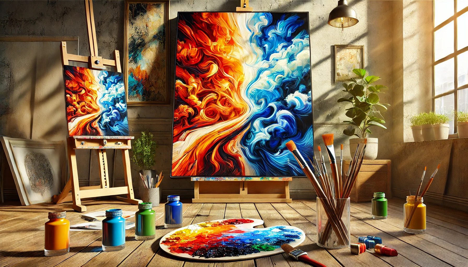
Color plays a vital role in art, influencing how viewers perceive emotions and themes. Using contrasting colors can dramatically enhance the drama in artwork, making it more engaging and impactful. Artists can create tension and excitement by combining opposing colors, leading to visually striking compositions that capture attention.
When they understand how to use color contrast effectively, artists can unlock a powerful tool for expression. Different color combinations can evoke feelings from calmness to chaos, guiding the viewer’s experience. Whether it’s a painting or a graphic design, the right contrasts can turn an ordinary piece into something memorable.
Exploring ways to combine colors invites creativity and experimentation. With a few techniques and a keen eye, anyone can transform their art into vibrant and dramatic visual stories.
Understanding Color Theory
Color theory is essential for artists who want to effectively use contrasting colors. It involves understanding how colors interact and the emotional responses they can evoke. This knowledge helps create drama and visual interest in artwork.
The Color Wheel Basics
The color wheel is a visual tool that organizes colors in a circle. It consists of primary colors (red, blue, yellow), secondary colors (green, orange, purple), and tertiary colors, which are made by mixing primary and secondary colors.
Colors are placed on the wheel to show relationships. Colors opposite each other are complementary, while those next to each other are analogous. Complementary colors create strong contrasts, while analogous colors offer harmony. Knowing how to navigate the color wheel enables artists to make informed choices in their compositions.
Color Harmony and Contrasts
Color harmony refers to the balanced arrangement of colors in artwork. Using colors that complement each other can enhance visual appeal. For instance, red and green or blue and orange used together can create dramatic effects.
Artists often use color contrasts to draw attention to specific areas of their work. For example, pairing a bright color with a muted one can create focal points. This strategy helps guide the viewer’s eye and emphasizes important details. Knowledge of both harmony and contrast makes it easier to develop a cohesive art piece.
The Psychological Impact of Colors
Colors have the power to evoke emotions and influence moods. For example, warm colors like red and orange can inspire feelings of excitement or passion. In contrast, cool colors such as blue and green often bring a sense of calm.
Understanding these psychological effects is crucial for artists. By strategically choosing colors, they can enhance the emotional response of their audience. Different cultures may also associate specific colors with various meanings, so it’s important to consider this in artwork as well. This layered understanding of color can greatly impact the effectiveness of an art piece.
The Role of Contrast in Art
Contrast plays a vital role in art by highlighting differences between various elements. It draws the viewer’s attention and adds depth to a piece. Understanding contrast helps artists create more engaging works that evoke emotion.
Defining Contrast
Contrast refers to the differences between elements in art. These differences can be in color, brightness, texture, and size. By placing opposing elements next to each other, artists create visual interest that catches the eye.
For example, a bright red can stand out against a dark blue background. This creates a striking image that captures attention. Artists use contrast to guide the viewer’s gaze and to emphasize certain parts of their work.
Types of Color Contrast
There are several types of color contrast that artists commonly use. Some of the most notable include:
- Complementary Contrast: Uses colors opposite each other on the color wheel, like blue and orange.
- Analogous Contrast: Involves colors next to each other on the wheel, creating harmony with subtle differences.
- Warm and Cool Contrast: Juxtaposing warm colors (like red and yellow) with cool colors (like blue and green) to create emotional responses.
By mixing these contrasts, artists can achieve different moods and feelings in their artworks. Using various contrast techniques allows for more dynamic and compelling pieces.
Planning Your Composition
Creating a strong composition involves thoughtful choices about color, balance, and focal points. The right decisions can lead to a striking piece that captures attention and conveys emotion.
Choosing a Color Scheme
When selecting a color scheme, it’s important to consider the mood of the artwork. Using complementary colors can create vibrant contrasts, while analogous colors offer a more harmonious feel.
Artists can decide between a monochromatic palette for subtlety or a triadic color scheme for a balanced yet dynamic look. Creating a small color swatch can help to visualize how these choices will interact in the final piece. Moreover, understanding the meanings of colors can add deeper layers to the artwork, guiding viewers’ emotions and reactions.
Balancing Colors and Imagery
Balance is essential in any composition, especially when using contrasting colors. An artist should aim to distribute colors evenly across the canvas to prevent any one side from feeling overloaded.
Using color placement strategically can guide the viewer’s eye and create visual interest. For instance, placing a bright color next to a neutral tone can help it pop. Additionally, balancing complex imagery with open spaces can also enhance impact. Maintaining this balance allows the contrasting colors to work together instead of competing for attention.
Focal Points and Drama
Creating focal points is vital to building drama in art. Contrast can be utilized to draw attention to specific areas. A bright, bold color can highlight important subjects against darker backgrounds, making them stand out.
Additionally, using value contrast—the difference between light and dark—can further emphasize focal points. Artists can explore the emotional effects of high contrast versus low contrast in their work. By positioning elements thoughtfully, they can evoke feelings of tension, excitement, or calm, depending on the desired outcome.
Applying Contrasting Colors
Contrasting colors can bring energy and focus to artwork. By mixing and layering, artists can create unique effects. This section will explore practical techniques, ways to create depth, and the impact of contrast in backgrounds.
Mixing and Layering Techniques
Mixing contrasting colors can produce vibrant and eye-catching artwork. One effective method is to use complementary colors, such as blue and orange. When placed next to each other, these colors enhance each other’s brightness.
Layering can add complexity to the piece. Artists can start with a base layer of one color and then apply another on top. This method allows for blending, creating new shades and tones. Thin, transparent layers help achieve a sense of luminosity.
Using a palette knife or sponge can also create interesting textures. This adds another layer of visual interest and depth. Experimenting with these techniques can yield unique outcomes, leading to more dynamic artwork.
Creating Depth and Volume
Contrast helps to create depth, making artwork more engaging. Artists can use darker shades in the foreground and lighter shades in the background. This technique gives the illusion of space, drawing the viewer’s eye into the piece.
Shadow effects can also enhance depth. Adding darker colors or shades to areas that recede creates distance. Artists often employ the technique of highlighting to bring elements forward.
Using variations in color intensity can further amplify this sense of volume. Bold colors can be used in focal areas while softer hues can fade into the background. This balance of colors helps maintain visual interest.
Using Contrast in Backgrounds
Backgrounds play a crucial role in how contrasting colors are perceived. A simple, contrasting background can highlight the main subject. For instance, a bright subject against a deep, dark background draws immediate attention.
When selecting background colors, artists should consider how they interact with foreground elements. Using analogous colors in the background can create a smooth transition, making the foreground pop even more.
Textures in the background also enhance contrast. A smooth, vibrant color can contrast nicely with a rough, muted texture. This technique adds depth and a tactile quality to the artwork.
Tips and Tricks
Using contrasting colors can bring energy and emotion to artwork. Here are some effective methods focusing on color temperature, texture, and light.
Color Temperature Tricks
Color temperature plays a crucial role in creating contrast. Warm colors, like reds and yellows, can evoke warmth and excitement, while cool colors, like blues and greens, provide calmness.
To achieve drama, artists can place warm colors next to cool ones. This helps make the warm tones pop and catch the viewer’s eye.
Using a palette knife for mixing can also reveal subtle shifts in color temperature. Utilizing these shifts can enhance the emotional impact of the piece. Finding the right balance between warm and cool can transform an artwork entirely.
Contrast with Textures
Incorporating texture alongside color can amplify the impact of contrasting colors. Different textures can add depth, drawing attention to various aspects of the artwork.
For example, a rough surface can highlight vibrant colors, making them stand out more. Conversely, smooth areas can soften the overall look.
Artists can use tools like brushes, sponges, and their fingers to create various textures. Experimenting with layering techniques can also stimulate interest in color contrasts. Using textures effectively invites viewers to explore the piece in more detail.
Illumination and Shadow Play
Lighting is essential for revealing color contrast in art. Strong light can enhance colors, making them appear more vivid. Shadows, on the other hand, can deepen colors and create a dramatic effect.
Using a light source from one direction can create striking contrasts. This can highlight certain areas while leaving others in shadow. The play of light and darkness can guide the viewer’s focus throughout the composition.
Artists should consider how different lighting affects color and mood. Experimenting with these effects can lead to captivating results in their artwork.
Practical Exercises
Engaging in practical exercises helps artists explore color contrast and enhance their skills. These activities focus on using contrasting colors effectively to create drama and interest in artwork.
Still Life with Contrasting Colors
Creating a still life is a fantastic way to practice contrasting colors. Choose a variety of objects with strong color differences. For example, select a bright red apple, a green leafy plant, and a deep blue vase.
Arrange them in a way that highlights the contrasts. Artists should pay attention to how the colors interact. This setup encourages exploration of how light affects the perception of colors. Consider using a light source from one side to cast dramatic shadows and enhance the contrast further.
After painting, artists can assess how the color choices impact the mood and depth in the composition.
Landscapes Using Color Drama
Landscapes offer endless opportunities to explore color contrast. Artists can select a scene with various elements, such as a vibrant sunset over a dark forest.
Using bold colors can create an emotional response. For instance, bright yellows and oranges can stand out dramatically against deep purples and blacks. This contrast not only draws the viewer’s eye but also adds a sense of energy to the piece.
Experimenting with different color palettes will help artists understand the effects of color contrast in natural settings. This exercise encourages them to find balance while generating dynamic visuals.
Abstracts to Experiment With
Abstract art allows artists to focus directly on color interaction. This exercise involves choosing two or three colors that are opposite on the color wheel, like orange and blue.
Using these colors in different shapes and forms can lead to exciting results. Artists can apply techniques like splattering, layering, or blending to see how colors react together.
This approach encourages freedom and experimentation. Abstracts can convey emotions or narratives purely through color, making this a rewarding exercise in understanding color drama.
Maintaining Harmony
Using contrasting colors effectively creates drama in a piece of art. Still, it is essential to maintain harmony so that the artwork remains cohesive and appealing. This balance helps viewers appreciate the contrasts without feeling overwhelmed.
Avoiding Overwhelm
To prevent an overpowering visual effect, it is important to limit the number of contrasting colors in a single artwork. Choosing two or three key contrasting colors can enhance the drama while avoiding chaos.
Consider using neutral colors as a buffer. Neutrals, like whites or greys, can help balance vibrant colors. This technique allows bold hues to stand out without being too jarring.
Always step back and review the artwork. Observing it from a distance can help identify areas that may feel too busy or cluttered. A calmer composition allows the contrasting elements to shine.
Editing Your Palette
Selecting a well-defined color palette can significantly enhance harmony in dramatic artworks. Focus on finding complementary colors that work well together. Complementary colors, such as blue and orange or red and green, can maintain interest while keeping balance.
Artists can benefit from creating a test palette. Mixing and testing colors on a separate sheet helps determine which combinations create the desired effect and maintain unity.
Consider limiting the shades of colors used as well. Using different values of the same hue can add depth without overwhelming the viewer. This strategy ensures each color complements the other, contributing to a successful piece.
Inspirations from the Masters
Looking to the past can provide valuable insight into using contrasting colors effectively in art. Many famous artists have mastered the use of these techniques, providing examples that can inspire contemporary creators.
Studying Famous Artworks
Analyzing works from renowned artists like Caravaggio and Rembrandt reveals how they skillfully employed contrast. Caravaggio’s dramatic use of light and shadow, known as chiaroscuro, creates intense emotional depth. By observing his pieces, an artist can learn to manipulate brightness for dramatic impacts.
Rembrandt’s portraits offer another perspective. He balanced warm and cool colors, making skin tones vibrant while using deeper shades for background elements. This technique highlights the subject’s features and adds richness to the artwork.
Famous pieces often inspire artists to experiment with their color choices. Many artists keep reference images of these masters for guidance in their work.
Contemporary Color Usage
In contemporary art, many artists still draw from the techniques of the masters. An example is the work of Yayoi Kusama, who uses bold colors in contrast with polka dots. This creates a striking visual impact that catches the viewer’s eye.
Kusama’s approach encourages modern artists to think outside traditional boundaries. Similarly, artists like Mark Rothko used blocks of color that interact strongly. His color palettes evoke deep emotional responses and demonstrate how contrast can be used beyond realism.
Studying these modern examples shows how effective contrasting colors remain today. It helps artists see the relevance of classical techniques while developing their unique styles.