
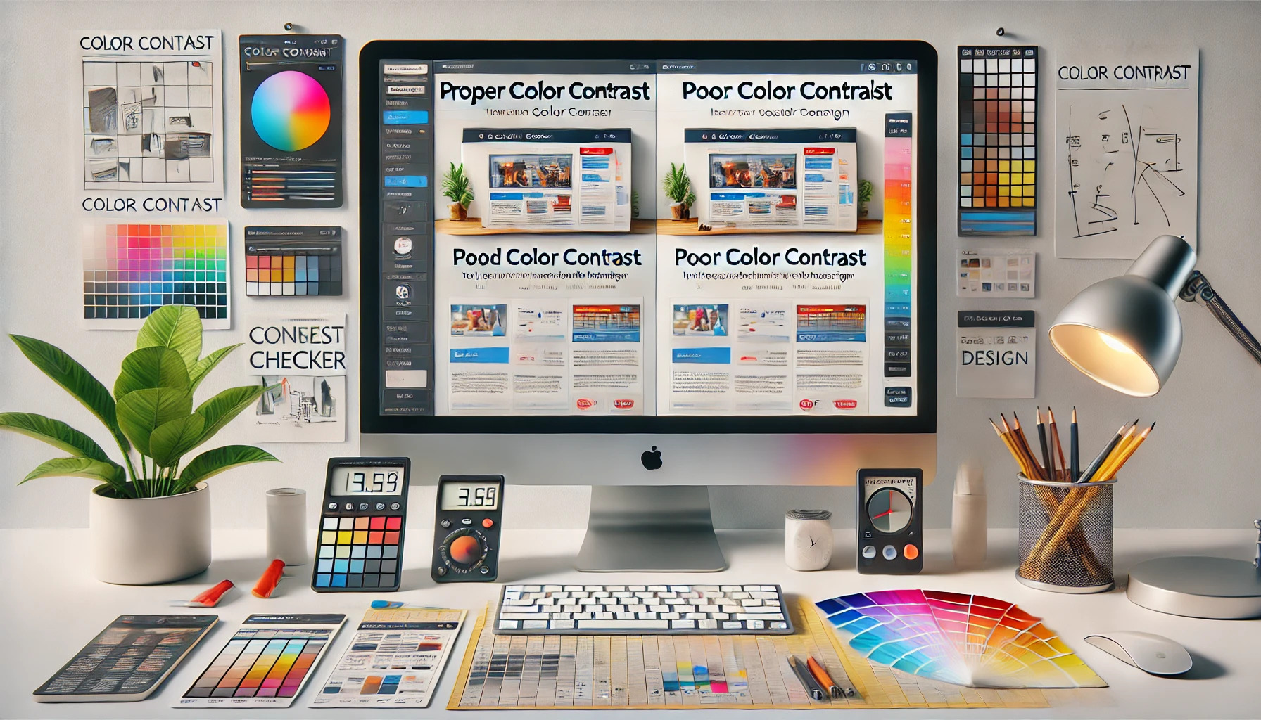
Color contrast is essential for successful design. Without it, even the most visually appealing layouts can fall flat. Good color contrast improves readability and helps convey the intended message, making designs more effective.
Many designers overlook this crucial aspect, often leading to frustration for users trying to interact with their work. When text blends into the background or images overwhelm the message, the audience may disengage. Understanding the impact of color choices can dramatically enhance the effectiveness of any design project.
Creating accessible designs is not just a trend; it is a necessity. Proper color contrast ensures that everyone can enjoy and understand the content, regardless of their visual abilities. In an increasingly digital world, investing time in mastering this skill can set a designer apart from the crowd.
The Basics of Color Contrast
Color contrast is crucial in design as it creates visual interest and guides the viewer’s attention. Understanding color theory and the psychology behind colors helps in making informed choices that enhance a design’s effectiveness.
Understanding Color Theory
Color theory explains how colors interact and the effects they create. In design, colors can be categorized into primary, secondary, and tertiary colors.
- Primary Colors: Red, blue, and yellow cannot be created by mixing other colors.
- Secondary Colors: Green, orange, and purple result from mixing primary colors.
- Tertiary Colors: These are formed by mixing primary and secondary colors.
Contrast in color involves the difference between hues, brightness, and saturation. A high contrast, like black and white, attracts attention, while low contrast may create a calmer effect. Designers often use tools, like color wheels, to find complementary colors that work well together.
The Psychology of Colors
Colors evoke emotions and can influence perceptions. Understanding color psychology helps designers communicate their intended message effectively.
- Red: Associated with passion and urgency; it can stimulate appetite.
- Blue: Conveys calmness and trust; often used in corporate branding.
- Green: Symbolizes nature and health; it’s refreshing and soothing.
Different cultures may view colors differently. For example, white represents purity in some cultures but can symbolize mourning in others. The right color choices enhance a design’s impact and ensure it resonates with the intended audience. Understanding these factors helps in creating effective visual content.
Importance of Color Contrast in Design
Color contrast plays a crucial role in successful design. It not only enhances how information is presented but also affects how users interact with it. Understanding its importance helps in creating designs that are both functional and appealing.
Enhancing Readability and Accessibility
Color contrast significantly improves readability. For example, dark text on a light background or vice versa makes it easier for viewers to read content clearly.
Online tools can help designers check contrast levels, ensuring that their designs meet accessibility standards. This is vital for users with visual impairments, making sure everyone can access information without strain.
Maintaining a ratio of at least 4.5:1 for body text is recommended. For larger texts, a ratio of 3:1 is acceptable. By prioritizing these standards, designers create inclusive experiences for all users.
Creating Visual Hierarchy
Using color contrast helps establish a visual hierarchy in designs. Different colors can indicate importance, guiding the viewer’s attention to key elements.
For instance, a bright call-to-action button against a muted background encourages engagement. This effect helps users quickly identify what actions they can take and what information is most important.
Establishing hierarchy through contrast also prevents information overload. It allows viewers to focus on what truly matters, making the design more effective and user-friendly.
Improving User Experience
Color contrast enhances user experience by making navigation easier. When elements stand out, users can find what they need without frustration.
For example, well-contrasted menus improve usability in websites or apps, helping users move through different sections effortlessly.
Moreover, visually appealing designs keep users engaged longer. Effective use of contrast creates a pleasant experience that encourages exploration and interaction. By focusing on contrast, designers reinforce the overall effectiveness of their work.
Evaluating Color Contrast
Evaluating color contrast is crucial for ensuring text and elements are easy to read. Proper assessment helps designers create accessible and user-friendly interfaces.
Tools for Assessing Contrast
Several tools can help assess color contrast effectively. Free online contrast checkers, such as WebAIM’s Color Contrast Checker, allow users to input foreground and background colors. The tool will calculate the contrast ratio and indicate if it meets accessibility standards.
Additionally, browser extensions like Axe or Lighthouse can analyze contrast directly on web pages. These tools provide instant feedback, helping designers make necessary adjustments quickly.
Using these resources ensures that designs are not only attractive but also functional for all users, including those with visual impairments.
Color Contrast Ratios Explained
Color contrast ratios are critical in determining legibility. The ratio compares the luminance of text to its background. It is expressed as a number, such as 4.5:1 or 7:1.
For normal text, a ratio of at least 4.5:1 is recommended to ensure readability. For larger text, a lower ratio of 3:1 is acceptable. Advanced standards, or Level AAA, require a contrast ratio of 7:1 for normal text.
Maintaining these ratios helps create designs that are easier to read for everyone. It’s essential to keep in mind that different people may have varying levels of vision, so prioritizing contrast is a step toward inclusivity.
Implementing Effective Color Contrast
Effective color contrast is crucial for creating designs that are visually appealing and easy to understand. By incorporating the right practices, designers can enhance readability and accessibility in their projects.
Best Practices for Designers
Designers should consider a few key practices when implementing color contrast. First, they must choose colors that are distinctly different from one another. This may involve selecting complementary colors or contrasting shades.
Using tools like color contrast checkers can help assess how well colors work together. Designers should aim for a high contrast ratio—at least 4.5:1 for normal text and 3:1 for large text. Testing designs in various lighting conditions also ensures visibility and comprehension.
Common Contrast Mistakes to Avoid
Many designers make common mistakes that can affect color contrast. One frequent error is using colors that are too similar, which can create visual confusion. This is especially important for text over complex backgrounds.
Another mistake is disregarding accessibility standards. Not all users perceive colors in the same way, so designs should accommodate various visual impairments. Failing to use sufficient contrast can lead to frustration for users, making their experience less enjoyable.
Contrast Considerations Across Different Media
Contrast requirements can vary depending on the media being used. In print, for instance, colors may appear different due to paper texture and ink quality. Designers should conduct physical tests to see how colors translate from screen to paper.
For digital platforms, screen brightness and settings can impact color visibility. Designers need to ensure that color contrasts remain effective across various devices, including mobile phones and tablets. This adaptability is essential for maintaining user engagement and satisfaction.
Designing for Accessibility Compliance
Creating designs that meet accessibility standards is essential. This ensures that everyone can use and enjoy the content, regardless of their abilities. Proper color contrast plays a vital role in achieving this goal.
Understanding WCAG Guidelines
The Web Content Accessibility Guidelines (WCAG) provide a framework for making web content accessible. The guidelines focus on four main principles: Perceivable, Operable, Understandable, and Robust.
Contrast ratios are key when designing for accessibility. A minimum ratio of 4.5:1 is recommended for normal text to ensure readability. Larger text requires a ratio of at least 3:1.
Using tools to test color combinations can help designers meet these standards. Many resources are available online, such as this guide on color contrast. Following these guidelines can enhance user experience significantly.
Designing for Visual Impairment
Visual impairments affect how individuals perceive color and contrast. Designers should consider these variations when developing content.
For instance, people with color blindness may struggle with certain color combinations. Avoid using color alone to convey information; support it with text or symbols.
To improve accessibility, designers can implement features such as text resizing. Adequate line height (about 1.5 times the font size) and limited line length also enhance readability.
By focusing on these factors, designers can create more inclusive experiences. Efforts to follow accessibility standards will benefit all users.