
Gradients are everywhere in modern design, adding a fresh and vibrant touch to both digital and print media. They create depth and interest, transforming simple visuals into engaging masterpieces. Designers of all levels can harness the power of gradients to elevate their projects and capture audience attention.
From websites to social media graphics, the use of gradients can make designs feel more dynamic and alive. Understanding how to effectively implement these color transitions is essential for anyone looking to enhance their design skills. With the right techniques, anyone can unlock new creative possibilities in their work.
In this guide, designers will explore practical tips and trends related to gradients. By learning how to use gradients effectively, they will discover ways to bring their ideas to life through color. The journey into the world of gradients promises to be exciting and inspiring.
The Essence of Gradients
Gradients play a significant role in modern design. They add depth, enhance aesthetics, and influence emotional responses. Understanding their definition and history helps designers effectively use them in their work.
Defining Gradients in Design
Gradients are smooth transitions between two or more colors. They can be linear, where colors change along a line, or radial, where colors shift outward from a central point. These transitions create a sense of movement and depth, making designs more engaging.
Designers use gradients to evoke emotions and direct user attention. They can make elements appear more dynamic and three-dimensional. By carefully choosing color combinations, creators can enhance a brand’s personality and appeal to target audiences.
Historical Context of Gradients
Gradients have evolved significantly over the years. In the early days of digital design, they were often seen in backgrounds and simple graphics. As technology advanced, the use of gradients became more sophisticated.
In the late 20th century, gradients were used to add depth to logos and branding. The introduction of advanced design software made it easier to work with gradients, leading to their rise in popularity. Today, they are widely used in web design and app interfaces, allowing for creativity and expression.
Technical Fundamentals of Gradients
Gradients are essential in design, creating smooth transitions between colors. Understanding the technical aspects can enhance a designer’s ability to use gradients effectively and creatively.
Understanding Color Theory
Color theory involves understanding how colors interact. The color wheel is a helpful tool, showing primary, secondary, and tertiary colors. It’s crucial to know how contrasting and complementary colors work together.
Warm colors, like reds and oranges, can evoke feelings of energy. Cool colors, such as blues and greens, create calmness. Designers can use this knowledge to achieve specific emotional responses through gradient choices.
Moreover, designers should consider the concept of hue, saturation, and brightness. Hue refers to the color itself, saturation indicates the intensity, and brightness describes how light or dark the color appears. Combining these elements in gradients can lead to beautiful, impactful designs.
Gradient Types and Structures
There are several types of gradients, and each has its own structure. The most common are linear and radial gradients.
Linear gradients transition along a straight line, which can flow vertically, horizontally, or diagonally. These are great for backgrounds that require a smooth color shift.
Radial gradients start from a central point and radiate outward. This type creates a circular pattern, giving depth to elements.
Some gradients include multi-stop gradients, which blend three or more colors. They can create vibrant and dynamic effects.
Lastly, understanding the angle of a gradient is important. Adjusting the angle can drastically change the perception and flow of the design. This versatility allows for creative freedom in visual storytelling.
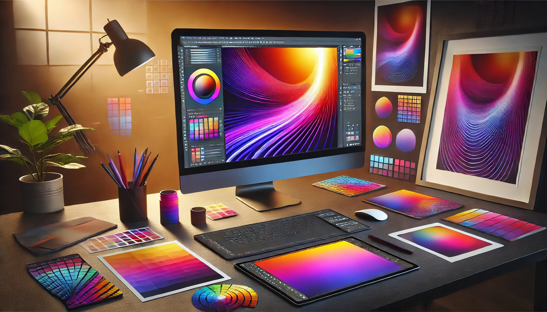
Software and Tools for Creating Gradients
Creating stunning gradients requires the right software and tools. Various options are available, catering to different design styles and needs. From vector to raster graphics, each has its own unique capabilities for crafting beautiful gradients.
Vector vs. Raster Graphics
Vector graphics use paths defined by mathematical expressions. This allows for smooth scaling without losing quality. Software like Adobe Illustrator excels in vector-based designs. It lets designers create crisp and clean gradients with precise control over color and shape.
On the other hand, raster graphics consist of pixels. Programs such as Adobe Photoshop are popular for raster designs. They provide rich options for blending colors and creating more complex textures. Designers can use layers, filters, and brushes in raster applications to enhance their gradient designs. Each type, vector and raster, offers unique benefits, so choosing the right one depends on the project needs.
Popular Design Software Overview
Several popular design tools cater to gradient creation. Each provides unique features that can help designers achieve their desired look.
-
Adobe Illustrator: Known for its vector capabilities, it offers tools for creating smooth gradients and precise adjustments.
-
Adobe Photoshop: A go-to for raster graphics, it has powerful options for blending colors and effects.
-
Figma: This online design tool promotes collaboration. It supports both vector and raster graphics and provides powerful gradient features.
-
Sketch: Favored for UI/UX design, it includes simple tools to create gradients quickly.
-
Canva: User-friendly for beginners, Canva has preset gradients and allows for easy customization.
Each software has strengths that make it suitable for different design styles, empowering creators to bring their visions to life.
Designing with Gradients
Gradients add depth and interest to designs. They can enhance layouts and create dynamic interactions. Here’s how to effectively incorporate gradients into your designs.
Incorporating Gradients into Layouts
Using gradients in layouts can create visual harmony. Designers often apply them as backgrounds or overlays. This technique helps to soften stark contrasts and blends elements seamlessly.
Tips for integration:
- Use subtle gradients to maintain a clean look.
- Gradients work well as headers or footers.
- They can guide the viewer’s eye across the design.
Choosing the right gradient can impact the mood of the design. For instance, warm colors can evoke energy, while cool tones often promote calmness.
Color Transitions and Interactions
Color transitions enrich user experiences. Designers can create smooth shifts between hues to evoke emotion or draw attention.
Best practices include:
- Use complementary colors for smoother transitions.
- Apply gradients to buttons for an interactive effect.
- Animate gradients subtly to enhance engagement.
Interactive gradients can signal changes or responses, making interfaces feel alive. For example, a button’s color could shift when hovered over. This small detail encourages user interaction and enhances usability.
Use Cases of Gradients
Gradients are valuable tools that designers can utilize in various fields. They enhance visual appeal and can effectively communicate messages in digital and print formats.
Digital Interfaces and Web Design
In digital interfaces, gradients bring life to websites and applications. They add depth and interest to backgrounds, buttons, and other elements. A vibrant gradient can draw attention to call-to-action buttons, encouraging user interaction.
Gradients can also create a sense of movement and energy, which is essential in user experience design. By carefully selecting colors, designers can evoke emotions and guide users through various tasks. The use of layers in gradients helps establish a visual hierarchy, making key information stand out.
Many brands leverage gradients to build their identities. For example, Tech Tactic Blog highlights how these colors create harmony in designs.
Print Media and Product Packaging
In print media, gradients are effective in enhancing product packaging and promotional materials. They can create a modern look and attract customers on crowded shelves. Bright, playful gradients often catch the eye, making a product more memorable.
Using gradients in print allows designers to communicate brand values visually. They can signify freshness, creativity, or luxury, depending on the color choices. For instance, a smooth transition between colors can create a sense of sophistication.
Gradients also work well in brochures and advertisements. They can lead the reader’s eye to critical information while keeping the overall design cohesive. Brands like VDEESIGN have noted how gradients enrich the color palette in their designs.
Advanced Techniques in Gradient Design
Exploring advanced techniques in gradient design allows designers to create engaging visuals that stand out. These methods enhance the aesthetics and functionality of web projects.
Creating Depth and Dimension
To create a sense of depth, designers can use multiple layers of gradients. By blending different colors and opacities, they produce a three-dimensional look. This technique draws the eye and gives the design a more dynamic feel.
Using shadow and highlight effects can further enhance depth. For instance, applying a darker gradient to the bottom of an element and a lighter one to the top simulates light. This method can make buttons, cards, or backgrounds feel more tangible and interactive.
Another approach is to use subtle changes in color across a gradient. This technique adds a rich texture to backgrounds. Designers should experiment with color combinations to find the best fit for their project.
Animated and Interactive Gradients
Animated gradients capture attention and create a lively user experience. Using CSS animations, designers can transition between gradients smoothly. For example, changing from one color scheme to another can occur over a few seconds, giving a website a fresh look.
Interactive gradients react to user actions, making the design feel more engaging. When a user hovers over a button, the gradient can change, adding interactivity. This simple effect encourages users to explore the site.
Key tools for implementing animated gradients include CSS and JavaScript libraries. Designers can use these libraries to simplify the process and create complex animations easily. Experimenting with timing and color shifts can lead to unique results that enhance user engagement.
Best Practices and Common Pitfalls
When working with gradients, it’s essential to achieve balance and avoid mistakes that can lead to visual clutter. Proper techniques help designers create appealing visuals without overwhelming the audience.
Achieving Balance and Harmony
To create eye-catching gradients, finding the right color combinations is key. Designers should select colors that complement each other, which can be done using a color wheel or online tools.
Consider using analogous colors (colors next to each other on the wheel) for a subtle effect or complementary colors (colors opposite each other) for a bold look.
Maintaining a consistent style throughout the design helps in creating harmony. For example, using similar gradient styles across website sections promotes a unified appearance.
Using a limited color palette is another effective way to keep the design clean and focused. A balanced gradient should guide the viewer’s eye without causing distraction.
Avoiding Overuse and Visual Clutter
One major pitfall in gradient design is overusing them, leading to visual clutter. Designers should be mindful of how many gradients they use in a single project.
Having too many gradients can compete for attention and confuse the viewer.
It’s good practice to limit gradients to key elements, such as buttons or backgrounds, to maintain clarity. A simple gradient can enhance a design, while complexity can detract from it.
Another point to remember is the importance of testing gradients on different devices. What looks great on a large screen may appear too harsh on a smaller one.
Keeping gradients subtle and focused ensures they add to the design rather than overwhelm it.
Future Trends in Gradient Usage
As design continues to evolve, gradients will play a central role in creating captivating visuals. New technologies and methods are developing, allowing gradients to be used more creatively and effectively. Predictions suggest that gradients will become even more dynamic and integrated into the overall user experience.
Emerging Technologies and Methods
Advancements in technology are shaping how gradients are applied in design. CSS features, like CSS Grid and Flexbox, allow for more complex and responsive gradient layouts. These tools enable designers to create unique and interactive backgrounds that change based on user actions.
AI and machine learning are also influencing gradient use. They can analyze user preferences and adjust gradients automatically to enhance engagement. This can lead to personalized experiences that resonate more with the audience.
Moreover, tools like Figma and Adobe XD are innovating how designers create gradients. These platforms feature gradient generators and libraries that offer countless options and variations. This makes it easy to experiment and find the perfect gradient for any project.
Predictions for Evolution in Design
Looking ahead, gradients are expected to become more dynamic and integrated into user interfaces. Designers predict that gradients will evolve from static backgrounds to more lively elements. For example, animated gradients that shift in tone and intensity can capture attention and improve user interaction.
Additionally, the concept of micro-interactions will push the boundaries of how gradients are used. These small animations can enhance usability and make websites more engaging. Designers will likely implement gradients in buttons, sliders, and transitions, creating a cohesive experience.
Lastly, the use of dark mode design is gaining popularity. Gradients will adapt to work well in these settings, ensuring visuals remain appealing regardless of the overall theme. This flexibility will allow designers to maintain brand identity while accommodating user preferences.