
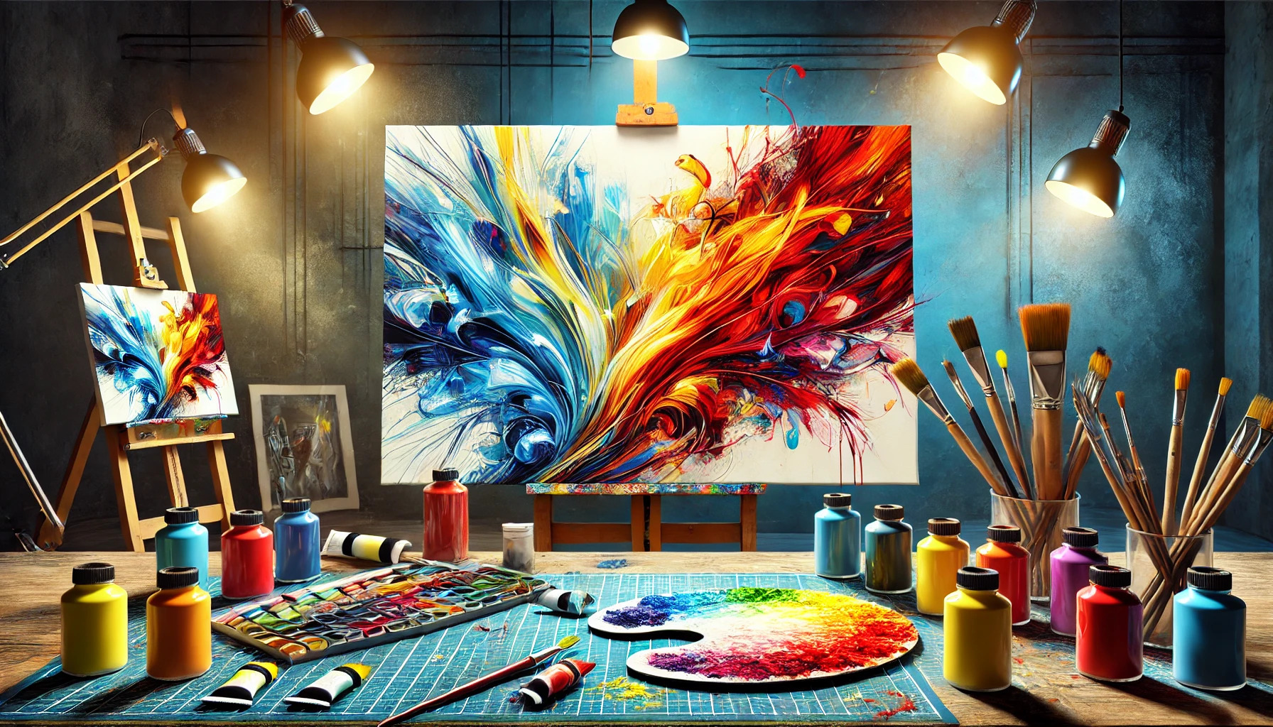
In a world filled with endless options, vibrant colors have the power to make designs truly stand out. Using bold colors effectively can enhance visual appeal and capture the viewer’s attention instantly. The right color choices can draw people in and keep them engaged with the message being conveyed.
Bold colors can evoke emotions and create memorable experiences. Designers often leverage these shades to highlight key elements, ensuring that the essential parts of their work are noticed. By striking a balance between vibrancy and harmony, they can create designs that are both eye-catching and pleasing to the eye.
Understanding how to use these colors can transform any creative project into an impactful masterpiece. Whether in art, advertising, or digital design, the application of vibrant hues can elevate the overall aesthetic. Exploring the many ways to incorporate bold colors will help anyone looking to make their work more appealing and effective.
The Psychology of Color
Colors have a significant impact on emotions and perceptions. They can evoke feelings, memories, and even influence decisions. Understanding how colors shape responses can enhance how artists communicate and connect with their audience.
Emotional Responses to Colors
Each color can trigger specific emotional reactions. For instance, red often symbolizes passion and energy. It can create a sense of urgency, making it effective in art intended to provoke strong feelings.
Blue is known for its calming effect. It often represents tranquility and stability. In contrast, yellow is associated with happiness and optimism, brightening moods with its warmth.
Artists use these emotional links to engage viewers more deeply. By choosing colors thoughtfully, they can guide how people feel when experiencing their work.
Color Associations in Different Cultures
Cultural background greatly influences color perception. In many Western cultures, white is linked to purity and new beginnings, often seen in weddings. However, in some Eastern cultures, it may symbolize mourning and loss.
Green is generally associated with nature and growth. Yet, in certain contexts, it can convey envy or jealousy.
Similarly, the meaning behind black varies widely. In Western cultures, it often represents sophistication. In contrast, it may signify bad luck or evil in others.
Artists can play with these cultural meanings to enhance their messages and challenge norms. Understanding these associations allows for richer and more nuanced artwork.
Fundamentals of Color Theory
Color theory is the foundation of using color effectively in art and design. It helps artists and designers choose colors that create harmony and convey the right message.
Understanding Color Wheel
The color wheel is a circular diagram that displays colors in a way that shows their relationships. It includes primary colors (red, blue, yellow), secondary colors (green, orange, purple), and tertiary colors (mixes of primary and secondary colors).
By using the color wheel, artists can see how colors relate to each other. For instance, colors that are opposite, like red and green, are called complementary colors. These pairs create a strong contrast and can make a design pop.
Complementary and Analogous Schemes
Complementary color schemes involve two colors directly opposite each other on the color wheel. This creates a vibrant look that draws attention. For example, blue and orange are complementary. When used together, they can create excitement in a design.
Analogous color schemes, on the other hand, use colors next to each other on the wheel. These colors blend well and offer a more harmonious feel. An example is using blue, blue-green, and green. This scheme provides a soothing look while still being visually interesting, making it great for various design projects.
Bold Choices in Art and Design
Using vibrant colors in art and design has a rich history and continues to evolve with contemporary artists. This section looks at how color has been embraced throughout time and how today’s creators utilize it to make eye-catching works.
History of Color Usage in Art
Artists have used color to convey emotions and messages for centuries. In ancient Egypt, colors held specific meanings. For example, green symbolized fertility, while red denoted chaos.
During the Renaissance, artists like Leonardo da Vinci began experimenting with color to create depth. Impressionists, such as Claude Monet, focused on capturing light with bold palettes. They painted scenes using vibrant colors in ways that changed how people viewed the world.
By the 20th century, movements like Fauvism emerged. Artists like Henri Matisse used color for expression, disregarding realistic representation. This change encouraged future generations to embrace more daring color choices in their work.
Contemporary Artists and Vibrant Colors
Today, many artists use bold colors to grab attention and evoke feelings. They explore and experiment with vibrancy in various ways.
For instance, Yayoi Kusama is known for her use of bright colors and patterns. Her immersive installations create striking visual experiences. She encourages viewers to connect with her work emotionally.
Another artist, Takashi Murakami, combines traditional art techniques with modern aesthetics. His colorful pieces often engage themes of consumer culture while remaining highly appealing.
These artists, among many others, demonstrate how vibrant colors continue to play a crucial role in art. By capturing attention and sparking interest, they show that bold choices remain essential in creative expression.
Planning Your Palette
Choosing the right colors is essential for creating an engaging design. A well-planned palette can enhance visual appeal and ensure that the colors complement each other. Here are key steps for planning an effective color palette.
Choosing Your Base Colors
Start by selecting base colors that will form the foundation of your palette. These colors should reflect the mood or message you want to convey. For example, warm colors like reds and oranges can evoke energy, while cool colors such as blues and greens can instill calmness.
Using color theory can be beneficial in this step. Consider the color wheel to find colors that harmonize well with each other. Choosing 2-3 main colors allows for variety while maintaining coherence in the design.
Balancing Colors for Harmony
Balance is critical to create a visually pleasing design. To achieve this, it’s essential to combine bold colors with neutral tones. This method helps the vibrant shades stand out without overwhelming the viewer.
A popular approach is the 60-30-10 rule. This means using 60% of a dominant color, 30% as a secondary color, and 10% as an accent color. Using different shades or tints of the same hue can also provide depth while keeping harmony.
Tips for Mixing Colors
Mixing colors can be a fun yet tricky process. Start by testing combinations on a small scale to see how colors interact. This approach helps identify which combinations work best together.
Utilize tools like color swatches or online palettes to visualize options. Keeping contrast in mind is important, as high-contrast color combinations can make specific elements pop. Additionally, consider color accessibility to ensure that everyone can appreciate your design.
Techniques for Capturing Attention
Using vibrant colors effectively requires specific techniques. These methods help artworks stand out and engage viewers in a meaningful way. Focal points, accents, and the interplay of light and color are key strategies.
Focal Points and Accents in Composition
Focal points are essential for grabbing attention. They direct the viewer’s eye to important elements of the artwork. Using bright colors as accents around a focal point enhances its visibility.
For example, an artist may use a vivid red flower in a mostly green landscape. This contrast not only attracts attention but also creates balance in the composition.
Additionally, placing accents in specific areas can guide the viewer’s journey through the piece. Careful positioning of bright colors at strategic points can make the art more dynamic and engaging. This encourages viewers to explore the artwork in detail.
Interplay of Light and Color
Light interacts with color in fascinating ways. Bright colors can appear more vibrant when illuminated properly. For instance, placing a fluorescent color next to a darker shade can create a striking effect, making the bright color pop.
Artists can use different lighting techniques to enhance the emotional impact of their work. Soft light can soften colors, while harsh light can intensify them.
Moreover, shadows can deepen colors, adding layers of complexity. This interplay helps to create a sense of depth and movement in artwork, making it more appealing. Understanding how light affects color can significantly improve an artist’s ability to capture attention.
Integrating Bold Colors in Various Media
Bold colors can transform artwork and designs, enhancing their visual appeal and making them stand out. Different media provide unique opportunities for integrating these vibrant hues effectively.
Oil and Acrylic Painting Techniques
When using oil and acrylic paints, artists can create striking effects with bold colors. One technique is color blocking, where large areas of flat color are applied next to each other. This method creates a strong visual impact.
Another effective approach is layering. Artists can build depth by applying transparent layers of color over a dried base. This allows the underlying hues to shine through while adding richness to the overall composition.
Mixing medium can also enhance boldness. For instance, adding gel mediums to acrylics can give a brilliant shine. This not only boosts color vibrancy but also alters texture.
Digital Media and Color Dynamics
In digital design, bold colors can be manipulated easily, offering flexibility that traditional media lacks. Using software like Adobe Photoshop or Illustrator, designers can experiment with color adjustments and blending modes.
Color theory principles are essential here. Understanding complementary colors helps create visual interest. Designers should also keep in mind the emotional impact of colors. For example, red often evokes excitement, while blue provides calmness.
Additionally, smart use of gradients and color overlays can make designs pop. By layering colors, designers can achieve depth and dimension. Tools available in digital platforms enable quick adjustments, making it easy to find the perfect balance.
Managing Viewer Perceptions
Color choices play a vital role in shaping how viewers perceive artwork. Using vibrant colors wisely can direct attention and set the mood effectively.
Guiding the Eye with Color Contrasts
Vibrant colors can create strong contrasts, making certain elements of a design stand out. For instance, using complementary colors—colors opposite each other on the color wheel—can draw attention to specific areas.
A bright orange next to a deep blue can create a striking visual effect. This not only guides the viewer’s gaze but also emphasizes key features. Artists and designers often use this technique to highlight important messages within their work.
By placing bold hues together, they can create a dynamic interaction that keeps viewers engaged.
Creating Mood and Atmosphere
Colors evoke emotions and feelings. For instance, warmer colors such as red and yellow can create energy and excitement. In contrast, cooler colors like blue and green often convey calmness or tranquility.
Artists can manipulate color palettes to set the desired mood for their audience. A painting with a predominantly warm palette might feel inviting and energetic, while one with cool colors may feel peaceful and reflective.
Strategically incorporating these colors helps shape narratives within the artwork. This allows viewers to connect on an emotional level, enhancing their overall experience.
Practical Applications
Using vibrant colors can significantly enhance design effectiveness across various fields. When applied thoughtfully, bold choices can create memorable impressions and evoke specific emotions, whether in marketing or interior spaces.
Color in Branding and Marketing
In branding, color plays a crucial role in shaping perception. Companies often choose bold colors to stand out and attract attention. For instance, fast-food chains typically use bright reds and yellows to stimulate appetite and excitement.
Color can also convey brand values. For example, blue often represents trust and reliability. Companies like Chase effectively use this color in their branding, promoting confidence among customers.
An effective strategy is to maintain consistency across platforms. Using a specific color palette helps consumers easily identify and remember the brand.
Interior Design and Color Impact
In interior design, color choices can transform a space. Bright colors can make a room feel lively and inviting. For example, a bold orange accent wall can create warmth in a living area.
On the other hand, soft pastel colors can evoke calmness in bedrooms. Designers often use color theory to select harmonious combinations, making spaces visually appealing.
Color can influence mood and functionality, too. In offices, cool colors like blue can enhance focus and productivity.