
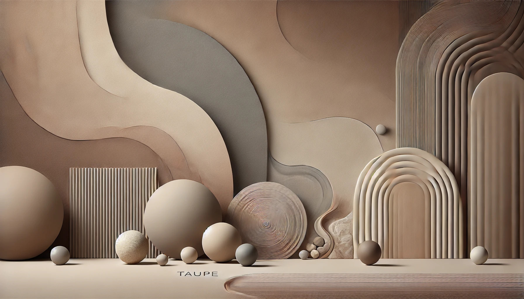
Taupe is a color that blends brown and gray, creating a unique and modern hue. It is often associated with calmness, neutrality, and practicality, making it a popular choice in design and décor. As people explore color psychology, taupe stands out for its ability to create a warm and inviting atmosphere without being overpowering.
Many prefer taupe over other neutrals like beige because it feels more contemporary and earthy. This color is linked to feelings of reliability and humility, characteristics that resonate with many individuals. Those who favor taupe often seek a sense of balance and comfort in their environments.
Using taupe in spaces can enhance relaxation and focus, perfect for homes or offices. It pairs well with various colors, providing versatility in design. By understanding taupe’s psychological impact, anyone can make informed choices that reflect their personal style and values.
Understanding Taupe Color
Taupe is a unique color that blends the warmth of brown with the coolness of gray. Its neutral tone makes it versatile in various design contexts. Here, the focus is on what defines taupe, how it fits into color theory, and the different shades it can take.
Definition and Composition
Taupe is often described as an intermediate shade, sitting between dark brown and gray. This color can vary in hue and intensity, resulting in a range of tones. Typically, taupe includes mixtures of brown, gray, and sometimes beige, giving it a warm yet muted appearance.
When mixing colors to achieve taupe, artists often combine equal parts of brown and gray. The resulting shade can be adjusted by altering the proportions, allowing for lighter or darker versions. Taupe may not always capture attention, but it carries depth and sophistication when used creatively.
Taupe in Color Theory
In color theory, taupe is classified as a neutral color. This makes it an excellent choice for backgrounds and other subtle design elements. Its neutral nature allows it to complement a wide range of other colors.
Taupe pairs well with both warm and cool color palettes. It can enhance the appearance of brighter colors like coral and salmon, making them more vibrant. In addition, taupe provides a calming effect when used with monochromatic color schemes, creating a soothing atmosphere in spaces like living rooms and bedrooms.
Different Shades of Taupe
There are many shades of taupe, each possessing distinct characteristics. Some common variations include:
- Light Taupe: A softer, lighter version perfect for airy spaces.
- Dark Taupe: This shade adds richness and depth, making it ideal for accent walls.
- Gray Taupe: A cooler tone that leans more towards gray, offering a modern feel.
- Brown Taupe: This variant emphasizes warmth and earthiness, suitable for cozy settings.
These shades can dramatically influence the mood of a room. Light taupe can open up spaces while dark taupe may suggest elegance and comfort. Understanding these variations allows for better design choices, ensuring taupe is used effectively in any context.
Psychological Implications of Taupe
Taupe carries various psychological implications that can greatly influence mood and perception. It is often seen as a bridge between warmth and neutrality, making it a versatile color in different contexts. This section explores the symbolic meanings, emotional impacts, and cultural associations tied to taupe.
Symbolic Meanings
Taupe is deeply connected to ideas of stability and subtlety. It serves as a neutral backdrop, allowing other colors to shine while providing a sense of calm. This color can symbolize balance, as it blends both warm and cool tones.
In nature, taupe often resembles earth and stone, linking it to durability and grounding. For artists and designers, taupe can evoke feelings of sophistication without being overwhelming. Many choose taupe when they seek elegance with understated charm.
Mood and Emotion
The soothing quality of taupe can promote feelings of relaxation and comfort. It is less harsh than bolder colors, making it a perfect choice for spaces meant for unwinding or reflection. Many people feel a sense of peace when surrounded by taupe.
Taupe can also create a cozy environment. Its warm undertones can foster a welcoming atmosphere, ideal for living rooms and family spaces. This color encourages connection and calm, often leading to positive social interactions.
Cultural Associations
Different cultures have varied associations with taupe. In Western contexts, it is often linked to sophistication and timelessness. Many view it as an elegant choice for home decor, furniture, and fashion.
In other cultures, taupe can represent stability and reliability. Its neutral nature means it fits well in many settings, from traditional to modern. This versatility makes taupe a popular choice for people looking to create a harmonious environment.
Taupe in Design
Taupe is a versatile color that finds its place in various design fields. Its mix of brown and gray offers unique opportunities in interior design, fashion, and branding, making it a preferred choice for many.
Taupe in Interior Design
In interior design, taupe creates a warm and inviting atmosphere. It serves as a neutral backdrop that can enhance both modern and traditional spaces. Designers often pair taupe with brighter colors to add vibrancy while maintaining a sophisticated look.
Taupe works well with palettes of white, black, and even soft pastels. This flexibility makes it popular in living rooms, bedrooms, and offices. Using taupe as a main color can provide a sense of calm, making it ideal for relaxation areas.
Taupe in Fashion
In fashion, taupe adds elegance and versatility to wardrobes. It is a flattering color that complements many skin tones, making it a popular choice in clothing collections. Taupe can be easily paired with other colors, such as navy or burgundy, for stylish outfits.
Accessories like shoes and bags in taupe can elevate many looks without overpowering the outfit. The understated nature of taupe allows for bold patterns and designs in clothing while providing balance.
Branding and Marketing
In branding and marketing, taupe symbolizes reliability and sophistication. Many companies use this color to convey a sense of trust and professionalism. Brands in the fashion and design industries, in particular, are drawn to taupe for its ability to represent a timeless quality.
Using taupe in logos and advertisements can create a sense of calmness, making customers feel secure. This attribute is essential for businesses that want to build lasting relationships with their clients. Taupe can effectively enhance brand identity by offering a subtle yet memorable impact.
Color Combinations with Taupe
Taupe is a versatile color that works well with many other shades. Its neutral tone makes it an excellent choice for creating various color schemes in design projects. Understanding how to combine taupe with other colors can enhance aesthetics and set the mood.
Complementary Colors
Complementary colors are those that sit opposite each other on the color wheel. For taupe, this means shades like blue and teal. These colors create a striking contrast that can energize a space.
When used together, taupe’s warmth balances the coolness of blue or teal, making for a harmonious look. For instance, pairing taupe walls with bright blue furniture adds a modern touch while still feeling grounded. Incorporating accents of bright colors, like orange or coral, can add even more visual interest.
Analogous and Monochromatic Schemes
Analogous colors are next to each other on the color wheel, offering a serene and cohesive look. For taupe, it pairs beautifully with taupe-adjacent shades like beige and gray. This combination creates a soft, inviting atmosphere.
For a monochromatic scheme, using various shades of taupe can add depth. Dark taupe furniture can contrast nicely with lighter walls, creating interest without overwhelming the senses. Adding textures, like a velvet taupe sofa or linen taupe curtains, can further enhance a space’s warmth and comfort.
Contrasting Palettes
Contrasting palettes utilize colors that are different in hue and intensity. Pairing taupe with bright and bold hues can create a dynamic environment. Colors like bright red or vivid yellow work well to pull attention.
For instance, a taupe background can make colorful artwork or vibrant cushions pop. This approach combines the elegance of taupe with a lively twist, perfect for modern interiors. Bold contrasts can be tempered with neutral accessories to keep the overall look balanced and stylish.
Choosing Taupe
Taupe offers a unique blend of brown and gray that can enhance various spaces. Its versatility makes it a popular choice, but selecting the right shade is important for achieving the desired effect.
Selecting the Right Taupe
When choosing taupe, consider the undertones. Some taupes lean more toward gray, while others may have warmer brown tones.
To select the best taupe, it can help to test samples in different lighting conditions. Natural light can significantly alter how a color appears. He or she should observe the taupe at different times of the day to ensure it fits well within the space.
Tools like paint samples or fabric swatches can assist in visualizing how the color will interact with existing decor. Choosing a taupe that complements other colors in the environment can create a cohesive look.
Considerations for Various Settings
Taupe works in many settings, from cozy homes to professional offices. In living spaces, warmer taupe shades can create a comforting atmosphere, perfect for relaxation.
In contrast, cooler taupe tones are often suited for work environments. These colors can promote focus and clarity. She or he should think about furniture, flooring, and decor when deciding on the taupe hue.
For outdoor areas, taupe pairs beautifully with greenery. It can enhance the natural beauty of a garden space. Ultimately, taupe’s flexibility makes it an easy and stylish choice across various settings.
The Future of Taupe
Taupe continues to gain popularity in design and fashion. Its unique blend of neutrality and versatility makes it a favorite choice for many. This section explores the future trends in taupe and how advancements in color technology could enhance its application.
Trends in Taupe
Taupe is finding its way into more modern designs and styles. Interior designers often use taupe as a base color to create calming environments. It pairs well with both bright and muted tones, allowing for flexible color schemes.
In fashion, taupe has become a staple. It is used in seasonal collections and everyday wear. Designers appreciate its ability to complement various skin tones. As preferences shift toward sustainability, taupe’s timeless quality makes it a go-to color.
Additionally, taupe is increasingly seen in branding and marketing. Companies choose taupe for its associations with stability and elegance. This trend suggests that taupe will continue to be relevant in various industries.
Innovation in Color Technology
The future of taupe is also linked to advances in color technology. New methods of paint mixing and digital design allow for more precise shades of taupe. This means designers can create unique variations that fit specific projects.
Furthermore, technology helps in predicting color trends. Brands can analyze consumer preferences and adjust their offerings accordingly. This innovative approach ensures taupe remains fresh and appealing.
Sustainable practices are also influencing taupe’s future. Eco-friendly pigments and materials are becoming more popular. This shift supports taupe’s growth in environmentally conscious design.
These developments show that taupe’s appeal will likely endure and evolve with changing trends and technologies.