
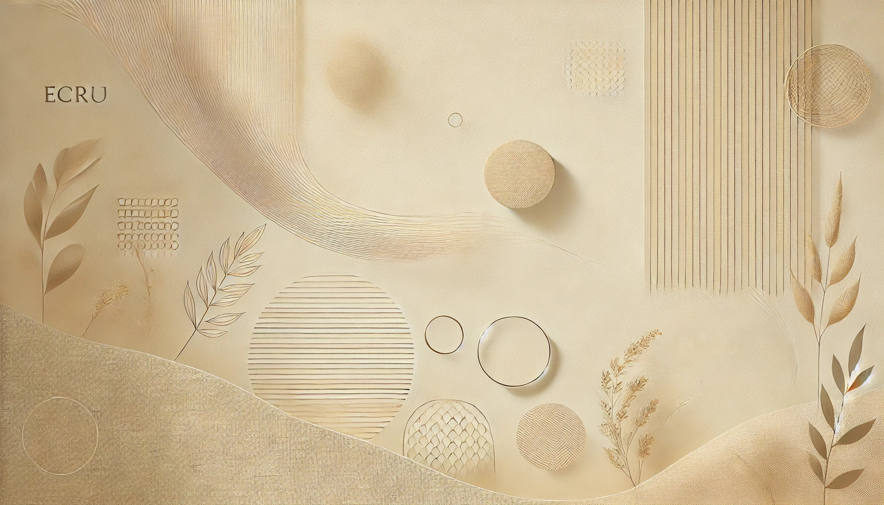
Ecru is more than just a color; it carries a gentle charm and warmth that can influence moods and feelings. In color psychology, ecru is associated with relaxation and well-being, making it a popular choice for creating calm spaces. This soft, neutral hue sits comfortably between beige and cream, adding a touch of elegance to any setting.
People often overlook the impact colors can have on their lives. The subtlety of ecru fosters balance and connection to nature, which can be comforting in a fast-paced world. Designers appreciate how ecru can enhance creativity while providing a minimalist backdrop that allows other elements to shine.
Whether used in home decor, fashion, or branding, ecru brings a sense of simplicity and refinement. Understanding its psychological effects can help individuals make more intentional choices in their environments. Embracing ecru might just be the key to creating a more peaceful atmosphere in everyday life.
Exploring Ecru Color
Ecru is a unique and elegant shade that sits between beige and cream. Its soft appearance carries a sense of warmth and simplicity. Understanding its definition and origin, as well as its place in the color spectrum, can enhance appreciation for this versatile hue.
Definition and Origin
Ecru is defined as a light grayish-yellowish-brown color. It often resembles the natural color of unbleached linen or raw silk. The term “ecru” originates from the French word cru, meaning “raw” or “unbleached.”
In terms of color codes, ecru’s hex code is #C2B280. This code shows its RGB values as R: 194, G: 178, and B: 128. The soft tones of ecru offer a calming effect, making it widely used in design and decor.
Ecru in the Color Spectrum
Ecru is a neutral color that fits well with many palettes. It is often considered a blend of warmer hues, which gives it a cozy feel.
In the color spectrum, ecru lies close to beige and cream. This positions it uniquely, allowing it to balance out bolder colors. Interior designers frequently use ecru to create a serene and inviting atmosphere.
Ecru also works well in fashion. It can convey sophistication and simplicity while pairing nicely with a variety of colors. This adaptability makes it a favorite for many people looking to enhance their style.
Psychological Implications of Ecru
Ecru, with its warm and neutral tones, has notable psychological effects on those who encounter it. Its associations with comfort, sophistication, and versatility contribute significantly to its appeal in design and art.
Warmth and Comfort
Ecru is often linked to feelings of warmth and comfort. It provides a cozy atmosphere that can make spaces feel inviting. This color draws from natural elements, which can be soothing for many.
In homes, ecru can create a relaxed setting for gatherings. It’s common in living rooms and bedrooms, where people seek tranquility. This soft hue makes it easier for individuals to unwind and feel at ease.
Furthermore, ecru encourages a sense of security, making it ideal for spaces meant for rest and relaxation. Its gentle presence can help lessen stress and promote a calm mood.
Sophistication and Elegance
Ecru’s subtle tone adds a touch of sophistication to any design. This color embodies understated elegance, distinguishing it from brighter shades. It’s often chosen in fashion and interior design for its refined quality.
In upscale environments, ecru can convey a sense of luxury without being flashy. Designers frequently use it to introduce a timeless element that appeals to various tastes. Its soft neutrality complements many other colors.
Ecru can also enhance the perceived quality of materials. Whether in textiles or furnishings, its presence allows other elements to stand out while maintaining a classy vibe.
Neutrality and Versatility
Ecru’s neutral stance makes it a versatile choice in various contexts. It can seamlessly blend with both warm and cool colors. This adaptability allows it to fit beautifully in different design schemes.
In color palettes, ecru works well as a foundation. It can balance bolder colors while maintaining its own identity. This quality makes it popular in both contemporary and traditional settings.
Moreover, ecru serves as an excellent backdrop, allowing other accents to shine. Its understated charm means it can be used in offices, homes, and creative spaces without overwhelming the design.
Cultural Associations of Ecru
Ecru, a soft and natural color, holds various cultural meanings across fashion, design, and different communities. Its subtle warmth and neutral tone make it an appealing choice that resonates uniquely in different contexts.
Ecru in Fashion and Design
In the world of fashion, ecru is celebrated for its versatility. Designers often use this color as a backdrop to showcase vibrant hues. Its understated elegance allows it to shine in both casual and formal attire.
Ecru garments are popular in spring and summer collections, as they evoke a sense of freshness. The color pairs well with many other shades, enhancing outfits without overwhelming them.
In interior design, ecru is a common choice for creating a calm atmosphere. It promotes a sense of serenity and pairs beautifully with natural materials like wood and linen. Ecru walls or furnishings establish a welcoming and cozy environment.
Symbolism in Various Cultures
Ecru’s associations can differ across cultures. In some contexts, it symbolizes simplicity and purity. This connection stems from its resemblance to natural materials like unbleached cotton or linen.
In many Eastern cultures, ecru can represent tranquility and wisdom. Its soft tone evokes a connection to nature, aligning with values of harmony and balance.
Additionally, in Western cultures, ecru is often linked to luxury and sophistication. It suggests a refined taste while remaining subtle. Many luxury brands incorporate ecru to enhance their image of quality and elegance.
These cultural perspectives contribute to ecru’s widespread appeal and usage across various fields.
Use of Ecru in Design
Ecru, with its soft and neutral tones, serves as an excellent choice in various design fields. Its calming effect and versatility make it a favorite for creating inviting environments.
Interior Design with Ecru
In interior design, ecru adds a touch of warmth and sophistication. It works well in living rooms, bedrooms, and dining areas, blending seamlessly with both modern and traditional styles.
Using ecru as a primary color can create a balanced and harmonious atmosphere. It pairs beautifully with different colors, including blues, greens, and deep browns, allowing for creative flexibility.
For furnishings, ecru upholstery can enhance comfort, while ecru walls provide a soothing backdrop for artwork and decor. The color’s understated elegance contributes to a refined space that feels welcoming and peaceful.
Graphic and Web Design Insights
In graphic and web design, ecru is valued for its neutrality. It helps create clean layouts that draw attention to essential elements without overwhelming viewers.
Ecru backgrounds can enhance readability, especially when combined with darker text. This combination is pleasing to the eye and encourages clearer communication of information.
Using ecru in branding can convey sophistication and reliability. Companies aiming for a luxurious feel often incorporate this color, creating visuals that resonate with their target audience.
Ecru’s adaptability makes it a practical choice for various design projects, allowing designers to maintain a fresh and contemporary look.
Marketing and Branding with Ecru
Ecru is a versatile color often linked to values like authenticity and sustainability. Brands that choose ecru aim to connect with consumers on a deeper level, often promoting a natural and eco-friendly image.
Impact on Consumer Behavior
Ecru can subtly influence consumer choices. This soft, neutral shade promotes feelings of calmness and trust. When consumers see ecru in branding, they may feel a connection to nature and simplicity.
Many people associate ecru with quality and timelessness. Brands that use this color can attract consumers looking for genuine, sustainable products. By choosing ecru, companies enhance perceptions of reliability and authenticity. This can lead to increased brand loyalty, as customers value eco-conscious options.
Ecru in Logo and Packaging Design
Ecru is becoming popular in logos and packaging design for many brands. Its neutral tone makes it compatible with various color palettes. This adaptability allows ecru to fit into diverse branding strategies.
Using ecru in packaging can highlight a brand’s commitment to natural ingredients. Eco-friendly brands often choose this color to reflect their values. For example, organic food and skincare products frequently feature ecru to signal purity and sustainability.
When designed well, ecru can help a product stand out on the shelf. Its softness draws attention without being overpowering, making it an excellent choice for brands seeking an elegant yet approachable look.