
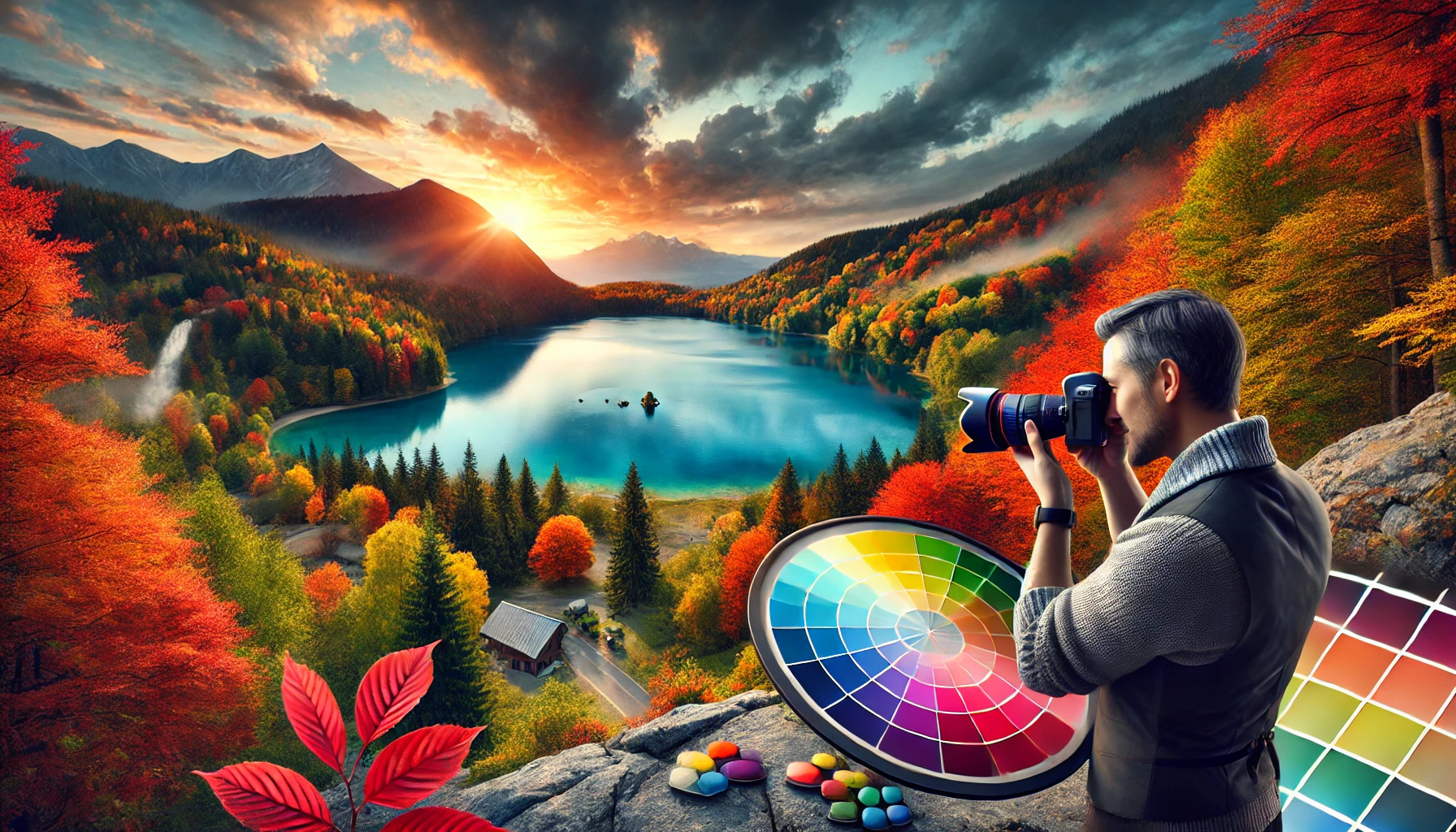
Capturing stunning color compositions is an art that can elevate photography from ordinary to extraordinary. By mastering the use of color theory and a limited palette, photographers can create images that evoke strong emotions and draw the viewer in. Understanding how colors work together can transform a simple shot into a compelling narrative.
Many photographers often overlook the importance of color in their work. With a thoughtful approach to color selection, they can make choices that enhance their visual storytelling. Using contrasting or complementary colors can grab attention and create a dynamic balance in an image.
Exploring different color palettes allows photographers to experiment and find their unique style. By focusing on the emotional impact of colors, they can connect more deeply with their audience. This journey into color composition not only enriches their photography but also makes the process much more enjoyable.
Understanding Color Theory
Color theory is essential for photographers to create visually appealing images. By grasping the concepts of the color wheel, color temperature, and color harmonies, photographers can enhance their compositions and communicate emotions effectively.
The Color Wheel and Color Relationships
The color wheel is a key tool in photography. It displays primary colors like red, blue, and yellow, along with secondary colors like green, orange, and purple. Understanding how these colors relate helps photographers make informed choices.
Color Relationships:
- Complementary Colors: Opposite each other on the wheel, they create contrast and energy.
- Analogous Colors: Next to each other, they provide harmony and can create a soothing effect.
- Triadic Colors: Equally spaced on the wheel, they offer a balanced and vibrant look.
Using these relationships can elevate the impact of a photograph.
Color Temperature: Warm vs Cool Colors
Color temperature describes the warmth or coolness of colors. Warm colors like red, orange, and yellow convey energy and excitement. They can evoke feelings of warmth and happiness. Warm colors are often used to attract attention.
Cool colors such as blue, green, and purple evoke calm and tranquility. They can create a sense of relaxation and peace. Cool colors might be preferred for nature photography or to convey a serene mood.
Photographers should consider the temperature of colors when planning their shots. This choice can significantly affect the emotion and message of an image.
Color Harmonies for Engaging Compositions
Color harmonies help create appealing and balanced compositions. Photographers can use various schemes to guide their color choices.
Common Color Harmonies:
- Monochromatic: Variations in one hue provide a cohesive look.
- Complementary: Bold contrasts attract the eye and create visual interest.
- Triadic: Uses three evenly spaced colors for vibrancy and balance.
By applying these harmonies, photographers can enhance their images and draw viewers’ attention effectively. The right color choices can transform a good photograph into a stunning one.
The Role of Light in Color Photography
Light plays a crucial role in how colors are perceived in photography. Different light sources can enhance or alter colors, shaping the overall mood of an image. Understanding how to work with light can significantly improve the effectiveness of color compositions.
Harnessing Natural Light
Natural light is one of the best tools for photographers. It offers a range of qualities that can enhance color. For example, the golden hour, just after sunrise or before sunset, provides a warm, soft glow that enriches colors.
Photographers should pay attention to the direction of light. Light coming from the side can create depth and texture. On the other hand, light coming from behind can illuminate colors from within, making them appear more vibrant.
Shooting on cloudy days can also give a soft, diffused light that reduces harsh shadows. This can be perfect for capturing subtle color tones without distraction.
Working with Artificial Light Sources
Artificial lighting allows for more control over the color in photographs. Using different colored bulbs or gels can create specific moods. For instance, a warm light can mimic sunset hues, while cool light can create a more clinical feel.
Using softboxes or diffusers can help diffuse harsh lighting, producing softer shadows and more balanced colors. Different light temperatures can change how colors appear. A warm light might make reds and oranges pop, while cooler lights could enhance blues and greens.
When working indoors, it’s important to adjust the white balance on the camera. This ensures that colors appear true to life. Experimenting with various light setups helps photographers discover unique color compositions.
Camera Settings for Vibrant Colors
The right camera settings can make a big difference in capturing vibrant colors. Two key areas to focus on are white balance and understanding histograms. Adjusting these settings helps photographers create stunning images with accurate color representation.
Choosing the Right White Balance
White balance affects how colors appear in a photograph. If the setting is incorrect, photos can look too warm or too cool. Each light source has its own color temperature, measured in Kelvin.
Photographers can choose from preset options like Daylight, Shade, or Tungsten. They can also use custom settings by taking a photo of a white or neutral gray object. This calibration ensures that colors appear true to life.
For vibrant colors, many photographers prefer setting the white balance to a slightly cooler temperature. This can enhance blue and green hues, making them pop. Experimenting with these settings can help find the perfect balance for different environments.
Understanding Histograms for Better Color Representation
A histogram is a graph that shows the distribution of light and color in an image. It can help photographers evaluate exposure and color balance. A well-balanced histogram displays data evenly across the graph.
When capturing vibrant colors, pay attention to the histogram. Ensure that it doesn’t show too much data on the left or right sides, which indicates underexposure or overexposure. A balanced histogram means more vibrant colors and improved detail.
Regularly reviewing the histogram while shooting allows for quick adjustments. This practice helps capture the best possible color representation. Photographers can adjust settings or lighting conditions to ensure their images truly reflect the scene.
Creative Use of Lenses and Filters
Lenses and filters play a crucial role in enhancing color photography. By selecting the right lenses and using various filters, photographers can elevate their images and achieve stunning compositions.
Choosing Lenses for Color Capture
Different lenses have unique qualities that can affect how colors appear in a photograph. Prime lenses often provide sharper images and better color fidelity compared to zoom lenses.
Photographers can opt for wide-angle lenses to capture vibrant landscapes. These lenses help to widen the scene, making colors pop against expansive backgrounds. For portraits, a portrait lens can blur backgrounds and highlight the subject’s vibrant features, emphasizing skin tones and clothing colors.
When selecting a lens, considering the aperture is important. A lens with a wide aperture allows more light to enter, which can enhance colors in low-light conditions. This capability helps to capture deeper and richer colors in various settings.
The Impact of Filters on Color Photography
Filters are valuable tools that enhance or alter colors in photography. A polarizing filter reduces glare and reflections from surfaces like water or glass. This filter can increase contrast and saturation, making colors appear more vivid.
Color filters can adjust the hue of an image. For example, a warming filter enhances the golden tones in sunsets, while a cooling filter emphasizes blue shades in landscapes. Filters can also create different moods, allowing photographers to express their artistic vision.
Furthermore, diffusion filters soften light, creating a dreamy quality in images. This effect can be used to highlight colors in a subtle way, adding a unique touch to portraits or flower photography. By experimenting with different filters, photographers can discover new ways to enhance their color compositions.
Post-Processing Techniques to Enhance Colors
Enhancing colors in post-processing can significantly improve the visual appeal of photographs. By utilizing specific techniques, photographers can bring out the best in their images, making them more striking and memorable.
Color Correction Basics
Color correction is the foundation of image enhancement. It focuses on adjusting colors to achieve a natural look. The main steps include:
- White Balance: Adjusting the white balance helps ensure that colors appear true to life. If a photo looks too cool or warm, using sliders to correct it can work wonders.
- Exposure Adjustment: Sometimes, brightening or darkening parts of the image is necessary, creating balance among colors and highlights.
- Saturation and Vibrance: Increasing saturation boosts all colors but may oversaturate some. Vibrance, on the other hand, raises less saturated colors, creating a more balanced enhancement.
These basics help images look more appealing without going overboard.
Advanced Color Grading for Impact
After mastering color correction, photographers can explore advanced color grading. This technique allows for creative expression and can dramatically change an image’s mood. Key elements include:
- Selective Color Adjustments: Photographers can target specific color ranges, enhancing only shades of blue or green for better contrast.
- Curves and Levels: Utilizing curves helps manipulate brightness and color contrasts. This precise control can create stunning visual effects.
- Color Lookup Tables (LUTs): Applying LUTs can quickly achieve a specific look. They are particularly popular for video but also offer unique styles in photography.
These advanced techniques provide tools for photographers to elevate their work significantly.
Understanding Color Psychology
Color psychology plays a significant role in photography. Different colors can evoke various emotions and feelings. By knowing how colors influence mood, photographers can create images that resonate more deeply with viewers.
Colors and Emotional Impact
Colors have distinct emotional associations that can enhance the message of a photograph. For example, red often signifies passion and energy. It can draw attention and create a sense of urgency.
Blue typically represents calmness and tranquility. Photographers may use it to instill a feeling of peace or reflection.
Yellow is linked to happiness and warmth. It can bring a cheerful vibe to an image, making viewers feel uplifted.
Moreover, combinations of colors can amplify their effects. Using contrasting colors, like blue and orange, can heighten tension or excitement. Understanding these associations allows photographers to choose colors that effectively convey their intended emotions.
Composing with Color in Various Photography Genres
Color plays a vital role in creating mood and conveying messages across different photography genres. Understanding how to compose with color can enhance the viewer’s experience and strengthen the storytelling aspect of each image.
Landscape Photography
In landscape photography, color can set the tone for the entire image. Photographers often seek out vibrant sunrises or sunsets. These moments showcase a wide spectrum of colors, like oranges, pinks, and purples, that can evoke strong emotions.
To make landscapes more impactful, photographers should consider the color wheel. For example, complementary colors, such as green foliage against a red sunset, can create visual interest. Using a limited color palette can also help emphasize the beauty of a scene. Warm colors can make a landscape feel inviting, while cooler tones can evoke calmness and serenity.
Portrait Photography and Skin Tones
When capturing portraits, color choices are crucial for presenting subjects in the best light. The background color should complement the skin tones of the subject. Neutral backdrops often work well as they don’t distract from the person being photographed.
Clothing color also matters. Bold colors can add energy, while softer hues convey gentleness. Additionally, photographers should use lighting to enhance skin tones, making them appear natural and flattering. Soft, diffuse lighting can minimize blemishes and emphasize warmth in skin tones, ultimately leading to more stunning portraits.
Street and Documentary Photography
In street and documentary photography, color can tell compelling stories. Urban scenes often feature a mix of bright, contrasting colors. Photographers can use these colors to highlight social issues or cultural aspects within their frame.
Paying attention to details like graffiti, signage, and clothing can reveal narratives. Colors in these elements can evoke specific emotions or provoke thought. Using a technique like color blocking can also direct the viewer’s eye to important aspects of the photograph, making the overall composition more powerful.
Macro and Nature Photography
Macro photography focuses on the beauty found in small details, making color composition even more critical. Colorful flowers, insects, and other elements can create a stunning visual experience.
Photographers should aim to isolate subjects against contrasting backgrounds to make colors pop. Using shallow depth of field can focus attention on the subject while blurring out distracting elements. Moreover, understanding color contrast can help draw attention to focal points, resulting in striking macro images.
Practical Exercises to Master Color in Photography
Engaging in practical exercises can significantly improve a photographer’s ability to use color effectively. Focusing on mood and finding inspiration in everyday life are two ways to enhance this skill.
Chromotherapy: Using Color for Mood
Chromotherapy leverages the emotional power of colors. Different colors can evoke various feelings. For example, blue often brings a sense of calm, while red can ignite energy.
Photographers can practice by choosing a color to focus on for a shooting session. They should look for subjects and scenes that embody this color. This exercise helps in understanding how color influences the viewer’s perception and mood.
After capturing the images, they can experiment with editing to enhance these colors. Adjusting saturation and contrast can further amplify the emotional impact of the image.
Color Hunt: Finding Color in Everyday Life
The Color Hunt encourages photographers to seek out vibrant colors in their surroundings. This activity transforms ordinary settings into creative opportunities. It challenges them to look beyond the obvious.
To start, select a color theme for the day. For instance, choosing “green” means focusing on plants, traffic lights, and any shade of that color. This exercise helps to sharpen observation skills and inspire fresh perspectives.
Photographers often return with a collection of unexpected colors and compositions. They may discover unique textures and patterns, enhancing their ability to compose stunning, colorful shots.