
Color plays a vital role in filmmaking, shaping the mood and enhancing storytelling. Directors like Wes Anderson and the Wachowskis use distinctive color palettes that not only define their films but also evoke deep emotions in the viewer. By examining these iconic choices, one can understand how color influences narratives.
Wes Anderson’s films are known for their vibrant hues, which often contrast with darker themes, creating a unique viewing experience. Similarly, films like The Matrix utilize color to reflect the story’s technological and philosophical undertones. These carefully chosen palettes engage audiences, making them more invested in the characters and their journeys.
In this exploration of movie color palettes, readers will discover the techniques behind some of the most visually stunning films. From bright pastels to bold primary colors, this article will showcase how these artistic choices enhance storytelling and leave a lasting impression.
The Art of Color in Film
Color in film serves as a powerful storytelling tool. It can shape emotions, define characters, and create memorable visual experiences. Understanding how filmmakers use color can enhance the viewing experience.
Defining Color Palettes
Color palettes refer to the specific set of colors used in a film. They help establish the film’s mood and aesthetic. Filmmakers often choose palettes that reflect themes or characters. For example, warm colors may convey comfort, while cool colors can suggest tension or sadness.
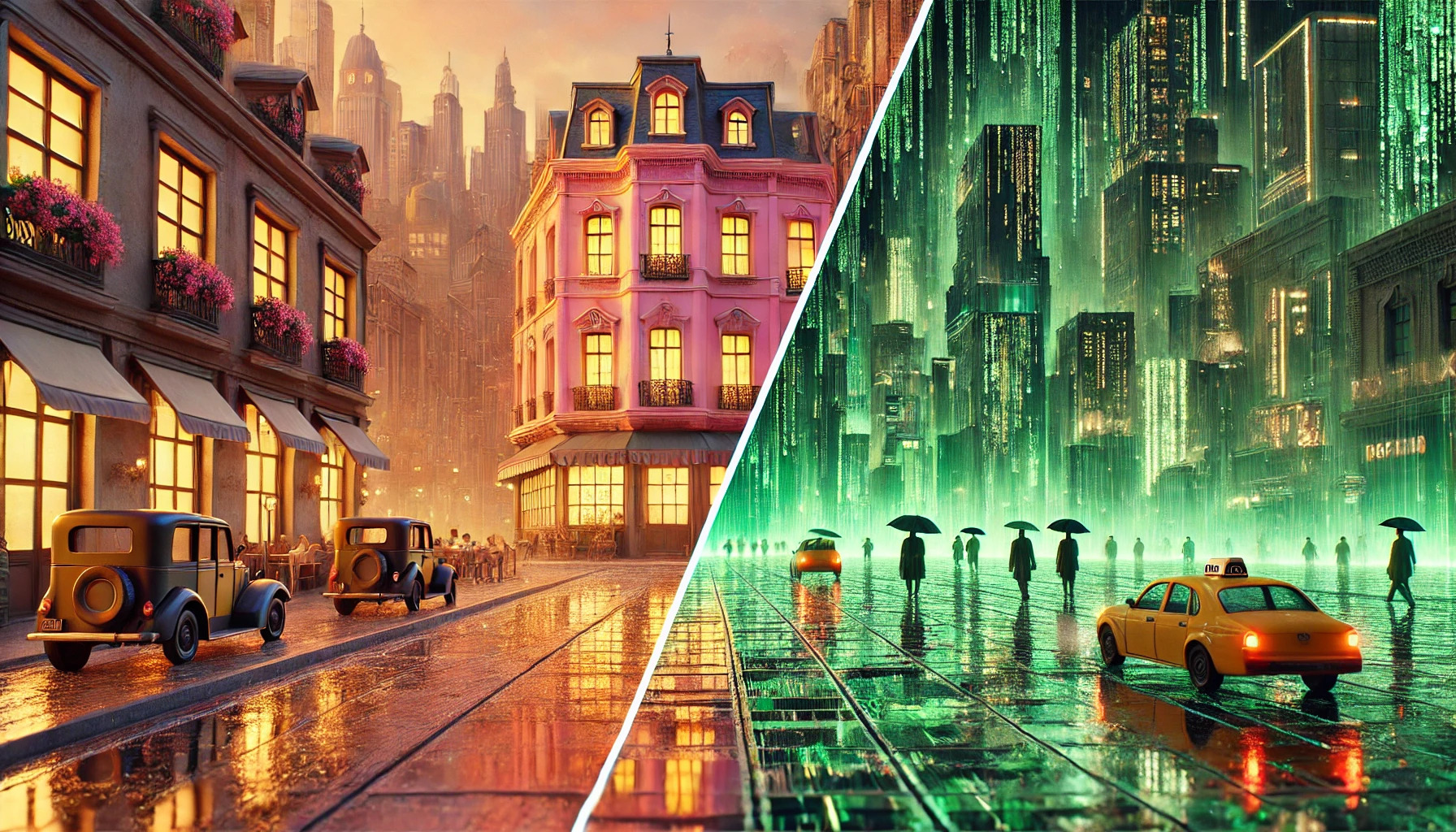
Wes Anderson is known for his unique color choices. He often uses a limited color palette that brings harmony to his scenes, making his films instantly recognizable. In contrast, “The Matrix” uses a green tint to create a stark contrast between the real world and the digital realm.
Emotional Impact of Colors
Colors can evoke specific feelings in viewers. Bright, vibrant colors often express joy, excitement, and playfulness. Darker tones, like deep blues and blacks, might instill fear or sadness.
Directors use color psychology to influence audience reactions. For instance, red can symbolize passion or danger. In Wes Anderson’s films, pastel colors often instill a sense of nostalgia. In “The Matrix,” the use of green can evoke feelings of unease, emphasizing the film’s themes of control and reality.
The History of Color in Cinema
The use of color in cinema has evolved over time. Early films were shot in black and white, but the introduction of Technicolor in the 1930s changed the landscape. This allowed filmmakers to explore a wider range of storytelling techniques.
Over the years, directors adopted color to reflect style and message. Iconic films like “The Wizard of Oz” showcased how color could dramatically impact storytelling. Today, filmmakers continue to experiment with color palettes to capture audience attention and enhance narratives.
Wes Anderson’s Distinctive Use of Color
Wes Anderson is known for his unique approach to color that shapes the atmosphere and emotional tone of his films. He uses color not just to decorate his scenes but to enhance storytelling and character development.
The Grand Budapest Hotel: A Study in Pastels
In “The Grand Budapest Hotel,” Wes Anderson uses a vibrant palette dominated by pastels. The light pinks, blues, and yellows create a whimsical and nostalgic feel. These colors reflect the opulence of the hotel and transport viewers to a fictionalized, romantic Europe.
The clever use of color enhances the film’s themes of loss and memory. The contrast between bright hues and darker undertones helps to underscore the story’s more serious moments. Each color is meticulously chosen to guide the audience’s emotions throughout the film.
Moonrise Kingdom: Nostalgia in a Color Wheel
“Moonrise Kingdom” features a color palette inspired by childhood memories. The greens, yellows, and browns evoke feelings of warmth and adventure. These colors create a sense of innocence and nostalgia, which perfectly fits the film’s coming-of-age story.
Anderson’s use of color mirrors the playful, youthful spirit of the characters. The vibrant landscapes and quirky costumes make the viewer feel as if they are part of this colorful world. Each scene is a visual treat that captures the essence of summer and young love.
Color as a Character in The Royal Tenenbaums
In “The Royal Tenenbaums,” color is not just a backdrop; it is a character itself. Each family member is associated with specific colors, reflecting their personalities and emotions. For instance, Margot Tenenbaum’s use of rich reds and browns highlights her complexity and depth.
The use of color helps to illustrate the family dynamics throughout the film. Different shades represent relationships, secrets, and conflicts. This artistic choice adds layers of meaning, allowing viewers to engage more deeply with the characters and their stories.
The Matrix: A Technical Revolution
The Matrix introduced groundbreaking techniques that redefined how movies use color and visual storytelling. Its striking use of green tint and contrasting colors played a crucial role in creating a memorable cinematic experience.
Decoding the Green Tint
The green tint in The Matrix is one of its most iconic features. This effect is used when characters are inside the Matrix, highlighting the digital nature of their reality. It creates a stark contrast with the real world, which has natural colors.
This color choice is not random. It symbolizes the artificial environment and the control that machines have over humans. The eerie green filter adds to the overall atmosphere of tension and unease. Viewers are immersed in a world that feels both familiar and unsettling.
Symbolism in Color Choices
Color plays a vital role in conveying themes and emotions throughout The Matrix. The stark differences between colors represent various states of reality. For instance, the warm tones of the real world evoke feelings of hope and humanity.
In contrast, the cold greens and blues within the Matrix reflect isolation and control. The use of these colors helps to illustrate the tension between freedom and confinement, enhancing the film’s underlying messages. Each color decision serves to deepen the viewer’s understanding of the characters’ journeys.
Visual Dichotomy: Real World vs. The Matrix
The visual contrast between the real world and the Matrix is impressive. Key scenes show this duality through color palettes that change dramatically. This helps viewers instantly identify which reality they are observing.
The real world is presented with rich, earthy tones, suggesting authenticity. Conversely, the Matrix is dominated by harsh, synthetic colors, emphasizing its artificial nature. This visual dichotomy not only aids storytelling but also reinforces the film’s themes about choice and illusion.
By using color thoughtfully, The Matrix elevates its narrative, making every scene memorable and impactful.
Color Palettes in Other Iconic Films
Color plays a crucial role in defining the mood and tone of various films. The use of specific color palettes can enhance storytelling and give depth to characters and scenes.
Amélie: Saturated Tones and Whimsy
In “Amélie,” the color palette features vibrant, saturated tones that embody the film’s whimsical nature. The dominant reds and greens create a cheerful atmosphere, drawing viewers into Amélie’s enchanting world.
This unique combination helps to highlight her quirks and magical perspective on life. The cinematography uses color to illustrate emotions, guiding the audience through joyful and nostalgic moments.
The colors also reflect Parisian charm, making the city itself feel like a character in the story. Amélie’s signature green dress and her bright red hair create visually striking contrasts that stick in the viewer’s memory.
Her: Technological Warmth
“Her” presents a color palette filled with warm, soft hues that evoke feelings of intimacy and connection. The film often uses pastel colors, blending shades of pink, orange, and yellow to create a comfortable atmosphere.
These hues connect with the movie’s themes of love and loneliness in a technologically advanced world. The use of these warm tones contrasts sharply with the cold, sterile environments often associated with technology.
Characters appear inviting and relatable, making their emotional struggles more impactful. The color design supports the narrative by enhancing the sense of closeness between the characters, despite the physical gaps created by technology.
Drive: Neon Nocturne
“Drive” utilizes a bold and striking neon color palette that reflects its edgy, urban setting. Vivid pinks, blues, and yellows create a sense of danger and excitement, mirroring the film’s intense action sequences.
These neon tones stand out against the darker backgrounds, emphasizing the conflict in the story. The colors are particularly effective in night scenes, where they highlight the characters’ emotions and motivations.
This palette not only sets the film’s tone but also serves as a visual metaphor for the characters’ inner turmoil. The powerful use of color keeps viewers engaged in the high-stakes world of crime and passion.
Creating Mood Through Color
Color plays a crucial role in setting the mood of films. Directors use specific colors to evoke emotions and create atmosphere, enhancing storytelling and viewer experience.
Color Theory Basics
Color theory involves understanding how colors interact and the feelings they can evoke. Colors are often categorized into three groups: primary, secondary, and tertiary. Each color carries its own psychological impact.
For example, red can signify passion or danger, while blue often represents calmness or sadness. Directors also use warm colors (like reds and yellows) to create an inviting vibe and cool colors (like blues and greens) for distance or tranquility.
In film, the choice of color affects viewers’ emotions before a word is spoken. This powerful tool contributes significantly to narrative depth.
Palette Selection Process
When selecting a color palette, filmmakers consider the film’s themes, characters, and settings. A well-chosen palette enhances the visual storytelling.
Directors like Wes Anderson often use restricted palettes for a distinctive look. He selects colors that symbolize character traits or emotional states.
For instance, color-coded characters can make relationships clearer. A character dressed in warm colors might be seen as friendly, while one in cool colors may come across as distant. This careful selection shapes how audiences perceive the story and its characters.
Setting the mood through color not only enhances visuals but also deepens the audience’s emotional connection to the film.
Practical Considerations for Filmmakers
Filmmakers must consider various factors when incorporating color into their projects. Each choice can impact the budget, design, and final look of the film. Understanding these practical aspects helps in achieving the desired visual style.
Budget Constraints and Color Choices
Budget limitations play a significant role in color choices. Filmmakers often must prioritize which aspects of color they can invest in. For example, using vibrant paint on sets might be cost-effective, while specialty lighting may require a larger budget.
When funds are tight, it’s essential to make smart decisions. Simple color palettes can be effective and impactful. Creative solutions, like using colored gels on existing lights or affordable props, can achieve stunning results without overspending.
Color in Set Design and Wardrobe
Color in set design and wardrobe creates mood and character. Designers should work closely with directors to ensure that colors align with the film’s vision. For instance, pastel colors in a whimsical film like “The Grand Budapest Hotel” help establish a unique atmosphere.
Wardrobe choices also influence how characters are perceived. Bright colors can signify playfulness, while darker tones may evoke seriousness. Attention to detail in these elements strengthens the storytelling through visual cues.
Post-Production Color Grading
Color grading in post-production is crucial for the film’s final look. This process enhances the film’s mood and ensures color consistency.
Filmmakers should collaborate with skilled colorists to achieve the desired aesthetic.
Using color grading software, they can adjust hues, saturation, and contrast. This flexibility allows for creativity and refinement of the film’s visual style.
Proper color grading can make a significant difference in storytelling and audience engagement.