
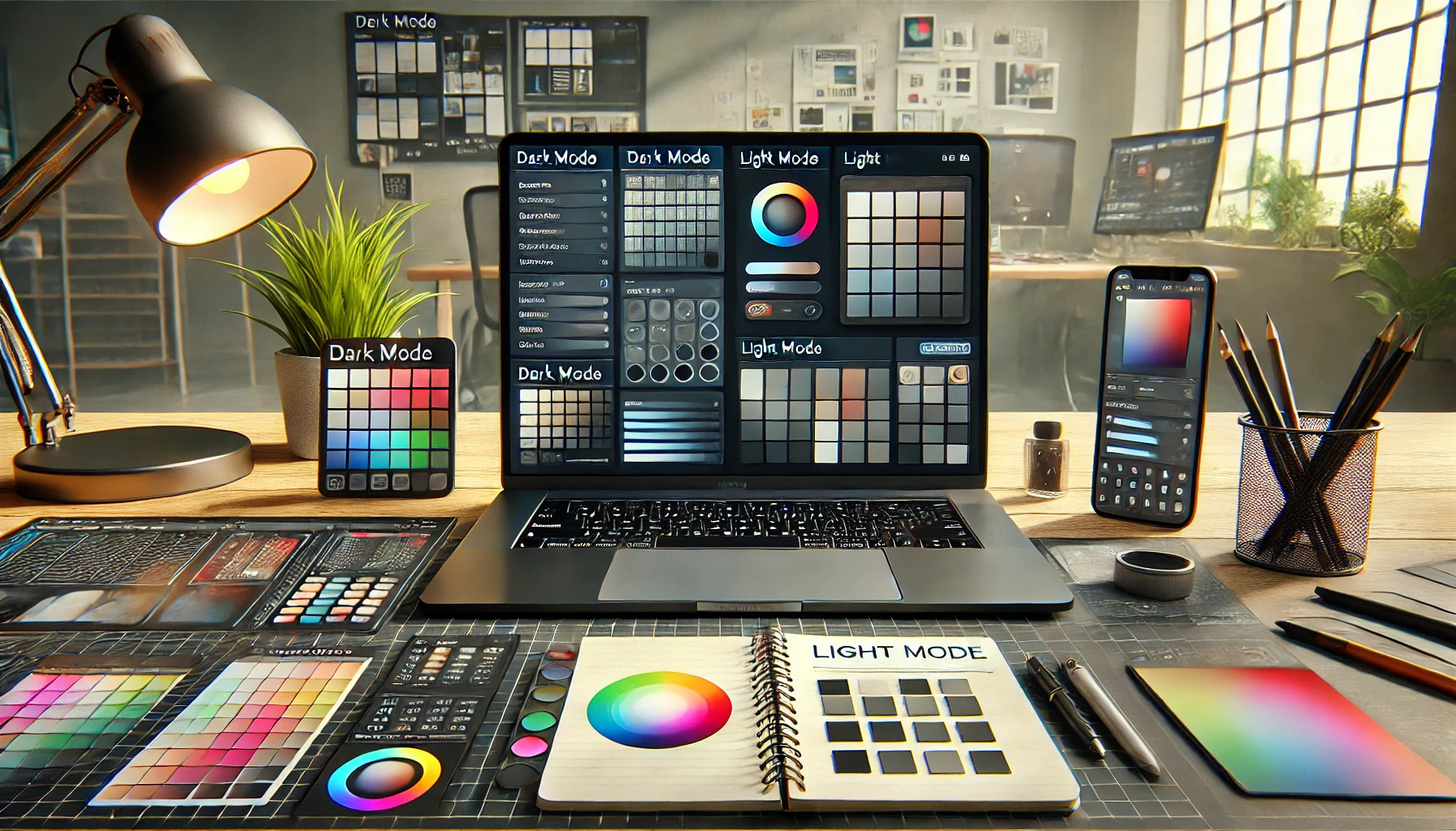
Choosing between dark mode and light mode can feel overwhelming. The best approach is to create palettes that complement both modes, providing a consistent and enjoyable user experience. This not only enhances visual comfort but also caters to varying preferences and settings.
Designers often consider factors like user comfort and battery efficiency when selecting their color schemes. Dark mode is popular for its sleek look and potential power savings on OLED screens, while light mode can create a vibrant and energetic atmosphere. By understanding the strengths of each, it becomes easier to find a balance that works for everyone.
As the digital landscape evolves, the choice between these two styles continues to grow in importance. Exploring ways to harmonize dark and light modes can lead to creative solutions that benefit both users and designers. This discussion will dive into practical strategies for crafting effective palettes that shine in every situation.
Understanding Dark Mode and Light Mode
Dark mode and light mode are two popular themes in user interfaces today. Each mode has unique features and benefits that cater to different user preferences and environments. These settings greatly affect how information is presented and perceived.
Definition and Background
Dark mode uses a dark color palette with light text, making it easier on the eyes in low-light conditions. This design aims to reduce eye strain, especially during nighttime use. Light mode, on the other hand, presents a light background with darker text, improving visibility in well-lit environments.
The first implementation of dark mode appeared in software design as a way to enhance readability at night. It has since gained traction with mobile devices and operating systems. Many users appreciate dark mode for its aesthetic appeal and potential battery-saving benefits on OLED screens.
Current Trends in User Interface Themes
User interface themes continue to evolve, with many apps offering both dark and light modes. This flexibility allows users to switch based on their preferences or environmental conditions. Some applications also use auto-switch features that change themes according to the time of day.
Studies show that users often feel more comfortable in dark mode during evening periods. In contrast, light mode remains popular during daytime use. This trend has influenced major platforms to adopt customizable themes, providing a better user experience across various devices.
The Science Behind Color and Brightness
Color and brightness play a significant role in user experience. They can affect emotions, comfort, and even the usability of digital content. Understanding how these elements work helps in choosing the right palette for both dark and light modes.
Psychology of Colors
Colors can evoke different feelings and responses. For example, blue is often linked to calmness and productivity, while red can create excitement or urgency. Designers should consider the psychological impact of colors when crafting their palettes.
Warm colors like orange and yellow can stimulate energy and creativity, while cool colors like green and purple often promote relaxation. When creating a user interface, it’s crucial to select colors that align with the desired emotional response.
Using contrasting colors also improves visibility and highlights important features. This ensures users engage positively with the design, making color choice impactful in user satisfaction.
Brightness and Eye Comfort
Brightness levels affect how comfortable a user feels while viewing content. High brightness in light modes can lead to eye strain, especially in dim lighting. The key is to match brightness with environmental conditions.
Dark modes can reduce glare, making it easier on the eyes. However, poorly designed dark themes may create poor visibility if the contrast is too low. A balance is essential to ensure legibility and comfort.
Implementing features like auto-brightness adjustments based on ambient light enhances user experience. By adapting the display to the user’s environment, the design becomes more user-friendly, minimizing discomfort during prolonged use.
Design Principles for Effective Palettes
Choosing the right colors for dark and light modes is crucial in design. Effective palettes enhance user experience, improve readability, and ensure accessibility. Understanding color theory and contrast can lead to better design choices.
Color Theory Essentials
Color theory is fundamental for creating effective palettes. Designers use colors to evoke emotions and set the mood. For instance, blue often conveys trust, while yellow can represent joy.
Using the color wheel helps in selecting complementary or analogous colors. Complementary colors, like blue and orange, create balance. Analogous colors, such as blue, green, and teal, provide harmony.
Designers should also consider cultural meanings attached to colors. For example, red can symbolize danger in some cultures but signify love in others. Selecting the right colors helps communicate the intended message clearly.
Contrast Ratios and Accessibility
Contrast ratios are vital for ensuring readability in any design. They measure the difference between text and background colors. A higher contrast ratio improves visibility, especially for users with visual impairments.
The Web Content Accessibility Guidelines (WCAG) suggest specific contrast ratios. For example, a ratio of 4.5:1 is recommended for regular text, while 3:1 suffices for larger text. Using simple tools can help check contrast levels easily.
Designers must also account for different lighting conditions. Dark mode should use softer colors to reduce glare, while light mode may require bolder colors for clarity. Balancing contrast is key to making content accessible for all users.
Developing a Unified Color Scheme
Creating a cohesive color scheme is essential for ensuring that both dark mode and light mode visually blend well. This process involves selecting core colors that work harmoniously in various settings, then adapting these tones for different backgrounds.
Creating a Core Palette
The first step in developing a unified color scheme is to build a core palette. This palette should consist of a few essential colors that will serve as the foundation for both modes.
- Primary Colors: Choose 2-3 core colors that represent the brand or theme. These colors should be versatile.
- Accent Colors: Include 1-2 accent colors for highlights and important elements. They can help draw attention where needed.
- Neutral Colors: Select neutral colors, like grays and whites, that balance the palette. They provide background support without overpowering other colors.
By focusing on these key components, it becomes easier to maintain a consistent look across both dark and light modes.
Adapting Colors for Dark and Light Modes
Once a core palette is established, adapting it for dark and light modes is crucial. This adaptation allows the palette to be effective regardless of the user’s preferences.
- Contrast: Light mode often uses darker colors for text and various elements, while dark mode benefits from lighter text on a dark background.
- Shade Adjustments: Adjust the shades of colors slightly between modes. For example, a medium blue can appear more vibrant in dark mode and muted in light mode.
- Testing: It’s helpful to test color combinations in both modes to ensure readability and accessibility.
By making thoughtful adjustments, designers can create a seamless experience that pleases users in any mode.
Technical Implementation Strategies
Implementing dark and light modes requires careful consideration of several techniques. Developers can utilize CSS to manage theme switching effectively. Additionally, design tools can aid in creating responsive color palettes that work seamlessly in both modes.
CSS Techniques for Theme Switching
CSS offers various methods to implement theme switching. A popular approach is using CSS custom properties (variables). These can simplify color management across a project.
:root {
  --background-color: #ffffff; /* Light mode */
  --text-color: #000000;
}

[data-theme='dark'] {
  --background-color: #000000; /* Dark mode */
  --text-color: #ffffff;
}

body {
  background-color: var(--background-color);
  color: var(--text-color);
}
Using a data attribute, such as data-theme, allows quick toggling between modes. JavaScript can easily update this attribute, making theme switching user-friendly. This method also improves maintainability by centralizing color controls.
Design Tooling and Resources
Design tools can enhance the palette creation for dark and light modes. Tools like Adobe XD, Figma, or Sketch offer features for creating and testing color schemes. Users can preview how colors appear under different modes.
Resources such as color contrast checkers help ensure accessibility. Ensuring sufficient contrast is crucial for readability. Designers can use tools like the WebAIM Contrast Checker to verify their choices.
Additionally, there are libraries like Tailwind CSS that provide utility classes for dark mode. This resource allows for quick implementation and customization. Utilizing these tools helps streamline the design process for practical and inclusive interfaces.
Challenges and Considerations
Designing for both dark and light modes involves understanding user preferences and finding a balance between aesthetic appeal and usability. Each mode has its strengths and weaknesses, which can impact user experience.
Addressing User Preferences
User preference is a significant factor when choosing between dark and light modes. Some users feel that dark mode reduces eye strain, especially in low-light settings. Others prefer light mode for its brightness and clarity during the day.
A good design should provide options to switch between modes easily. Additionally, understanding the target audience is crucial. Surveys or user feedback can help designers know which mode most users favor.
It’s also essential to consider accessibility. Ensuring that users with visual impairments can adapt the interface is vital for inclusivity. Offering customization options for text size and contrast can enhance the experience for everyone.
Balancing Aesthetics with Functionality
Finding the right balance between looks and usability can be challenging. Designers must consider how color choices in both modes affect readability. For instance, light mode often works well with dark text. In contrast, dark mode benefits from lighter text on dark backgrounds.
Contrast is important for visibility. Designers can use tools to check color contrast ratios. This ensures that text is easy to read in both modes.
Maintaining brand identity while adapting colors for each mode is also critical. A brand’s colors should be recognizable, no matter which mode is active. Ensuring consistency in design helps users feel comfortable, whether they prefer dark or light themes.
Exploring Case Studies
Examining real-world examples can provide valuable insights into the effectiveness of dark mode and light mode. This section looks at successful applications and user feedback to understand how users interact with these different design choices.
Successful Applications
Many apps and websites have embraced both dark mode and light mode settings. For instance, popular platforms like Twitter and YouTube allow users to toggle between modes. This flexibility meets the diverse preferences of users.
Dark mode often shines in low-light settings, reducing eye strain while conserving battery life on OLED screens. Light mode, on the other hand, works well in bright situations, offering visibility and clarity. A study by Adam Fard highlights that users frequently switch between modes depending on the environment.
Offering both options can enhance user satisfaction, as it allows individuals to choose what works best for them. Developers should consider integrating similar features to accommodate their audiences while improving usability.
Analyzing User Feedback
User feedback plays a critical role in refining dark and light mode designs. Many users appreciate the choice of modes, especially for tasks prolonged over time. Feedback often mentions that dark mode enhances focus during night-time use.
Reports show some users experience discomfort with excessive light mode use in dim settings. This discomfort reinforces the need for adaptable designs. Some platforms, like Facebook, utilize auto-switching features based on the ambient light.
Surveys can reveal users’ preferences and comfort levels when using these modes. Collecting insights helps designers make informed adjustments that cater to user needs while enhancing overall experience.
Best Practices for Designers
Designers should focus on iterative design and continuous testing to create effective dark and light mode interfaces. Staying updated on the latest design trends and innovations is also crucial for making informed decisions.
Iterative Design and Testing
Iterative design is a key approach where designers create multiple versions of their work and test them with users. This helps in understanding how different elements function in both dark and light modes.
Testing can include gathering user feedback through surveys or usability studies. Applying insights can refine the user interface.
Designers should use tools that allow for quick color adjustments. This flexibility helps to see how palettes perform under different lighting conditions and user preferences.
Ultimately, frequent iterations can lead to designs that better meet the needs of all users.
Staying Informed on Design Innovations
Keeping up with design innovations is essential for creating relevant and user-friendly experiences. Designers should follow industry blogs, attend webinars, or join design communities.
New trends often emerge with technology changes. For instance, advances in accessibility tools can provide valuable insights.
Designers can also explore resources that share best practices for dark and light modes. This knowledge helps them understand choices that enhance readability and user satisfaction.
By staying informed, designers can anticipate shifts and incorporate modern solutions into their work. This proactive approach can lead to better user engagement and a polished look.