
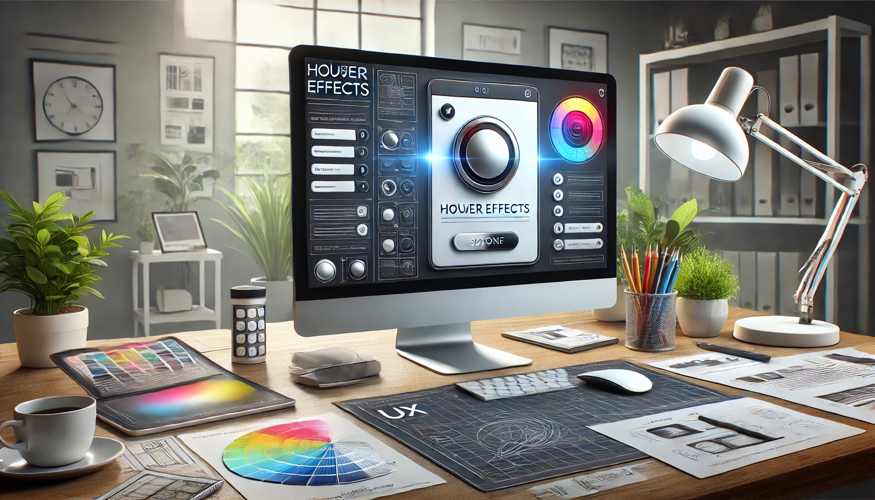
Hover effects play a crucial role in web design by providing users with visual feedback as they interact with elements on a page. These subtle color shifts not only enhance user experience but also guide users toward important actions, such as clicking buttons or links. By incorporating hover effects carefully, designers can create more engaging and intuitive websites.
When a user moves their cursor over a button or image, the hover effect serves as an invitation to explore. This interaction is not just about aesthetics; it communicates that the element is clickable and encourages user engagement. Understanding the art of these effects can make a significant difference in how users perceive and interact with a website.
In this blog post, readers will learn practical tips on implementing hover effects effectively. By following these guidelines, anyone can elevate their website’s interactivity and overall look, ensuring a delightful experience for visitors.
Exploring the Basics of Hover Effects
Hover effects are interactive design elements that change in response to a user’s actions. They enhance user experience (UX) by providing visual feedback and guiding users through an interface. Understanding the basics of hover effects can significantly improve web engagement.
What Are Hover Effects?
Hover effects occur when a user places their cursor over a specific element on a webpage. This interaction can trigger visual changes, such as color shifts, size adjustments, or animations. For example, a button might change from blue to green when hovered over, signaling that it is clickable.
These effects create an engaging experience, keeping users informed about which elements are active. Simple changes, like underlining text or changing opacity, can make a big difference in usability. Consistent hover effects help users learn how to interact with the site, which can lead to increased satisfaction.
Understanding UX and Its Importance
User experience (UX) refers to how users feel when they interact with a website or application. Good UX is essential for keeping visitors on a site and encouraging them to return. When users find an interface easy to navigate, they are more likely to engage with its content.
Hover effects play a crucial role in enhancing UX. They provide immediate feedback that can help users understand where to click or what actions are possible. By effectively guiding users, hover effects reduce confusion and lead to a more pleasant browsing experience.
The Role of Color in UX
Color is a powerful tool in web design and directly impacts user perception. It can evoke emotions and influence decisions. In hover effects, color shifts are often used to attract attention or indicate interactivity.
For instance, changing a button’s color from gray to bright blue can create an inviting feel. The choice of color should align with the website’s overall design and brand identity. By maintaining consistency in color usage, designers can create a cohesive experience that feels intuitive to users.
Design Principles for Hover Effects
Creating effective hover effects requires attention to key design principles. These principles guide designers in enhancing user experience while maintaining visual appeal. By focusing on consistency, feedback, and color theory, designers can create interactions that feel intuitive and engaging.
Consistency and Predictability
Consistency is vital in hover effects. When users encounter a familiar hover action, they quickly learn how to interact with the interface. For example, if all buttons change color when hovered over, users know what to expect.
Predictability helps build trust. If hover effects are used randomly, users may get confused and frustrated. Designers should apply similar styles across the site. This includes keeping the color palette uniform and using the same effects for buttons and links. By doing this, users can navigate more easily.
Feedback and Interactivity
Hover effects should provide clear feedback. This means when a user hovers over an element, there should be an immediate and noticeable change. This change can be simple, like a color shift or more dynamic, like a scaling effect.
Feedback signals that an element is interactive. Subtle animations can draw attention without being overwhelming. For instance, when a button slightly increases in size or changes shade, it clearly indicates that it can be clicked. This interaction creates a more engaging user experience.
Color Theory in Action
Color theory plays a significant role in hover effects. Colors can evoke emotions and influence behavior. When designing hover effects, choosing colors that suit the brand is essential.
A well-chosen color for hover effects can enhance visibility and appeal. For example, using a contrasting color for a hover state can make a button stand out. This draws users’ eyes and encourages clicks. Designers should also consider the balance of colors so that effects are noticeable yet not jarring. Combining color shifts with other subtle effects can yield a lively, consistent interface.
Implementing Color Shifts
Color shifts can greatly enhance user interaction on a website. By carefully choosing colors and managing transitions, a designer can create a seamless experience. Accessibility should also be a priority to ensure all users benefit from these enhancements.
Choosing the Right Colors
Selecting the right colors is crucial for effective hover effects. Designers should focus on colors that complement the existing palette.
Contrast is Key: It’s important to ensure that there is enough contrast between the normal state and the hover state. This makes the change noticeable without being jarring.
Testing Combinations: Designers can experiment with different color combinations. Tools like color contrast checkers can help ensure the chosen colors are visually accessible.
Transition Timing and Duration
The timing and duration of color transitions can impact user experience significantly. Quick transitions can add a sense of energy, while slower ones may feel more relaxed.
Duration Matters: Generally, a duration of 0.3 to 0.5 seconds is standard for hover effects. This range is long enough for users to notice the change but quick enough to keep it engaging.
Easing Functions: Using easing functions can create smoother transitions. For instance, “ease-in-out” offers a gentle start and finish, making the transition feel more natural.
Accessibility Considerations
Accessibility in hover effects ensures that all users can navigate a website effectively. Designers should always keep users with varying abilities in mind.
Color Blindness: It’s essential to choose colors that work well for people with color blindness. Tools are available to simulate how color changes appear for these users.
Visual Indicators: Besides color changes, adding other visual cues like underlining or changing borders can help. This way, users can still identify interactive elements without solely relying on color.
Case Studies: Successful Color Shifts
Color shifts have proven effective in enhancing user experience across various platforms. Many successful case studies demonstrate how effective color changes can draw attention and create a more engaging environment.
E-commerce Websites
E-commerce websites frequently use color shifts to attract shopper attention and guide them through the buying process. For example, when a customer hovers over a product image, the image might shift to a different color or show additional details. This interactivity not only showcases the product but also encourages clicks.
A study of top retail sites shows that incorporating subtle color changes during hover can improve click-through rates by up to 15%. Popular brands often implement this technique on call-to-action buttons, changing their color to create urgency. For instance, a button might change from gray to vibrant orange, indicating a promotional discount.
Mobile App Interfaces
In mobile app design, color shifts enhance navigation and interaction. Games and utility apps often use color transitions when users tap buttons or select options. These shifts create a sense of immersion, making users feel more connected to the app.
For example, a popular fitness app uses color shifts on its activity buttons. When users select a workout, the button may briefly change from blue to green, offering instant feedback. This technique reinforces user choices and keeps them engaged, driving users to explore more features.
Portfolio Websites
Portfolio websites rely heavily on visual appeal. Designers often use color shifts to highlight their work and keep the viewer’s attention. A well-designed gallery can use hover effects to change the background color or overlay text on images.
For instance, many photographers use slight color shifts on their portfolio images. When a viewer hovers over an image, the colors may brighten or slightly change hue. This change can draw the viewer’s eyes and create a memorable browsing experience. By making the work feel dynamic, designers can leave a lasting impression.
Advanced Techniques and Trends
In modern web design, hover effects can elevate user experience significantly. By using advanced techniques, designers can create visually appealing and engaging interactions. This section will explore gradient shifts, interactive backgrounds, and future trends that enhance hover effects.
Gradient Shifts and Animation
Gradient color shifts are becoming popular in hover effects. These shifts offer smooth transitions that attract attention without being overwhelming. Instead of a single color change, a gradient can smoothly blend two or more colors, creating depth.
To implement this effect, designers often use CSS transitions. For example, a button can shift from a soft blue to a vibrant purple on hover. This not only looks appealing but also suggests interactivity. Designers should consider the brand colors to ensure that the gradients match the overall aesthetic.
Interactive Backgrounds
Interactive backgrounds take hover effects a step further. These backgrounds can change or animate in response to user interactions. For instance, a background image might shift slightly or change its opacity when a user hovers over specific elements.
Using CSS and JavaScript makes it easy to create these effects. This technique encourages deeper exploration of a website. When backgrounds respond to actions, users feel more engaged and curious to learn more about the content.
Future Trends in Hover Effects
As technology evolves, so do hover effects. Future trends suggest that more dynamic and responsive designs will emerge. Designers may explore the use of 3D effects or layered animations, which can create a sense of depth.
Furthermore, with the rise of mobile usage, designers will likely seek to make hover effects adaptable. They may create similar effects that work on touch devices, where traditional hover states are absent. This shift will require innovative thinking to maintain interactivity while considering varying screen sizes.
By incorporating these advanced techniques, designers can ensure that hover effects remain relevant and impactful.
Best Practices for Developers
When implementing hover effects, developers should focus on creating efficient code, ensuring cross-browser compatibility, and optimizing performance. These practices help create a smooth user experience while maintaining website functionality.
Efficient Code for Hover Effects
Using clean and efficient code is crucial for smooth hover effects. Developers should minimize the use of excessive CSS rules or JavaScript functions. Keeping styles organized and concise ensures faster load times and easier maintenance.
It is beneficial to use CSS transitions for hover effects. This method allows for smoother animations compared to JavaScript, which can be more resource-intensive. Developers can add subtle effects like color changes or scaling with just a few lines of CSS.
For example, a simple transition on a button might look like this:
.button {
  transition: background-color 0.3s ease;
}

.button:hover {
  background-color: #ff5733;
}
Cross-browser Compatibility
Ensuring that hover effects work across different browsers is important for user experience. Developers should test their designs in browsers like Chrome, Firefox, Safari, and Edge. This helps identify any issues that might arise.
Using CSS prefixes can help with compatibility. Consider adding -webkit- or -moz- prefixes for specific styles. Developers can also rely on tools like Autoprefixer to automate this process.
They should remain mindful of older browser versions that might not support certain features. Providing fallback styles can ensure that users have a functional experience, even if some effects are not supported.
Performance Optimization
Optimizing hover effects can significantly improve overall website performance. Developers should avoid heavy animations that might slow down page loading. Instead, they should opt for simple and subtle changes that enhance interactivity without sacrificing speed.
Using CSS instead of JavaScript for animations can lead to better performance. CSS animations are typically hardware-accelerated, which results in smoother effects. Additionally, developers should avoid using large images or complex visuals in hover effects.
Regularly testing performance with tools like Google Lighthouse can help identify areas for improvement. Developers can monitor load times and make necessary adjustments to maintain an optimal user experience.
User Testing and Feedback
To create effective hover effects, gathering data from real users is essential. This information allows designers to make informed decisions, ensuring that the effects enhance user experience without causing confusion or frustration.
Gathering User Data
User surveys and feedback sessions are great ways to collect data about hover effects. By asking questions about specific interactions, designers can understand what users find appealing or confusing.
A/B testing is another useful method. Designers can compare different hover effects by showing users two versions of a site. This method helps identify which effect drives more engagement. Key metrics to track include click-through rates and user satisfaction ratings.
Iterative Design Process
The iterative design process allows for continuous improvement of hover effects. After initial testing, designers can tweak the designs based on user feedback. Making small changes and testing again can lead to better understanding of user preferences.
Creating prototypes and mockups can also help. These allow users to interact with the design before the final version is implemented. Feedback during this phase is valuable for refining hover effects to ensure they meet user expectations.
Adapting to User Preferences
Designers need to be flexible and adapt hover effects based on user preferences. Analyzing collected data helps in identifying trends and specific interactions that resonate with users.
For example, if users favor subtle color shifts over bold animations, designers can adjust accordingly. Implementing features like customizable hover effects can allow users to tailor their experience, increasing engagement. Listening to user preferences can ultimately lead to enhanced satisfaction and a more intuitive design.