
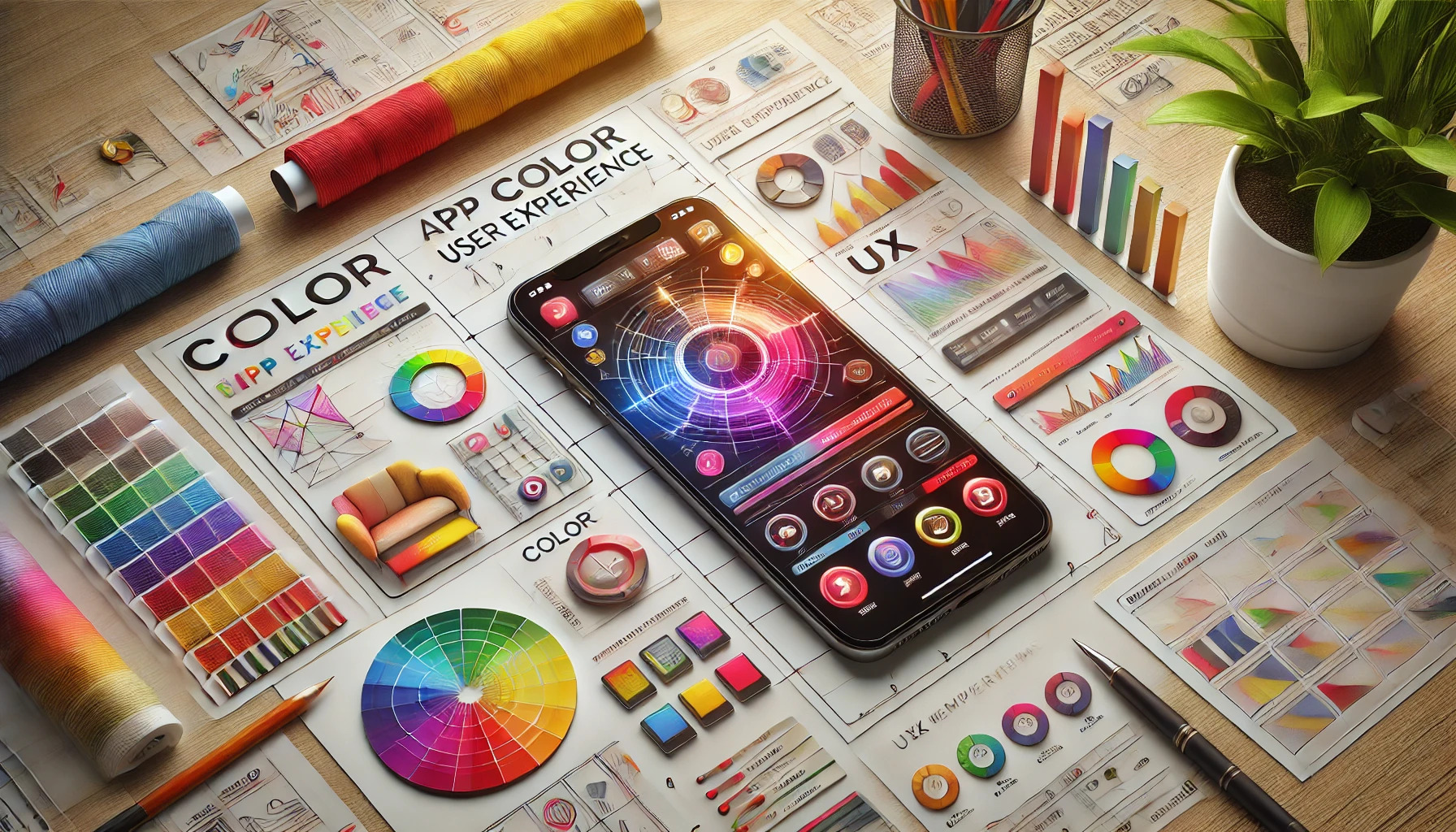
Color plays a crucial role in shaping how users interact with an app. The right color choices can engage users, evoke emotions, and reinforce brand identity, making color the MVP of user experience. When users open an app, their immediate perception is heavily influenced by its colors, setting the stage for their overall experience.
Understanding color psychology can help designers craft interfaces that resonate with their audience. Colors can create feelings of trust, excitement, or calmness, guiding users through their journey in the app. By strategically using color, developers can enhance usability and encourage desired actions.
In a competitive app market, making a strong impression is key. Colors not only attract users but also keep them engaged and coming back. Effective use of color can transform a basic app into an unforgettable experience.
The Impact of Color on User Experience
Color plays a crucial role in shaping how users interact with an app. It not only influences emotions but also affects decisions and recognition. Understanding the significance of color can lead to better designs and improved user satisfaction.
Color Psychology and User Perception
Color psychology refers to how different colors evoke specific feelings and reactions. For example, blue often creates a sense of trust and calm, while red can stir excitement or urgency.
This influence extends to user behavior. Studies show that users tend to engage more with interfaces that use colors consciously. For instance, a well-placed red call-to-action button can enhance conversion rates significantly. By knowing the emotional responses that colors can trigger, designers can create interfaces that resonate well with users.
Color and Brand Identity
Colors are essential to building a strong brand identity. A consistent color palette helps users recognize and remember a brand. For instance, brands like Coca-Cola use red to convey energy and excitement, while Facebook uses blue for trust and dependability.
When users see familiar colors, they feel a connection to the brand. This connection can affect loyalty and retention. Companies that align color choices with their values often find greater success in developing a memorable presence in a crowded market.
Design Principles for Color Usage
Choosing the right colors in app design is essential. This section covers key principles that ensure colors enhance user experience while being attractive and functional.
Color Harmony and Contrast
Color harmony refers to how colors work together in a design. Balanced color combinations create a pleasing look that keeps users engaged. The classic color wheel can guide choices.
Complementary colors, which sit opposite each other on the wheel, create strong contrasts. This makes important elements stand out, while analogous colors, which are next to each other, offer a more subtle look.
Effective contrast is vital for readability. For instance, a dark text on a light background is easier to read. Color contrast enhances navigation, making it simple for users to interact with different app sections.
Accessibility and Readability with Color
Accessibility in color usage ensures all users can enjoy the app. Approximately 8% of men and 0.5% of women are colorblind. Therefore, using high-contrast color schemes helps these users navigate easily.
Tools are available to check color combinations and find potential issues. Avoid using colors solely to convey information. Instead, incorporate symbols or text alongside colors for clarity.
Using tools like color blindness simulators can help designers understand how color choices affect users with visual impairments. This thoughtful approach enhances overall accessibility.
The Role of Color in Usability
Colors can guide users through an app. For example, using a consistent color for buttons signals that they are clickable. This consistency helps users navigate without confusion.
Colors can also set the mood or tone of the app. Warm colors, like reds and oranges, promote energy, while cool colors, like blues and greens, create calmness.
Emphasizing important features with distinct colors can improve usability. Designers must choose colors thoughtfully to align with the app’s purpose and audience. A well-planned color strategy can lead to a more enjoyable user experience.
Choosing the Right Color Palette
Selecting the right color palette is vital for creating a positive user experience in an app. It helps establish brand identity and guides users effectively through the app. By using the right tools and considering the audience, designers can make informed choices that enhance usability and engagement.
Color Tools and Resources
Many tools are available to help choose the perfect color palette. Websites like Adobe Color and Coolors allow designers to create, explore, and save color schemes easily. They provide options to generate palettes based on different color theories, like complementary or analogous colors.
Designers can also use resources such as Canva’s color wheel and Paletton. These resources help visualize how colors work together. They offer suggestions for colors that evoke specific emotions or themes. This approach ensures that the selected colors align well with the app’s purpose and target audience.
Evaluating Context and Audience
Understanding the context and target audience is crucial when picking an app color palette. Different demographics respond to colors in unique ways. For instance, younger users might prefer bold and bright colors, while older users may favor more muted tones.
Designers should also consider cultural meanings of colors. For example, while red can signify excitement or love in some cultures, it may represent danger in others. Researching user preferences and conducting surveys can provide valuable insights. This understanding allows for a more tailored approach that resonates with the intended users, improving overall user experience.
Effective Implementation of Color Strategies
Using color effectively in an app can create a significant impact on user experience. By focusing on consistent usage, emotional connections, and continuous testing, developers can ensure that their color strategies enhance engagement and usability.
Consistent Color Usage Across the App
Consistency in color usage helps users navigate an app more easily. When the same colors represent specific actions or categories, it builds familiarity. For example, using one color for buttons across all screens can create a seamless experience.
Developers should create a color palette that reflects the brand identity and stick to it across the app. Here are some tips for maintaining consistency:
- Define Primary and Secondary Colors: Choose a primary color for major actions and a secondary color for accents.
- Use Color Codes: Stick to hex or RGB codes to ensure colors remain uniform.
- Create a Style Guide: Document color usage guidelines to guide future updates.
Emotional Impact Through Color
Colors evoke emotions and can significantly influence how users feel about an app. For instance, blue often represents trust and calmness, while red can stimulate excitement or urgency. Understanding color psychology is key to tapping into these emotional responses.
Developers can enhance user experience by aligning colors with the app’s purpose. Some effective strategies include:
- Choose Colors That Align with Brand Values: For example, a health app may benefit from greens and blues, which convey freshness and tranquility.
- Consider Cultural Context: Be aware that color meanings can differ by culture. What works in one region may have a different impact in another.
- Use Warm and Cool Colors Wisely: Warm colors attract attention, while cool colors can create a soothing experience.
Testing and Iterating Color Choices
Testing color choices is vital to refine user experiences. Conducting A/B tests can reveal how different color schemes affect user behavior. This method allows developers to see what resonates best with their audience.
Key steps for effective testing include:
- Gather User Feedback: Use surveys or focus groups to gain insights on color preferences.
- Monitor User Interaction Data: Analyze metrics like click-through rates or time spent on tasks to gauge effectiveness.
- Iterate Based on Findings: Make adjustments based on user feedback and data to continually improve color strategies.
Color Trends in Mobile and Web Design
Color trends are vital in mobile and web design. They keep interfaces fresh and engaging. Here are some popular trends to watch:
-
Bold Neon Colors: Bright and vibrant colors create a lively atmosphere. They can make key features stand out.
-
Pastel Palettes: Soft colors offer a calming effect. This trend is great for apps focused on wellness or relaxation.
-
Dark Mode: Many users prefer dark backgrounds for a sleek appearance. This trend can ease eye strain, especially in low-light situations.
-
Gradients: Smooth transitions from one color to another add depth. They make designs look modern and dynamic.
-
Eco-Friendly Colors: Natural, earthy tones reflect a commitment to sustainability. This trend resonates well with environmentally conscious users.
Designers need to consider how these colors influence emotions. For example, blue can promote trust, while green is often associated with health.
Staying up-to-date with color trends helps create a positive user experience. It can lead to better engagement and loyalty among users. Keeping users’ preferences in mind is essential for effective mobile and web design.
By adopting the right colors, designers can guide users’ actions and enhance their overall experience. Effective use of color is a powerful strategy in creating intuitive interfaces.