
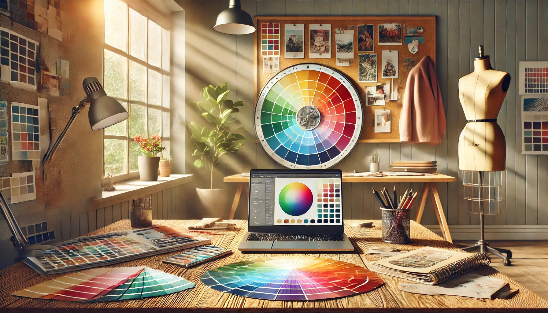
Using the color wheel can transform how someone approaches color combinations in art and design. By understanding the relationships between colors, anyone can create perfect pairings that enhance their projects. Whether working on a painting, designing a room, or choosing outfits, the color wheel serves as a valuable tool.
Many people struggle with selecting colors that look good together. Fortunately, the color wheel simplifies this process by showing complementary and analogous colors. This knowledge allows for creative exploration while ensuring a cohesive look.
As readers dive into this article, they will discover practical tips for using the color wheel effectively. With the right guidance, anyone can boost their color skills and make their work stand out.
Understanding the Color Wheel
The color wheel is a powerful tool for anyone interested in art and design. It helps visualize how colors relate to one another and can guide choices for harmonious color pairings.
The Basics of Color Theory
Color theory is a collection of guidelines that explains how colors interact. It provides a framework to understand how colors can be combined to create visually appealing results. This theory categorizes colors based on their relationships.
For example, complementary colors sit opposite each other on the wheel, like blue and orange. They create high contrast and vibrancy. Analogous colors, found next to each other, like blue, blue-green, and green, offer harmony and tranquility when combined.
By using these concepts, artists and designers can make informed choices about color combinations that enhance their work.
Primary, Secondary, and Tertiary Colors
Colors on the wheel can be divided into three main categories: primary, secondary, and tertiary colors.
Primary colors are red, blue, and yellow. These cannot be created by mixing other colors. Secondary colors are made by mixing two primary colors, such as green (blue + yellow), orange (red + yellow), and purple (blue + red).
Tertiary colors result from mixing a primary color with a secondary color. These include combinations like red-orange and yellow-green. Recognizing these categories helps in selecting colors that work well together.
The Meaning Behind Colors
Colors evoke emotions and convey meanings. Understanding these associations can greatly influence design choices. For instance, blue often represents calmness and stability, while red can signify excitement or passion.
Yellow is commonly linked to happiness and energy, while green is associated with nature and growth. Artists can effectively use these meanings to enhance the mood of their work.
Types of Color Schemes
Color schemes help create pleasing visuals in design. Understanding different types enables better choices for color pairings and enhances the overall look. Below are five key types of color schemes.
Monochromatic Scheme
A monochromatic color scheme uses a single color along with its shades and tints. This means taking one base color and adding black for darker shades or white for lighter tints. This scheme is great for creating a uniform and cohesive look.
A monochromatic scheme is easy to work with. It helps maintain harmony across a design, making it visually appealing. It is also useful for projects where a specific mood or effect is desired, such as calming blues or vibrant reds.
Analogous Scheme
An analogous color scheme combines three colors that are next to each other on the color wheel. For example, a combination of blue, green, and yellow can create a harmonious look. These colors complement each other and are pleasing to the eye.
Designers often use analogous schemes to create serene or vibrant atmospheres. They work well in nature-inspired designs, as they mimic the colors found in environments like sunsets or gardens. This choice fosters a sense of flow within the design.
Complementary Scheme
The complementary color scheme pairs colors that are opposite each other on the color wheel. For instance, blue and orange or red and green are strong examples. This scheme provides high contrast, making designs pop.
Using complementary colors can draw attention to specific elements. However, balance is crucial, as using equal amounts may clash. It’s often effective in branding and marketing to create excitement.
Triadic Scheme
Triadic color schemes involve three colors that are evenly spaced on the color wheel. An example could be red, yellow, and blue. This arrangement offers vibrant contrasts while maintaining harmony.
When using a triadic scheme, it’s essential to choose one dominant color. The other two should support this main color to avoid visual chaos. This scheme is popular in art and design, as it can provide a bold and playful look.
Tetradic Scheme
A tetradic scheme uses four colors arranged in two complementary pairs. This creates a rectangle on the color wheel. For instance, red and green paired with blue and orange can inspire lively designs.
Using a tetradic color scheme can be balanced or dynamic. It allows for a wide range of contrasts while still maintaining coherence. Choosing a dominant color, while using the others as accents, is vital for clarity in the design.
Choosing Colors for Your Design
Selecting the right colors is crucial for effective design. Understanding the context in which colors will be used, along with ensuring harmony among them, can significantly enhance visual appeal.
Understanding Color Context
Color context refers to how colors interact with their environment. A color can look different based on surrounding hues and the overall theme. For example, blue may appear calm in a nature setting but could feel cold in a modern, industrial design.
Designers should consider the emotions they want to evoke. Warm colors like red and orange often convey energy and excitement, while cool colors like blue and green can promote relaxation. It’s important to align color choices with the message and identity of the brand or project.
Considering Color Harmony
Color harmony involves using colors that blend well together, creating a pleasing visual experience. Different schemes can be used, such as complementary, analogous, or triadic colors.
- Complementary Colors: Opposite each other on the color wheel, like red and green. They create contrast and can draw attention.
- Analogous Colors: Next to each other on the wheel, like yellow, yellow-orange, and orange. They provide a cohesive look.
- Triadic Colors: Three colors evenly spaced, like red, blue, and yellow. This scheme is vibrant and balanced.
Choosing a harmonious palette can enhance the design’s impact while ensuring that the colors work together effectively.
Color Pairings in Practice
Color pairings can transform a project by enhancing its visual appeal. By carefully mixing tones, creating moods, and embracing contrast, anyone can achieve stunning results. Here are some practical ways to use the color wheel for effective pairings.
Mixing Warm and Cool Tones
Mixing warm and cool tones adds depth and interest to designs. Warm colors, like red and yellow, evoke energy and excitement. Cool colors, such as blue and green, provide calm and tranquility.
By blending these color families, one can create balance. For example, pairing a vibrant orange with a cool teal can create a refreshing contrast.
Another effective strategy is to use warm colors as accents against cooler backgrounds. This draws attention where needed while maintaining harmony throughout the piece. Knowing how to combine these tones is vital for achieving an engaging look.
Creating Mood with Color Pairings
Colors play an essential role in conveying emotion and mood. A bright yellow can evoke happiness, while deep blues can suggest sadness or calmness.
Using the color wheel helps choose colors that work together to create the desired effect. A combination of bright pink and soft lavender can create a cheerful and soft environment.
In contrast, pairing a dark burgundy with soft grey can create a more serious or elegant feel. Being mindful of these combinations allows for purposeful design that speaks to viewers.
Contrast and Vibrancy
Contrast is important in design, as it can draw attention and create visual excitement. Complementary colors—those opposite each other on the color wheel—provide the most contrast. For example, a vibrant blue paired with a bright orange can really catch the eye.
Using varying shades and tints can also enhance vibrancy. A deep green with a light mint creates depth while still being harmonious.
Mixing different textures with contrasting colors can amplify the effect. This approach engages viewers and ensures that the colors are not only vibrant but also meaningful in the overall design.
Tips for Successful Color Combinations
Creating beautiful color combinations can seem tricky, but it becomes easier with some guidance. Here are useful strategies to help anyone master the art of pairing colors.
Learning from the Masters
Studying great artists and designers can provide valuable insights. Many successful creators use the color wheel to develop their palettes.
For example, Vincent van Gogh often used complementary colors. He paired bright tones like yellow and blue to create striking effects.
Exploring the works of famous designers can inspire new ideas. Look for projects that utilize similar color schemes.
This approach can broaden one’s understanding of color relationships and sparking creativity.
Experimentation Is Key
Trying out different color combinations is essential. No one can predict exactly what will work best without experimenting.
Start with a base color and explore various shades or tints. Use colors that are next to each other on the color wheel for harmonious blends.
Sometimes, surprising combinations can emerge where colors clash beautifully. For instance, a warm yellow paired with a cool blue can create an exciting visual tension.
Recording results can help refine future choices. Keeping a color journal can lead to discovering what works best for personal projects.
Using Tools and Resources
There are plenty of tools available to help simplify color selection. Color wheel apps can show complementary and analogous colors.
Additionally, many websites provide inspiration through curated color palettes. Sites like Readymag Blog offer tips on finding perfect combinations.
Using these resources makes it easier to explore and visualize color pairings.
Templates and guides can also outline popular combinations used in design. Following these tips can lead to successful and pleasing color choices.
Common Mistakes to Avoid
Choosing colors can be tricky. Here are some common mistakes to watch out for:
-
Ignoring the Color Wheel
Many people overlook the color wheel. It helps to understand color relationships like complementary and analogous colors. -
Overusing One Color
Using too much of a single color can make a space feel overwhelming. It’s important to balance colors using the 60-30-10 rule. -
Choosing Colors in Poor Lighting
Colors can look different depending on the light. Always check color samples in natural light and at different times of the day. -
Rushing the Process
Picking colors too quickly often leads to regret. Take time to explore different combinations and test them before commitment. -
Not Considering the Entire Space
It’s essential to think about how colors flow from one room to another. Keeping a consistent palette makes for a harmonious look. -
Forgetting Texture and Patterns
Colors interact with textures and patterns. Mixing them smartly can create more depth and interest.