
Understanding complementary colors is essential for anyone interested in design. These colors, located opposite each other on the color wheel, create a vibrant contrast that catches the eye and enhances aesthetics. By grasping how to effectively use complementary colors, designers can improve the emotional impact and clarity of their work.
Incorporating complementary colors into a project can elevate it from ordinary to extraordinary. This understanding not only aids in creating effective visuals but also helps to convey messages more clearly. Designers can engage their audience better when they select color pairs that harmonize beautifully and maintain balance.
Familiarity with color theory opens the door to more creative possibilities. When designers learn how to mix and apply complementary colors, their projects will become more visually appealing. This skill is a cornerstone of successful design that anyone can master with practice and awareness.
The Basics of Color Theory
Color theory is an important concept in design that involves understanding how colors interact with each other. It helps to create appealing and effective color schemes that can evoke emotions and enhance visual communication.
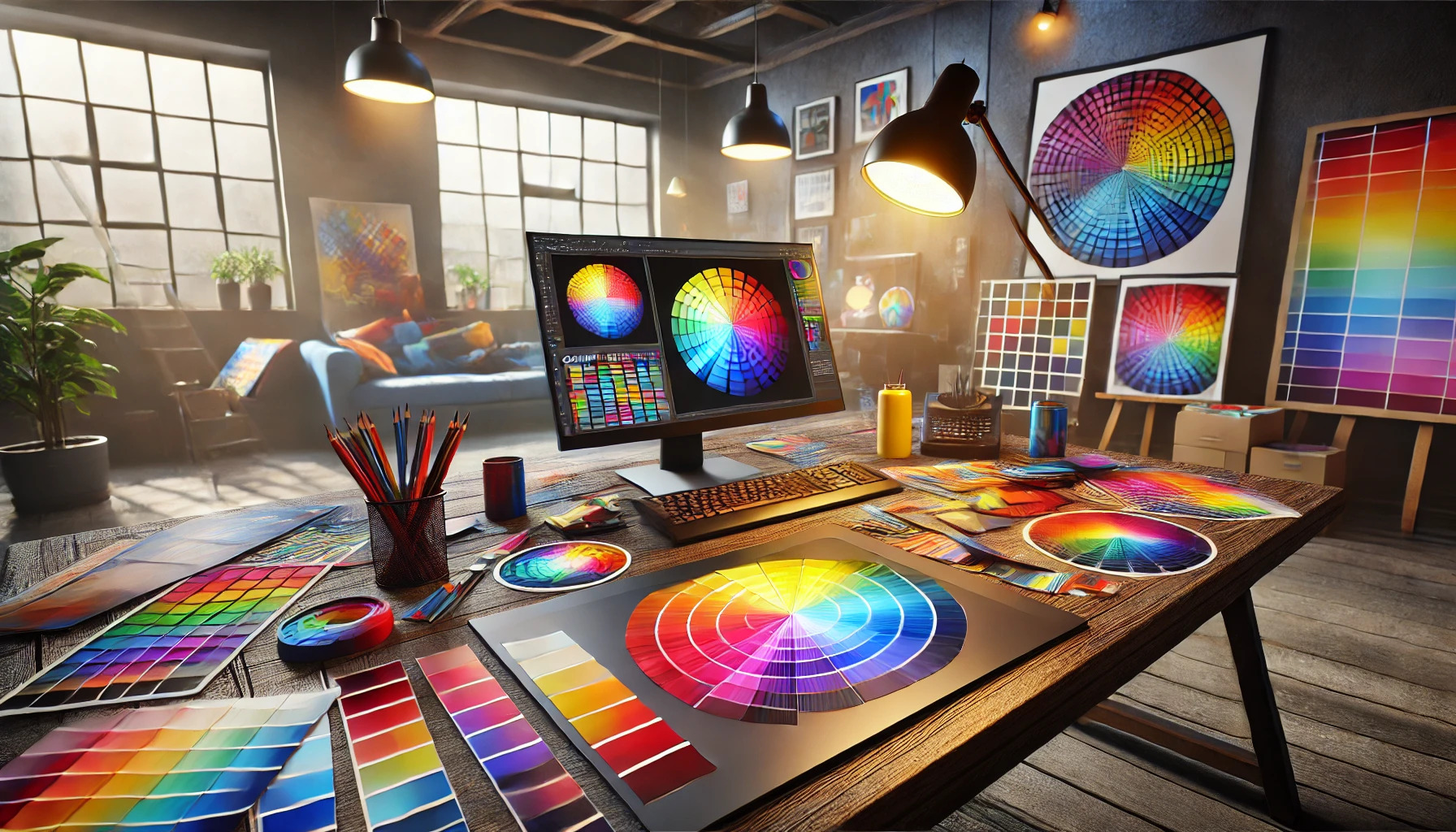
Understanding the Color Wheel
The color wheel is a visual tool that organizes hues around a circle. It typically includes primary, secondary, and tertiary colors.
- Primary colors (red, blue, yellow) cannot be created by mixing other colors.
- Secondary colors (green, orange, purple) are formed by mixing primary colors.
- Tertiary colors result from blending primary and secondary colors.
Using the color wheel, designers can see how colors relate and find combinations that work well together.
Defining Complementary Colors
Complementary colors are pairs of colors that sit opposite each other on the color wheel. When these colors are combined, they create a vibrant contrast.
For example:
- Blue and orange
- Red and green
- Yellow and purple
This contrast can make designs more dynamic and eye-catching. Complementary color schemes are often used to highlight important features or messages in design work.
Primary and Secondary Colors Relationship
Primary and secondary colors have a unique relationship that forms the basis of color theory.
- Primary colors are the building blocks of all other colors.
- Mixing two primary colors produces a secondary color.
The balance between these colors can create harmony or tension in a design. Designers often use this balance to guide viewers’ emotions and responses. By understanding this relationship, they can apply colors more effectively in their work.
Psychology of Complementary Colors
Complementary colors have a strong connection to emotions and cultural meanings. Understanding these aspects helps designers create impactful visual experiences.
Emotional Impact of Color Combinations
Colors can trigger specific feelings and responses. Complementary color pairs, like blue and orange or red and green, create a strong contrast that draws attention. This contrast can evoke emotions ranging from excitement to calmness. For instance, blue is often linked to tranquility, while orange can convey enthusiasm.
When combined, these colors can heighten emotional responses. A design using complementary colors can make a message feel more dynamic and engaging. Designers often use this approach to spark interest or to guide the audience’s emotions, making it a powerful tool in visual communication.
Cultural Significance of Colors
Cultural meanings of colors can vary widely across societies. For many cultures, certain colors carry specific connotations. For example, red often symbolizes luck and prosperity in Chinese culture, while in Western cultures, it can mean love or danger.
Using complementary colors thoughtfully can respect and honor these meanings. Understanding the cultural background of colors helps designers communicate more effectively. It ensures that the visual message resonates with a diverse audience, avoiding potential misunderstandings. Recognizing these nuances is key to effective design.
Complementary Colors in Design
Complementary colors play a key role in design by enhancing visual appeal and improving audience engagement. Understanding how to balance these colors, create harmonious contrasts, and choose the right palette can significantly impact design effectiveness.
Balancing Colors in Composition
Balancing colors in a design is crucial. Complementary colors, like red and green, create vivid contrasts that can draw attention.
To achieve balance, a designer might use one color as the dominant hue while employing the complementary color as an accent. This approach helps maintain visual interest without overwhelming the viewer.
For example, a website may feature a green background with red buttons. This not only balances the composition but also guides the viewer’s eye to key areas.
Color Harmonies and Contrast
Color harmonies are essential in creating pleasing visual experiences. Complementary colors, when paired correctly, can create a dynamic yet balanced look.
Using color contrast efficiently can help emphasize important elements. For instance, using a bright complementary color for calls to action can draw attention and encourage interaction.
Designers can also explore adjacent color schemes. Mixing a dominant color’s shades with its complementary counterpart can create depth without sacrificing harmony.
Choosing the Right Palette for Your Audience
Understanding the target audience is essential when selecting a color palette. Different colors evoke different emotions and responses.
For example, blue and orange can convey trust and enthusiasm, making them suitable for tech-related designs. In contrast, a palette of purple and yellow can present creativity and energy, ideal for artistic projects.
Testing color combinations helps gauge audience reactions. Designers can use tools to check how colors appear together and ensure they resonate with viewers.
Application in Various Design Fields
Complementary colors play a vital role in several design fields. They enhance visual appeal, guide user experience, and create a harmonious atmosphere. Here is how they apply across different areas.
Graphic Design and Branding
In graphic design, complementary colors are used to draw attention and convey brand messages. Designers can combine colors like blue and orange or red and green to create striking visuals. These color pairings help in making logos and advertisements pop.
For instance, using blue for trust and orange for enthusiasm can attract different audience emotions. Important elements, such as calls to action, can be highlighted using these vibrant contrasts. Consistent use of complementary colors strengthens brand identity, making it memorable for consumers.
Interior Design Essentials
Interior designers use complementary colors to create balance and style in a space. For example, pairing a soft blue with a warm orange can make a room feel inviting. It’s important to consider how these colors influence mood and perception.
Accent walls are a popular choice, where a bold color contrasts with muted tones. Textiles, such as cushions and rugs, can also utilize complementary colors to bring life to any room. The right combinations can enhance light and space, making smaller areas feel larger and more sophisticated.
Web Design and User Interfaces
In web design, complementary colors enhance user engagement and accessibility. Designers carefully select color combinations to improve readability and navigation. For example, using dark text on a light background creates a pleasant contrast that is easy to read.
Buttons and links often use complementary colors to stand out, guiding the user’s attention. Websites can benefit from maintaining a consistent color scheme throughout their pages to create a unified experience. Ensuring that contrast meets accessibility standards helps all users, including those with visual impairments, enjoy the content.
Techniques for Mixing and Matching Complementary Colors
Mixing complementary colors can enhance design and create visual interest. Understanding how to use these techniques helps in achieving harmony and balance in artwork or design projects.
Analogous vs. Complementary Schemes
Analogous colors are next to each other on the color wheel, while complementary colors are opposite. Using analogous colors creates a sense of serenity and unity. They work well in backgrounds or less prominent elements.
For example, if using blue, green, and yellow can create a calm atmosphere. In contrast, complementary colors, like blue and orange, add excitement and energy. Mixing these two schemes can help balance a design. Combining a strong complementary color with a softer analogous color can bring depth and focus.
Choosing the right balance between these schemes contributes to a well-rounded composition. Designers often experiment to find the right mix that resonates with the intended message.
Color Schemes for Visual Hierarchy
Establishing a visual hierarchy is essential in design. Complementary colors can serve to highlight key elements. For instance, one may choose a bold color for the main subject and a complementary shade for the background.
Using complementary colors strategically guides a viewer’s eye. This can encourage engagement with the content. A bright red paired with a dull green can signify urgency while keeping the overall look balanced.
Designers should also consider saturation levels. A highly saturated color can grab attention, while a muted complementary color can recede into the background. This technique enhances focus and ensures clarity in communication.
Experimenting with these principles helps in creating effective and appealing designs.
Working with Complementary Colors in Digital Tools
Digital tools offer powerful ways to work with complementary colors. By knowing how to use popular design software and online resources, designers can create appealing color schemes.
Photoshop and Illustrator Tips
In Photoshop and Illustrator, complementary colors play a vital role in design. First, select your base color using the color picker. From there, you can find its complementary color by looking at the color wheel. This can usually be done using color harmony tools available in these programs.
For example, if your primary color is blue, its complementary color is orange. Using layers, designers can create striking contrast by placing the dominant color against its complement.
To enhance the visual impact, try adjusting the opacity of the complementary layer. This allows the colors to blend harmoniously. Designers can also create gradients with complementary hues for a more dynamic effect.
Using Online Color Scheme Generators
Online color scheme generators are useful tools for selecting complementary colors quickly. These generators allow users to input a specific color and instantly get its complement.
Websites like Coolors and Adobe Color Wheel are popular choices. Users can explore various color combinations and see how they work together.
Quickly generating palettes helps designers visualize complementary colors in their projects. Additionally, many generators offer a “lock” feature, letting users keep their chosen colors while exploring others. This leads to great combinations that can boost project creativity.
Utilizing these tools can save time and improve design quality, making them essential for any designer looking to master complementary colors.
Challenges and Considerations
When using complementary colors, designers face unique challenges. It’s important to consider how different viewers might perceive color combinations in various contexts. This section looks at two main concerns: accommodating color blindness and ensuring color consistency across different media.
Dealing with Color Blindness
Color blindness affects a significant portion of the population. Many people cannot distinguish between certain colors, especially reds and greens or blues and yellows.
Designers should avoid relying solely on color to convey information. Instead, they can use different patterns or textures alongside color to help communicate messages clearly. For instance, labels or symbols can guide users regardless of their color vision.
Testing designs with color-blind individuals can provide valuable feedback. Utilizing tools that simulate color blindness can also help designers see how their color choices may appear to others.
Screen vs. Print: Color Consistency
Colors can look different on screens compared to printed materials. This inconsistency can pose a challenge for designers aiming for a specific visual effect.
To tackle this issue, designers should be aware of RGB and CMYK color modes. RGB is used for screens, while CMYK is for printing. Colors may appear brighter on screens and duller when printed.
Conducting a print test can help designers ensure colors align with expectations. Keeping a color reference guide handy is useful for matching colors across different formats.
Advanced Techniques
Understanding and applying complementary colors involves various advanced techniques. These methods enhance visual appeal and depth in design, particularly in film and photography.
Color Grading for Film and Photography
Color grading is crucial in film and photography. It adjusts colors to create mood, enhance aesthetics, and ensure consistency throughout a project. Complementary colors significantly impact this process.
For instance, using blue tones alongside orange can evoke a sense of coolness and warmth simultaneously. When found in shadowy scenes, blue can create tension, while orange adds vibrance to highlights.
Key Steps:
- Selection: Choose complementary colors that fit the story’s emotional tone.
- Adjustment: Use software tools to balance color intensity and saturation.
- Fine-Tuning: Apply color grading techniques in layering to ensure smooth transitions.
Practicing these steps can dramatically enhance the viewer’s experience.
Creating Mood with Complementary Shades
Complementary shades can transform a design by affecting viewers’ emotions. By mixing these colors wisely, designers can communicate different atmospheres.
For example, pairing red with green can create a vibrant, energetic scene, while blue with orange might suggest tranquility alongside excitement.
Tips for Effective Mood Creation:
- Contrast: Use high contrast between the colors to draw attention.
- Balance: Ensure one color does not overpower the other.
- Layering: Consider layering complementary colors in different opacities to create depth.