
Chartreuse is a vibrant color that blends green and yellow, creating a lively and eye-catching hue. This color represents enthusiasm, happiness, and freshness, making it a popular choice in design and art. Its unique tone not only grabs attention but also evokes feelings of energy and renewal.
Many people may not realize how color can influence emotions and thoughts. Chartreuse is often associated with spring and growth, symbolizing new beginnings. This makes it a great choice for spaces intended to inspire creativity and positivity.
Incorporating chartreuse into personal style or home decor can be a fun way to express personality. It stands out, drawing the eye and sparking conversation. Understanding the psychology behind this color can enhance its use and impact in everyday life.
Origins of Chartreuse
Chartreuse has a rich and colorful history, deeply rooted in art and culture. This section explores its historical significance and its presence in nature.
Historical Background
The name “Chartreuse” comes from a French liqueur created in 1764 by Carthusian monks. This liqueur’s unique greenish-yellow color drew attention and later inspired the name of the color itself. The drink is made from a blend of herbs and plants, which adds to its mystique.
Artists and designers have long been fascinated by this vibrant hue. It appears in various artworks and design pieces, symbolizing creativity and unconventional thinking. Chartreuse has also played a role in fashion and interior design, where its boldness makes a statement.
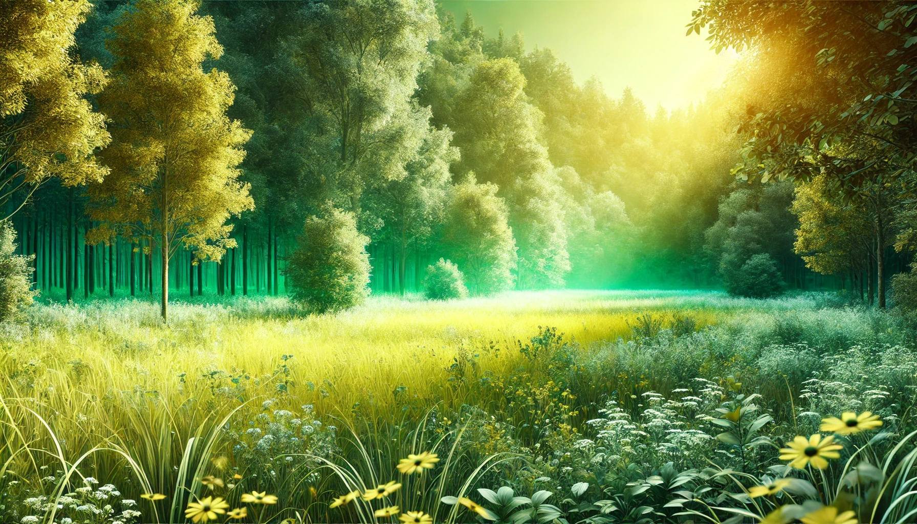
Chartreuse in Nature
In nature, chartreuse can be seen in many plants and flowers. Many springtime blossoms display this lively color, adding brightness to gardens. The leaves of young plants, such as certain types of hostas and ferns, often feature this striking shade.
Its presence in nature is not just visually appealing; it also signals health and growth. The color is often linked to renewal and vitality, making it a favorite in landscaping and nature-themed designs. Chartreuse adds a fresh feel to any outdoor space.
Chartreuse in Color Theory
Chartreuse holds a unique position in color theory, serving as a bridge between yellow and green. Understanding its placement and complementary relationships can provide insight into its impact in design and art.
Position on the Color Wheel
Chartreuse is located directly between yellow and green on the color wheel. This makes it a tertiary color, possessing qualities of both its neighboring hues.
Because of this position, chartreuse can create a vibrant and lively atmosphere. It is often associated with freshness, energy, and youthfulness due to its bright appearance. In design contexts, chartreuse adds a pop of color that can energize a composition, making it particularly appealing in trendy spaces, fashion, and advertising.
Complementary Colors
The complementary color of chartreuse is a shade of red-violet. This relationship creates a dynamic contrast that can enhance visual interest.
When paired together, chartreuse and red-violet can highlight each other’s vibrancy. This stark contrast can be utilized effectively in art and interior design. By incorporating elements of both colors, a balanced and modern look can be achieved. Additionally, using accents of neutral colors like gray or black can help to soften the overall visual impact while still showcasing the boldness of chartreuse.
Psychological Implications
Chartreuse is a unique color that evokes strong emotional responses and carries various cultural meanings. Understanding these implications can help individuals better relate to this vibrant hue.
Emotional Responses
Chartreuse tends to provoke a range of emotions. For many, it represents energy, creativity, and freshness. Its bright nature can uplift moods, making it an excellent choice for inspiring environments.
However, not everyone reacts positively. Some may find it overwhelming or chaotic, leading to feelings of anxiety or stress. It’s essential to consider these varied emotional responses when using the color in design or fashion.
In art and design, chartreuse can stimulate creativity. Artists often use it to encourage innovation or discussions. Its striking appearance draws attention, promoting engagement and interaction.
Cultural Associations
Chartreuse holds different meanings across cultures. In some places, it symbolizes growth, hope, and renewal. This connection often arises from its association with nature and vibrant life.
In fashion, chartreuse has a reputation for being bold and unconventional. Wearing it can signal an open-minded approach and willingness to stand out. This color choice often reflects a person’s unique identity.
Additionally, in certain cultures, chartreuse is linked to spirituality. It may represent enlightenment or awakening, urging individuals to explore deeper thoughts and feelings. These cultural associations make chartreuse a powerful color in various contexts.
Usage of Chartreuse in Design
Chartreuse is a vibrant color that can add a unique flair to design projects. It combines the calming effects of green with the energy of yellow, making it effective for various applications.
Visual Impact
Chartreuse is known for its strong visual presence. It can serve as a focal point in any design, drawing the viewer’s eye immediately. This color is often used in marketing materials to catch attention and create interest.
In fashion, chartreuse can make bold statements. It stands out against neutral backgrounds and complements other bright colors well. Designers use it to evoke feelings of excitement and optimism, appealing to a wide range of audiences.
Design Tips
When incorporating chartreuse into designs, using it as an accent color is highly effective. This allows it to pop without overwhelming the viewer. For instance, pairing it with darker shades like navy blue or charcoal can create a striking contrast.
Additionally, incorporating chartreuse in small details, such as buttons or graphics, can guide the viewer’s focus. Using chartreuse in moderation can enhance designs by adding vibrancy without causing distraction. It’s also helpful in branding, as chartreuse can symbolize creativity, making it a solid choice for companies looking to convey innovation.
Chartreuse in Fashion
Chartreuse is a vibrant color that has made a significant mark in the world of fashion. Its bold and eye-catching qualities make it a popular choice for various apparel and accessories. This color can be both striking and elegant, influencing how outfits are styled and perceived.
Apparel and Accessories
In apparel, chartreuse stands out prominently. Designers often use this color in dresses, blouses, and jackets to create a lively and fresh look. It can bring energy to casual outfits and sophistication to formal wear.
When it comes to accessories, chartreuse adds a fun twist. Handbags, hats, and shoes in this vibrant hue catch the eye and enhance any outfit. They can be used as statement pieces that draw attention without overwhelming the overall look.
Color Pairing in Fashion
Pairing chartreuse with other colors can create stunning visual effects. For a bold combination, it works well with shades like navy, black, and even certain pastels. This allows chartreuse to pop without competing for attention.
Additionally, it can be paired with complementary colors like purple or blue for a lively contrast. Many designers take advantage of these combinations to make outfits feel dynamic and exciting. Whether in clothing or accessories, chartreuse offers limitless style possibilities.
Impact on Marketing and Branding
Chartreuse is a vibrant color that can significantly influence brand perception and consumer behavior. Its bright and eye-catching nature helps brands stand out in a crowded market. Understanding its roles in brand identity and consumer reaction is essential for effective marketing.
Brand Identity
Chartreuse can play a crucial role in establishing a brand’s identity. This color combines the warmth of yellow and the coolness of green, making it unique and dynamic. Brands that use chartreuse often want to express creativity, freshness, and energy.
For example, companies in the eco-friendly sector may opt for chartreuse to convey sustainability and a connection to nature. This color can create a memorable logo and marketing materials that appeal to innovative, forward-thinking audiences. Choosing chartreuse can help a brand establish a modern and youthful appearance.
Consumer Reaction
Consumers often react strongly to colors, and chartreuse is no exception. It can evoke feelings of happiness and excitement. This reaction is particularly important in marketing, where emotions drive purchasing decisions.
Research shows that using chartreuse can increase attention and curiosity about products. Brands that incorporate this color in their advertising can attract a younger demographic. This makes it a great choice for items that are trendy or creative. By tapping into these emotional connections, brands can boost engagement and foster brand loyalty among consumers.
Influence of Lighting on Chartreuse
Lighting plays a crucial role in how chartreuse is perceived. The color can change dramatically depending on whether it is in natural light or under artificial sources. Understanding these effects helps in making informed decisions for design and decor.
Natural vs Artificial Light
Natural light tends to bring out the vibrancy of chartreuse. In daylight, the color shines with a fresh and lively energy. It appears more yellow in direct sunlight, enhancing its brightness and visual appeal.
Under artificial light, chartreuse can take on different qualities. Incandescent bulbs may give it a warm tone, making it look more muted. In contrast, LED lights can amplify its brightness, revealing the green undertones. It is essential to consider the type of lighting when choosing chartreuse for a space.
Color temperature significantly affects how chartreuse appears. Cooler light, like that from fluorescent bulbs, can make the color look sharper and more intense. This can create a lively atmosphere.
Warm light, however, softens the hue. In warmer settings, chartreuse might look more subdued. The shift in temperature alters the viewer’s perception, making it vital to match lighting with the desired ambiance.