
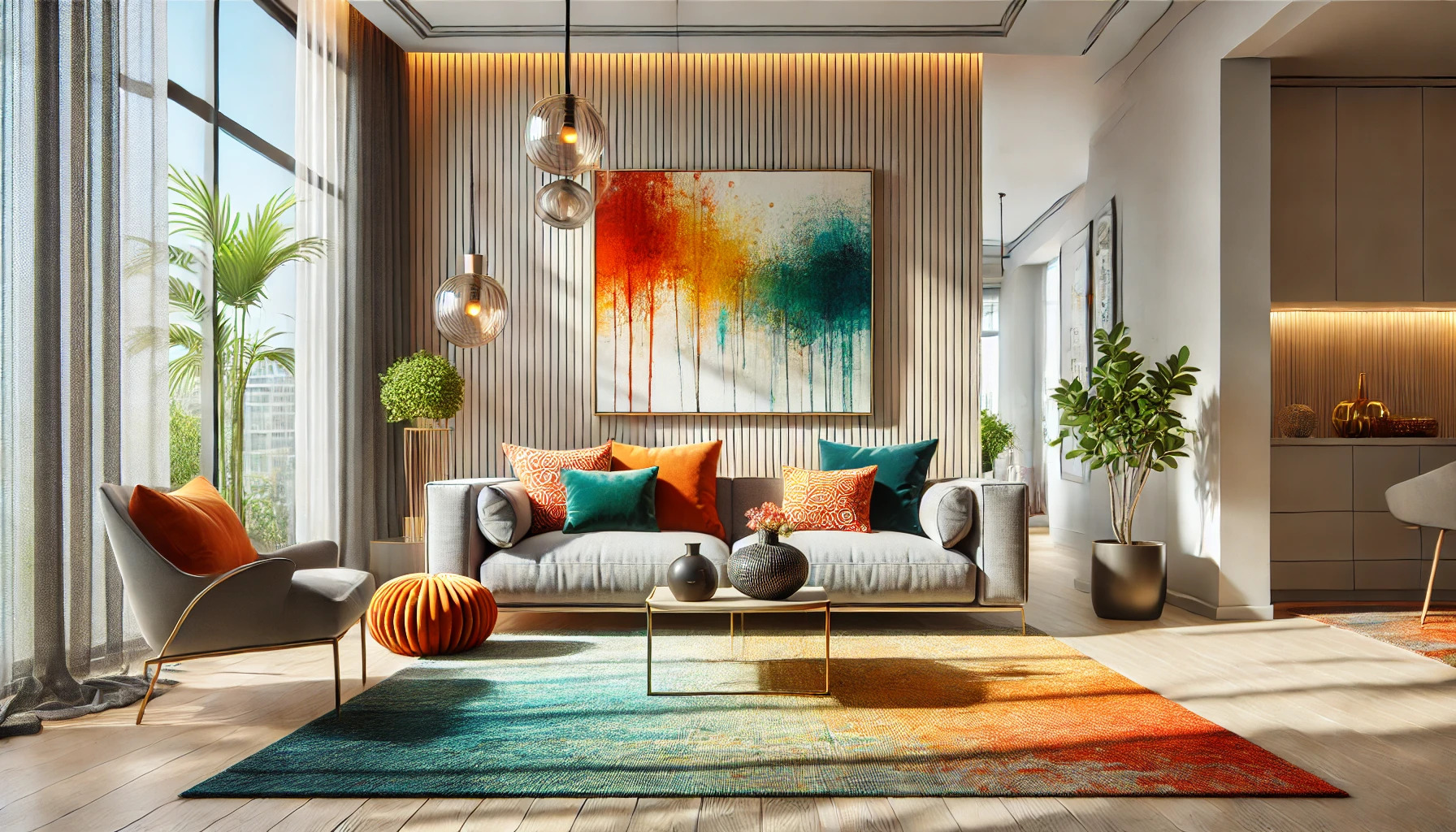
Adding bold accent colors to a room can transform its atmosphere, making it feel vibrant and inviting. To achieve this without overwhelming the space, one can start small by incorporating accent pieces like pillows, art, or rugs in a bold hue. These elements provide the pop of color needed while allowing for balance with the overall design.
Another effective approach is to follow the 60-30-10 rule, which suggests using 60% neutral colors, 30% a secondary color, and 10% an accent color. This strategy ensures that bold colors stand out without dominating the room.
Understanding how to mix and match colors effectively makes a significant difference. By selecting colors that complement each other and reflect personal style, a space can be both lively and harmonious. This creates a welcoming environment that energizes and inspires those who enter.
Understanding Color Theory
Color theory helps in choosing and using colors effectively in interior design. It guides how colors interact with each other and the mood they can create in a space.
Basic Color Schemes
There are several basic color schemes to choose from. Here are a few common ones:
- Monochromatic: This scheme uses different shades and tints of a single color. It creates a calm and cohesive look.
- Analogous: Colors that are next to each other on the color wheel create harmony. They blend well together and provide a gentle transition.
- Complementary: Opposite colors on the wheel, like blue and orange, create contrast. This combination can add energy to a room.
Choosing a scheme helps define a space’s style and feel.
Psychology of Colors
Colors can influence emotions and perceptions. Each color carries different meanings:
- Red: Often linked to energy and passion. It can make a space feel lively.
- Blue: Associated with calmness and tranquility. It’s a popular choice for bedrooms.
- Yellow: Brings happiness and warmth. It can brighten a room and uplift moods.
Understanding these meanings helps in selecting the right colors to set the desired atmosphere. Using color psychology effectively enhances the overall experience in any space.
Choosing Your Bold Accent Color
Selecting the right bold accent color is crucial for enhancing a space without it feeling chaotic. It’s important to assess the current color palette and consider how lighting and space will affect the chosen color. Each decision plays a role in achieving a balanced look.
Assessing the Current Palette
Start by looking at the existing colors in the room. Identify the dominant and neutral shades, as these will guide the selection of the accent color.
- Dominant Colors: These are the main colors used for walls or large furniture pieces.
- Neutral Shades: These include whites, grays, or beiges that help ground the space.
Opt for two to three bold accent colors that complement rather than clash with the current palette. For example, a vibrant navy can pair well with soft beige walls. Testing paint samples on the wall can help see how they interact with existing colors.
Considering Lighting and Space
Lighting is a major factor when choosing a bold accent color. Natural light can brighten bold colors, while low light may dull them.
- Natural Light: Colors appear more vibrant in sunlight.
- Artificial Light: The type of bulb can change how colors look in the evening.
Additionally, consider the size of the room. In smaller spaces, using one bold color in moderation can prevent overwhelming the area. Larger rooms can handle multiple bold accents.
By understanding both lighting and the size of the space, a person can make a more informed choice about which bold accent color will best enhance their environment.
Integrating Bold Colors with Neutrals
Using bold colors can be exciting, but finding the right balance with neutrals is essential. Neutrals allow vibrant tones to shine while keeping the space inviting and comfortable. Here are some practical ways to integrate bold colors harmoniously.
Balancing Colors
To balance bold colors, he or she might want to choose one or two accent shades. This strategy keeps the design cohesive. For example, a bright blue sofa can be paired with soft gray walls.
Using a 70-30 ratio can help as well. He or she could use 70% neutral colors and 30% bold hues. This ensures that bold colors enhance rather than overpower the room.
It’s helpful to introduce bold colors through smaller elements. Items like throw pillows, art, or rugs can bring in those vibrant tones without overwhelming the space. This way, it becomes easy to adjust the decor later if needed.
Neutral Background Tips
Creating a neutral background is key for showcasing bold colors. He or she might consider painting the walls in soft beiges, whites, or light grays. This simple step sets the stage for other vibrant elements to stand out.
Another effective tip is to use textures in neutral colors. For instance, incorporating textured fabrics like linen or cotton can add depth to a space.
Choosing furniture in neutral shades can also help maintain balance. A neutral couch allows for colorful cushions or throws that can easily be swapped out. This makes it easy to refresh the look without major changes.
Adding Accents Strategically
Adding bold accent colors to a space can create vibrancy and personality without feeling overwhelming. By using textiles and accessories wisely, and considering accent walls or furniture thoughtfully, anyone can achieve a balanced look.
Textiles and Accessories
Using textiles is a great way to incorporate bold colors. Throw pillows, blankets, and rugs can introduce vibrant accents while staying low-pressure.
Key Ideas:
- Select a few standout pieces in bold colors.
- Mix and match with neutral colors for balance.
Accessories like artwork and decorative items also add flair. They can be easily swapped or updated, allowing for flexibility.
Suggestions:
- Choose bright vases or colored candles.
- Hang a bold painting to add a focal point.
These elements can transform a room without dominating the entire design.
Accent Walls and Furniture
Accent walls can give a room a fresh look. One wall painted in a bold color can create depth without overwhelming the space.
Tips:
- Use lighter shades on adjacent walls for contrast.
- Consider temporary wallpaper for a fun pattern.
Bold furniture pieces such as a colorful chair or sofa can also make a statement.
Considerations:
- Pair them with neutral decor to avoid cluttering the space.
- Aim for one or two bold furniture pieces to ground the room.
This strategic approach allows for personality while maintaining harmony in the overall design.
Maintaining Harmony with Boldness
Balancing bold accent colors is essential to creating a cohesive look in a space. Thoughtful design choices can help maintain harmony while allowing vibrant elements to shine.
Flow Between Rooms
Creating a smooth flow between rooms enhances the overall feel. He or she can achieve this by using similar bold colors in different spaces. For example, a bright blue accent wall in the living room can be complemented by blue throw pillows in the adjacent dining area.
Using transitional colors can also help. They should choose a neutral shade that bridges both rooms while still allowing the bold color to stand out. This approach prevents visual disruption and creates a stylish connection throughout the home.
Repeating Color Elements
Repeating bold colors is key to achieving balance. She can incorporate the same vibrant hue in various decor elements. This might include using a striking red vase on a coffee table, red artwork on the walls, and red cushions on the sofa.
It is important to vary the shades and patterns of the repeated colors. Using different textures, like a plush throw or a sleek lamp, adds depth while keeping the look cohesive. This technique ties the space together, allowing boldness to be embraced without chaos.
Dos and Don’ts of Bold Accents
When using bold accent colors, it’s essential to know what enhances a space and what can make it feel chaotic. Keeping these dos and don’ts in mind will help create a balanced look that feels vibrant yet inviting.
Effective Use of Patterns
Using patterns can add a lot of personality to a room. When incorporating bold patterns, choose one or two standout pieces. This could be a statement rug or a set of vibrant throw pillows.
It’s helpful to mix patterns with caution. For instance, if you have a bold floral print, pair it with a simpler geometric pattern to keep things cohesive. Sticking to a similar color palette will create harmony across the space.
Remember, too much pattern can overwhelm a room, so it’s best to limit the number of bold prints. A well-placed pattern can draw attention without clashing with other design elements.
Avoiding Color Clashes
Choosing the right colors is key to avoiding clashes. Start by selecting a main color for your space, then choose one or two bold accent colors that complement it well.
Using a color wheel can help with this process. For example, pairing colors that are next to each other on the wheel creates a softer look. On the other hand, contrasting colors can energize a space.
Be cautious with too many competing colors. This can lead to a disjointed feel. To avoid this, balance bold colors with neutral shades. This allows the bold accents to pop without overwhelming the room.
Experimenting with Trends and Personal Style
Incorporating bold accent colors allows for creativity while maintaining a personal touch. Understanding current trends and reflecting individuality helps to create a balanced and engaging space.
Current Color Trends
Bright and bold colors are making a statement in home decor. Colors like deep emerald green, vibrant mustard yellow, and rich burgundy are popular choices right now. These shades add energy and warmth to any room.
When using bold colors, it’s important to consider how they fit into the overall design. They can shine as accent walls or through decorative pieces like cushions and rugs. Many decorators recommend the 60-30-10 rule. This means using a dominant color (60%), a secondary color (30%), and an accent color (10%) for balance.
Reflecting Individuality
Everyone has unique tastes, and using color is a great way to showcase that. Bold colors can express personality and style. For instance, a home filled with bright colors can reflect a lively spirit, while softer hues may hint at a more relaxed vibe.
To personalize a space, choose colors that resonate personally. Adding accessories like artwork or throw pillows featuring favorite colors can tie a room together. Mixing different textures, like velvet and linen, can also make a space inviting.