
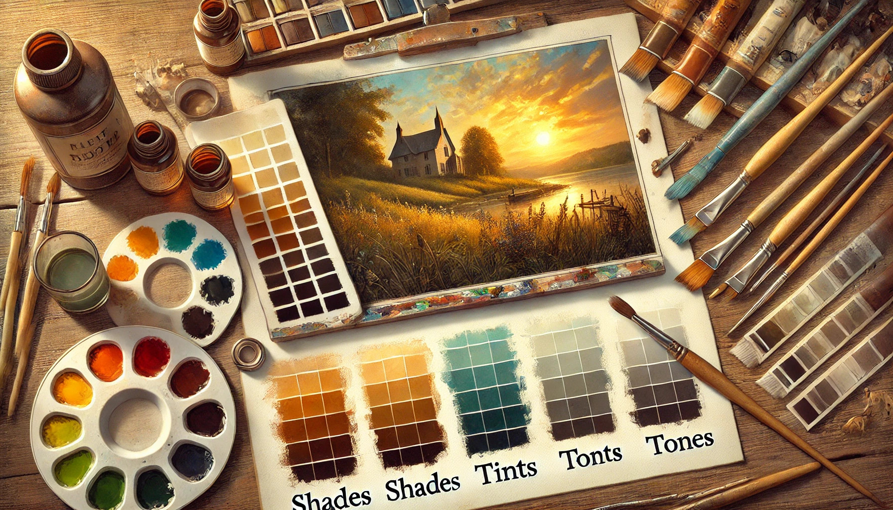
Adding depth to artwork can transform a flat image into a vibrant and engaging piece. To achieve this, artists can use shades, tints, and tones to create contrast and interest. Understanding these techniques allows them to guide the viewer’s eye and convey emotions more effectively.
Shades are created by mixing colors with black, resulting in darker, richer hues. Tints, on the other hand, involve adding white, creating lighter and softer variations. Tones are made by combining colors with gray, leading to more muted and complex shades.
By mastering these tools, artists can bring their creations to life and add layers of meaning. This blog post will explore practical ways to incorporate shades, tints, and tones into artwork, making it accessible for all skill levels.
Understanding Color Theory
Color theory is essential for artists to create depth and interest in their work. Knowing how colors interact helps in making informed decisions when using shades, tints, and tones.
The Color Wheel Basics
The color wheel is a visual tool that shows how colors relate to each other. It is often divided into primary, secondary, and tertiary colors.
- Primary Colors: Red, blue, and yellow are the building blocks. They cannot be created by mixing other colors.
- Secondary Colors: These are made by mixing primary colors, such as green (blue + yellow), orange (red + yellow), and purple (red + blue).
- Tertiary Colors: These result from mixing a primary with a secondary color, like red-orange or blue-green.
Artists use the color wheel to find harmony and contrast in their artwork. Familiarity with its layout leads to better color choices.
Meaning of Shades, Tints, and Tones
Understanding shades, tints, and tones is vital for adding depth. Each plays a unique role in the visual impact of colors.
- Shades: Created by adding black to a base color, shades darken the original hue. This adds depth and richness.
- Tints: By adding white, tints lighten the color, creating a softer appearance. Tints can make artwork feel airy or light.
- Tones: Adding gray reduces brightness, creating a muted effect. Tones allow for more subdued variations, giving the artist more control over the mood.
By mastering these concepts, artists can enhance the dimensionality of their works.
Color Relationships and Harmonies
Color relationships highlight how colors interact. Understanding these can elevate an artist’s work.
- Complementary Colors: Opposite each other on the color wheel, like red and green. They create vibrant contrasts.
- Analogous Colors: Next to each other, such as blue, blue-green, and green. They blend well, creating serene designs.
- Triadic Colors: Three colors evenly spaced on the wheel, like red, yellow, and blue. This scheme can make artwork dynamic and balanced.
Using these relationships thoughtfully helps create pleasing compositions. They guide artists in making choices about color schemes that suit their vision.
Materials and Tools for Adding Depth
Using the right materials and tools can greatly enhance the depth in artwork. Choosing the right medium and essential art supplies makes a significant difference in how effectively shades, tints, and tones convey depth and dimension.
Choosing the Right Medium
Different art mediums can create various effects when adding depth. For example, acrylics dry quickly and allow for layering, making them ideal for creating depth through multiple shades. On the other hand, oil paints offer a rich blendability, enabling smooth transitions between colors and depth.
Watercolors can also be effective, especially when layering washes for transparent depth. Pastels work well, too, as they can produce vibrant tones and interesting textures. Each medium has unique qualities that can enhance the depth perception in the artwork. Choosing the right one depends on the artist’s style and desired outcome.
Essential Art Supplies
The tools an artist uses are just as important as the medium itself. Brushes come in various shapes and sizes. Flat brushes are great for broad strokes, while round brushes are perfect for detail. Artists should also stock up on sponges for texturing and blending.
Palette knives are essential for mixing paints and creating unique textures. Additionally, a good set of pencils for sketching outlines can help establish depth early in the process. Finally, having a reliable sharpener and appropriate paper or canvas is crucial to achieving the best results. With these supplies, artists can effectively explore depth in their works.
Shades: Adding Darkness to Your Palette
Shades can dramatically transform the look of art. By mixing colors with black, artists create richer, deeper tones that add dimension to their work. This section explores how to mix and apply shades effectively, as well as how to use them for creating realistic shadows.
How to Mix and Apply Shades
To create shades, an artist starts with a base color and gradually adds black. It’s helpful to begin with a small amount of black. This ensures the color doesn’t become too dark too quickly.
Steps to Follow:
- Select a Base Color: Choose the color you want to deepen.
- Add Black Gradually: Mix in a tiny bit of black and observe the effect.
- Test the Shade: Apply the mixture on paper to see how it looks when dried.
This process allows for control over darkness. By mastering this technique, artists can achieve a variety of shades perfect for their projects.
Creating Depth with Shadows
Shades play a crucial role in creating shadows in artwork. To convey depth, an artist uses darker shades where shadows naturally occur.
Key Areas to Focus On:
- Light Source: Understand where light is coming from. This guides where to place shadows.
- Layering Shades: Start with a mid-tone color and layer shades progressively darker.
This method creates a realistic sense of depth. Using shades effectively can bring life to a painting, making objects appear three-dimensional.
Tints: Introducing Lightness
Tints are a great way to add lightness and brightness to artwork. By mixing colors with white, artists can create soft variations that enhance their pieces in unique ways. This section explores how to mix tints for high key effects and how to layer light over darker colors for added depth.
Mixing Tints for High Key Effects
Mixing tints involves adding white to a color to create a lighter shade. This technique is perfect for achieving high key effects in art. High key works feature brighter colors, giving a fresh and airy feel to the piece.
To mix tints successfully, an artist starts with their base color. They can gradually add white until they reach the desired lightness. Keeping a separate palette for lighter tints helps in seeing how they work together.
Artists should consider the balance of colors when applying tints. Using lighter hues can evoke feelings of joy and tranquility, making them excellent choices for landscapes and floral artworks. Experimenting with different ratios can lead to stunning results.
Layering Light Over Dark
Layering light tints over darker shades can create a beautiful contrast in artwork. This technique works particularly well in illustrating light and shadow. When done carefully, it adds dynamism and depth to the overall composition.
To layer effectively, an artist should start with a dark base. After the base dries, they can apply tints to highlight specific areas. This can enhance the feeling of light striking a surface, like sunlight on water or a person.
Choosing the right brush is important for layering. A soft brush can create smooth transitions, while a stiffer brush can make defined marks. Artists can also experiment with different pressures to achieve various effects, making their pieces more captivating.
Tones: The Role of Desaturation
Tones play a vital role in art by adding depth through desaturation. By mixing colors with gray or varying levels of black and white, artists can create nuanced, subdued shades that enhance their work’s richness and complexity.
Blending Colors for Subtlety
Blending colors to create tones involves adding gray to a hue. This process softens the color, resulting in a muted shade that is less vibrant but more harmonized with other colors.
By using this technique, artists can convey emotions more effectively. For example, a softer blue tone may evoke calmness, while a more intense blue might feel overwhelming.
To achieve subtlety, artists can also blend colors on the canvas, layering them until the desired tone is reached. This method allows for greater control and helps in creating depth.
Neutral Tones for Balance
Neutral tones are essential for balancing vibrant colors in a composition. They include shades of gray, beige, and soft browns. These tones can ground a piece, making brighter colors feel more cohesive.
Artists can use neutral tones to guide the viewer’s eye throughout the artwork. For instance, a neutral background can make colorful subjects stand out, enhancing their impact.
In practice, mixing colors with a small amount of gray helps achieve neutrals. This process is crucial when aiming for a sophisticated and polished look in artwork. By using neutral tones wisely, the artist can establish a strong visual foundation.
Techniques for Realistic Depth
Creating realistic depth in art involves using techniques that enhance the illusion of three-dimensional space. Two important methods are utilizing gradients and transitions in color, and effectively playing with light through highlights and reflections. These techniques can transform flat images into dynamic and engaging works.
Gradients and Transitions
Gradients can create a smooth transition between colors, helping to suggest depth. Artists often use this technique by blending colors from light to dark. For example, in landscape painting, the sky may transition from a light blue at the horizon to a deeper blue overhead.
In portraits, gradual shading around the face adds realism, making features appear more three-dimensional. Blending can be achieved with tools like brushes or even fingers for softer effects. Artists should focus on where light hits and the shadows it creates to enhance depth through these gradual shifts.
The Play of Light: Highlights and Reflections
Highlights are essential for conveying the effects of light in art. They indicate where light directly hits an object, creating a sense of volume. For example, on a shiny surface like a glass, artists place bright spots to simulate the reflection of light.
Reflections add another layer of complexity. They help to ground an object within its environment. When painting water, artists use soft, wavy strokes to represent how light reflects off the surface. This method draws the viewer’s eye and enhances the realism of the artwork.
Combined, these techniques create a rich, immersive experience, inviting viewers to engage more deeply with the art.
Composing with Contrast
Contrast plays a vital role in creating depth and interest in art. Strategic use of high contrast can draw the viewer’s attention, while balancing elements helps maintain harmony in the composition.
Strategic Use of High Contrast
High contrast can make certain elements pop within a piece. For instance, pairing light colors against dark backgrounds creates visual excitement. Artists often use this technique to highlight focal points, guiding the viewer’s eye to where it matters most.
Using complementary colors can also enhance contrast. For example, a bright red against a cool green can create a striking effect. Artists should experiment with these combinations to see how they affect the piece’s mood and energy.
High contrast should be used thoughtfully. Too much can overwhelm the viewer, while just enough can create a dynamic balance.
Balancing Your Composition
Balance in an artwork is essential for creating visual stability. If one side is too busy or dark, it can distract from the focal point. Artists can create balance by distributing lighter and darker elements evenly throughout the piece.
One effective method is to use a color wheel to find complementary colors. This ensures there is enough contrast without creating chaos. Artists can also consider the size of elements; larger dark areas might need lighter, smaller components nearby to achieve balance.
Color Schemes for Cohesion
Choosing a color scheme is essential for a harmonious piece. Artists can use various schemes like complementary, analogous, or monochromatic colors.
-
Complementary Colors: These are opposite each other on the color wheel, such as blue and orange. They create a vibrant contrast.
-
Analogous Colors: These colors sit next to each other on the wheel, like red, orange, and yellow. They provide a serene effect.
-
Monochromatic Schemes: This involves different shades and tints of a single color. It creates unity and a subtle depth.
Using these schemes can tie together elements in a painting. They guide the viewer’s eye and create a sense of balance.
Connecting Elements in a Scene
To enhance harmony, it’s crucial to connect the elements in a scene. This can be achieved through repetition and consistency.
-
Repetition: Repeating shapes, colors, or patterns in various parts of the artwork creates a cohesive look. For example, if an artist uses circular shapes in one area, adding more circles elsewhere strengthens the design.
-
Consistency: Keeping the same style or technique across different elements can unify the piece. If an artist chooses a specific shading technique, applying it throughout can enhance depth and cohesion.
By focusing on these connections, artwork can become more engaging. This approach helps viewers feel a sense of completeness within the piece.