
Balancing light and dark colors in fashion can transform an outfit from ordinary to striking. Many people struggle with how to combine these contrasting hues effectively. To create harmony in any look, one should aim for a balanced mix that enhances the overall style and achieves visual interest.
Understanding the impact of lighting and color values is essential for styling outfits. Light colors can make a look feel airy and fresh, while dark colors add depth and sophistication. By choosing the right ratio of light and dark pieces, anyone can elevate their wardrobe effortlessly.
Fashion isn’t just about choosing colors; it’s about how they work together. By incorporating accent pieces that reflect the chosen color intensity, outfits can feel cohesive and well-thought-out. Embracing the right techniques will make anyone confident in their ability to style light and dark colors beautifully.
The Basics of Color in Fashion
Color plays a vital role in fashion styling. By understanding color theory and the color wheel, anyone can create better outfits that balance light and dark colors effectively.
Understanding Color Theory
Color theory is a way to understand how colors work together. It involves concepts like complementary, analogous, and monochromatic colors.
- Complementary Colors: These are opposite each other on the color wheel, like blue and orange. Combining these can create a bold look.
- Analogous Colors: These sit next to each other on the wheel, such as blue, blue-green, and green. They offer a softer, harmonious style.
- Monochromatic Colors: These involve different shades or tints of the same hue. For instance, wearing light and dark shades of blue can create depth without overwhelming the viewer.
This knowledge helps in making informed fashion choices.
Color Wheel and Fashion
The color wheel is a visual tool that shows how colors relate to one another. It helps in selecting colors that will work well together.
- Primary Colors: Red, blue, and yellow are the main colors that cannot be made from other colors.
- Secondary Colors: Mixing two primary colors creates secondary colors like green, orange, and purple.
- Tertiary Colors: These are made by mixing a primary color with a secondary color.
Using the color wheel, one can see which colors bring out the best in an outfit. For example, pairing light colors with dark can provide contrast and balance. Choosing the right balance ensures a polished look.
Striking the Balance
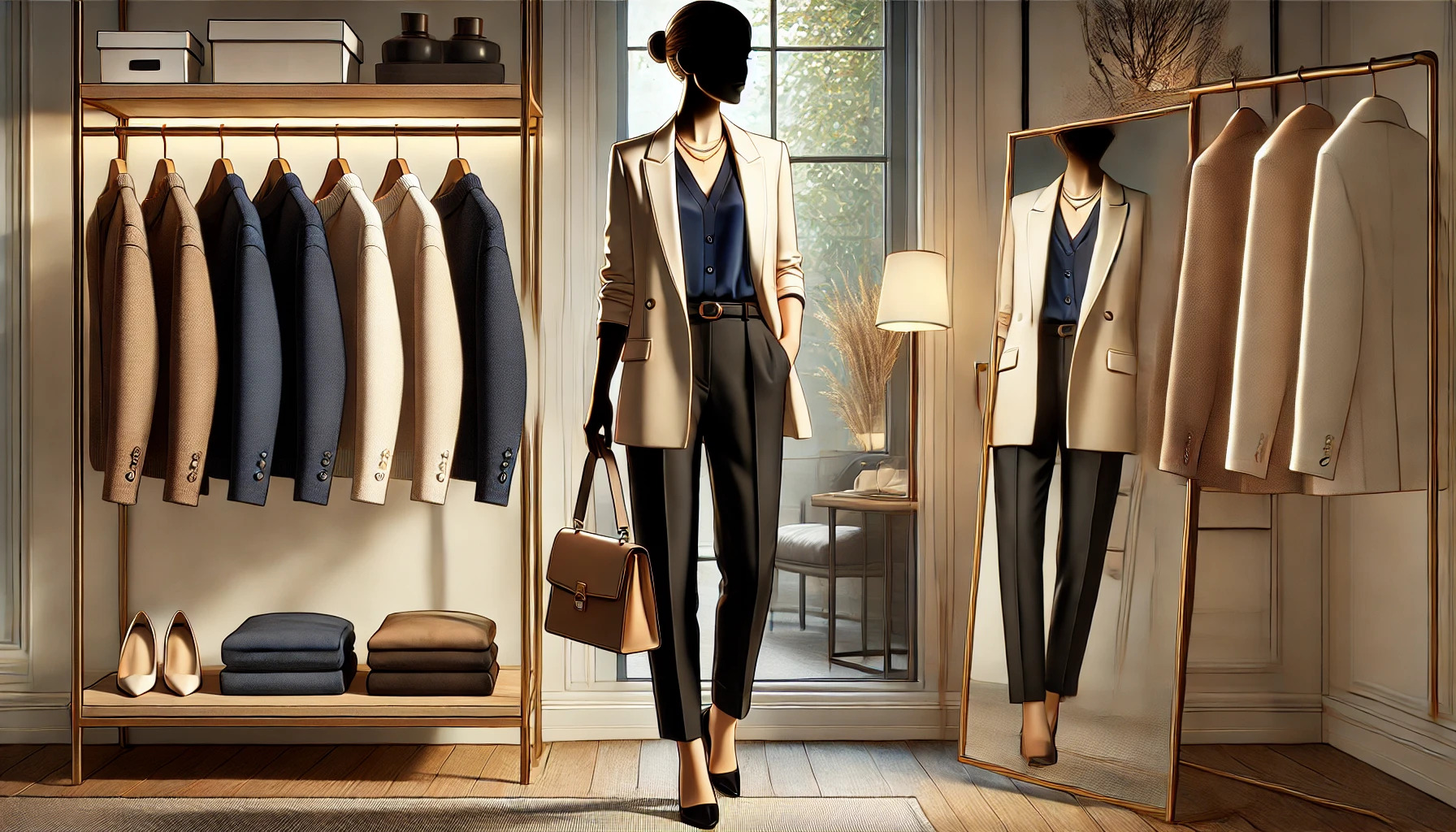
Balancing light and dark colors in fashion can create visually appealing outfits. Understanding how these colors interact with one another is key to mastering style. This section explores the definitions of light and dark colors, their impact on silhouette, and how to achieve contrast and harmony.
Defining Light and Dark Colors
Light colors include shades like pastels, whites, and light neutrals. These colors tend to reflect more light, making them feel airy and fresh.
Dark colors, on the other hand, include blacks, deep blues, and rich jewel tones. They absorb more light and often convey a sense of sophistication.
Finding the right balance means mixing these colors effectively. For example, pairing a pale blouse with dark jeans creates an appealing look.
The Impact of Color on Silhouette
Colors play an important role in shaping how an outfit is perceived. Light colors can make a person appear larger, while dark colors tend to have a slimming effect.
For instance, someone might choose a light top to draw attention upwards, combined with dark bottoms to emphasize a sleek silhouette.
Layering works well too. Wearing a darker jacket over a lighter dress adds interest while maintaining a balanced look.
Contrast and Harmony
Creating striking outfits requires an understanding of contrast and harmony. High contrast, such as a black and white ensemble, grabs attention and makes a bold statement.
In contrast, softer combinations, like a light top paired with medium-colored pants, promote a more subtle look.
It’s important to pay attention to texture and patterns as well. Mixing a dark patterned skirt with a solid light top can enhance the balance while adding visual interest.
By experimenting with different combinations, anyone can find their perfect balance of colors in fashion.
Color Coordination Techniques
Balancing light and dark colors is essential in fashion styling. Different color coordination techniques can help achieve a harmonious look, making outfits visually appealing. Here are some effective methods to use when coordinating colors.
Monochromatic Looks
A monochromatic look uses different shades and tints of a single color. This method creates a cohesive and sophisticated appearance. For example, wearing various shades of blue—like navy pants, a lighter blue shirt, and sky-blue accessories—brings depth to the outfit.
When using this technique, it’s helpful to mix textures. Combining denim with silk can create interest while staying within the same color family. To add more dimension, one can play with accessories that feature patterns within the chosen color palette, enhancing the overall effect without overwhelming the outfit.
Analogous Color Schemes
Analogous color schemes involve three colors that sit next to each other on the color wheel. This technique offers a sense of harmony and balance. For instance, pairing blue, teal, and green creates a fresh look perfect for spring.
To successfully use this scheme, select a dominant color and allow the others to serve as accents. Incorporating patterns can also tie the look together, as seen in floral prints that include the chosen colors. This method is user-friendly, making it suitable for anyone looking to step up their color game without clashing.
Complementary Color Schemes
Complementary color schemes use colors that are opposite each other on the color wheel. This approach leads to vibrant and eye-catching outfits. For example, pairing blue with orange can create a striking contrast that draws attention.
A good way to balance complementary colors is to use one as the dominant shade and the other as an accent. For instance, a blue dress can be accented with an orange handbag or shoes. This keeps the outfit from being overpowering while still offering a bold statement.
The Role of Textures and Fabrics
Textures and fabrics play a vital role in fashion styling, especially when balancing light and dark colors. Choosing the right textures and weights can enhance an outfit’s visual appeal and add depth. Understanding these elements helps in creating a harmonious look.
Textural Contrasts
Mixing different textures creates interest in an outfit. For instance, pairing a soft velvet top with a structured denim jacket adds dimension. This contrast keeps the eye engaged and elevates the overall style.
A few examples of textures to consider include:
- Smooth: Fabrics like silk or satin that reflect light.
- Rough: Textiles like tweed or denim that absorb light.
- Shiny: Like sequins or metallics that add sparkle.
These textural differences can highlight both light and dark colors effectively. A shiny fabric against matte offers a striking contrast that draws attention.
Fabric Weights and Colors
The weight of a fabric influences how colors are perceived. Heavier fabrics often have a more subdued look, while lighter fabrics can appear brighter. For example, a thick wool sweater may absorb light, making dark colors appear richer.
When mixing fabrics, it’s essential to consider their draping quality. Fabrics like chiffon or silk flow beautifully and can soften the appearance of darker pieces. A layered look using different fabric weights contributes to a more dynamic outfit.
Understanding these aspects ensures a well-balanced combination of light and dark colors.
Light and Dark in Seasonal Styling
Balancing light and dark colors is essential in seasonal styling. Different seasons call for various color palettes that enhance personal style. Understanding how to mix these colors can freshen an outfit and suit changing weather.
Seasonal Color Palettes
Each season has its unique color palette that mixes light and dark shades. For example, winter often features high contrast, combining deep colors like navy or black with bright whites or icy pastels. This approach creates a striking look.
In spring, light and vibrant colors take the spotlight. Think about soft pastels paired with deeper accents to maintain a fresh, lively appearance. Summer has a blend of light colors that harmonize, while autumn embraces rich, warm tones. Using colors that represent their season can enhance outfits and boost confidence.
Transitioning Between Seasons
Transitioning between seasons requires careful thought about color choices. As winter shifts into spring, lighter shades can replace heavier dark colors. This change can involve incorporating light blues or greens to uplift typical winter wear.
During autumn, layering techniques work well. For instance, a dark sweater can pair nicely with lighter scarves or accessories. This balance not only creates warmth but also adds interest to the outfit.
When moving into summer, opting for lighter fabrics with vibrant patterns is ideal. It keeps the look bright and fresh, while still offering some contrast through accessories. Knowing how to blend these shades offers versatility in styling throughout the year.
Accessorizing with Light and Dark Hues
Accessories play a crucial role in bringing balance to outfits that feature light and dark colors. By carefully choosing and balancing these items, one can create a stylish and cohesive look.
Choosing the Right Accessories
When selecting accessories, consider how they interact with both light and dark colors. For outfits with dark hues, gold or metallic accessories can add a touch of brightness. For lighter outfits, deep colors like navy or burgundy in accessories can create a nice contrast.
Tips for Choosing Accessories:
- Jewelry: Pair silver with light colors and gold with dark shades.
- Bags: A light-colored bag can brighten up a dark outfit, while a dark bag can ground a lighter look.
- Shoes: Light shoes can soften dark wardrobes, while dark footwear anchors lighter outfits.
Balancing Accessories with Outfits
Balancing accessories is essential for achieving a polished appearance. Too many bold accessories can overwhelm an outfit. It’s important to ensure that accessories complement rather than compete with the outfit’s main colors.
Key Balancing Techniques:
- Limit Bold Pieces: Pick one or two statement accessories at most.
- Use Neutral Colors: Incorporate accessories in neutral tones to maintain balance.
- Create Visual Interest: Mixing textures adds depth without heavy color contrasts.
By thoughtfully selecting and balancing accessories, one can enhance any outfit with light and dark colors.
Influence of Lighting on Outfit Colors
Lighting plays a crucial role in how colors are perceived in fashion. The type of light—whether natural or artificial—can greatly affect how an outfit appears. Understanding these differences helps in making stylish choices.
Indoor vs. Outdoor Lighting
Indoor lighting often includes various sources such as incandescent, fluorescent, or LED lights. Each type casts a different hue and can alter the appearance of colors. For example, incandescent bulbs produce a warm, yellowish glow, which can make colors look richer and deeper.
In contrast, outdoor lighting varies with the time of day and weather. Natural daylight, especially during morning or late afternoon, presents colors in their true form. Overcast days can soften brighter colors, while direct sunlight can wash out certain shades. Choosing outfits that complement the type of lighting can enhance overall style.
Color Perception in Different Lighting
Colors can appear entirely different under various lighting conditions. For example, a dark navy may look black in low light but vibrant under bright light. This can make a big difference when selecting outfits for events.
When dressing for a specific occasion, it is beneficial to test the outfit in the intended lighting. She or he should try to see how colors change from day to night. Using reflective surfaces, like mirrors, can also help visualize how an outfit may appear in different lights.
Styling for Different Body Types
In fashion styling, choosing the right colors can enhance individual features and maintain a sense of balance. Understanding how to use light and dark colors effectively can help to flatter different body shapes and create an overall harmonious look.
Highlighting Features with Colors
Choosing the correct colors can bring attention to a person’s favorite features. For those wanting to accentuate their waist, opting for dark colors on the bottom and lighter shades on top can create a beautiful hourglass effect.
Conversely, if someone wants to draw attention to their legs, bright or light colors are ideal for trousers or skirts. For curvier body types, dark, solid colors can help to streamline the figure.
Accessories in bold colors can also highlight particular features. A bright necklace or scarf can draw the eye upward, making the overall outfit more balanced.
Visual Balance and Proportion
Balancing light and dark colors is essential for creating visual harmony. If a person has a pear-shaped body, they might prefer dark colors for the lower half. This approach minimizes the hips while using lighter shades on top to draw focus to the shoulders.
For rectangle body types, styling with colors that create curves is beneficial. Mixing dark and light shades can help to add dimension and shape.
Using patterns can also assist in achieving visual balance. For example, a light-patterned top paired with dark, solid bottoms can enhance overall proportions and create a well-rounded look.
Creating Personal Style with Color
Finding a personal style using color can be a fun way to express individuality. By identifying the right colors and experimenting with different combinations, anyone can create outfits that reflect their personality.
Identifying Your Color Palette
To start, a color palette is key to creating unique outfits. Individuals should look for colors that complement their skin tone and hair color. For example, warm skin tones often look great in earthy colors like oranges and yellows, while cool tones may shine in blues and purples.
A simple way to find a personal palette is to create a mood board. This can include images, fabric swatches, or paint chips. Once they have a selection of colors, they can see which ones work best for them.
It’s also useful to narrow the palette down to 3-5 main colors. This makes it easier to mix and match items in the wardrobe. Choosing a dominant color with a couple of accent colors can create a balanced and eye-catching look.
Experimenting with Light and Dark
Mixing light and dark colors is essential for creating depth in outfits. Light colors can bring brightness, while dark shades add contrast. Together, they create a more dynamic ensemble.
A good approach is to use the 70-30 rule. This means using one color for 70% of the outfit and a contrasting color for the other 30%. For instance, combine a light top with dark pants. This technique ensures the outfit is visually appealing without being overwhelming.
Additionally, layering can enhance the effect of light and dark colors. A light jacket over a darker top can add interest. Accessories like belts or scarves allow for small pops of color, balancing the overall look while allowing space for personal style.