
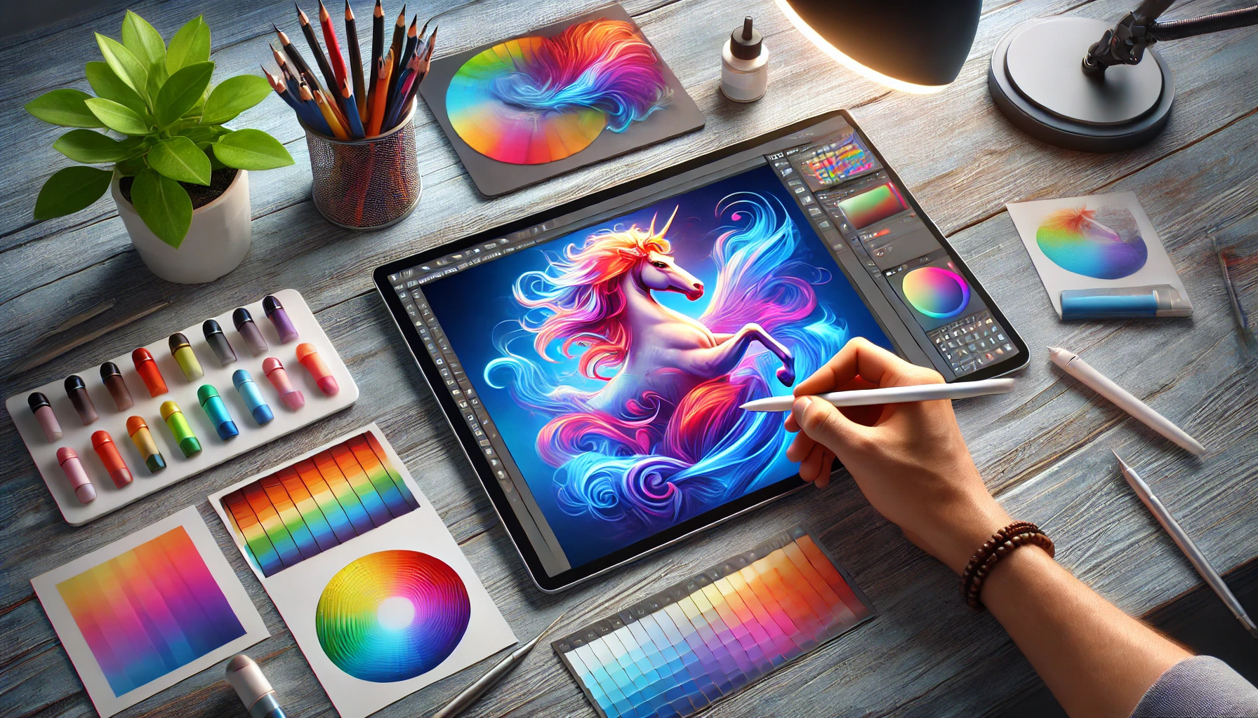
Blending colors seamlessly in digital illustrations can elevate any artwork. By mastering a few essential techniques, artists can create smooth transitions and dynamic effects that truly bring their pieces to life. Understanding how to work with color, tools, and techniques plays a vital role in achieving polished results.
Creating beautiful gradients and blends enhances the overall appeal of an illustration. Artists who utilize tools like the Gradient tool in programs such as Adobe Illustrator can make their work pop. By starting with a solid grasp of color theory and practice, anyone can improve their blending skills and artistic expression.
Whether beginners or seasoned digital artists, everyone can benefit from learning color blending techniques. With some patience and practice, the results can be both impressive and satisfying. This journey into seamless color blending is sure to inspire creativity and innovation in digital art.
Understanding Color Theory
Color theory is a vital part of creating effective digital illustrations. It helps artists understand how colors interact, which can lead to more compelling artwork. Knowing the basics of the color wheel, color harmonies, and color values can improve blending techniques.
Color Wheel Basics
The color wheel is a tool that shows how colors relate to each other. It typically features primary colors (red, blue, yellow), which cannot be made by mixing other colors. From these, artists can create secondary colors (green, orange, purple) by combining two primary colors.
Additionally, tertiary colors are formed by mixing primary and secondary colors. Placing colors strategically on the wheel helps artists see relationships. Colors opposite each other are called complementary colors, which create strong contrast. Understanding the color wheel allows artists to select colors that naturally work well together, enhancing their illustrations.
Color Harmonies
Color harmonies refer to the pleasing combinations of colors. They can create a specific mood or emotion in artwork. Here are a few types of color harmonies:
- Complementary Harmony: Uses two colors opposite each other on the wheel, creating high contrast.
- Analogous Harmony: Involves three colors that are next to each other, offering a serene look.
- Triadic Harmony: Features three evenly spaced colors, providing vibrancy while maintaining balance.
Choosing the right harmony can help convey the desired feeling. For instance, complementary colors can highlight important elements, while analogous colors can create a sense of unity and calm.
Color Values and Saturation
Color value refers to the lightness or darkness of a color. It adds depth and dimension to illustrations. Tints are created by adding white to a color, making it lighter. Shades are formed by adding black, which results in a darker hue.
Saturation describes the intensity of a color. A color can be vibrant when saturated or more subdued when less saturated. Understanding how to adjust value and saturation allows artists to blend colors smoothly. For example, lower saturation can create soft transitions, enhancing the blending process in digital art. This control enables artists to craft visually appealing illustrations with depth and variety.
Setting Up Your Workspace
Creating an effective workspace is crucial for blending colors seamlessly in digital illustrations. A well-set workspace can enhance creativity and efficiency. Here are some key aspects to consider.
Choosing the Right Software
Selecting the right software makes a big difference in the blending process. Popular choices include Adobe Photoshop, CorelDRAW, and Krita. Each has unique tools and features.
Photoshop is equipped with various brush options and blending modes. CorelDRAW offers a blending tool for smooth transitions. Krita is excellent for brush customization and supports high-resolution canvases.
Choosing software that fits the artist’s needs allows for smoother blending and better results in artwork.
Customizing Brushes for Blending
Customizing brushes is vital for achieving smooth blends. Most digital art programs allow users to modify brush settings.
A soft round brush is a great starting point. Adjusting opacity and flow can help create smooth transitions. Artists often set the opacity low, allowing for gradual color blending.
Using a textured brush can also enhance the effect. It adds depth and character to the artwork. Experimenting with different settings can lead to unique blending styles.
Working with Layers
Working with layers is an essential technique in digital art. By using layers, artists can separate different elements of their artwork. This makes it easier to adjust colors without affecting the whole piece.
For blending, it’s helpful to create a new layer for each color. This allows artists to work more freely. They can easily erase or modify colors without starting over.
Setting the layer blending modes offers additional options for mixing colors. Options like “Multiply” or “Overlay” can create interesting effects in the artwork. Working with layers provides flexibility and improves the overall blending process.
Blending Techniques
In digital art, mastering blending techniques is crucial to achieving smooth and appealing color transitions. This section covers effective methods that artists can use to enhance their illustrations.
Gradient Maps
Gradient maps allow artists to apply color gradients over their images quickly. This tool helps create depth and dimension by mapping colors from a gradient onto the tones in the artwork.
To use a gradient map, select the layer of your artwork. Then, apply the gradient map adjustment layer. You can adjust the colors and opacity to fit the desired effect. Using a range of colors effectively can significantly improve the mood and tone of a piece.
Artists often find it helpful to experiment with different gradients. This way, they can discover unique combinations that complement their designs.
Manual Blending Methods
Manual blending involves using various digital brushes and tools to mix colors directly on the canvas. Techniques such as soft brush blending can create smooth transitions between colors.
Artists can adjust the opacity and flow of the brushes for more control. Using a low-opacity brush allows for gradual blending, while a high-opacity brush can lay down color quickly.
Common techniques include smudging and layering colors to create depth. Combining multiple layers of color, artists can achieve a rich, textured appearance in their work, enhancing the visual interest.
Using the Eyedropper Tool
The eyedropper tool is a simple yet powerful option for blending colors. It allows artists to select existing colors from their artwork, making it easier to create cohesive blends.
To use the eyedropper tool, simply click on the color in the artwork you want to capture. Once the color is selected, artists can paint with it, developing a seamless transition.
This method can help maintain the harmony in colors throughout the piece. It is especially useful when working with multiple shades, ensuring that all colors align and blend beautifully.
Color Blending Tips and Tricks
Blending colors seamlessly is key to creating beautiful digital illustrations. Effective techniques can enhance artwork, making it more appealing. Here are essential tips on managing opacity, controlling edges, and considering light sources.
Managing Opacity
Adjusting opacity is crucial in achieving smooth color transitions. Lowering the opacity of the brush allows colors underneath to show through, softening the transition. This technique is especially useful when creating shadows or highlights.
Digital artists often use a layer system. It’s beneficial to work with multiple layers for better control. For instance, applying a new color on a separate layer permits adjustments without affecting the whole picture.
Regularly experimenting with different opacity levels can yield surprising results. Finding the right balance can elevate the quality of the work significantly.
Edge Control
Controlling edges is vital for seamless blending. Soft edges can create a smooth transition, while hard edges can define shapes clearly. Knowing when to use each technique can enhance the overall composition.
Using a brush with soft edges for blending can help eliminate harsh lines. Additionally, artists should vary the size of their brushes as needed. A larger brush can blend more effectively over wide areas, while a smaller brush is ideal for fine details.
Using techniques like “smoothing” or “feathering” can also assist. These methods allow colors to melt into one another effortlessly.
The Importance of Light Source
Understanding light sources can improve color blending techniques. Light direction affects how colors appear, creating highlights and shadows. Recognizing this can guide color choices and blending styles.
When planning an illustration, artists should define the light source early. This decision impacts contrast and the color palette. For instance, colors near the light source will be lighter, while those away will be darker.
By incorporating highlights where light hits, artists can create depth. Shadows can be blended in ways that follow the shapes and forms of the object, making the illustration feel more three-dimensional.
Practical Exercises
Practicing color blending through specific exercises can help improve skills in digital illustrations. These exercises focus on different aspects of blending to provide a well-rounded approach.
Simple Object Coloring
To start with blending, choose simple objects like a ball or a cube. Using a base color, gradually add a second color. For example, starting with a bright blue ball, blend in a lighter shade to add highlights.
Use soft brushes with low opacity to create gentle transitions. This allows for smooth color shifts without harsh lines. Experimenting with various combinations helps in understanding how colors interact.
Using layers can be beneficial too. Apply one color on a separate layer, adjust its opacity, and blend it with the base color. This method simplifies corrections.
Complex Shading Challenges
Once comfortable with simple objects, tackle complex shading. This involves adding depth and dimension to a figure or landscape. Selecting a character with multiple colors can provide a good challenge.
For instance, when painting a sunset, start with the lightest colors. Then, gradually layer on darker shades, focusing on how colors shift from light to dark. This practice helps develop an eye for subtle transitions.
Using a variety of brush types can also aid in creating interesting textures. Switch between soft and hard brushes to achieve different effects.
It’s essential to observe real-life objects and light sources. Understanding how light interacts with colors will greatly improve blending skills.
Textures in Color Blending
Incorporating textures adds a new layer of complexity to color blending. You can practice by replicating textures like wood or fabric in digital art.
A good method is to start with a solid base color and then overlay a texture. Using a brush that mimics the texture—like a canvas or fur—can make the blend more natural. Pay attention to how the colors behave in relation to the texture.
Using varying opacities and blending modes can enhance the outcome. For example, setting the layer to “multiply” can deepen colors, creating more contrast.
Practicing this helps in achieving realistic effects in digital illustrations, enhancing the overall quality of the artwork.