
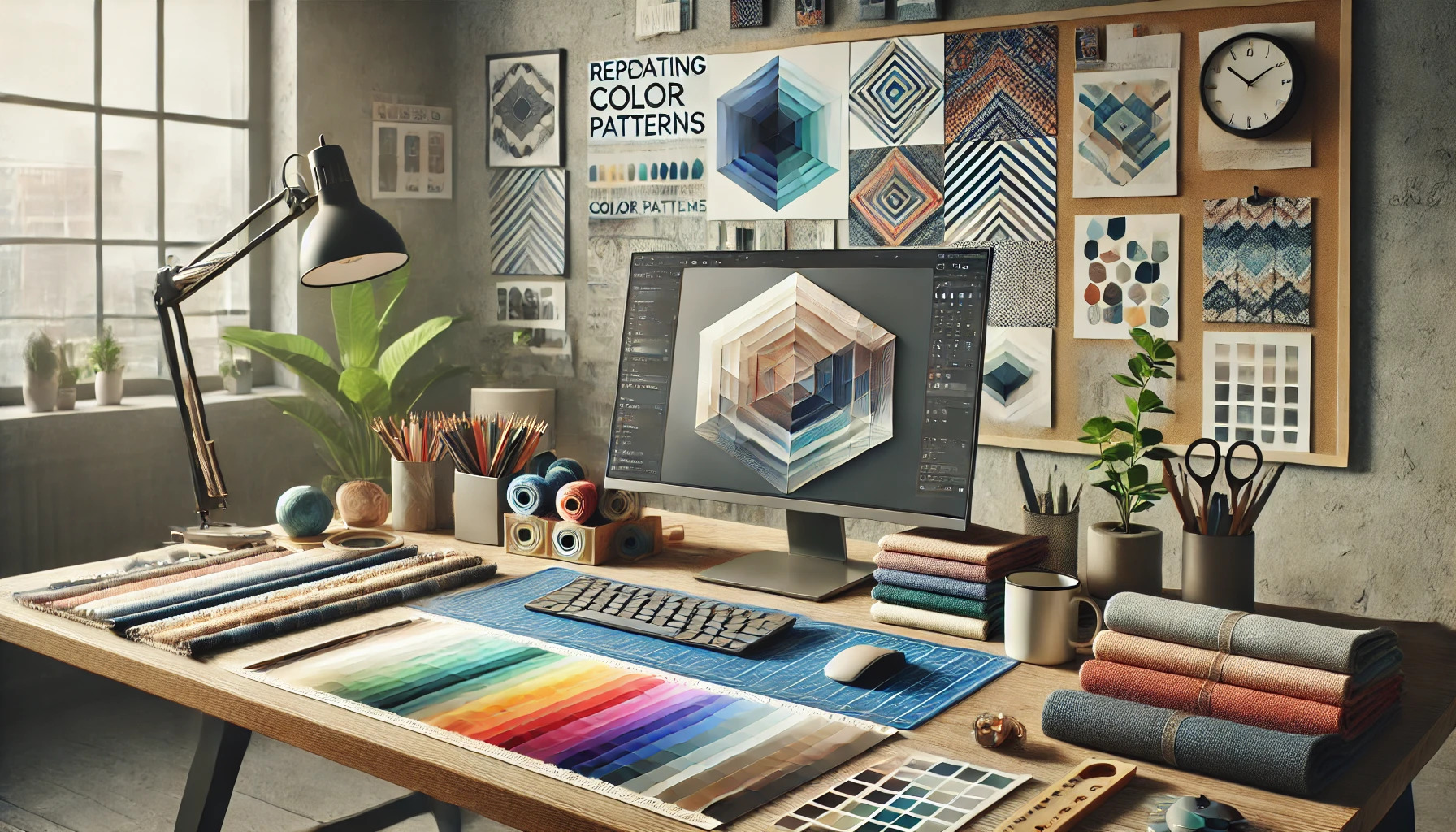
Creating a space that feels harmonious and inviting can be achieved by using repetition in color patterns. When colors are repeated throughout a room, they help to create a cohesive look that ties everything together. This method not only enhances the visual appeal but also adds rhythm and depth to the design.
Through thoughtful placement of color, she can transform any room into a stylish retreat. Using a mix of different patterns in the same color palette allows for excitement without losing the sense of unity. By focusing on this simple yet effective technique, they can elevate their interior design game.
Whether updating a living room or refreshing a bedroom, knowing how to effectively incorporate repeating color patterns is essential. Readers will discover practical ways to achieve this goal while exploring the joy of personal expression in their décor.
Understanding Color Theory
Color theory is essential for creating a cohesive look using repeating color patterns. By understanding the color wheel and the differentiation between warm and cool colors, one can effectively choose colors that harmonize and enhance designs.
The Color Wheel and Color Relationships
The color wheel is a tool that shows the relationship between colors. It consists of primary colors (red, blue, yellow), secondary colors (green, orange, purple), and tertiary colors (like red-orange or yellow-green).
Colors next to each other on the wheel are called analogous colors. These colors create a serene, cohesive feel. An example of this scheme includes shades of blue, green, and yellow, which are often used in nature-inspired designs.
On the other hand, complementary colors are opposite each other on the wheel, such as blue and orange. These colors create contrast and can make a design stand out. Using both schemes can lead to vibrant and dynamic designs.
Warm and Cool Colors
Warm colors include reds, oranges, and yellows. These colors evoke feelings of warmth and energy. They can make a space feel cozy and inviting.
Cool colors, like blues, greens, and purples, give a calm and soothing impression. They can help a room feel more spacious and serene.
Using a mix of warm and cool colors can create balance. For example, adding warm accents to a cool color palette can make a design more lively and engaging.
Defining the Color Palette
Defining a color palette is essential in creating a cohesive look. It involves selecting colors that work harmoniously together. Key factors include choosing a dominant color, selecting complementary shades, and incorporating neutral tones to balance the overall design.
Choosing a Dominant Color
The dominant color sets the mood and tone for the entire design. It should reflect the brand’s identity or the desired emotion of the project. To choose this color, consider the message you want to convey.
Some popular dominant colors include:
- Blue: Trust and calmness
- Red: Energy and passion
- Green: Growth and health
Testing the dominant color with different shades can help visualize its impact across various elements. It should be the most visible color and used in key areas such as backgrounds or main graphics.
Selecting Complementary Colors
Complementary colors enhance the dominant color and create visual interest. These colors are usually opposite each other on the color wheel. For example, if the dominant color is blue, orange could be a great complementary choice.
It’s helpful to choose one or two complementary colors for balance. They can be used in smaller, supporting elements like buttons, text, or accents. This creates a pleasing contrast without overwhelming the design.
Consider using tools or apps that generate color palettes based on your dominant color. This will ensure a harmonious blend that keeps the design cohesive.
Incorporating Neutral Tones
Neutral tones play a significant role in adding depth to a color palette. They provide a background that allows other colors to stand out. Common neutral colors include white, black, gray, and beige.
Using these tones effectively can create balance. For instance, a bright dominant color against a soft gray backdrop can make the main elements pop.
Neutral colors can also be used for text or borders to avoid competing with the dominant and complementary shades. This approach helps maintain clarity and focus in the design.
Integrating Patterns into Your Design
Integrating patterns into a design can create a visually appealing and cohesive look. Focusing on pattern scale, proportion, and repetition helps to ensure that the patterns work together harmoniously.
Pattern Scale and Proportion
When using patterns, scale and proportion are key factors to consider. Large patterns can dominate a space, so they should be balanced with smaller patterns. For example, a large floral print can be paired with a small geometric pattern to create interest without overwhelming the room.
Tips for Scale:
- Use large patterns on statement pieces like sofas or curtains.
- Place smaller patterns on accent pillows or rugs.
- Maintain a consistent proportion to keep a balanced feel.
Choosing the right scale enhances the overall look and ensures that the patterns complement rather than clash.
Repetition with Variation
Repetition is essential in pattern integration. Repeating a pattern in different areas of a space helps create unity. However, adding variation keeps the design fresh and interesting.
Ways to Incorporate Variation:
- Use different colors of the same pattern across various pieces.
- Mix similar patterns with slight differences, such as stripes and polka dots.
- Vary the texture of repeated patterns to add depth.
By carefully planning repetition with variation, designers can achieve a cohesive look while maintaining an engaging environment.
Color Repetition Techniques
Using color repetition can create harmony in a space. This section focuses on specific methods to achieve a cohesive look through different techniques that enhance design.
Visual Echo in Different Elements
Creating a visual echo through color repetition is effective in tying different elements together. When he uses the same shade on various items, it visually connects them.
For example, applying a soft blue on a sofa, curtains, and throw pillows can unify a room. This method encourages the eye to move smoothly from one item to another.
Consider using a color wheel to select complementary colors. This can add depth while maintaining a cohesive feel. The balance between vibrant and muted tones can keep the design from feeling flat.
Balancing Colors Across Spaces
Balancing colors is crucial, especially in open floor plans. When she picks a color scheme, it helps to repeat those colors in adjoining rooms.
For instance, if the living room uses a particular red, that shade can appear in the dining area through artwork or table accessories. This method creates a seamless flow between areas.
A helpful tactic is to use a color in varying intensities. Lighter shades can work well in smaller spaces, while deeper tones add richness to larger areas. Mixing textured surfaces can also enhance this effect.
Building Cohesion in Various Spaces
Creating a cohesive look in different areas of a home involves using repeating color patterns. This ensures that each space feels connected and harmonious, enhancing the overall aesthetic appeal.
Consistency in Common Areas
Common areas like the living room and dining room should showcase a unified color scheme. This can be achieved by selecting a palette that reflects a consistent theme.
For example, if the living room has soft blue accents, the dining area might include blue in the textiles or artwork. This repetition fosters a sense of flow.
- Use Color Swatches: Keep samples of chosen colors handy when decorating.
- Furniture Choices: Select furniture that incorporates the same colors.
Additionally, light fixtures can share similar tones, connecting the two spaces further. By focusing on consistency, these common areas create a welcoming atmosphere.
Transitional Spaces and Color Flow
Transitional spaces, like hallways or staircases, serve as vital connections in a home. Using color flow in these areas enhances the visual transition between rooms.
A smooth color gradient, from lighter shades in one room to darker hues in another, can gently guide the eye. This may include painting walls or using similar wall art.
- Accent Walls: An accent wall in a hallway that features the primary color from adjacent rooms reinforces the theme.
- Rugs and Decor: Rugs that incorporate multiple colors from surrounding spaces can also unify the look.
These techniques ensure that even transitional areas feel cohesive, contributing to an inviting environment. Each color decision should reflect an overall design intention, enhancing harmony throughout the home.
Accents and Accessories
Accents and accessories play a crucial role in achieving a cohesive look with repeating color patterns. By carefully selecting textiles and decorative elements, one can create harmony in a space while enhancing its visual appeal.
Strategic Use of Textiles
Textiles are essential for adding warmth and texture to a room. Choosing cushions, throws, and rugs in colors that repeat throughout the space helps tie different elements together.
For instance, using a throw blanket in a shade that matches accent pillows creates a pleasing balance. Consider layering different fabrics like cotton, linen, and wool to add depth. Sheer curtains can also diffuse natural light, introducing subtle color nuances without overwhelming the room.
Incorporating repeating patterns in textiles can reinforce the color scheme. Geometric or floral designs can be used across cushions or bed linens for variety while maintaining unity. This strategy helps to create a curated look that feels thoughtfully designed.
Decorative Elements as Color Anchors
Decorative accessories serve as vital color anchors in home design. Items like vases, artwork, and decorative bowls can reinforce the repeating colors established in larger furnishings.
Selecting key pieces that feature these colors can create focal points in a room. For example, an artwork piece showcasing the room’s accent colors draws the eye and connects different areas.
Using similar color palettes for picture frames and smaller decorative items can enhance cohesion. Grouping items in odd numbers, like three or five, can make arrangements visually appealing. This thoughtful placement emphasizes the color story while adding interest and personality to the space.
Practical Tips and Tricks
Creating an eye-catching and cohesive look using color patterns requires careful consideration and a few practical strategies. By testing different mock-ups and adjusting for lighting, one can ensure that their design remains appealing and balanced.
Testing Color Patterns in a Mock-up
Before committing to a final look, it’s vital to test color patterns using mock-ups. This step allows designers to see how their color choices will interact with other elements.
Using tools like Adobe Illustrator or online design platforms can help. They allow adjustments without the need for costly physical samples. Designers should create several variations and observe how colors work together.
It’s also helpful to use real-world examples. Placing the mock-up in a similar setting to the intended use can provide insights. This practice ensures the chosen palette appears cohesive in the desired environment.
Adjusting Patterns to Lighting
Lighting plays a big role in how colors appear. Bright sunlight can wash out colors, while low-light conditions can make them seem dull. Therefore, it’s important to test the patterns under different lighting setups.
Designers should observe how colors shift and adjust accordingly. Using warm light fixtures can bring out rich tones, while cooler lights may enhance pastels.
Creating a lighting guide can also be useful. It will allow designers to predict how their colors will alter based on the environment. This understanding helps keep the overall look cohesive despite changing light conditions.
Maintaining Balance and Harmony
Achieving a balanced look is crucial when using repeating color patterns. Designers should focus on not overwhelming the viewer with too many colors or overpowering designs.
A good rule of thumb is the 60-30-10 rule. This means using 60% of one dominant color, 30% of a secondary color, and 10% for accents. This technique helps maintain balance while allowing creativity.
Additionally, designers should pay attention to the scale and proportion of patterns. Large patterns can dominate a space, while smaller ones may feel lost. Choosing the right combination of sizes will enhance harmony in the overall design.