
Building a monochromatic color scheme can seem simple, but it often leads to designs that feel flat. By using different shades, tones, and tints of a single hue, anyone can create a vibrant and engaging palette that stands out. This approach not only maintains harmony but also adds depth and interest, making it an appealing choice for any project.
The key to an exciting monochromatic scheme lies in variety. Mixing your base color with lighter and darker variations can breathe life into the design. From creating a cozy atmosphere in a room to designing an eye-catching website, a well-planned monochromatic color scheme can transform the ordinary into something extraordinary.
Exploring the nuances of light and dark hues can unleash creativity. With a little experimentation, anyone can craft a palette that is both cohesive and exciting. The possibilities are endless when it comes to designing with one color in mind!
Understanding Monochromatic Colors
Monochromatic colors use one base hue along with its variations, creating a unified look. This approach can add depth and interest to designs without overwhelming the viewer.
Definition and Basics
Monochromatic color schemes focus on a single hue, which is the main color. This hue can be altered by adjusting its lightness and saturation. Variants of the hue include:
- Tints: Made by adding white to the base color, which creates lighter shades.
- Shades: Created by adding black, resulting in darker tones.
- Tones: These are made by adding gray, which alters the intensity.
Using these variations allows for a rich palette while maintaining harmony. The beauty of monochromatic design lies in its simplicity yet ability to create a visually appealing space.
Psychology Behind Monochromatic Schemes
The use of monochromatic colors can significantly affect emotions and moods. Each hue can evoke different feelings. For instance:
- Blue often feels calming and serene.
- Red can convey excitement and energy.
- Green is associated with tranquility and nature.
When used in a monochromatic scheme, the intensity and brightness can influence these reactions further. A lighter tint might feel more uplifting, while a deeper shade can evoke comfort. This emotional response can enhance the design and create a connected experience for the viewer.
Starting with a Base Color
Choosing a base color is a crucial first step in creating an engaging monochromatic color scheme. The right hue can set the mood and tone of the space. It’s important to carefully consider the color’s impact and how it interacts with its environment.
Choosing the Right Hue
Selecting the right hue involves understanding personal preference and the message you want to convey. Cool colors like blues and greens often create a calm atmosphere. Warm colors, such as reds and yellows, can be more energizing.
To narrow down options, look at color swatches and test samples on the wall. This helps visualize how it will look in different lights. Consider using an online color tool to compare shades easily.
Considering Room Lighting and Size
Lighting significantly affects how colors are perceived. Natural light can make colors appear brighter and more vibrant. In contrast, artificial light may alter a color’s warmth or coolness.
Room size also matters. Lighter hues can make a small space feel larger, while darker shades can create a cozy feel. For a balanced look, combine your base color with varying shades and tints. This helps maintain depth and interest in any size room. Be mindful of how both lighting and size change how the chosen hue appears throughout the day.
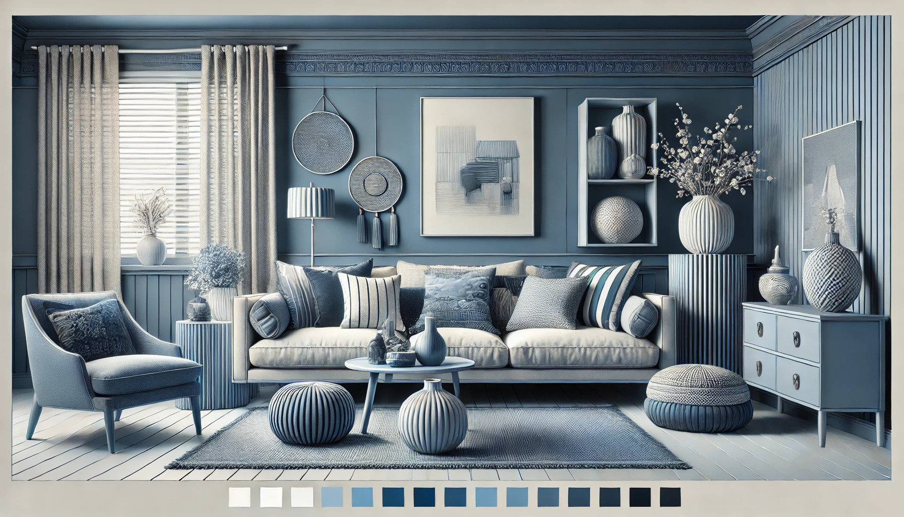
Mixing In Different Tints, Tones, and Shades
Mixing different tints, tones, and shades is essential for creating an engaging monochromatic color scheme. It adds depth and character while ensuring the space remains visually interesting.
Creating Depth and Dimension
To create depth, use a range of values within the same hue. Tints, which are made by adding white, lighten a color, while shades, made by adding black, darken it. This variation helps define areas in a room.
For example:
- Light Tints can be used on walls to enhance brightness.
- Darker Shades can create cozy corners or accent walls.
Incorporating textures also elevates the appearance. Mixing matte and glossy finishes or adding textured fabrics can add dimension and prevent the space from feeling flat.
Balancing Color Intensity
Balancing the intensity of colors keeps the design harmonious. Too much vibrancy in one tone can be overpowering. To avoid this, spread the colors out evenly across the space.
A good method is to pick one dominant color and use it at varying intensities.
Suggestions:
- Use a bold hue for focal points, like throws or art.
- Apply softer tints for larger areas, such as walls and furniture.
This balance allows the eye to rest while still appreciating the beauty in the variations of color. Implementing both bold and subtle elements leads to a lively yet cohesive look.
Adding Textures and Patterns
In a monochromatic color scheme, adding various textures and patterns is key to keeping the space lively. This approach helps create visual interest and depth, making the room feel inviting and dynamic. Here are two effective ways to incorporate these elements.
Using Fabrics and Materials
Choosing the right fabrics and materials adds layers to the monochromatic design. Soft textiles like plush cushions, cozy throws, and rich curtains can create a warm atmosphere.
Varying the weave and texture of these fabrics is important. For example, combining smooth silks with chunky knits makes the design more appealing.
Here are some ideas:
- Cushions: Mix and match different textures.
- Rugs: Choose a patterned rug to anchor the space.
- Throws: Add a soft throw for contrast.
Using a mix of textures can transform a plain room into a cozy haven.
Incorporating Wall Treatments
Wall treatments greatly enhance a monochromatic color scheme. Textured wallpaper, such as grasscloth or geometric designs, adds interest to flat surfaces.
Another option is adding wood paneling or shiplap. This creates a striking contrast while maintaining a cohesive look.
Consider options like:
- Paint Techniques: Use sponging or ombre effects for depth.
- Hanging Art: Add framed art or woven wall hangings.
- Accent Walls: Use a bold pattern on one wall to make it a focal point.
These treatments help break up large areas of solid color, leading to a balanced and engaging environment.
Incorporating Accents and Highlight Colors
Accents and highlight colors are essential for bringing life to a monochromatic color scheme. By carefully choosing and placing these elements, the overall design can feel vibrant and engaging.
Picking Complementary Accents
Choosing the right accent colors can elevate a monochromatic space. It’s important to select hues that work well with the main color. For example, if the primary color is blue, consider accents in orange or warm yellows.
Using shades or tints from the same color family can also create harmony. For instance, light blue can be paired with rich navy accents to add depth.
Textures play a crucial role too. Different materials, like a shiny accent piece against a matte background, can draw attention and enhance visual interest.
Strategic Placement of Accents
Where to place these accents is just as important as choosing them. Focus on areas that naturally catch the eye, such as pillows on a sofa or art pieces on walls.
Using larger accent pieces, like rugs or furniture, can create focal points in the room. They should complement the main color without overwhelming it.
Consider the flow of the space. Accents can guide visitors through a room, drawing attention to features with strategic placement. It’s all about balance to keep the atmosphere lively and inviting.
Furniture and Decor Selection
Selecting the right furniture and decor is crucial to creating a monochromatic color scheme that feels fresh and inviting. With careful coordination and thoughtful choices, it’s possible to bring depth and interest into the space without overwhelming it.
Coordinating with Color Scheme
Choosing furniture and decor that aligns with the monochromatic color scheme is important. Start by selecting a primary color and its various shades. For instance, if the main color is blue, consider including light blue, navy, and teal pieces.
Opt for different materials to add texture. A suede couch paired with silk curtains can create a visually rich environment. Accessories, like throw pillows or rugs, should also vary in pattern and texture, enhancing the depth of the scheme without straying from the chosen color palette.
Contrast vs. Harmony
Finding the right balance between contrast and harmony can elevate the design. Contrast helps highlight specific pieces, drawing attention in a stylish way. For example, a dark gray sofa can stand out against lighter gray walls, creating a focal point.
Meanwhile, harmony provides a cozy and cohesive look. This can be achieved by using similar shades and tones for various elements. Aim for a mix of both to keep the space lively yet unified. Incorporating different shapes, like round tables with angular chairs, can also introduce visual intrigue without disrupting the overall flow.
Lighting and Its Impact
Lighting plays a crucial role in enhancing a monochromatic color scheme. The right lighting can highlight textures, create depth, and influence the perception of color. Understanding how to use both artificial and natural light can make a significant difference.
Choosing the Right Bulbs and Fixtures
Selecting the right bulbs and fixtures is essential for achieving the desired effect. Incandescent bulbs offer a warm glow that can soften colors, making them inviting. On the other hand, LED bulbs provide a bright, crisp light that can make colors appear more vibrant.
When choosing fixtures, consider the style and purpose of the space. Pendant lights add a focal point while wall sconces can create a softer ambiance. Options such as dimmers allow the user to control brightness and adjust the mood according to the time of day or activity.
Key tips:
- Use warm bulbs for a cozy feel.
- Consider adjustable fixtures for flexibility.
Effect of Natural Light
Natural light can change the appearance of colors throughout the day. Morning light tends to be cooler, while evening light is often warm and golden. This shift can dramatically affect how a monochromatic palette looks in different hours.
To maximize natural light, place mirrors strategically to reflect sunlight into darker areas. Window treatments also matter; lighter fabrics allow more light to filter through. Keeping windows clean enhances brightness and clarity in any room.
Quick ideas:
- Use sheer curtains for softer light.
- Experiment with different window placements for optimal lighting.
Maintaining Interest and Flow
Creating a monochromatic color scheme doesn’t mean it has to be dull. One can keep the space lively by mixing different shades and tones of the same color. This adds depth and visual interest.
Textural Variety is essential. By combining materials like wood, metal, and fabric, it can elevate the look. For example, a light gray wall paired with a dark gray velvet couch adds richness.
Accent Pieces also play a key role. Adding decor items in varying shades of the main color can bring the room together. They create focal points and can help guide the eye around the space.
Lighting affects color perception. Warm lighting can add warmth to cooler colors. Using different types of light can make the same color feel more dynamic at different times of the day.
Patterns can enhance a monochromatic scheme too. Stripes, dots, or geometric designs in varying shades keep the eye engaged. For instance, a patterned rug in lighter shades can soften a room without overpowering it.
Incorporating natural elements is another way to maintain interest. Plants with green tones can fit seamlessly into a monochromatic palette, providing a refreshing contrast and a pop of life.
Real-Life Examples and Inspiration
Monochromatic color schemes can create stunning designs. Here are some real-life examples to inspire creativity.
Living Spaces:
- Soft Neutrals: A room painted in varying shades of beige can feel calm and inviting.
- Bold Black: A black kitchen with varying textures can exude elegance and drama.
Fashion:
- All-White Outfits: Wearing different shades and fabrics of white can add depth to a monochromatic look.
- Various Blues: An outfit combining navy, sky blue, and denim creates a fresh, cohesive style.
Graphic Design:
- Branding: Many brands use one primary color. It strengthens brand identity and keeps visuals consistent. For instance, a company might choose blue in different shades for its website and marketing materials.
Art:
- Paintings: Artists like Picasso often used monochromatic palettes to express emotion. His blue period highlighted the power of shades and tints of one color.
Interiors:
- Accent Walls: Choosing one color and painting a feature wall can add visual interest. Adding white or gray accents can make the space feel balanced.