
Choosing the right neutral colors can greatly enhance the look and feel of a home. To find the best options, consider the undertones that will harmonize with your existing decor and create an inviting atmosphere. Neutral colors not only create a calming environment but also provide a versatile backdrop for any style.
Using subtle shades can add depth without overwhelming a space. They can brighten a room and make it feel more spacious. With so many choices available, learning how to pick the perfect neutral can transform any area from ordinary to extraordinary.
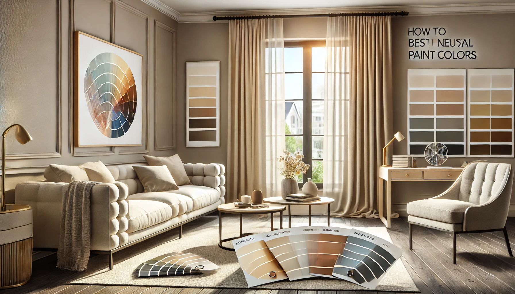
Understanding Neutral Colors
Neutral colors are essential for creating a calm and cohesive look in any home. They can complement other colors while adding warmth and depth. This section explores what neutral colors are and the advantages they offer.
Defining Neutrals
Neutral colors are hues that don’t strongly lean toward warm or cool tones. Common neutrals include whites, beiges, grays, and taupes. These colors can feature different undertones, such as warm, cool, or even earthy tones.
Warm neutrals, like cream and beige, create a cozy atmosphere. Cool neutrals, such as gray, bring a modern and airy feel. It’s important for homeowners to consider the lighting in their space since it can change how a neutral color looks.
A neutral palette is versatile. It provides a backdrop for bolder colors and patterns, making it perfect for any room design.
Benefits of Neutral Hues
Neutral hues offer many benefits that enhance a home’s aesthetic. First, they create a sense of harmony. When a room features a neutral base, it allows for easy mixing with other colors and textures.
Second, neutral colors can make a space appear larger. Lighter shades reflect light, which can open up smaller rooms. This is particularly useful for apartments or compact living spaces.
Additionally, neutral colors are timeless. Unlike trendy shades, they won’t easily go out of style. This allows homeowners to invest in neutral colors, knowing they will remain appealing for years to come.
Using neutral shades also simplifies decorating. Accessorizing becomes easy since many items will complement the neutral foundation.
Finding Your Ideal Palette
Choosing the right neutral colors involves understanding how light affects spaces and how a room’s size can influence color choices. This section will explore these key aspects, helping to create a harmonious environment.
Assessing Natural Light
Natural light plays a significant role in how colors appear in a room. A space with ample sunlight can benefit from warmer neutrals, such as creams or soft beiges, which can create a cozy feel.
In contrast, a room with limited natural light may look better with cooler neutrals, like greys or pale blues. These colors can help brighten and open up the space.
To assess this, spend time in the room during different times of the day. Note how the light changes and how it interacts with the color of the walls. This simple evaluation helps in selecting a palette that enhances the room’s ambiance.
Considering Your Space
The size of a room is crucial when choosing a neutral palette. Lighter shades, such as whites and light creams, can make small spaces appear larger and airier. These colors reflect light, adding a sense of openness.
On the other hand, darker neutrals like deep greys or taupes can bring warmth and comfort to larger rooms, making them feel cozier.
Measuring the room and visualizing the colors can be helpful. Don’t forget to consider the function of the space as well. For instance, a calming neutral in a bedroom promotes relaxation, while a light and fresh color in a kitchen invigorates energy.
Color Psychology and Mood
Color plays a significant role in shaping mood and emotions within a space. The neutral colors chosen for a home can significantly influence how individuals feel and behave in each room. By understanding the emotional impact and how to create a desired atmosphere, homeowners can make more informed decisions.
Emotional Impact
Neutral colors can evoke various emotions. For instance, soft grays and off-whites can instill a sense of calmness and serenity, which is perfect for spaces like bedrooms and living areas.
On the other hand, warmer neutrals like taupe or beige can create a cozy and inviting environment. This is ideal for gathering spaces, making them feel more welcoming.
The psychological effects of color should not be underestimated. They can create spaces that enhance wellbeing and promote relaxation or energy, depending on their choices.
Creating a Desired Atmosphere
It is essential to match neutral colors with the purpose of each room. Light, cool tones work well in workspaces to enhance productivity and focus. Shades like light blue-green can reduce eye strain, making them perfect for home offices.
Additionally, warm neutrals can be integrated into family areas to promote conversations and comfort. Mixing various shades can add depth and interest, transforming a basic space into something special.
By carefully considering the colors used, individuals can create an environment that aligns with their lifestyle and emotional needs.
Combining Neutrals with Textures
Mixing neutral colors with different textures can create a rich and inviting atmosphere in any space. It adds depth and visual interest, making rooms feel more dynamic and comfortable.
Incorporating Fabrics
Fabrics play a key role in enhancing the neutral palette. Soft textiles like linen, cotton, and wool can introduce warmth. Choosing cushions, throws, or curtains in various neutral shades can create layers.
For example, a light gray sofa can pair well with darker gray and beige throw pillows. Mixing patterns, such as stripes with solids, also adds dimension without overwhelming the space. The goal is to select fabrics that not only complement each other but also add a tactile quality.
Tips for Fabric Selection:
- Choose fabrics with varying textures, like velvet or knit.
- Stick to the same color family for a cohesive look.
- Consider the feel of the fabric—softness or roughness can influence mood.
Playing with Finishes
Finishes are crucial when combining neutrals. Different surfaces, like matte, glossy, or textured, can transform a room’s aesthetic. For instance, a matte beige wall paired with glossy white furniture can create eye-catching contrast.
Using finishes in decor elements such as frames, lighting fixtures, and hardware adds personality. A distinctive light fixture in a brushed nickel finish can become a focal point against neutral walls.
Ideas for Mixing Finishes:
- Pair matte walls with glossy decor to create balance.
- Incorporate textures through wood, metal, or stone for variety.
- Experiment with contrasting finishes in furniture for added intrigue.
These techniques help to create a layered, sophisticated look that makes the most of a neutral color scheme.
Color Coordination Techniques
Choosing the right neutral colors involves careful coordination. This includes balancing the various neutral shades and strategically adding accents to create visual interest.
Balancing Neutrals
Balancing neutrals means selecting shades that work well together to create harmony in a space. Start by choosing a main neutral color, such as a soft gray or beige, as the foundation.
Next, consider adding darker or lighter shades of the same color for depth. For example, combining light taupe with a deep chocolate brown can create a sophisticated look.
It’s also important to include different textures. Using materials like wood, metal, and fabric can enhance the neutral palette. This approach prevents the room from appearing flat and uninviting.
Adding Accents
Adding accents brings life to neutral colors. Use bold colors for accents, such as cushions, artwork, or vases. A bright blue or rich red can really pop against a neutral backdrop.
When choosing accents, consider the style of the room. Matching the accent colors to the room’s theme can create a cohesive look. For instance, warm colors complement a cozy setting, while cooler tones suit modern spaces.
Finally, ensure that accents are used sparingly. Too many bright elements can overwhelm the neutrals. Focusing on a few standout pieces will enhance the overall design.
Maintenance and Longevity
Maintaining neutral colors in a home is key to keeping spaces looking fresh and appealing. This involves regular upkeep and making choices that last. Selecting the right shades plays a big part in how well these colors endure over time.
Upkeep of Neutrals
To maintain neutral paint colors, regular cleaning is essential. Walls can collect dust and smudges, so using a damp cloth helps keep them looking new. For deeper cleaning, a gentle soap solution can be applied occasionally.
It’s also wise to make minor touch-ups when needed. Keeping leftover paint can ease this process. Touch-ups using the same shade can blend imperfections, ensuring the walls stay uniformly colored.
Pay attention to the finish as well. Satin or semi-gloss finishes are easier to clean than flat paint. Choosing the right finish can make a significant difference in how well the colors wear over time.
Timeless Versus Trendy Choices
When selecting neutral colors, timeless choices often outperform trendy ones. Classic shades like soft beige, warm gray, or off-white tend to remain stylish and adaptable over time. These colors can easily match different decor styles and personal preferences.
Trendy colors, on the other hand, may fade in popularity. This can lead to an outdated look, requiring repainting sooner than expected. Therefore, sticking to classic neutrals can help reduce maintenance and provide a lasting appeal.
For those drawn to trends, consider using trendy colors as accents rather than main wall colors. This method allows for easy updates without complete repainting. A balance of timeless and trendy can keep a home feeling current yet established.
Practical Tips for Paint Application
Choosing the right color is just the beginning. Proper application is essential for achieving a professional and lasting look. These tips will guide anyone through testing colors in their space and applying paint effectively for the best results.
Testing Colors in Your Space
Before committing to a color, it’s important to test it in your actual space. Lighting can change how a color appears at different times of the day. Here are a few steps to follow:
- Get Samples: Purchase small paint samples from the store.
- Paint Swatches: Apply the samples on large sections of the wall, at least 2 feet by 2 feet.
- Observe: Check how each color looks in various natural and artificial lights. It’s helpful to view them morning, noon, and night.
This will allow for a more accurate decision. By observing the colors actively in the space, it becomes clearer how they complement existing decor.
Applying for Best Results
To ensure a smooth and even paint application, several key practices should be followed. First, prep the area by cleaning walls and covering furniture or floors to protect them from splatters.
Next, use quality tools. A good roller and brushes make a difference.
- Use Primer: Priming the walls can help the paint adhere and improve color coverage.
- Consistent Techniques: Apply paint using even strokes and avoid overloading the brush or roller.
Lastly, allow the paint to dry fully before applying a second coat.