
Combining warm and cool colors in interior design can transform any space into a vibrant retreat. The key to achieving a balanced and inviting look lies in understanding the roles these colors play. Warm colors like red and yellow evoke energy, while cool colors such as blue and green offer calmness.
To create a harmonious atmosphere, incorporating neutral tones can help blend these two color groups seamlessly. For example, using a neutral backdrop allows warm and cool colors to stand out without clashing.
As homeowners experiment with different combinations, they can discover how warm hues can enhance social areas, while cooler shades can provide tranquility in private spaces. Playing with these colors can lead to a beautifully designed home that reflects personal style.
Understanding Color Theory
Color theory is a key concept in interior design. It helps designers create visually appealing spaces by understanding how colors interact. This section covers the basics of color temperature, how the color wheel supports harmony, and the differences between warm and cool colors.
Color Temperature Basics
Color temperature is divided into two main categories: warm and cool colors. Warm colors include shades like red, orange, and yellow. These colors evoke feelings of comfort and energy, making spaces feel inviting.
Cool colors, such as blue, green, and purple, create a calm and relaxing atmosphere. They can also make a room feel larger. Recognizing the temperature of colors helps in choosing the right palette for a specific mood.
Deciding on a color scheme involves balancing these temperatures. A mix of both can offer depth and interest to any space.
The Color Wheel and Harmony
The color wheel is a useful tool in understanding color relationships. It displays colors in a circular format, showing how they relate to each other. The wheel is divided into primary, secondary, and tertiary colors.
Harmonious color schemes can be created using complementary, analogous, or triadic color combinations. Complementary colors are opposite each other on the wheel. They provide contrast and can make a room pop.
Analogous colors sit next to each other on the wheel. These create a more subtle and peaceful look, perfect for harmonizing a space. Triadic schemes use three evenly spaced colors for vibrant and balanced aesthetics.
Warm vs. Cool Colors
Warm colors include reds, oranges, and yellows, which can create cozy and energetic spaces. They are often associated with sunlight and warmth. Many people find these colors uplifting.
Cool colors like blues, greens, and purples promote tranquility and can help reduce stress. They often remind people of nature, water, and sky. Using these colors can create a refreshing environment.
It’s essential to know the balance between warm and cool colors in design. For a dynamic look, consider using about 80% of one temperature and 20% of the other. This creates interest while maintaining harmony.
The Psychology of Color in Interior Design
Colors can have a big impact on how people feel in a space. Different colors can create different moods and emotions. Understanding this helps in choosing the right shades for a home.
Warm Colors: These include reds, oranges, and yellows. They tend to create feelings of energy, warmth, and comfort. Warm colors can make a room feel cozy and inviting, perfect for living spaces.
Cool Colors: Shades like blue, green, and purple fall into this category. They are often calming and peaceful. These colors are great for bedrooms or areas meant for relaxation.
Effects of Color Combinations:
| Color Type | Mood Created | Best Used In |
|---|---|---|
| Warm | Energetic, Inviting | Living Rooms, Kitchens |
| Cool | Calm, Peaceful | Bedrooms, Offices |
Choosing the right mix of warm and cool colors helps balance a room’s atmosphere. It can also affect how people interact within the space. For instance, combining warm and cool colors can create a vibrant yet relaxing environment.
Thinking about color psychology can guide decisions in interior design. This makes spaces more enjoyable and effective for their purpose.
Planning Your Color Palette
Creating a color palette is key to successful interior design. It helps define the mood and style of a space. Careful planning can enhance the overall look and feel of a room.
Choosing Your Dominant Color
Selecting a dominant color sets the tone for the entire room. It is the main color that will dominate your space. This choice should reflect personal taste and the atmosphere she wants to create.
Soft blues promote calmness, while vibrant reds add energy. When choosing, consider the room’s purpose. Different colors have various psychological effects that can influence feelings and behaviors.
Once the dominant color is chosen, it should be applied to larger areas, like walls or furniture. This creates a foundation on which to build the rest of your palette.
Selecting Complementary Colors
Complementary colors enhance the dominant color and create interest. These colors should harmonize with the dominant shade while adding depth.
Using a color wheel can help identify complementary options. Colors opposite each other, like blue and orange, create a dynamic contrast. He can also choose colors that are adjacent, such as blue and green, for a softer effect.
When selecting, consider using neutral colors to balance the palette. Neutrals like beige or gray can serve as a backdrop, allowing the complementary colors to pop without overwhelming the space.
Balancing Warm and Cool Tones
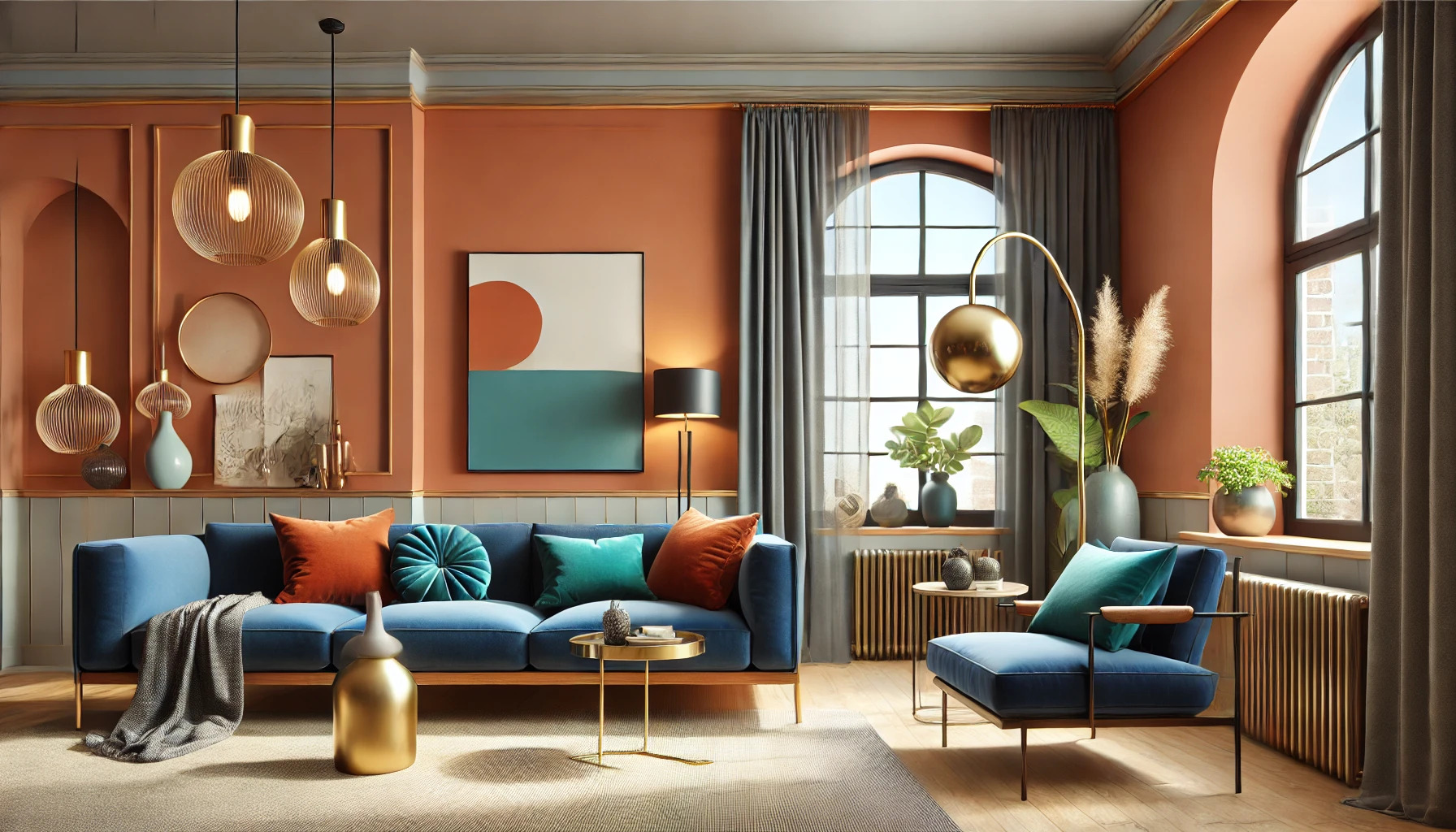
Combining warm and cool colors adds complexity to design. Warm colors like reds and yellows create a cozy feel, while cool colors like blues and greens evoke a sense of calm.
To balance these tones, a good rule is to use a dominant warm or cool color and support it with the opposite tone. For instance, a warm beige can pair nicely with cool gray accents.
Incorporating transitional colors, like teal, can bridge the gap between warm and cool. This approach creates a cohesive look that feels inviting and comfortable.
Using textures can also enhance the balance. For example, a soft throw in a warm color can sit next to cooler-toned pillows. This variety adds visual interest and harmony to the space.
Color Coordination Techniques
Effective color coordination is crucial for creating a harmonious interior. Warm and cool colors can enhance a space when used thoughtfully. Here are two key techniques for mixing these colors successfully.
Using Contrast Effectively
Contrast plays a vital role in color coordination. By pairing warm colors like red or orange with cool colors like blue or green, one can create striking visual interest.
For instance, a bold red accent wall can draw attention, while soft blue furnishings can balance the space. This kind of contrast helps to define areas within an open floor plan.
Using contrasting colors can also guide the eye. Placing warm and cool colors strategically can highlight architectural features or artwork. It’s important to find a balance; too much contrast can feel chaotic.
Color Flow Through Spaces
Color flow connects different areas of a home. Transitioning from warm colors in one room to cool colors in another creates a sense of harmony.
For example, a living room with warm gold tones can smoothly lead into a dining room featuring cool greens. Using transitional colors, like soft taupe, can bridge these two opposing palettes.
This technique ensures that spaces feel cohesive and inviting. Consistent color use in adjacent areas allows for a seamless experience as one moves through the home. Well-planned color flow enhances the overall ambiance.
Implementing Colors in Decor
Combining warm and cool colors in decor creates a balanced and inviting space. It’s important to consider how different elements interact with each other to achieve harmony. Here are some ways to implement these colors effectively in various aspects of interior design.
Textiles and Fabrics
Textiles play a key role in adding warmth and texture to a room. They can include items like curtains, cushions, and rugs.
For example, using warm shades in fabrics, like red or orange, can create a cozy atmosphere when paired with cool tones, such as blue or green.
Layering different textiles can also enhance visual interest. Mixing patterns and textures, like a soft wool throw with a silk cushion, offers depth to the design.
Additionally, neutral fabrics can serve as a bridge, helping to blend warm and cool colors. This allows for a cohesive look without overwhelming the space.
Wall Colors and Accents
Choosing wall colors is crucial in establishing the room’s mood. Lighter cool colors, like soft blues or greens, can create a calm backdrop.
On the other hand, warm colors, like yellows or warm beiges, can induce a sense of comfort.
An effective method is to paint one wall in a bold warm color to create a focal point, while keeping the other walls in a cooler shade to balance it out.
Accent pieces, such as artwork or wall decor, can also incorporate both warm and cool tones, tying the entire design together seamlessly.
Using neutral shades for larger surfaces makes it easier to add pops of color through smaller accents.
Furniture and Woodwork
When it comes to furniture, choosing warm woods like oak or cherry can complement cooler color palettes beautifully.
Adding colorful upholstery, such as a navy sofa with warm orange pillows, creates a striking contrast.
For woodwork, a natural finish can enhance the warmth of the wood while allowing it to harmonize with cooler hues in the room.
Selecting furniture pieces that blend different color temperatures can open up design possibilities.
Consider mixing furniture styles and colors, like a modern coffee table with traditional chairs, to add personality while maintaining balance.
Lighting and Its Impact on Colors
Lighting plays a crucial role in how colors appear in a room. Both natural and artificial light can change the look and feel of warm and cool colors.
Cool colors, like blues and greens, often look lighter and more vibrant in bright light. Under dim lighting, they can seem darker or even muted. This can affect the overall mood of the space.
Warm colors, such as reds and yellows, can gain an inviting glow in softer lighting. They tend to create a cozy atmosphere, perfect for living areas. However, in bright artificial light, these colors may appear harsh.
Here are some tips for using lighting effectively:
- Test Colors: Always check how paint colors look in different lighting. A swatch might seem great in the store but change appearance at home.
- Use Dimmer Switches: These allow flexibility to adjust the light level according to the time of day or occasion.
- Layer Lighting: Combine ambient, task, and accent lights. This creates depth and can enhance both warm and cool tones.
Natural light changes throughout the day, so it’s important to observe how it impacts colors at different times. This awareness can help in choosing the best color combinations for any room.
Accessorizing with Color
Accessorizing with color can bring a space to life. The right decor can enhance the overall design and create a balanced atmosphere. Two key areas to focus on are art and decorative elements, along with plants and natural elements.
Art and Decorative Elements
Art pieces can serve as focal points in a room. They can mix warm and cool colors beautifully to create harmony. For example, a painting with vibrant reds and oranges can brighten a space with cool walls.
Choose frames that complement the color scheme. Gold or wooden frames can add a warm touch, while sleek silver or black frames often add a cool contrast. Display sculptures or decorative items that also merge these color temperatures.
A colorful wall gallery with a mix of warm and cool tones can create interest and depth. Using diverse textures in decorative elements can enhance the visual appeal.
Plants and Natural Elements
Adding plants is an easy way to incorporate color and life into a room. Greenery generally has a cool effect but can be combined with warmer colors in pots or planters.
Choosing pots in warm hues, like terracotta or gold, can complement the greenery well. This combination creates a pleasant balance.
Using natural elements like wood can also enhance the design. Warm wood tones work well with cool colors, while adding texture and warmth to the overall look.
Mixing plants with vibrant blooms can serve as colorful accents. Flowers in shades of red, orange, or yellow can contrast beautifully with lush green leaves and cool backgrounds.
Common Mistakes To Avoid
Mixing warm and cool colors can be tricky. Some common mistakes can lead to a design that feels off. Here are a few to watch out for:
1. Ignoring Undertones
Each color has an undertone. Warm colors usually have red or yellow undertones, while cool colors lean towards blue. Choosing colors with mismatched undertones can make a room feel disjointed.
2. Overusing One Palette
Sticking too strictly to warm or cool colors can limit creativity. A balanced mix can create a more dynamic and inviting space. It’s important to incorporate both warm and cool tones for harmony.
3. Not Considering Neutrals
Neutrals like white, beige, or gray can help blend warm and cool colors. They act as a bridge, softening contrasts and providing balance. Neglecting these colors can lead to a harsh or chaotic look.
4. Skipping Samples
Assuming how colors will look together without testing can result in disappointment. Lighting changes how colors appear, so it’s wise to sample combinations in the actual space. This step can ensure the desired outcome.
5. Rushing the Process
Design is a creative process that takes time. Rushing can lead to poor choices. Take time to explore and find the right balance for a space.
Tips for Small Spaces and Open Floor Plans
Using color wisely can make a small space feel bigger. Here are some helpful tips:
-
Choose Light Colors: Light colors like soft whites, pale blues, and light grays can create an airy feel. They reflect light, making rooms seem larger.
-
Create a Color Flow: For open floor plans, it’s important to connect spaces with colors. Use a warm color in common areas like the living room and dining area to foster warmth and comfort.
-
Add Neutrals: Neutrals such as beige, gray, and white can bridge the gap between warm and cool colors. This helps create a smooth transition from one space to another while keeping things cohesive.
-
Use Accent Walls: Painting one wall in a bold shade can add interest without overwhelming the space. This draws attention while allowing other walls to remain light and airy.
-
Consider Lighting: Natural light can change how colors appear. Keep in mind the direction of light in the room when choosing colors to ensure a seamless look.
-
Incorporate Mirrors: Mirrors can reflect light and colors, further opening up the space. They also add a decorative element that enhances both warm and cool tones.