
Creating vibrant digital artwork can be an exciting journey. Layering colors effectively enhances both depth and interest in any piece. By mastering techniques such as using translucent layers and contrasting colors, artists can make their digital creations truly pop.
Understanding how to manipulate different layers allows for more control over the final piece. This technique not only helps in achieving a polished look but also in conveying emotions through color. Artists can experiment with various blending methods to achieve the effects they desire.
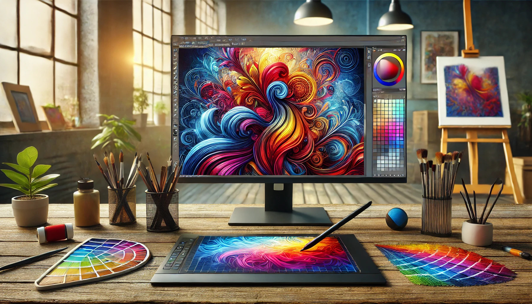
In this blog post, readers will discover practical tips for creating vibrant artwork through layered colors. With the right approach, anyone can elevate their digital art skills and develop a unique style that stands out.
Understanding Digital Art and Color Theory
Digital art combines creativity with technology. Artists use software to create images, illustrations, and designs. Understanding color theory is essential to making vibrant and appealing artwork.
Color theory involves how colors interact with each other. The color wheel is a helpful tool that shows relationships between colors.
Key Color Concepts
- Primary Colors: Red, blue, and yellow. These cannot be made by mixing other colors.
- Secondary Colors: Green, orange, and purple. These are created by mixing primary colors.
- Tertiary Colors: These result from mixing primary and secondary colors.
Using color harmonies can enhance a piece. For instance, complementary colors create strong contrasts.
Effective color choices can affect mood. Warm colors like red and yellow can evoke energy. Cool colors like blue and green can create calmness.
When layering colors in digital art, transparency matters. Artists can blend colors by adjusting the opacity. This creates depth and richness in the artwork.
Setting Up Your Digital Canvas
Creating vibrant digital artwork starts with a well-prepared digital canvas. Proper setup allows for smooth workflows and enhances creativity. This section covers choosing the right software, understanding resolution and aspect ratios, and selecting a color palette.
Choosing the Right Software
Selecting the right software is crucial for digital artists. Popular options include Adobe Photoshop, Corel Painter, and Procreate. Each program has unique features that cater to different styles and preferences.
For beginners, Procreate is user-friendly and offers a variety of brushes and tools. Photoshop, while more complex, provides advanced options for layers and adjustments. It helps to experiment with trial versions to find what feels comfortable.
Look for software that fits one’s artistic needs and budget. Before settling on a choice, checking for available tutorials can provide additional insights into using the software effectively.
Understanding Resolution and Aspect Ratios
Resolution refers to the level of detail in an image, measured in pixels. Higher resolution allows for clearer, more detailed artwork. It’s essential to start with a resolution that suits the final display size, whether it’s for web use or printing.
Aspect ratios, the ratio of width to height, also play a significant role. Common ratios include 16:9 for screens and 4:3 for prints. Choosing the right aspect ratio helps maintain the composition of the artwork.
Setting the canvas size correctly at the beginning saves time later. Most programs allow users to set both resolution and aspect ratio during canvas creation, ensuring the final piece looks just right.
Selecting Your Color Palette
A well-chosen color palette can bring artwork to life. Artists often begin with a limited color selection to streamline their creative process. Using a color wheel can assist in choosing colors that complement each other.
Artists should consider color theory basics, such as complementary and analogous colors. Keeping the palette simple helps maintain focus and consistency throughout the artwork.
Many digital art programs offer preset palettes. Customizing one’s palette to fit a specific theme or mood adds a personal touch to each piece. Experimenting with different colors can lead to exciting new ideas and techniques in digital art.
Mastering Layers in Digital Art
Layers are essential in digital art, allowing artists to create and organize their work effectively. Each layer acts like a transparent sheet, letting them stack colors, textures, and effects without losing previous work.
Using layers offers great flexibility. Artists can edit, hide, or rearrange layers easily. This means mistakes can be fixed without starting over.
Here are some key tips for mastering layers:
- Use Adjustment Layers: These help modify colors and tones while keeping the original image intact.
- Group Layers: Organizing layers into groups can simplify complex projects. This makes managing artwork much easier.
- Rename Layers: Clear labels help keep track of different elements in a piece.
Artists can blend multiple layers for interesting effects. Techniques like opacity changes and layer blending modes can create unique visuals.
For beginners, using basic blending modes such as “Multiply” or “Screen” can enhance colors and add depth. As they gain confidence, they can experiment with more advanced options.
Using layers also allows for creative experiments. Mixing textures, adjustments, and overlays can produce vibrant artwork. Those new to digital art can explore different tools and techniques to discover their style.
Working with Base Colors
Base colors create the foundation for vibrant digital artwork. Proper application of flat colors and establishing tonal values are essential steps in achieving depth and richness in the artwork.
Applying Flat Colors
When starting with digital art, applying flat colors is crucial. These are solid colors used in different areas of the artwork. First, select a color palette that fits the theme. This selection should include a range of colors to give the composition variety.
Next, use a digital brush tool to apply these colors. It’s best to work on separate layers for each color. This approach allows for easy adjustments and corrections later. He or she can also use the bucket fill tool for larger areas.
Fill in the basic shapes of the design with chosen colors. Maintain consistent strokes for a cleaner look. Keeping colors within the lines will enhance the overall appearance of the piece. This technique sets a strong base for later blending and detailing.
Establishing Tonal Values
Tonal values are key to adding depth and interest to the artwork. He or she should think about light and shadow when applying base colors. Start by defining the light source in the scene, as it affects how colors appear.
Next, use shades and tints to create contrast. A common trick is to darken colors slightly for shadows and lighten them for highlights. This method gives the artwork a three-dimensional effect.
To establish tonal values effectively, the artist can use blending modes on layers. This allows for softer transitions between light and dark areas. Experimenting with opacity and brush settings can enhance this process. Keeping tonal balance across the piece will lead to a more harmonious final result.
Adding Depth and Dimension
Creating depth and dimension in digital artwork adds interest and realism. By utilizing shading and highlighting techniques, artists can create a more vibrant and engaging piece.
Shading Techniques
Shading is essential for adding depth to artwork. It helps to define shapes and create a three-dimensional look. Artists can use various methods like gradient shading, which involves blending colors smoothly from light to dark.
Another popular technique is hatching, where artists use parallel lines to indicate shadows and depth. Cross-hatching takes this further by layering crossed lines to enhance texture and shadow.
Using a soft brush in digital art can also create smooth transitions. This can make objects appear rounded and more realistic. It’s important for artists to practice different shading techniques to find what works best for their style and artwork.
Highlighting for Impact
Highlighting is just as crucial as shading. It draws the viewer’s eye and adds vibrancy to the artwork. Highlights can be applied using a lighter color or by increasing brightness in brighter areas.
Strategic placement of highlights on objects enhances their form and creates contrast. Artists often focus on where the light source is coming from to determine where highlights should be applied.
Using techniques like rim lighting can add extra flair. This technique outlines the edges of an object, giving it a glowing effect. This adds a dynamic quality to the artwork, making it feel more alive.
Playing with Color Blending and Transparency
Color blending and transparency are essential for adding depth and vibrancy to digital artwork. By mastering these techniques, artists can create stunning visuals that catch the eye and enhance the overall composition.
Understanding Blending Modes
Blending modes are powerful tools in digital art. They determine how layers interact with each other, affecting the final appearance of the artwork. Each mode offers a unique way to mix colors, which can create various effects.
Common blending modes include:
- Normal: The default mode, showing the upper layer without changes.
- Multiply: Darkens the base color by multiplying it with the blend color.
- Screen: Lightens the base color by screening it with the blend color.
Artists can achieve different textures and looks by experimenting with these modes. Adjusting the blending modes can help create highlights, shadows, and intricate details within a piece.
Experimenting with Opacity
Opacity controls how transparent or solid a layer appears. Lowering the opacity of a layer lets the colors beneath it show through. This technique is crucial for creating soft transitions and blending effects.
For example:
- At 100% opacity, a color is completely solid and vibrant.
- At 50% opacity, the layer becomes semi-transparent, allowing details from the layers below to blend subtly.
By creatively adjusting opacity, artists can soften edges or enhance specific areas of their artwork. This control allows for nuanced and layered designs that add depth and interest to the final piece.
Creating Textures with Layered Colors
Creating textures with layered colors can transform digital artwork into something eye-catching. By combining different layers, artists can achieve depth and a more realistic look.
Steps to Create Textures:
-
Start with a Base Layer: Choose a solid color or gradient as the foundation. This will set the tone for the artwork.
-
Add Texture Layers: Use various patterns or images on new layers. This can include textures like fabric, stone, or organic elements. Adjust the opacity for subtle effects.
-
Experiment with Blending Modes: Different blending modes can change how layers interact. This creates unique visual effects. For example, using “Multiply” can darken colors, while “Screen” can lighten them.
-
Incorporate Custom Brushes: Custom brushes allow for more organic textures. They can replicate effects like fur, grass, or clouds. This adds detail and interest to the artwork.
-
Use Color Overlays: Applying a color overlay can unify the colors. It can tie the layers together and enhance the overall look.
Tips for Success:
- Keep layering until satisfied with the texture.
- Don’t hesitate to try different combinations.
- Adjust layer order to find the best arrangement.
Using layered colors to create textures makes artwork vibrant and engaging. Each layer adds its unique touch, making the final piece come alive.
Incorporating External Assets and Textures
Using external assets and textures can greatly enhance digital artwork. These elements add depth and interest, making the art more engaging.
Types of External Assets:
- Photos: Scanned images of natural objects can add realism.
- Textures: Different surface patterns can create visual interest.
- Brush Packs: Custom brushes offer unique effects in painting.
To incorporate these assets, artists often start by selecting a base texture. This can be applied as a background or layered in specific areas.
Next, she imports a scanned texture into her design program. After that, she adjusts the opacity to blend it with the colors beneath. This technique helps create a more immersive piece.
Maintaining a mix of textures is vital. A variety of natural and digital textures can avoid a flat appearance. Artists can explore options like those found in Mastering Textures: Digital Art Tutorial Guide.
Experimenting with layers is essential. Each layer can hold different textures, which adds complexity. This method also allows for easy adjustments without starting over.
Finally, sharing textured artwork can bring joy. Artists love to showcase their creations, allowing others to appreciate their unique style. With practice and exploration, incorporating external textures can transform digital art.
Finishing Touches for Vibrancy
In this section, she can enhance her digital artwork by focusing on key adjustments. Tweaking saturation, contrast, and adding filters can significantly improve the vibrancy of the final piece.
Adjusting Saturation and Contrast
Adjusting saturation and contrast can dramatically change the look of digital artwork. Saturation refers to the intensity of color. Increasing saturation makes colors pop, making them more vivid and lively. However, too much can lead to unrealistic results.
Contrast affects the difference between light and dark areas. Enhancing contrast can add depth and excitement. She can use tools in her software, such as sliders, to find the right balance.
A good approach is to gradually adjust these settings. Make small changes and observe the effects. This helps avoid overwhelming the image.
Using Filters and Effects
Filters and effects are powerful tools to enhance vibrancy. She can apply various filters that enhance colors, smooth textures, or add stylization.
A Vibrance filter specifically targets less saturated colors, allowing more control. This helps maintain natural skin tones while brightening other colors.
Additionally, experimenting with blending modes can create unique effects. For instance, the “Overlay” or “Soft Light” modes can enhance highlights while enriching shadows.
Utilizing these techniques thoughtfully will elevate an artwork’s appeal, offering a polished finish that draws the viewer’s attention.