
Choosing the right color combination for vintage or retro styles can be a fun and creative journey. To achieve a striking look, designers should consider using muted tones and complementary shades that evoke nostalgia while ensuring a balanced appearance. When mixing colors, it’s important to limit the palette to enhance the vintage aesthetic without overwhelming the viewer.
Readers can explore various palettes that capture the charm of bygone eras, from the warm hues of the past to the pastel shades reminiscent of 1950s diners. Focusing on past trends can inspire unique designs that stand out in contemporary settings. Understanding the difference between vintage and retro colors will help in selecting the most fitting combinations for any project.
Understanding Vintage and Retro Styles
Vintage and retro styles offer a rich tapestry of color and design rooted in history. Each style has distinct characteristics that appeal to different tastes and aesthetics. Recognizing these differences is key to choosing the right color combinations for any project.
Defining Vintage
Vintage typically refers to items that are at least 20 years old, often evoking nostalgia. Colors associated with vintage styles are muted or faded, such as soft pastels and earthy tones. These colors often have a timeless quality, connecting to specific eras, like the 1920s or 1970s.
Vintage pieces may show wear, adding to their charm. The patina of age can alter colors, giving them a unique look. This characteristic draws many people toward vintage design, as it feels authentic and rich in story.
When searching for vintage color palettes, it’s essential to focus on authenticity. Look for colors that have an aged appearance or are inspired by colors popular in bygone eras. Such choices provide depth and character to vintage-inspired designs.
Characteristics of Retro
Retro refers to styles that intentionally mimic or draw inspiration from the past, particularly from the 1950s to the 1980s. Bright and saturated colors are common in retro designs, including bold blues, vivid reds, and neon hues. These colors create a playful and energetic vibe.
Retro styles often emphasize geometric patterns and funky shapes, making them eye-catching. Think of the vibrant graphics found in advertisements during mid-century America. Such designs encourage creativity and fun, setting them apart from more subdued vintage styles.
For those working with retro color palettes, understanding the era is crucial. Each decade has distinct color trends that can influence design choices. By tapping into these historical references, it’s possible to create striking and memorable works that resonate with nostalgia.
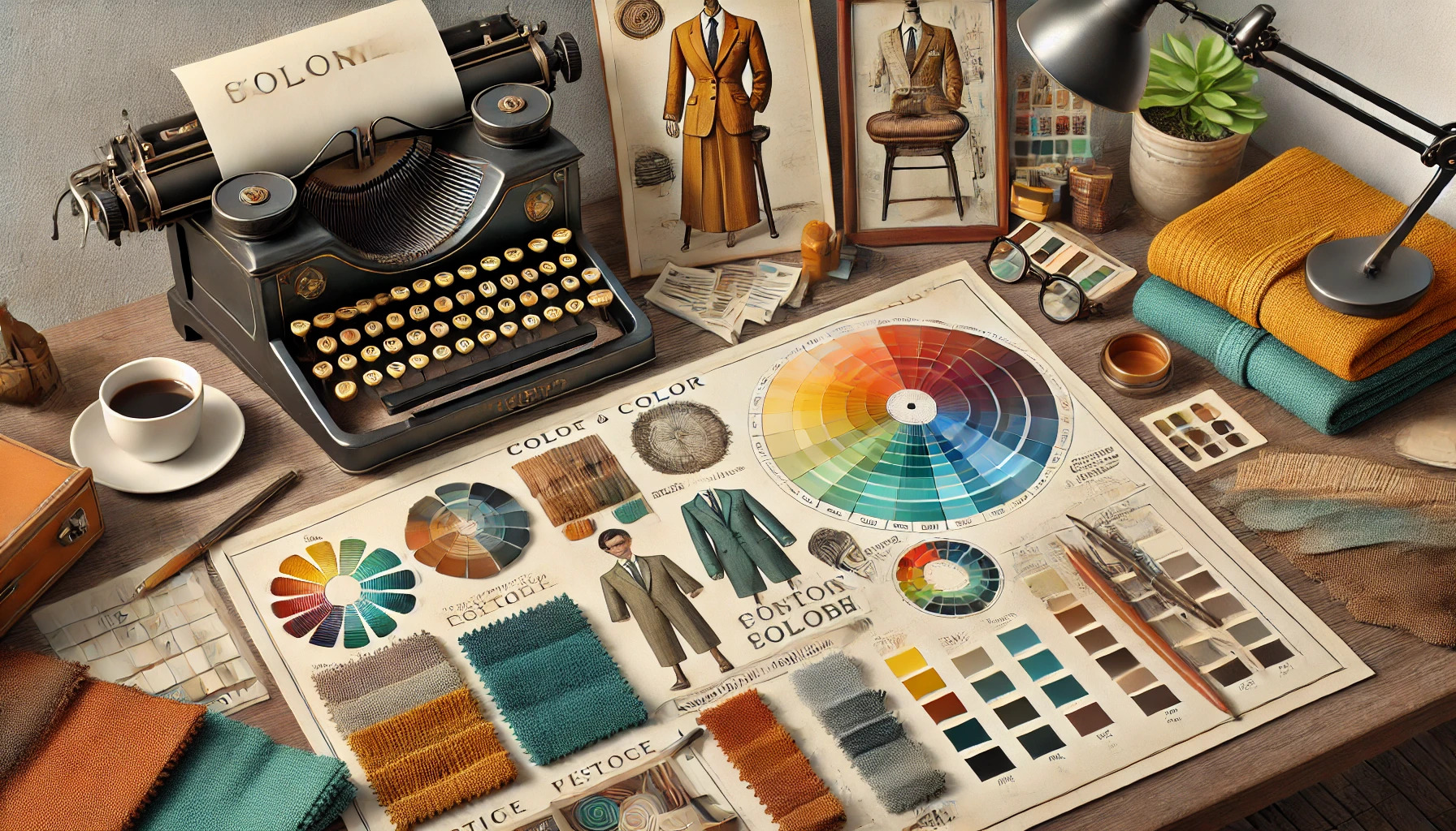
Color Theory Basics
Understanding color theory is essential for creating effective vintage or retro designs. Knowing how colors work together can help achieve the desired mood and aesthetic. This section covers key aspects of color theory, including the color wheel, the difference between warm and cool colors, and principles of color harmony.
Color Wheel Essentials
The color wheel is a visual tool that displays colors in a circular format. It is divided into primary, secondary, and tertiary colors.
- Primary Colors: Red, blue, and yellow are the foundation.
- Secondary Colors: These are created by mixing primary colors. For example, red and blue make purple.
- Tertiary Colors: Formed by mixing a primary color with a secondary color.
The arrangement of colors on the wheel helps in identifying complementary and contrasting colors. This knowledge is crucial for selecting color combinations that evoke the desired vintage feel.
Warm vs. Cool Colors
Colors are often categorized as warm or cool.
-
Warm Colors: Reds, oranges, and yellows create a cozy and energetic atmosphere. These colors can evoke feelings of warmth and excitement, making them popular in retro designs.
-
Cool Colors: Blues, greens, and purples tend to be calming and peaceful. These colors can convey a sense of relaxation and nostalgia, suitable for vintage aesthetics.
Understanding the implications of warm and cool colors can guide designers in choosing the right palette that fits their vision.
Color Harmony Principles
Color harmony refers to the pleasing arrangement of colors. Using color harmony principles helps achieve balance and cohesion in design.
-
Complementary Colors: Opposites on the color wheel (like blue and orange) create strong contrasts.
-
Analogous Colors: Next to each other on the wheel (such as blue, blue-green, and green) provide a serene look.
-
Triadic Colors: Three colors evenly spaced on the wheel (like red, yellow, and blue) offer a vibrant feel.
Utilizing these principles aids in creating a well-balanced and attractive color scheme that can enhance vintage or retro styles.
Identifying Period-Appropriate Colors
Choosing the right colors for vintage or retro designs involves understanding the popular shades from different periods and their specific palettes. Each decade has its own distinctive style, and being aware of these can help create a more authentic look.
Popular Colors from the Past
Different eras celebrated unique color trends. For instance, the 1920s often showcased soft pastels, like mint green and blush pink, which gave designs a light and airy feel. The 1950s typically featured bold hues like cherry red and sunny yellow, reflecting the vibrant optimism of that time.
In the 1970s, earth tones, such as olive green and burnt orange, became the go-to choices, resonating with a more natural aesthetic. By recognizing these color patterns, designers can effectively evoke a sense of nostalgia and relevance in their work.
Decade-Specific Palettes
Understanding decade-specific palettes can guide designers in making informed choices.
- 1920s: Pastel pink, light blue, soft lavender
- 1950s: Bright turquoise, cherry red, sunny yellow
- 1970s: Olive green, burnt orange, mustard yellow
Each decade communicates a specific mood. The colors of the 1960s, for example, often blended vibrant colors with rich, deep tones, leading to a lively mix.
By selecting colors from these palettes, designers can capture the essence of the era they wish to emulate. The choices made will set the tone and enhance the overall feel of the design.
Creating Your Color Palette
Choosing the right colors is essential for capturing the vintage or retro style. The process involves selecting a dominant color, adding complementary colors, and incorporating neutrals and accents to harmonize the design.
Selecting a Dominant Color
The dominant color sets the mood for the entire palette. It should reflect the era or theme the designer is aiming to recreate. For vintage looks, earthy tones like deep greens or muted reds work well. In contrast, retro designs often benefit from brighter hues like turquoise or mustard yellow.
To choose the dominant color, consider the emotional response it evokes. Test a few shades against each other to see which resonates best. This color should be used widely throughout the design to unify all elements.
Choosing Complementary Colors
Complementary colors enhance the dominant color and add depth to the palette. These colors should be chosen carefully to avoid clashing. Designers can refer to the color wheel for guidance.
For instance, pairing a warm red with a soft green can create a striking balance. A good rule of thumb is to use two or three complementary colors. This can help to maintain focus while providing visual interest.
Incorporating Neutrals and Accents
Neutrals like beige, cream, and gray serve to ground the palette. They allow the vibrant colors to pop and can be used in backgrounds or text. Accents are small doses of bright or bold colors that add excitement.
Consider adding these elements sparingly for maximum impact. For example, a vintage design might use a soft beige with accents of deep navy blue or vibrant coral. This approach maintains a harmonious look while highlighting key features.
Combining Patterns and Textures
Finding the right mix of patterns and textures can enhance vintage and retro styles. It allows individual design elements to work harmoniously, creating a cohesive look while adding interest.
Mixing Patterns with Color
When combining patterns, start with color as the driving force. Select a main color palette that reflects vintage tones, such as muted oranges, browns, and faded yellows. This sets the stage for choosing patterns that complement each other.
Consider pairing bold floral designs with stripes or polka dots in similar colors. This creates a pleasing contrast without overwhelming the space. The key is to mix organic patterns, like florals, with geometric options to balance soft and sharp lines. Always try to incorporate at least one solid color in the mix to ground the look.
Texture and Color Dynamics
Textures play a crucial role in adding depth to any design. When working with vintage styles, think about materials that evoke nostalgia, such as velvet, linen, or burlap. These textures enhance visual interest.
Match textures to the chosen color scheme. For instance, a soft, textured throw can add warmth to a smooth, patterned sofa. Combining different textures can create a dynamic feel. Using similar colors across various textures keeps the design cohesive.
Incorporating multiple textures makes the space feel inviting and comfortable. Vintage designs thrive on this contrast, making rooms look more layered and thoughtfully designed.
Influence of Material and Lighting
Choosing the right materials and understanding how lighting affects color can significantly enhance vintage or retro designs. The interplay between fabric and light defines how colors are perceived in a space, which is essential for achieving the desired aesthetic.
Impact of Fabric Selection
Fabric choice can dramatically influence the color palette in vintage or retro styles. Different materials, such as cotton, velvet, or linen, each have unique textures and colors. For instance, velvet has a rich, deep color that can evoke a sense of luxury, while cotton tends to have a brighter, fresher appearance.
Additionally, the finish of the fabric can alter how colors are viewed. A matte finish may soften colors, making them feel more subdued. In contrast, glossy fabrics can amplify brightness, producing a lively look. It’s important to consider how the chosen fabric will fit within the overall design framework.
Understanding Color Behavior in Different Lighting
Lighting plays a crucial role in how colors appear in any space. Warm lighting, such as incandescent bulbs, can make colors look more inviting and cozy, enhancing the vintage feel. This type of lighting can bring out soft tones in fabrics, creating a harmonious atmosphere.
In contrast, cool lighting, like LED lights, may cause colors to appear sharper and can sometimes strip away the warmth from vintage palettes. Designers should experiment with different light sources to see how they affect the colors of their materials. Natural light also brings a unique quality, often changing throughout the day, which can alter the mood of the space.
Application in Fashion and Interior Design
Vintage and retro styles are all about bringing the past into the present. Whether in clothing or home decor, these applications emphasize specific color combinations and patterns that evoke nostalgia while still feeling fresh and relevant.
Dressing with a Vintage Flair
When it comes to fashion, choosing the right colors can transform an outfit into a vintage masterpiece. Soft pastel shades, like mint green or blush pink, are common in mid-century styles. These colors often pair well with classic patterns such as polka dots or florals.
Accessorizing is key in achieving a vintage look. Items such as wide-brimmed hats, statement jewelry, and retro handbags can enhance an outfit. She could also mix old and new pieces for a unique flair.
Layering is another effective technique. A simple dress can be brought to life with a vintage cardigan or a print scarf. Fabrics with texture, like lace or denim, add character and depth to vintage outfits.
Retro-Chic Home Decor
Home decor inspired by retro styles focuses on bold colors and patterns that create a lively atmosphere. Earthy tones, bright yellows, and deep oranges were popular during the 1970s. These colors can be featured on walls, furniture, or accent pieces.
Wallpaper with geometric designs can make a strong statement in any room. Mixing and matching different patterns is encouraged to create a vibrant look. Vintage-inspired rugs can also add warmth and texture to a space.
Furnishing with retro pieces is essential for authentic decor. Mid-century modern furniture, such as low-slung sofas and sleek coffee tables, fits perfectly into this theme. Including vintage decor items like old radios or classic artwork can complete the desired aesthetic.
Maintaining Authenticity While Being Trendy
Finding the right balance between vintage authenticity and modern trends is key for anyone looking to create stylish outfits. By carefully choosing elements from the past and present, individuals can achieve a unique look that feels both fresh and respectful of its roots.
Balancing Old and New
To mix vintage and modern effectively, it helps to choose a few standout pieces. For instance, pairing a classic 70s blouse with contemporary jeans can create a fun and stylish outfit.
Colors play a big role in maintaining this balance. Utilizing retro palettes like warm earth tones alongside modern shades can create a cohesive look. Accessories can also bridge the gap. A vintage handbag matched with modern shoes can enhance the overall style without feeling out of place.
Contemporary Takes on Classic Looks
Modern fashion often draws inspiration from the past. Many designers reinterpret classic styles to fit today’s trends. Elements like high-waisted pants or oversized jackets have made a comeback, but they come with updated fabrics and cuts.
When recreating these classic looks, it’s important to focus on fit. A well-fitted vintage dress mixed with trendy sneakers can keep the look current. Experimenting with layering is another great idea. A vintage scarf can add charm to a modern outfit, creating a refreshing take on traditional fashion.
Accessorizing Your Vintage Look
Accessorizing is an essential part of creating a vintage style. The right accessories can enhance the overall aesthetic and tie together a look. Choosing pieces that match the outfit’s color palette and fit the style of a specific era can elevate any vintage wardrobe.
Matching Accessories to Your Palette
When selecting accessories, it’s important to consider the main colors in the outfit. Accessories should either blend in harmoniously or provide a lovely contrast. For instance, if someone is wearing muted earth tones, they could opt for accessories in lighter shades of cream or pastel.
- Choose bags, belts, and shoes that complement the outfit’s colors.
- Consider jewelry that accentuates similar tones, like gold or silver based on the color scheme.
Textured materials like leather or soft fabrics can add depth to the visual appeal, enhancing the vintage vibe. Mixing textures can have a powerful effect, making an outfit feel more complete.
Period Accessories as Color Accents
Using accessories inspired by specific eras can serve as bold color accents. Items like vintage brooches, hats, or scarves can bring an outfit to life. For example, a bright 1960s clutch can pop against a neutral dress.
- A 70s-inspired headband can add both color and personality.
- Statement jewelry from the 1920s can provide classic elegance.
Including these accessories not only adds color but also tells a story about the fashion trends of that time. This way, she can create a truly unique look while making a subtle nod to vintage eras.
Practical Tips and Tricks
Finding the right colors for vintage or retro styles can be fun and creative. Here are some practical tips to help in testing combinations and discovering fresh inspiration.
Testing Color Combinations
To test color combinations effectively, she can use color swatches or paint samples. This allows for visual comparisons in different lighting. A simple way to start is by selecting a base color, then choose one or two accent colors.
Make a list of potential combinations. This list helps in narrowing down options. A good rule is to aim for a balance between muted shades and richer tones.
Using online tools like color palette generators can also aid in visualizing how colors work together. These tools often provide suggestions based on the initial color chosen. They help ensure the resulting combination is harmonious and fitting for vintage or retro styles.
Finding Inspiration
Inspiration for vintage color schemes can come from many places. Old photographs, classic films, or even vintage furniture often showcase great color combinations.
Visiting antique shops or flea markets may spark ideas as well. Observing how past trends influence current designs helps create a nostalgic feeling.
Online platforms like Pinterest are also excellent resources. You can search for keywords like “vintage color palettes” or “retro designs” for abundant visuals. Another tip is to look into specific eras, such as the 1920s or 1970s, for inspiration that distinctly represents those times. These sources provide a wealth of ideas for designing with vintage charm.