
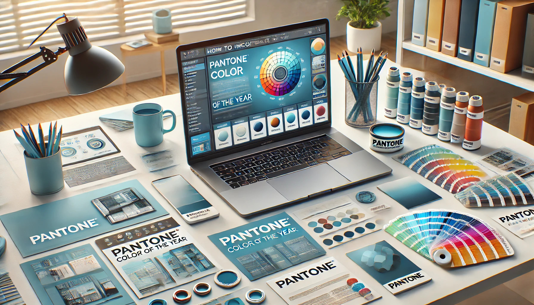
Finding new ways to refresh designs can be exciting, especially when incorporating the Pantone Color of the Year. Using this year’s color will help create a fresh and trendy look that can captivate your audience. Whether designing graphics, fashion items, or home decor, these colors can add a special touch that resonates with current trends.
This year’s color, Mocha Mousse, offers a sophisticated and warm tone, perfect for enhancing various projects. Designers can experiment with Mocha Mousse through backgrounds, typography, or accents to bring a polished yet approachable vibe. By weaving this color into their work, they can connect with viewers on a deeper level.
Embracing the Pantone Color of the Year can transform a basic design into something remarkable. It not only shows creativity but also keeps designs relevant and exciting. Readers will find practical tips and unique ideas that inspire effective use of this year’s color throughout the article.
The Significance of Pantone’s Color of the Year
Pantone’s Color of the Year holds great significance in design and branding. It reflects current trends and cultural moods, making it a useful tool for creators. This annual selection influences various industries, from fashion to interior design.
Using the Color of the Year can help brands connect with their audience. Designers can incorporate this color into their products, keeping them relevant and trendy. This can enhance marketing efforts and spark new ideas.
For many businesses, adopting this color shows awareness of industry shifts. It can attract customers who appreciate modern aesthetics. By aligning with Pantone’s choice, brands can enhance their visibility and appeal.
Each year’s color tells a story. It captures the spirit of the time, resonating with people’s feelings and experiences. This emotional connection can make designs more impactful and memorable.
Incorporating the Color of the Year into designs can involve various applications. Here are a few ideas:
- Fashion: Use the color in clothing lines.
- Interiors: Apply it in home decor choices.
- Branding: Integrate the color into logos or marketing materials.
Embracing Pantone’s color choice can inspire creativity and innovation. It encourages designers to think outside the box and explore new possibilities in their work.
Understanding Color Psychology
Color psychology plays a significant role in design. It helps creators choose colors that evoke specific emotions and convey particular messages. Knowing how colors affect feelings and perceptions can guide designers in making effective choices.
Emotional Impact
Colors can trigger strong emotions. For example, warm colors like red and orange often create feelings of excitement and warmth. In contrast, cooler colors like blue and green tend to evoke calm and tranquility. Understanding these associations can help designers choose colors that support their intended message.
Different colors can also influence behavior. Bright colors like yellow may inspire happiness and energy, while darker colors can create a more serious mood. By carefully selecting colors, a designer can enhance the viewer’s experience and connection to the design.
Color Associations
Each color carries certain associations that can vary by culture and context. For instance, green often symbolizes nature and growth. In many cultures, it is also linked to prosperity and health. Designers can use this knowledge to align their work with the themes they want to convey.
Similarly, blue is often associated with trust and reliability, making it a popular choice for corporate branding. Red can signify passion or urgency, so it often appears in sales or promotions. By understanding these associations, designers can communicate more effectively through their color choices.
Incorporating the Color into Various Design Fields
Integrating Pantone’s Color of the Year into different design fields can bring fresh energy and appeal. Each design area offers unique opportunities and methods to utilize this vibrant color effectively.
Graphic Design Tips
In graphic design, using the Color of the Year can enhance visual impact. Start by creating a color palette that includes the primary color along with complementary shades. This balance can make designs cohesive and inviting.
Try these techniques:
- Use bold typography: Highlight the color in headings or important text, drawing attention to key messages.
- Incorporate geometric shapes: Use the color in shapes and icons to add interest and structure to layouts.
- Create visual hierarchy: Utilizing various shades can help guide the viewer’s eye through the content.
These strategies can make graphic designs more memorable and engaging.
Interior Design Strategies
For interior design, applying Pantone’s Color of the Year can transform spaces. Start with accent walls to create focal points. Adding furniture or decor in the color can tie the room together.
Consider these tips:
- Mix textures: Combine fabrics and materials in the color for depth, like cushions, rugs, and drapes.
- Accessorize wisely: Use the color in artwork, vases, and other decorative elements to enhance visual interest without overwhelming the space.
- Layer with neutrals: Pair the color with neutral tones to let it shine while maintaining balance.
These approaches can make interiors look fresh and sophisticated.
Fashion Design Ideas
In fashion design, the Color of the Year can set trends. Designers can incorporate this color into their collections through various garments and accessories.
Explore these options:
- Statement pieces: Create standout items like dresses or coats that feature the color prominently.
- Layering options: Use the color in scarves or belts to easily incorporate it into existing wardrobes.
- Prints and patterns: Blend the color into patterns for dresses, shirts, or swimwear to attract attention.
These strategies can keep fashion collections current and appealing.
Web Design Best Practices
Web design offers unique possibilities for using Pantone’s Color of the Year. This color can enhance the user experience and create a strong brand identity.
Implement these practices:
- Call-to-action buttons: Use the color for buttons to attract clicks and boost conversions.
- Background and accent colors: Apply the color in backgrounds or accents to maintain user engagement without distraction.
- Consistent branding: Ensure the color aligns with overall brand colors for a unified appearance across all digital platforms.
These methods can significantly improve web designs and user interaction.
Combining Colors
When incorporating Pantone’s Color of the Year into designs, understanding how to combine colors effectively is crucial. Using complementary, analogous, or monochromatic color schemes can enhance the overall aesthetic and ensure a pleasing visual experience.
Complementary Colors
Complementary colors sit opposite each other on the color wheel. They create a strong contrast that draws attention. For example, if the Color of the Year is a warm shade like Mocha Mousse, pairing it with a cool color such as teal can make a striking combination.
To use complementary colors:
- Choose one dominant color for the main elements.
- Select its complementary color for accents or highlights.
This type of pairing can add energy to designs and make certain elements pop. It’s effective for marketing materials, posters, or branding.
Analogous and Monochromatic Schemes
Analogous colors sit next to each other on the color wheel. This harmony creates a serene look. For instance, if using Peach Fuzz as the main color, blending it with soft peach and light coral gives a gentle transition.
Monochromatic schemes involve using various shades and tints of a single color. This approach provides depth and dimension while keeping the design cohesive.
For both schemes, it’s helpful to:
- Start with one base color.
- Add variations to build visual interest.
These techniques are perfect for interior design or fashion, helping to create a unified and stylish look without overwhelming the viewer.
Selecting Materials and Mediums
Choosing the right materials and mediums is crucial when incorporating Pantone’s Color of the Year into designs. The type of material affects the color’s appearance and overall impact. Here are some important considerations for both textiles and digital mediums.
Textiles and Fabrics
When using Pantone’s Color of the Year in textiles, it is essential to think about the fabric’s texture and weight. For instance, cotton and linen provide a more casual look, while silk or velvet adds elegance.
Key points to consider:
- Fabric Type: Choose heavier fabrics for drapes and upholstery, and lighter materials for clothing.
- Color Matching: Different fabrics can absorb colors differently. Always test the color swatch on the chosen fabric before committing.
Experimenting with various fabrics allows designers to see how the color plays out in different lighting. This helps in making informed decisions for fashion or interior design projects.
Digital Mediums and Print
In digital designs, the Pantone Color of the Year can appear differently based on the screen and software used. It is important to ensure accurate color representation in digital formats.
Important tips include:
- Color Calibration: Regularly calibrate monitors to ensure colors display accurately.
- Print Testing: Always conduct print tests, as colors often appear differently on paper than on screens.
Using design software, like Photoshop or Illustrator, allows for precise color application. Keeping the color codes handy can make implementation smoother across various digital platforms. This ensures that designs are not only visually appealing but also consistent in color across multiple mediums.
Planning Your Design Projects
When planning design projects, it’s crucial to start with a strong concept and create mood boards. These steps help to visualize the final look and feel while ensuring the design aligns with the chosen color theme.
Concept Development
Concept development is the foundation of any design project. It begins with brainstorming ideas that resonate with the goals of the project. Choosing themes or styles can help narrow down those ideas.
Designers should consider the target audience and the message they want to convey. Questions like, “What emotion should this design evoke?” are essential. Using trends, such as Pantone’s Color of the Year, can give fresh perspectives.
Sketching initial ideas or drafting rough layouts helps bring the concept to life. This stage is all about exploration. Flexibility and open-mindedness often lead to the best results.
Mood Boards and Color Palettes
Creating mood boards is an effective way to visualize concepts and color choices. Designers can collect images, textures, and colors that inspire them. This can include fabric swatches, pictures from magazines, or digital images.
Incorporating Pantone’s Color of the Year, for example, Peach Fuzz, can elevate a mood board. It allows for experimentation with shades and combinations.
Once the mood board is ready, a cohesive color palette can be developed. This palette should include the main color, complementary shades, and accent tones. Designers should aim for balance and harmony within the palette. A well-crafted palette serves as a guide throughout the design process.
Executing Your Designs
When incorporating Pantone’s Color of the Year into designs, it’s essential to focus on practical steps. Proper prototyping and a solid iterative design process help refine the use of color in various applications.
Prototyping and Sampling
Creating prototypes is a critical step. It allows designers to visualize how Pantone’s color will work in their design. Using physical samples of materials, fabrics, or paints can help convey the true shade.
Designers should also consider different lighting conditions. Colors can look different depending on ambient light. Testing in natural light and under artificial light ensures that the final design meets expectations.
While prototyping, involving stakeholders can provide valuable feedback. This input can guide adjustments before the final implementation.
Iterative Design Process
The iterative design process emphasizes continuous improvement. Designers start with an initial idea, incorporating Pantone’s color, and then refine it. Feedback from users or team members is crucial for this phase.
Using mock-ups can facilitate effective discussions. Designers should seek opinions on how the color impacts the overall aesthetic and functionality. Based on this feedback, they can make necessary revisions.
Repeating this cycle of feedback and adjustment allows for better alignment with goals. This method helps ensure that the final design reflects the desired emotional impact of the chosen color.
Marketing and Presentation
Incorporating Pantone’s Color of the Year into marketing and presentation can enhance visibility and attract attention. It plays a vital role in branding and can be a game-changer in client pitches.
Branding and Identity
Using the Color of the Year can help businesses stand out. By aligning the color with brand identity, companies can connect with their audience on an emotional level.
One effective approach is to update marketing materials including logos, business cards, and websites. Subtle changes, like incorporating the color into backgrounds or accents, can create a fresh look without a complete rebranding.
Colors also evoke feelings. For example, vibrant colors can convey energy and creativity. This can engage customers and enhance their perception of the brand.
Client Pitches and Portfolios
When presenting to clients, the right color can make a significant impact. Using the Color of the Year in pitches or portfolios can capture attention and convey creativity.
For instance, incorporating the color into slides, visuals, and infographics can make presentations more engaging. It draws the viewer’s eye and can help highlight key information.
In portfolios, a consistent color usage can provide a cohesive look. This allows the work to shine while emphasizing a designer’s or marketer’s unique style. Making a strong visual impression can lead to more successful collaborations.