
Using color effectively can transform any artwork, making it more appealing and balanced. An analogous color scheme, which uses colors next to each other on the color wheel, helps artists create pleasing harmony in their pieces. This approach not only enhances visual unity but also evokes certain emotions, giving depth to the artwork.
Artists often seek ways to connect their colors smoothly and naturally. By choosing shades that are similar, they can achieve a calming effect that draws viewers in. Whether painting landscapes or abstract pieces, incorporating analogous colors can simplify the decision-making process and lead to stunning results.
Exploring the world of analogous colors invites creativity and experimentation. The beauty of this color scheme lies in its ability to soften contrasts, making compositions feel cohesive. With a little practice, any artist can master the art of using these harmonious colors to elevate their work.
Understanding Color Theory
Color theory is an essential aspect of art that helps in creating harmony within a composition. It involves understanding how colors interact, especially analogous colors, which share common hues. Knowing these concepts can greatly aid artists in making informed choices about their palettes.
Defining Analogous Colors
Analogous colors are groups of three or more colors that sit next to each other on the color wheel. For example, blue, blue-green, and green form an analogous color scheme. These colors create a sense of unity and cohesion in artwork because they blend well together.
When using analogous colors, the artist can achieve a calming effect. This is ideal for designing serene landscapes or portraits. An artist might use a palette of soft greens and blues to evoke a peaceful atmosphere.
Color Wheel Basics
The color wheel is a visual representation of colors and their relationships. It is divided into primary, secondary, and tertiary colors. Primary colors include red, blue, and yellow, while secondary colors are created by mixing primary colors, such as green and orange.
Understanding the color wheel helps artists identify which colors work well together. Artists can use this tool to find analogous colors for their artwork. By selecting colors next to one another, they can create harmonious designs that draw the viewer in.
Relationship Between Colors
Colors have unique relationships that affect how they are perceived. For instance, analogous colors promote harmony, while complementary colors (those opposite each other on the color wheel) create contrast. Knowing these relationships allows artists to create balance in their work.
When incorporating analogous colors, it is essential to consider their warmth and coolness. Warm colors like reds and yellows can energize a piece, while cool colors like blues and greens can provide tranquility. Mastering these relationships empowers artists to tell stories through their color choices.
The Psychology of Analogous Colors
Analogous colors can evoke strong emotions and carry significant cultural meanings. Understanding these aspects helps artists make informed choices in their work.
Emotional Associations
Artists often use analogous colors to create specific emotional responses. For instance, greens (like blue-green and green) can convey calmness and relaxation, making them ideal for tranquil scenes.
Meanwhile, warm analogous combinations, like red, red-orange, and orange, can evoke feelings of warmth and energy. This helps in creating inviting atmospheres.
Using these colors thoughtfully can improve the viewer’s connection to the artwork. Mixing colors like this encourages a sense of harmony and balance, enhancing the overall impact.
Cultural Significance
In many cultures, colors hold unique meanings. For example, blue and green may symbolize nature and tranquility in Western cultures.
In contrast, red can have different implications; it represents both love and danger.
Artists should consider these cultural contexts when choosing analogous colors. This awareness can deepen the viewer’s understanding and appreciation of the artwork. By picking colors that resonate culturally, they add an extra layer of meaning to their creations.
Planning Your Color Scheme
Creating a well-planned color scheme is essential for harmonizing artwork. Focusing on a dominant color, selecting supporting colors, and considering the color temperatures can help in achieving a balanced composition.
Choosing a Dominant Color
The dominant color acts as the foundation for any art piece. It sets the mood and draws attention, making it important to select the right hue. Artists can start by looking at color wheels to choose a color that resonates with their vision.
For example, a warm red can evoke emotions of passion, while a cool blue brings calmness. It is helpful to think about the feelings or message that the artwork should convey. Sticking to one dominant color will help maintain focus throughout the piece.
Selecting Supporting Colors
After determining the dominant color, artists should select supporting colors. These colors should be next to the dominant color on the color wheel.
For instance, if the dominant color is blue, using green and teal as supporting shades can create a smooth transition. This method allows colors to complement each other without competing for attention. It’s helpful to test combinations on a color palette before applying them to the artwork to see how they interact.
Considering Color Temperature
Color temperature plays a crucial role in the overall feel of the artwork. Artists should consider whether to use warm or cool colors to influence the mood.
Warm colors, like reds and yellows, create a sense of energy and vibrancy. Cool colors, such as blues and greens, can evoke feelings of tranquility. Balancing warm and cool colors can add depth and interest to the artwork, allowing viewers to engage more fully with the piece.
Applying Analogous Colors in Art
Using analogous colors can add warmth and richness to artwork. Artists can create balance, depth, and harmony by thoughtfully using colors that sit next to each other on the color wheel.
Balancing Visual Interest
Balancing visual interest involves using analogous colors to draw the viewer’s eye. By choosing three or more colors next to each other, artists can create a pleasing look. For example, combining blue, blue-green, and green can make a serene atmosphere.
To achieve balance, it’s essential to vary the intensity of the colors. Placing lighter and darker shades together can create a more dynamic piece. Artists might also use these combinations to highlight certain areas, guiding the viewer through the artwork.
Creating Depth and Dimension
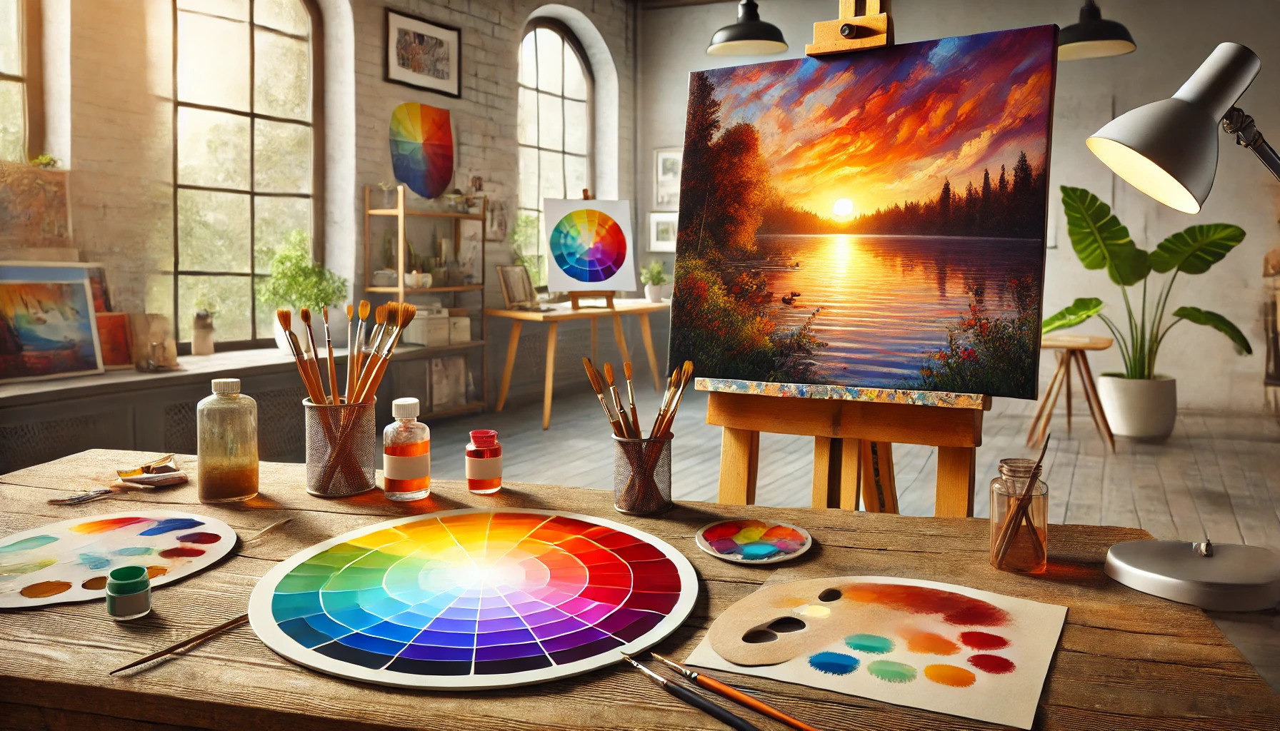
Creating depth and dimension is vital in art, and analogous colors can help. Artists can use warmer colors, like reds and oranges, in the foreground. Cooler colors, such as greens and blues, can recede into the background.
This technique tricks the eye into seeing layers, giving a three-dimensional feel. For example, an artist may paint a sunset with warm hues in the foreground and cooler tones in the background. This strategy enhances the sense of space in the artwork.
Color Harmony in Composition
Analogous colors naturally create harmony in a composition. By using colors that are close together on the wheel, artists can achieve unity in their work. For instance, combining yellows, oranges, and reds can evoke warmth and happiness.
Selecting the right combination enhances the overall message of the piece. It is important for artists to experiment with different analogous sets to find what best expresses their vision. This creates a cohesive and inviting feel, making artwork more engaging for viewers.
Mixing Paints and Mediums
Mixing paints and mediums is an essential skill for creating the perfect color blend in artwork. Understanding the types of pigments and techniques allows artists to achieve the desired effects, promoting harmony in their pieces.
Understanding Pigments
Pigments are the building blocks of color. They come in various forms, such as powders and liquids, and each has unique properties. Artists should choose high-quality pigments for better mixing and longevity.
Types of Pigments:
- Organic Pigments: Made from carbon compounds, they often provide vibrant colors but may fade over time.
- Inorganic Pigments: These are more stable and less likely to fade, making them excellent for outdoor art.
When mixing pigments, it’s crucial to know how they interact. Some colors can create muddy effects if not combined carefully. Using an artist’s guide can help determine which colors work well together.
Techniques for Mixing Colors
Mixing colors can be a fun experiment but requires some techniques to avoid mistakes. Here are a few effective methods:
- Palette Mixing: Use a clean palette to mix colors. This helps to assess the true shade.
- Wet Mixing: Blend wet paints directly on the canvas for unique effects.
- Color Gradients: Gradually add white or black to create lighter or darker shades.
It is important to mix in small amounts. This way, the artist can control the final color and avoid waste. Keeping a color notebook can also assist in remembering effective mixes for future use.
Lighting and the Impact on Colors
Lighting significantly affects how colors are perceived in artwork. Different light sources can change the appearance of colors, creating variations in mood and depth. Understanding these effects helps artists choose the right lighting for their pieces.
The Role of Natural Light
Natural light can dramatically influence the way colors appear in a painting. Morning light may provide soft, golden tones, while afternoon light can be brighter and more intense.
Artists may also notice that colors shift throughout the day. For instance, warm sunlight can enhance the richness of analogous colors, making them pop.
Using a north-facing window is often ideal for artists, as it gives consistent, even light throughout the day, reducing harsh shadows. Additionally, overcast days offer a soft and diffused light that is gentle on colors, allowing for smoother transitions between hues.
Artificial Lighting Considerations
Artificial lighting needs careful consideration to maintain color accuracy. Different bulbs emit varying color temperatures, which can affect how colors are seen.
For instance, incandescent lights tend to produce warmer light, while fluorescent lights can create cooler tones.
Using LED lights with adjustable color temperatures allows greater control over color perception.
When creating art, using daylight-balanced bulbs can help artists achieve a clearer view of their work, ensuring color harmony remains intact.
It’s helpful for artists to test their work under different lighting conditions. That way, they can see how their chosen analogous colors interact under various light sources.
Common Mistakes to Avoid
Using analogous colors can create beautiful and harmonious artwork, but there are common mistakes that can lead to unsatisfactory results. It’s important to be mindful of color saturation, tone variety, and contrast to achieve the best effects.
Over-Saturating Colors
One mistake many artists make is over-saturating their colors. While vibrant colors can be eye-catching, too much saturation can overwhelm the viewer. This often creates a chaotic look that detracts from the harmony intended with an analogous scheme.
To avoid this, artists should consider using softer, muted versions of their chosen colors. This approach maintains visual interest while promoting balance. A good rule of thumb is to start with a few saturated colors and gradually blend in lighter shades.
Lacking Variety in Tones
Another common issue is lacking variety in tones. Sticking too closely to one tone can make the artwork feel flat and uninspiring. Using only light or dark versions of analogous colors may limit the artwork’s depth and dimension.
To keep the piece engaging, artists should explore different tones within their selected color palette. For example, incorporating a mix of both light and dark hues of the same color family can add richness. This variety also helps in creating layers and interest in the artwork.
Neglecting Contrast
Neglecting contrast is a significant mistake that artists often overlook. Even within an analogous color scheme, some contrast is necessary to guide the viewer’s eye. Relying solely on similar colors may cause parts of the artwork to blend together, which can diminish impact.
To counter this, artists should strategically place contrasting elements. This might include using a complementary color in small doses or varying the intensity of analogous colors. Thoughtful contrasts can draw attention to focal points and enhance the overall composition effectively.
Tips for Harmonious Artwork
Creating harmony in artwork can elevate the overall feel and impact. By thoughtfully incorporating neutrals, playing with saturation and value, and using complementary colors strategically, artists can achieve a balanced and appealing piece.
Incorporating Neutrals
Adding neutral colors can enhance a painting’s harmony. Neutrals like white, gray, and beige work well to tone down brighter colors.
They create breathing space and balance amidst vibrant hues. When using an analogous color scheme, neutrals help highlight the main colors without competing for attention.
An artist can choose a neutral base to allow the analogous colors to stand out. This approach makes the artwork feel more cohesive and calming.
Experimenting with Saturation and Value
Saturation and value are vital aspects of color that can dramatically affect harmony. Adjusting the saturation of colors can bring depth to an artwork.
For example, a vibrant red can be adjusted to a softer pink to blend better within the analogous scheme.
Artists should also consider the value, which refers to how light or dark a color is. Mixing various values of the same color can create more interest and subtlety while preserving the harmonious feel.
Using lighter tones can highlight certain areas, while darker shades can add focus and dimension.
Strategic Use of Complementary Colors
Complementary colors offer a unique way to make analogous colors pop. When placed next to each other, they create contrast, which can draw attention to specific elements in the artwork.
For instance, using green in an artwork dominated by blue and teal can add excitement without overwhelming.
It’s essential to use these complementary colors sparingly, as too much can disrupt harmony.
By focusing on strategic placement, the artist can enhance the overall composition and guide the viewer’s eye throughout the piece.