
Color is more than just a visual element; it plays a crucial role in how people perceive and interact with designs. Using color theory effectively can significantly enhance user experience and make interfaces more appealing and functional. By understanding the emotional impact colors have, designers can create a connection with users that encourages engagement.
In UX/UI design, colors can influence decisions and guide users through an interface. Choosing the right color palette helps communicate the brand’s message and enhances usability. This post will explore practical ways to apply color theory to create designs that not only look good but also feel intuitive to users.
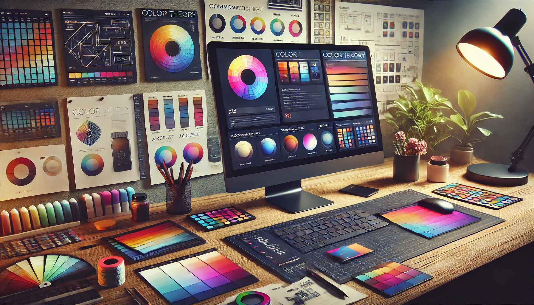
Understanding Color Theory
Color theory is a foundation for effective design. It helps designers choose and combine colors to create visually appealing and functional user interfaces. Key concepts include the color wheel, color harmony, and the psychology behind color choices.
The Color Wheel and Color Relationships
The color wheel is a useful tool that shows how colors relate to each other. It includes primary colors (red, blue, yellow), secondary colors (green, orange, purple), and tertiary colors, which are made by mixing primary and secondary colors.
Knowing the different types of color relationships is crucial. Complimentary colors are opposite each other on the wheel and create high contrast. Analogous colors sit next to each other and provide a harmonious look. Triadic colors form a triangle on the wheel, offering balance and vibrancy.
Color Harmony and Meanings
Color harmony is all about creating pleasing combinations that make designs attractive. Using colors that work well together enhances the overall experience. Designers often use established harmonies, like complementary, analogous, and monochromatic schemes, to achieve this balance.
Each color comes with its own emotional meaning. For example, blue often conveys trust and calmness, while red can evoke excitement or urgency. When used in design, understanding these meanings helps to communicate the right message and feel.
The Psychology of Color in Design
Colors can influence user emotions and behavior. Designers use this psychology to shape experiences and encourage specific actions. Research shows that colors can affect decision-making; for instance, green can indicate safety, making it suitable for call-to-action buttons.
When creating a UI, designers must consider the target audience. Different cultures can interpret colors in unique ways. For example, white symbolizes purity in many Western cultures, while in some Eastern cultures, it can represent mourning. Knowing these differences helps ensure that design resonates with users.
Applying Color Theory to UX/UI Design
Using color theory effectively can significantly enhance a user’s experience. It helps designers communicate emotions, values, and functions through color choices. Understanding color schemes, balance, and contrast ensures that designs are not only visually appealing but also user-friendly.
Color Schemes and Theme Development
Choosing the right color scheme is vital for any design project. Designers can select from various options, such as monochromatic, analogous, or complementary schemes. Each scheme conveys a different mood and message.
A monochromatic scheme uses variations of a single color, creating a clean and cohesive look. An analogous scheme combines colors that are next to each other on the color wheel, providing harmony. In contrast, complementary schemes use opposite colors for vibrant visual interest.
It’s essential to consider the brand identity when developing a theme. For instance, a tech company might opt for cool colors like blue for a modern feel, while a children’s brand might choose bright, cheerful colors.
Balancing Color for Accessibility
Accessibility is critical in design. Designers must ensure that color choices are inclusive for all users, including those with color vision deficiencies. A balanced approach is necessary to create a pleasant visual experience.
Using high-contrast colors enhances readability and user interaction. For example, dark text on a light background is easier to read than light text on a similarly colored background. Tools like color contrast checkers can help designers verify accessibility standards.
In addition, designers should avoid relying solely on color to convey information. For example, using symbols or text labels alongside color can assist those who may not perceive color differences.
Contrast and Comprehension
Effective use of contrast is essential in UX/UI design. It helps elements stand out and guides users through an interface. High contrast can improve comprehension, making it easier for users to navigate.
Designers should carefully select contrasting colors for text and backgrounds. For example, black text on a white background creates a sharp contrast that enhances readability.
Furthermore, using contrasting colors can direct user attention to important buttons or calls to action. It’s crucial to maintain visual balance, ensuring that contrasts do not overwhelm the design. Thoughtful application of contrast can support better user comprehension.
Designing with a Purpose
Color choices in design can significantly affect how users feel and interact with a product. Understanding how to utilize color meaningfully can lead to greater engagement and satisfaction.
Emotional Impact and Branding
Colors evoke emotions and set the tone of a design. For instance, blue often conveys trust, while red can invoke excitement. Brands must choose colors that reflect their values and connect with their audience emotionally.
For example:
- Blue: Trustworthy and dependable
- Red: Passionate and energetic
- Green: Calm and peaceful
Using colors thoughtfully helps to create a strong brand identity. Users begin to associate certain colors with specific feelings about a brand. When designing, it’s essential to align color choices with the brand message for consistency and impact.
User Demographics and Preferences
Different demographics may react differently to colors based on cultural backgrounds and personal experiences. A color that is appealing to one group may not resonate with another. Designers should research their target audience to understand these nuances.
For instance, younger users might prefer vibrant and bold colors, while older users might favor more subdued tones.
Key considerations include:
- Age: Younger users may enjoy brightness.
- Cultural Background: Colors can have various meanings.
- Gender: Men and women might have different preferences.
By understanding user demographics, designers can create color schemes that cater to their audience. This approach leads to increased usability and a more enjoyable experience.
Best Practices for Color in UI Elements
Choosing the right colors for UI elements can greatly impact user experience. Certain colors can evoke emotions and direct attention, making it important to use them effectively in design.
Buttons and Calls to Action
Buttons should stand out from the background to attract attention. Bright, contrasting colors like green or orange are often effective for call-to-action buttons.
Key tips for button color:
- Use colors that align with the brand but stand out enough to draw clicks.
- Ensure text is legible by using high contrast between text and button colors.
- Consider using hover effects to create an engaging experience.
Notifications and Alerts
Colors play a critical role in notifications and alerts, helping users quickly identify important messages. Typically, red indicates urgency, while yellow may signal caution.
Important points for alerts:
- Use distinct colors for different alert types; for instance, use green for success messages and red for errors.
- Ensure that color is not the only way to convey information. Supplement colors with icons or text labels.
- Maintain consistency across the site for similar alerts to reduce confusion.
Form Fields and Validation
When designing forms, color can guide users through the validation process. For instance, a green border might indicate a successfully filled field, while a red border signals an error.
Best practices for forms:
- Use clear and consistent color coding for all input fields.
- Provide immediate feedback with colors as users fill out the form.
- Avoid using only color to indicate errors; include icons and descriptive messages for clarity.
By focusing on these aspects, designers can enhance usability and create a more engaging experience for users.
Advanced Techniques in Color Usage
Using color effectively in design goes beyond basic choices. Advanced techniques can greatly enhance user experience, making interfaces more engaging and informative.
Gradient and Texture Application
Gradients can add depth and interest to designs. Designers can use subtle gradients to create a sense of dimension. This technique can lead to a more dynamic visual experience.
Using texture along with gradients can provide a tactile feel. Combining smooth gradients with textured backgrounds can highlight key areas. For example, a button with a gradient may stand out more against a textured backdrop.
It’s essential to maintain harmony with these techniques. Careful selection of colors within the gradient is crucial. Using colors that complement each other helps to prevent visual chaos.
Data Visualization and Color Coding
Color coding is vital in data visualization. It allows users to quickly grasp complex information. By assigning specific colors to different categories, designers improve clarity.
Using distinct, consistent colors for distinct data sets helps users navigate charts. For instance, blue for water-related data and green for nature-related data provides immediate understanding. This method enhances user engagement by reducing confusion.
When creating legends or keys, clarity is key. Designers should ensure that color choices are intuitive. They can use patterns or textures to differentiate shades for color-blind accessibility.
Testing and Iteration
Testing and iteration are vital steps in using color theory effectively in UX/UI design. By conducting tests and gathering user feedback, designers can refine their color choices. This ensures that color schemes not only look good but also improve user experience.
A/B Testing and User Feedback
A/B testing involves creating two different versions of a design to see which performs better. For example, one version might use a warm color palette, while the other uses cool tones. Designers can measure user interactions, such as clicks and time spent on the site.
Collecting user feedback is equally important. Surveys or direct comments can reveal how users feel about specific colors. It’s crucial to ask questions like:
- Do the colors make the site easy to read?
- Do they evoke the right feelings?
Combining these methods allows designers to understand what works best for their audience and make data-driven decisions.
Color Consistency Across Platforms
Color consistency across platforms is essential for a cohesive brand image. When users notice the same colors whether on a website, mobile app, or social media, it builds trust and recognition.
Designers should create a style guide that outlines primary and secondary colors. This guide can ensure teams use the same colors uniformly across all platforms.
Regular reviews and updates to this guide help maintain brand integrity. Testing for color consistency can also involve checking how colors appear on different devices. Ensuring readability and aesthetic appeal across platforms helps enhance the user experience effectively.