
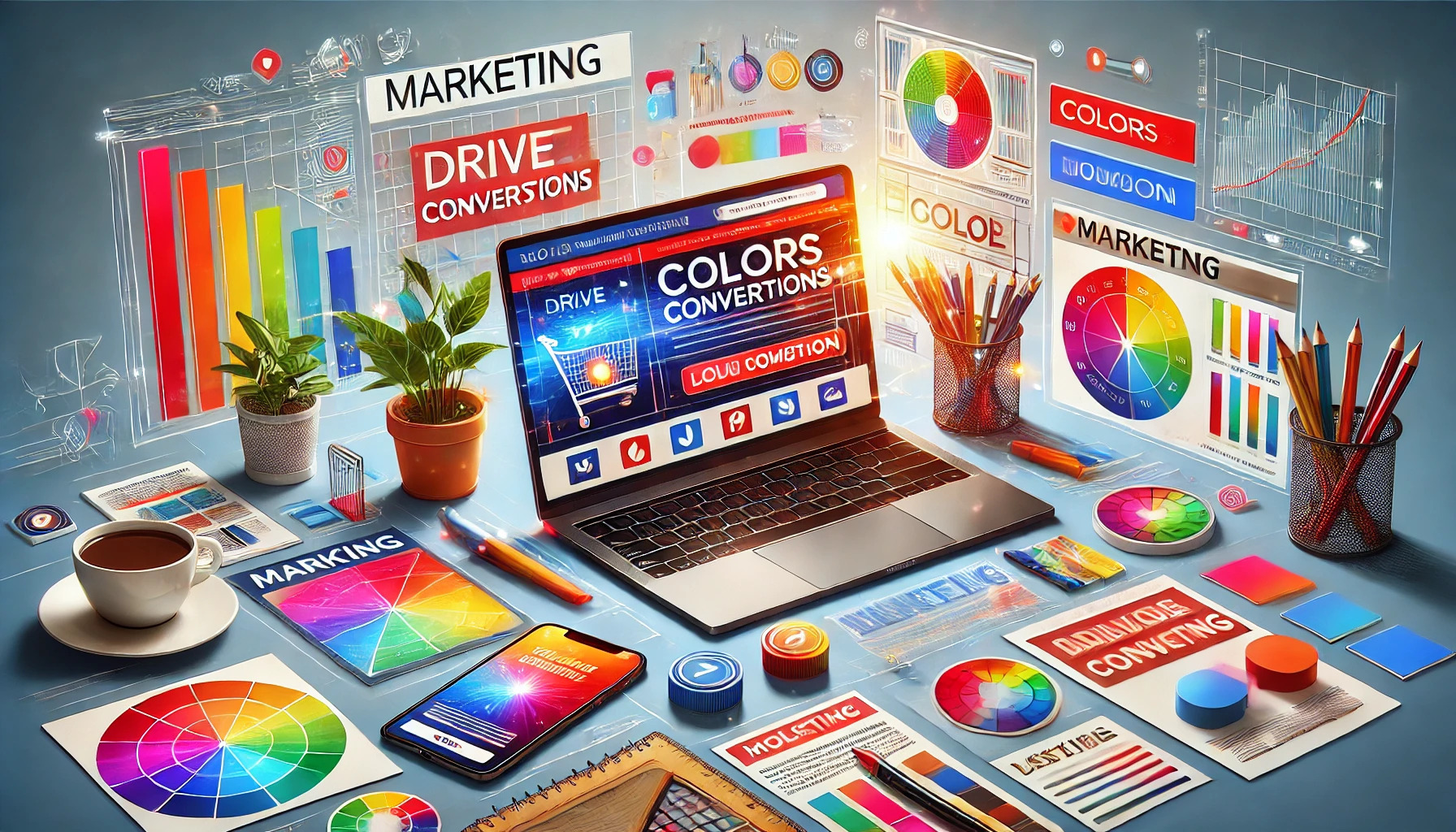
Colors play a vital role in marketing, influencing consumer emotions and decisions in subtle ways. Using the right colors can significantly increase conversions in marketing campaigns by attracting attention and creating a memorable brand experience. Understanding color psychology allows businesses to tailor their messages and visuals to resonate with their target audience.
Different colors evoke different feelings and responses. For example, warm colors like red and orange can create urgency, while cooler colors like blue tend to promote trust and calmness. By strategically incorporating these colors into their marketing materials, brands can effectively guide potential customers toward making a purchase.
As marketers explore how to use color to drive sales, they can tap into consumer perceptions and preferences. This approach not only enhances brand identity but also helps in crafting messages that resonate deeply with potential buyers. Embracing color psychology can transform a standard campaign into a powerful driver of success.
The Power of Color Psychology
Color psychology plays a crucial role in marketing. It influences how consumers perceive brands and make purchasing decisions. Marketers can use different colors to evoke specific feelings and drive actions.
Understanding Color Meanings
Colors have distinct meanings that can vary based on culture and context. For example, red often symbolizes excitement and urgency, making it a favorite for sales and promotions. It can grab attention quickly.
Blue, on the other hand, is associated with trust and reliability. Many banks and businesses utilize this color to instill confidence in their customers.
Green typically represents nature and health, making it ideal for eco-friendly brands. Each color can send a specific message about a brand’s values.
Understanding these meanings allows marketers to strategically choose colors that align with their goals.
Emotional Responses to Colors
Colors can trigger strong emotional responses in consumers. Yellow often evokes feelings of happiness and optimism. It can make a brand feel inviting and friendly.
On the other hand, black can convey sophistication and luxury. Many high-end brands use black to create an elegant image.
Orange is known for its energetic vibe. It often encourages action, making it effective in calls to action.
By knowing how people respond to different colors, marketers can better connect with their audience and encourage desired behaviors.
Designing Your Campaign
When creating a marketing campaign, choosing the right colors is essential. This section discusses how to select a color palette, ensure consistency across different media, and use contrast to enhance readability and capture attention.
Choosing the Right Color Palette
Selecting a color palette involves understanding the emotions and associations that colors evoke. For example, blue can convey trust and security, while red often signifies excitement and urgency. Marketers should start by defining the emotional response they want from their audience.
A good approach is to limit the palette to three or four main colors. This makes the design cohesive. Using a tool like Adobe Color can help visualize how colors work together. Checking the color palette against competitors can also ensure distinctiveness in the market.
Consistency Across Media
Consistency is key to building brand recognition. Whether a customer sees an email, a website, or social media ads, the colors should match. This helps create a unified brand identity that customers can easily recognize.
To achieve consistency, marketers can create a style guide that outlines the exact color codes and their applications. When designing digital content, tools like Canva can save time by maintaining consistent colors across different platforms. Ensuring the same colors are used in print materials is equally important, as it reinforces the brand.
Contrast for Readability and Attention
Using contrast effectively can make a campaign more engaging. High contrast between text and background colors improves readability, which is especially important for call-to-action buttons. A color wheel can help find complementary colors that stand out without clashing.
For example, a bright orange button on a dark blue background draws attention. Marketers should test different combinations to see what captures their audience’s interest. Balancing contrast while keeping the overall look attractive is essential for driving conversions.
Color Strategies for Different Goals
Selecting the right colors can significantly impact the effectiveness of marketing campaigns. Different colors evoke specific emotions and associations that marketers can use to achieve various objectives. Below are strategies for using colors to enhance brand recognition, drive sales, and create urgency.
Increase Brand Recognition
To boost brand awareness, businesses should select colors that align with their brand values. For example, blue often represents trust and professionalism, making it ideal for financial institutions.
Key Colors for Brand Recognition:
- Blue: Trust and reliability
- Red: Excitement and passion
- Green: Wellness and nature
Consistency is crucial. Companies that use the same colors across all platforms—like websites, social media, and packaging—are more likely to be remembered.
Action Item: Create a color palette and apply it across all marketing channels. This cohesive approach helps establish a strong visual identity.
Driving Sales and Promotions
Colors play a critical role in driving sales. Bright colors, like red or yellow, grab attention and stimulate purchases. Red, for example, is known to increase heart rates and create excitement, making it effective during promotions.
Effective Sales Colors:
- Red: Creates urgency and excitement
- Yellow: Associated with optimism and is eye-catching
- Orange: Inviting and creates a sense of stimulation
Using these colors in buttons or call-to-action sections can enhance conversion rates. Marketers should analyze how different shades perform in real-time data to fine-tune their approach.
Tip: A/B test different colors on promotional banners to see which ones lead to higher click-through rates.
Creating a Sense of Urgency
To inspire quick actions, certain colors can create a sense of urgency. Red is commonly used in “limited time offers” because it signals immediate action.
Urgency-Inducing Colors:
- Red: Best for immediate attention
- Black: Creates exclusivity and elegance
- Yellow: Brightens urgency without being overwhelming
Marketers can incorporate countdown timers alongside these colors to reinforce the urgency. This technique can encourage potential customers to make faster decisions.
Recommendation: Use red for flash sales or time-sensitive promotions to maximize results.
Testing and Analytics
Testing and analytics play a crucial role in understanding how colors affect consumer behavior. By using data-driven approaches, marketers can make informed decisions about color choices to boost conversions effectively. Here’s how to implement these strategies.
A/B Testing Color Schemes
A/B testing is a practical method for determining which color schemes resonate with the target audience. Marketers can create two versions of a campaign that differ only in color choices. For instance, one might use a blue button while the other uses green.
They should run both versions simultaneously to gauge performance. Key metrics to examine include click-through rates and conversion rates. This controlled comparison allows marketers to identify effective colors quickly. Consistent testing helps refine strategies over time.
Analyzing Conversion Metrics
Once A/B testing is conducted, analyzing conversion metrics becomes essential. Metrics such as bounce rate, time on page, and overall conversions provide valuable insights. It is important to focus on specific data that reflects consumer interactions.
Using tools like Google Analytics can help track these metrics efficiently. Marketers should also segment data by demographics to see how different groups respond to color schemes. Understanding these patterns can guide future marketing efforts effectively.
Adjusting Colors Based on Data
After analyzing the results, adjusting colors based on findings is necessary. If data shows a particular color drives higher conversions, marketers should implement it across their campaigns.
They might consider testing shades and combinations to enhance results further. Colors that align with emotional triggers can also create deeper connections with potential customers. Keeping a record of changes and their effects is crucial for ongoing improvement. This data-driven approach ensures marketing efforts are continually optimized for success.