
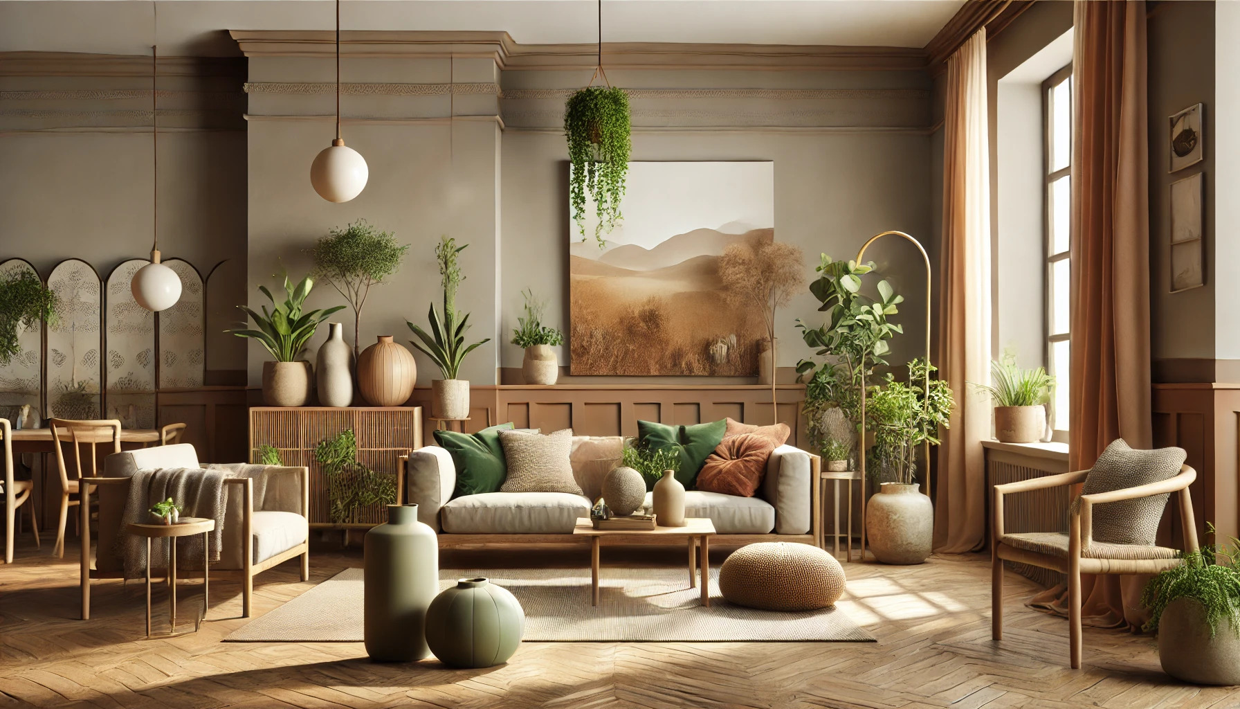
Earth tones bring the beauty of nature into design, creating spaces that feel warm and inviting. To use earth tones effectively, one should balance soft neutrals with deeper hues to create a harmonious environment. Mixing shades like warm browns, rich greens, and occasional pops of color can evoke calmness and connection to the outdoors.
When selecting colors, it helps to draw inspiration from natural elements like soil, trees, and stones. This approach allows for a palette that not only looks appealing but also promotes well-being. Those designing with earth tones will find that these colors can transform any space into a serene retreat.
Nature-inspired designs are versatile and can be applied in various settings, from home decor to branding. By understanding how to combine colors thoughtfully, anyone can achieve a grounding effect that resonates with those who enter the space. Embracing earth tones is a step toward creating a more balanced and aesthetically pleasing environment.
Understanding Earth Tones
Earth tones are colors that resemble the natural world. These hues create a calm and inviting atmosphere in designs. They evoke feelings of stability and comfort, making them a great choice for various applications.
The Color Palette of Nature
Earth tones include shades like brown, green, and gray. These colors are inspired by elements found in nature. For example, the deep brown of soil, the vibrant green of leaves, and the soft gray of stones all contribute to this palette.
Using a mix of these colors can create harmony in a design. Designers often select a neutral base tone, such as beige or taupe. Then, richer shades can be added as accents to bring warmth and depth.
Psychology of Earth Tones
The use of earth tones can have a significant emotional impact. These colors promote feelings of calmness and balance. They remind individuals of nature and the outdoors, which can help reduce stress.
Incorporating earth tones into spaces encourages relaxation. Studies show that these colors can foster a sense of safety and trust. This makes them ideal for places like homes, wellness centers, and spa environments.
Incorporating Earth Tones in Design
Using earth tones in design creates a warm and inviting atmosphere. It allows one to connect with nature while adding depth and richness to various spaces. There are key strategies to apply these colors effectively.
Starting With a Neutral Base
Starting with a neutral base is a smart choice. Shades like beige, cream, or soft gray set a calm foundation. They make excellent backdrops for other colors and textures.
This neutral foundation allows earth tones to shine without overwhelming the space. For example, a light beige wall pairs beautifully with deeper browns or greens in furniture or decor.
This combination offers flexibility. It allows for seasonal changes in decor without needing a complete overhaul. By adding colorful accents, the design stays fresh and engaging.
Choosing Complementary Earth Tones
Selecting complementary earth tones is essential for visual harmony. Colors like warm terracotta, soft greens, and muted blues work well together. Each adds unique traits, creating a balanced and inviting environment.
To achieve this, one can create a color palette. This palette can include up to three or four main earth tones. For example, pairing rich brown furniture with olive green pillows can enhance the room’s warmth while adding depth.
Textures also play a role. Mixing materials such as wood, stone, and fabrics can highlight the complementary colors. This approach enriches the design, making it appealing to the eye.
Balancing Warm and Cool Tones
Balancing warm and cool tones brings dynamism to any design. Warm tones like earthy reds and yellows create a cozy feeling. In contrast, cool tones such as deep greens and soft grays provide a sense of calm.
An effective way to balance these tones is through layering. For instance, using a warm wood table with cool-toned ceramic dishes can strike the right balance.
Another strategy is to use accents. Soft, warm throws or pillows can complement cooler wall colors. This method keeps the design feeling lively and engaging while maintaining harmony.
By being mindful of this balance, designs can evoke the perfect mood and atmosphere.
Design Elements and Textures
Using earth tones in design isn’t just about choosing the right color palette. It also involves selecting the right materials and textures that enhance the calming vibe of nature-inspired spaces. Here are some key elements to consider.
Natural Materials and Finishes
Choosing natural materials is essential for creating an earthy feel. Wood, stone, and bamboo are great options.
- Wood can range from light birch to dark walnut, adding warmth and texture to any space.
- Stone can be used for countertops or accent walls, offering a rugged look.
- Bamboo is both sustainable and stylish, perfect for furniture and decor.
Finishes also play a crucial role. Matte finishes provide a soft look, while polished surfaces can add a sophisticated touch. Mixing these materials will enhance the design, making it lively yet grounded.
Fabrics and Upholstery Choices
When it comes to fabrics, natural fibers are top choices. Cotton, linen, and wool bring comfort and organic appeal.
- Cotton is breathable and easy to clean, great for everyday use.
- Linen has a relaxed texture that suits casual settings.
- Wool adds warmth and is ideal for colder climates.
Choosing earth-toned fabrics like olive green, soft browns, or muted yellows blends well with nature-inspired designs. They create a cozy atmosphere that invites relaxation.
Consider using these fabrics on sofas, curtains, and throw pillows for a seamless look.
Incorporating Patterns and Prints
Patterns can bring life to earth-toned designs without overwhelming them. Nature-inspired motifs work best.
- Leaf prints and botanical designs complement the earthy hues.
- Geometric patterns can add a modern twist while still feeling grounded.
Using subtle patterns on accent pieces, like throw blankets or rugs, can tie the room together.
Mixing prints with solid earth tones allows for balance. This strategy creates an inviting and visually appealing space that still feels connected to nature.
Lighting and Earth Tones
Lighting plays a crucial role in how earth tones are perceived within any design. Using the right light can enhance the calming qualities of these colors, making spaces feel more inviting and connected to nature. Understanding both natural and artificial lighting is essential for achieving the desired effect.
Effect of Natural Light
Natural light has a unique quality that can change the way earth tones appear throughout the day. For instance, morning light brings out softer greens and browns, while afternoon light can intensify warmer tones like rust and terracotta.
Designers often recommend using large windows to let in plenty of daylight. This creates an airy atmosphere, which complements the grounding qualities of earth tones. It’s also wise to consider the direction your windows face. South-facing windows tend to provide the most consistent light, perfect for highlighting warm earth tones.
Choosing the Right Artificial Lighting
When natural light is limited, choosing the right artificial lighting becomes important. Warm white bulbs (2700K-3000K) work best with earth tones. These bulbs mimic the softness of natural sunlight.
Using dimmers can help control the intensity of the light, allowing for flexibility in moods and settings. Additionally, placing lights at varying heights can create layers, enhancing the textures of earth-toned surfaces.
Accent lighting, such as sconces or spotlights, can draw attention to specific areas. It’s important to avoid harsh fluorescent lights, as they can wash out the richness of earth tones.
Examples of Nature-Inspired Design
Nature-inspired design focuses on creating spaces that feel connected to the environment. Earth tones play a key role in achieving this, helping to create warmth, comfort, and harmony.
Residential Interiors
In residential settings, earth tones can transform a home into a cozy retreat. Walls painted in soft greens or muted browns give a serene backdrop to any room.
Furniture made of natural materials like wood enhances the earthy feel. Adding accents like cushions in deep terracotta or soft beige completes the look.
Textiles, like rugs and curtains in earthy shades, bring warmth and texture. Plants also play an important role; they add life and further connect the space to nature.
All these elements work together to create inviting and peaceful interiors that reflect the beauty of the natural world.
Commercial Spaces
Commercial spaces benefit greatly from nature-inspired designs using earth tones. These colors create a inviting atmosphere that attracts customers and encourages relaxation.
For example, a café might use warm browns and greens to evoke a grounded, welcoming vibe. Interiors can feature natural wood furniture and organic shapes, promoting a sense of calm.
In addition, artwork featuring landscapes or natural scenes complements the theme. Spaces designed in this way can promote well-being and enhance customer experience.
Using earth tones in commercial spaces not only appeals visually but also fosters a connection to nature, which is increasingly valued by consumers.
Maintaining Balance
When using earth tones in designs, finding the right balance is essential. This helps create a visually appealing and calming environment. Careful consideration can make all the difference in how these colors interact with each other and other design elements.
Avoiding Overuse of Dark Tones
Dark earth tones can add depth, but using them excessively can overwhelm a space. Too many rich browns or deep greens can make a room feel heavy and cramped.
To prevent this, it’s best to limit dark colors to smaller areas or accents. For example, painting one wall in a dark shade can create a focal point without dominating the entire room. Additionally, mixing in lighter or neutral shades helps to soften the overall look.
Using light-colored furniture or decor alongside darker tones can create a nice balance. This contrast allows the dark colors to stand out without feeling oppressive.
Contrast with Bright Accents
Incorporating bright accents is a great way to maintain balance in nature-inspired designs. Using brighter colors helps to lift the overall mood and adds energy to the space.
For instance, small pops of yellow or coral can bring a lively touch to a room dominated by earth tones. Accessories like cushions, artwork, or decorative items are perfect for introducing these vibrant hues.
Be mindful of the amount used; too many bright colors can clash with earth tones and create chaos. A well-placed accent works best, drawing attention without overwhelming the natural palette.