
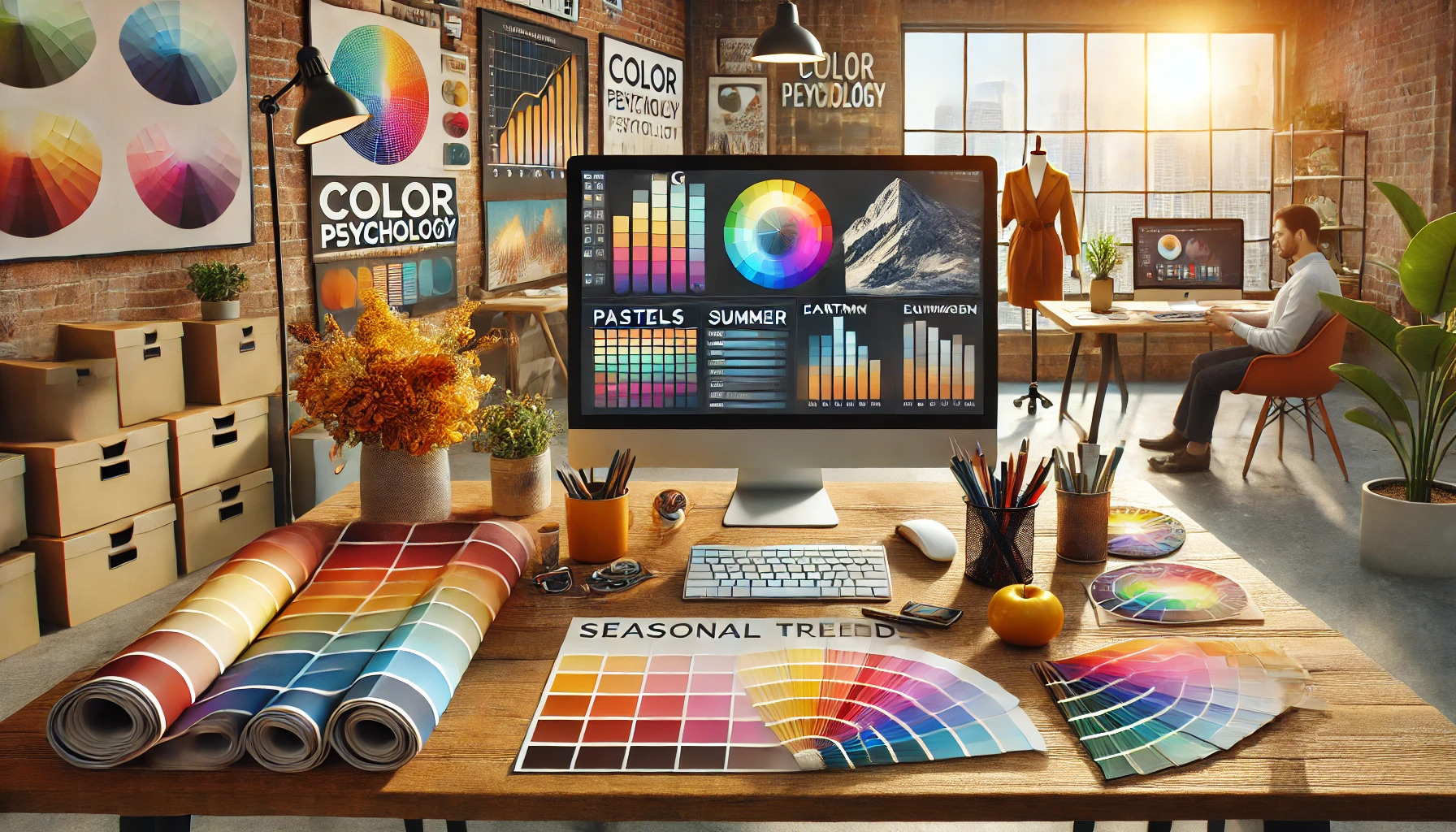
Seasonal color trends can greatly impact marketing strategies. Each season brings unique colors that evoke different feelings and associations, making it crucial for brands to adapt accordingly.
As the year progresses, colors that resonate with consumers shift with the seasons. For instance, warmer tones might prevail in autumn, while fresh pastels often dominate the spring. By keeping up with these changes, brands can refresh their messaging and stay relevant in a competitive market.
Marketers can enhance their creative efforts by incorporating seasonal colors into their branding and advertising. This approach not only captures attention but also aligns with customer sentiments. Embracing these trends can lead to increased engagement and brand loyalty.
Understanding Seasonal Color Trends
Seasonal color trends play a significant role in marketing and branding. They can align a brand’s message with consumer sentiments and seasonal events. Recognizing these trends helps marketers create relatable and engaging campaigns.
The Basics of Seasonal Colors
Seasonal colors are shades associated with specific times of the year. These colors evoke emotions and memories tied to different seasons.
Spring is often represented by pastels like soft pinks, light greens, and gentle yellows. These colors suggest renewal and growth.
Summer tends to feature bright, vibrant colors such as bold blues, sunny yellows, and lively greens. These colors express energy and fun.
Autumn brings warm tones like oranges, browns, and deep reds. They offer a sense of coziness and reflect the changing leaves.
Winter is characterized by cool, tranquil colors such as icy blues, whites, and deep burgundies. These shades evoke feelings of calm and celebration during the holiday season.
Historical Shifts in Seasonal Preferences
Over time, color preferences have evolved with cultural and societal changes. For instance, the past decades have seen a shift from traditional color palettes to more diverse and daring choices.
In the 1980s and 1990s, neon colors gained popularity, reflecting a vibrant youth culture. More recently, there has been a move towards earthy tones that promote sustainability and wellness.
Global events can also influence color trends. For example, the COVID-19 pandemic led to a rise in soothing, comforting shades as people sought stability and calm.
Marketers now analyze data to predict these shifts. Understanding these preferences allows brands to connect better with their audience during relevant seasons.
Why Seasonal Color Trends Matter for Marketing
Seasonal color trends play a significant role in marketing strategies. They can enhance brand recognition and impact consumer choices. Understanding these trends can lead to more effective marketing campaigns.
Influence on Consumer Behavior
Colors can evoke emotions and influence how consumers feel about a brand. For example, warm colors like red and orange can create a sense of excitement and urgency. This is why many brands use these colors during sales or holidays.
Conversely, cool colors like blue and green can foster calmness and trust. Brands may use these for products that need a more reassuring approach. Seasonal color choices can tap into these feelings, guiding purchasing decisions.
Trends may shift with the seasons. For instance, bright pastels are popular in spring, while deep oranges and browns are favored in autumn. Aligning marketing materials with these seasonal colors can help brands connect better with consumers.
Brand Association and Product Seasonality
Colors help establish strong brand associations. A brand that consistently uses specific colors can create familiarity and loyalty. For instance, Coca-Cola’s red and white scheme is recognized worldwide.
Different products are also linked to seasons. Winter brings ideas of cozy hot beverages in warm colors, while summer may highlight bright, vibrant products. Marketing teams can leverage seasonal colors to enhance product relevance.
Using color in marketing materials can help reinforce messages that relate to specific seasons. This helps consumers associate certain products with the right time of year. By doing this, brands can boost sales and engagement with their target audience.
Identifying Upcoming Seasonal Trends
To successfully anticipate seasonal trends, it is essential to look at the influences of fashion and design industries, as well as analyze social media and consumer data. These elements provide valuable insights that can shape marketing strategies.
Role of Fashion and Design Industries
Fashion and design industries play a critical role in setting seasonal trends. Designers often unveil their collections months in advance during fashion weeks. These events showcase colors and styles that influence broader market trends.
Additionally, top brands create trend reports that highlight emerging color palettes. For instance, the Pantone Color Institute releases forecasts that help predict which shades will be popular in upcoming seasons. Marketers look to these insights to align their products with consumer preferences.
Staying informed about these trends allows marketers to create effective campaigns. They can ensure their products meet the expectations of their target audience by incorporating popular colors and styles.
Analyzing Social Media and Consumer Data
Social media platforms are a goldmine for identifying upcoming trends. They allow marketers to track conversations and see what colors or styles are gaining traction. By analyzing hashtags and influencers, they can spot rising trends before they hit the mainstream.
Moreover, consumer data analytics offer insights into purchasing behavior. Tools that assess sales and online engagement help marketers recognize which colors are resonating with buyers. This data can shape future product lines and marketing strategies.
Conducting surveys can also provide first-hand insights into consumer preferences. Engaging directly with audiences helps identify their interests and seasonal favorites. By using both social insights and consumer data, marketers can stay ahead in the ever-evolving fashion landscape.
Spring Palette Predictions
As spring approaches, fresh colors begin to rise in popularity. Marketers should pay attention to the Spring color palette, which features light, warm, and vibrant hues.
Key Colors to Watch:
- Coral: A bright and cheerful shade that brings energy.
- Peachy Pinks: Soft and inviting, perfect for a gentle touch.
- Warm Greens: Refreshing and lively, reminiscent of new leaves.
- Aqua Blues: These shades add a soothing vibe to designs.
These colors reflect a sense of renewal and clarity. The spring palette is ideal for campaigns aiming to evoke feelings of freshness and optimism.
Trending Combinations:
These colors work well together. For example, pairing coral with aqua blue creates a vibrant look. Mixing warm greens with peachy pink adds warmth and balance.
Marketers can use these colors to attract audiences who are eager for new beginnings. Utilizing the spring palette will enhance visual appeal and resonate with seasonal changes. This approach can lead to effective marketing strategies that feel timely and relevant.
Summer Palette Insights
The summer palette features cool and soft hues that can bring out a person’s natural beauty. These colors often include shades like lavender, soft pink, and light blue.
A key characteristic of summer colors is their muted quality. They typically do not have the bright, bold intensity found in other seasons. This makes them perfect for creating a refreshing and approachable look.
Summer palettes can be divided into three main categories:
- True Summer: Balanced, cool tones with a soft appearance.
- Soft Summer: More muted shades, ideal for those with lighter features.
- Light Summer: Lighter colors that enhance a fair complexion.
Using these colors in marketing can influence how products are perceived. They evoke feelings of calmness and warmth, making them appealing for summer campaigns.
Designers and marketers can benefit from understanding how these colors work together. Coordinating outfits or branding with a summer palette can help connect with customers on a personal level.
For more information on the summer aesthetic, visit Gabrielle Arruda’s summer overview. This resource offers tips and insights into creating a compelling summer style.
Fall Palette Forecast
As the autumn season approaches, the color trends shift toward deeper, more vibrant shades. Marketers should pay attention to this year’s Fall Palette which features a mix of earthy tones and bold colors.
Key colors in the forecast include:
- Sandstone: A warm neutral that pairs well with various accents.
- Saddle Brown: This rich hue brings a classic and grounding touch.
- Pine Grove: A deep green that adds a refreshing twist.
The use of dusty tan and aquatic teal can create a soft yet striking contrast. This combination is popular in fashion, interiors, and digital design. Vibrant shades like coral and a dreamy purple-blue are also making waves this season.
Red and green remain staples, symbolizing passion and a connection to nature. These shades can enhance campaigns that aim for emotional engagement.
Incorporating these colors can elevate visual content, making it more appealing and effective. By embracing these trends, marketers can resonate better with their audience during the fall season.
Winter Palette Projections
As winter approaches, trends in color palettes emerge that help marketers align their campaigns. This season is expected to showcase a mix of warm and cool tones that resonate with consumers.
Key Colors for Winter 2024:
- Warm Grey: This versatile shade provides a neutral base that complements many styles.
- Olive Green: Often associated with nature, it adds a calm and earthy touch.
- Sage: A softer green that brings a refreshing feel to winter looks.
- Rich Navy: This deep hue offers elegance and works well for both casual and formal wear.
Marketers should consider the emotional impact of these colors. For example, warm tones tend to evoke feelings of comfort and coziness.
A well-balanced palette, which includes both dark and light shades, ensures that products appeal to a wider audience.
Using these winter color trends in marketing materials can create a visual harmony that attracts customers.
As brands incorporate these colors, they can enhance their visibility and connection with the season’s mood.
Incorporating Color Trends into Marketing Strategies
Using color trends effectively can enhance marketing efforts and make brands more relatable. Marketers should focus on aligning colors with their campaign goals, enhancing product appearance, and creating engaging content.
Campaign Design and Branding
Incorporating seasonal colors into campaign design can significantly impact brand recognition and engagement. It’s crucial to select colors that align with the brand’s identity while suggesting seasonal themes. For instance, a brand might use warm tones like oranges and yellows in autumn campaigns to evoke feelings of coziness and warmth.
Creating a cohesive look across all marketing materials, such as emails, social media, and ads, will reinforce the brand’s message. Using tools like color palettes can help maintain visual consistency. Additionally, subtle changes in logo colors during a campaign can attract attention while keeping the brand recognizable.
Product Packaging and Presentation
Product packaging plays a vital role in how consumers perceive a brand. Choosing seasonal colors for packaging can make products stand out and create a fresh appeal. For example, pastel colors are popular in spring, while rich, deep hues can enhance appeal during the winter months.
Marketers should consider the psychology of color when designing packaging. Colors can evoke specific emotions; for instance, green often represents freshness and health. Properly utilizing these colors can lead to increased sales and better overall customer experience.
Content Creation and Storytelling
Color trends can also enhance storytelling in marketing content. By using seasonal colors in visuals, marketers can set the mood and tone for their messages. Bright colors may energize the audience, while softer shades can create a calm and inviting atmosphere.
Incorporating these colors into videos, blog posts, and graphics helps communicate the brand’s message efficiently. Visibility can be increased by aligning colors with important holidays or events, making the content more relatable and engaging. This thoughtful use of color can keep the audience interested and returning for more.
Leveraging Color Psychology in Marketing
Color plays a crucial role in marketing strategies. Marketers can use color psychology to connect with their audience on an emotional level. Different colors evoke different feelings and can drive purchasing decisions.
Here are some common colors and their meanings:
- Red: Excitement, passion, and urgency. Often used for sales and promotions.
- Blue: Trust, calmness, and security. Popular among banks and tech companies.
- Green: Growth, health, and tranquility. Frequently used in eco-friendly brands.
- Yellow: Happiness, warmth, and caution. Useful for grabbing attention.
- Black: Sophistication and luxury. Common in high-end products.
By choosing the right colors, brands can shape how consumers perceive them. For example, a brand aiming for a youthful image might use vibrant colors like orange or pink.
Additionally, seasonal trends can influence color choices. In spring, lighter hues are often favored, while winter may see darker, richer colors. Marketers should stay updated on these trends to remain relevant.
Customizing color schemes based on target demographics can also enhance effectiveness. For instance, younger consumers may be drawn to bold colors, whereas older audiences might prefer subtle tones.
By understanding how colors influence behavior, marketers can create more engaging campaigns. This can lead to increased brand loyalty and higher sales.
Measuring the Impact of Color Trends on Campaigns
Measuring the impact of color trends can help marketers refine their strategies. Knowing what colors resonate with audiences is key to driving engagement.
Tools to Measure Impact:
- A/B Testing: This allows marketers to compare different color schemes in ads. They can see which color gets more clicks or conversions.
- Surveys: Gathering feedback from customers about their color preferences can provide valuable insights.
- Analytics: Tracking metrics like engagement rates and sales figures helps assess how color choices influence campaign performance.
Key Metrics to Monitor:
- Click-Through Rate (CTR): A higher CTR may indicate that the chosen colors attract more attention.
- Conversion Rate: This shows how effectively the color encourages purchases or sign-ups.
- Social Media Engagement: Likes, shares, and comments can reveal audience reactions to color usage.
Marketers should also pay attention to seasonal changes. For example, warm colors often relate to summer and can create feelings of happiness.
Additionally, competitors’ color trends can influence a brand’s choices. Staying updated on industry colors helps marketers stay relevant.
Using a mix of these methods can provide a clearer picture of how color affects marketing success.
Seasonal Trends Across Different Markets
Marketers need to understand how seasonal color trends vary by geography and industry. Different regions and sectors often show unique color preferences influenced by local culture, climate, and seasonal changes.
Geographical Variations
Color preferences can shift dramatically based on location. In warmer climates, earthy tones and vibrant colors are popular. These shades reflect the local environment and brighten the atmosphere. Regions with colder weather may lean toward muted, soft hues that evoke warmth and coziness.
For instance, locales in southern Europe might favor rich terracotta and deep blues to echo their landscapes. Meanwhile, northern countries may embrace icy blues and grays, mirroring winter skies. Understanding these regional preferences can help marketers create more appealing campaigns that resonate with local consumers.
Industry-Specific Color Applications
Different industries also utilize colors based on seasonal trends. In fashion, earthy tones might dominate in the fall, while bright, bold shades are common in summer. Seasonal color palettes can reflect trends and specific themes to capture consumers’ attention.
In the food industry, colors are also essential. Restaurants and food brands often use warm colors like red and yellow, especially during holidays, to stimulate appetite. For the home decor market, cool colors in spring can create a refreshing ambiance, while warm, rich colors are great for autumn themes. Tailoring color choices to the industry and season enhances engagement and drives sales.