
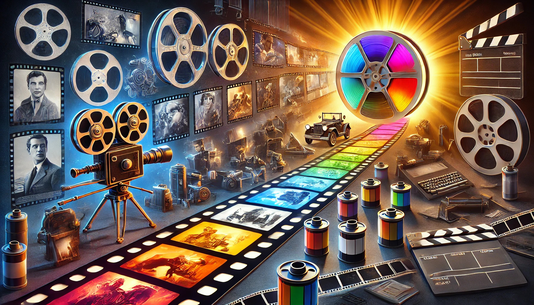
The journey of color in film has transformed the way stories are told on screen. From the earliest black-and-white films to the vivid hues of Technicolor, each step in this evolution adds depth and emotion to cinema. The introduction of Technicolor revolutionized filmmaking, allowing filmmakers to create visually stunning worlds that captivate audiences.
In its early days, color was a complex process, often requiring significant resources and skill. Technicolor emerged as a powerful tool that brought a new level of realism and artistic expression to film. As its techniques improved, filmmakers began to explore the emotional and narrative possibilities of color, forever changing the landscape of the movie industry.
Today, color is an essential aspect of filmmaking, influencing how viewers connect with characters and their journeys. The impact of Technicolor can still be seen in modern cinema, showing how far the industry has come. Understanding this evolution not only highlights the importance of color but also showcases the creativity and innovation that define filmmaking.
A Spectrum of Innovation: Early Experiments in Film Coloration
In the early days of cinema, filmmakers sought ways to bring color to their black-and-white films. One of the first methods used was tinting. This process involved dyeing the film stock to give a specific color to all scenes.
Another technique was hand painting individual frames. While labor-intensive, this method allowed for creative expression. Some films showcased vibrant colors, though it was not practical for longer projects.
In 1917, Technicolor introduced its first two-color process with the film The Gulf Between. It could produce a limited range of colors. This system was a breakthrough but had its challenges, including high costs and the need for special equipment.
By the 1930s, Technicolor improved its process, resulting in the three-color system. This innovation allowed filmmakers to capture a fuller spectrum of color. With films like Becky Sharp (1935), color cinema began to thrive.
Other techniques, such as Cinecolor, offered budget-friendly alternatives. Though it provided fewer colors, it was common in less expensive productions, including cartoons. These early experiments laid the foundation for the colorful films enjoyed today.
The Silent Rainbow: Color in Silent Cinema
Silent cinema saw bold and creative methods to add color to films. Techniques evolved over time, showcasing artistry, ingenuity, and a desire for visual storytelling.
Hand-Painted Frames and Tinting Techniques
In the early days of silent films, filmmakers often used hand-painted frames to bring color to their work. Each frame was painted by hand, a labor-intensive process that required great skill. This method resulted in vibrant, unique scenes but was not practical for longer films.
Tinting and toning were more efficient methods introduced in the 1890s. Tinting involved applying a color to the film’s light areas, while toning painted the darker parts. These techniques balanced artistry with practicality, making them popular during the silent era. They added depth and mood to black-and-white films, enhancing the audience’s experience.
Kinemacolor and Two-Color Processes
Kinemacolor, introduced in 1908, was one of the first successful color processes. It used a two-color method that combined red and green film. This approach created a visual richness that captivated viewers.
Technicolor also made strides in color cinema. Their two-color process was used in films like The Gulf Inbetween in 1917. While these methods were groundbreaking, they still had limitations in color range. Yet, they set the stage for future advancements in color film technology.
Technicolor Triumph: The Three-Strip Process
The three-strip Technicolor process changed how movies were made. It allowed filmmakers to capture a wider range of colors, making films visually stunning. This section explores the journey from black-and-white films to vibrant color, as well as the impact of iconic movies.
From Monochrome to a World in Color
Before the introduction of the three-strip Technicolor process, films were mostly black and white. Audiences experienced cinema in shades of gray. This began to change in the 1930s.
The three-strip process used three separate film strips to capture red, green, and blue light. This innovation allowed filmmakers to create rich, colorful images. The vibrant results were a game changer, making films more appealing.
Movies like “Becky Sharp” in 1935 first showcased this technique. Its bold colors set a new standard for film, paving the way for future projects. Audiences were captivated by the lifelike vibrancy that this method brought to the screen.
The Wizard of Oz and the Golden Age of Color
“The Wizard of Oz” is one of the most famous films to utilize the three-strip process. Released in 1939, it showcased Technicolor’s full potential. The transition from sepia tones in Kansas to vivid color in Oz amazed viewers.
Characters like Dorothy and the Scarecrow came to life in vibrant hues. The film used color to enhance emotions and storytelling. This approach was a hallmark of the Golden Age of Color in cinema.
Technicolor films became popular, with many other productions following suit. This era saw a boom in visually stunning films that left a lasting impact. The three-strip process transformed the cinematic experience, drawing audiences into a colorful world.
Industry Standards: Color as a Storytelling Tool
Color plays a vital role in film by enhancing emotions and setting the tone. It helps to create memorable visuals that deepen the audience’s connection to the story and characters.
Dynamic Palettes: Evoking Emotions and Atmosphere
Filmmakers use color palettes to influence feelings and build atmosphere. For instance, warm colors like red and orange can evoke excitement or anger, while cool colors like blue often create calmness or sadness.
Each color’s intensity also matters. A vibrant yellow can add cheer, while muted tones might suggest somberness. Directors choose colors deliberately to guide viewers’ emotional responses throughout the film.
Color grading during post-production further amplifies these effects. By adjusting the hues and saturation, filmmakers can draw attention to specific elements, indicating danger or peace without a word. This visual language enriches storytelling and elevates the entire viewing experience.
Set Design and Costume Colors in Narrative Context
Costume and set design heavily rely on color to enhance narrative understanding. Characters’ outfits often reflect their personalities and arcs. For example, a character in bright colors may represent optimism, while darker shades might imply mystery or danger.
Set design further complements the story through color choices. A vibrant, sunlit room can foster happiness, while a dimly lit setting can suggest fear or uncertainty. The combination of colors creates a cohesive visual theme that supports the storyline.
Moreover, films like “The Wizard of Oz” illustrate how color can signify transformation. The shift from black and white to vibrant color emphasizes the character’s journey. Such techniques showcase the power of color in filmmaking, making it an indispensable storytelling tool.
Technological Advancements: Modern Color Grading
Modern color grading has changed how filmmakers bring their stories to life. With the rise of new technology, filmmakers have more tools than ever to enhance their visual storytelling, creating stunning images.
Digital Intermediate: The Revolution of Color Timing
Digital intermediate (DI) techniques marked a huge shift in film production. After shooting, the film is scanned into a digital format, allowing for precise adjustments. Colorists can tweak every frame, enhancing shadows, highlights, and colors to fit the mood of the scene.
This process gives filmmakers the ability to create a consistent look throughout the film. It also allows for creative choices, like changing the sky’s color or adjusting skin tones. With tools like DaVinci Resolve and Adobe Premiere Pro, colorists can apply sophisticated effects swiftly. DI has democratized the art of color grading, making it accessible even for independent filmmakers.
Color in the Digital Age: High Dynamic Range Imaging
High Dynamic Range Imaging (HDR) has become a cornerstone of modern cinema. This technology allows filmmakers to capture a broader range of colors and brightness levels.
HDR images show more detail in both bright and dark areas, giving a more realistic and vibrant viewing experience. Filmmakers use HDR to create immersive environments that draw audiences into the story. Popular formats like HDR10 and Dolby Vision ensure compatibility with various screens, enhancing viewing options.
Today, color grading tools support HDR, allowing colorists to adjust how images appear on different devices. This ensures that viewers enjoy the film as intended, regardless of whether they watch on a smartphone or a large screen.
Cinematic Icons: Memorable Moments in Film Color
Color in film has shaped countless memorable moments. Iconic films have used color to create emotional depth and vivid imagery, making them unforgettable in cinematic history.
Gone with the Wind: A Technicolor Landmark
“Gone with the Wind” is often celebrated for its stunning use of Technicolor. Released in 1939, it showcased vibrant colors that brought the story of love and loss in the Civil War era to life. The bold hues of Scarlett O’Hara’s green dress and the sweeping landscapes of Georgia were revolutionary at the time.
The film’s cinematography emphasized emotional weight through color. The use of red and green during key scenes heightened the drama. These choices helped solidify “Gone with the Wind” as a landmark in film history, creating lasting visual memories.
Avatar: Defining the Modern Color Palette
“Avatar,” directed by James Cameron, set a new standard for color in filmmaking when it was released in 2009. The film’s rich blue hues and glowing landscapes of Pandora captivated audiences worldwide. This use of color not only enhanced the visual experience but also created a unique fantasy world.
The color palette played a key role in conveying themes of nature and harmony. Bright colors were used to depict the beauty of Pandora, while darker shades emphasized conflict. This blend of colors helped “Avatar” become one of the highest-grossing films ever and reshaped how filmmakers approach color.
Cultural Impact: Color and Film Theory
Color in film plays a significant role in storytelling and audience perception. It can evoke emotions, symbolize cultural themes, and enrich the viewer’s experience. Understanding these aspects helps to appreciate the power of color in cinema.
Color Symbolism and Its Cultural Significance
Color carries deep symbolism that varies across cultures. For instance, red can represent love and passion in many cultures, while in others, it may symbolize danger or anger. Filmmakers often use color to enhance themes and messages in their stories.
In films, specific colors may signify different character traits or emotional states. For example, a character dressed in blue might be portrayed as calm or sad, while bright yellow could suggest happiness or energy. This intentional use of color helps audiences connect with characters and their journeys on a deeper level.
The Psychology of Color in Audience Reception
The psychology of color significantly influences how audiences feel while watching a film. Each color can trigger emotional responses. For example, warm colors like red and orange can create feelings of warmth and excitement, while cool colors like blue and green often evoke calmness.
Moreover, filmmakers use color to guide viewers on how to react to scenes. A dramatic shift in color saturation can signal a change in tone or mood. By understanding these psychological effects, filmmakers create a more engaging viewing experience, ensuring that the audience feels invested in the story being told.