
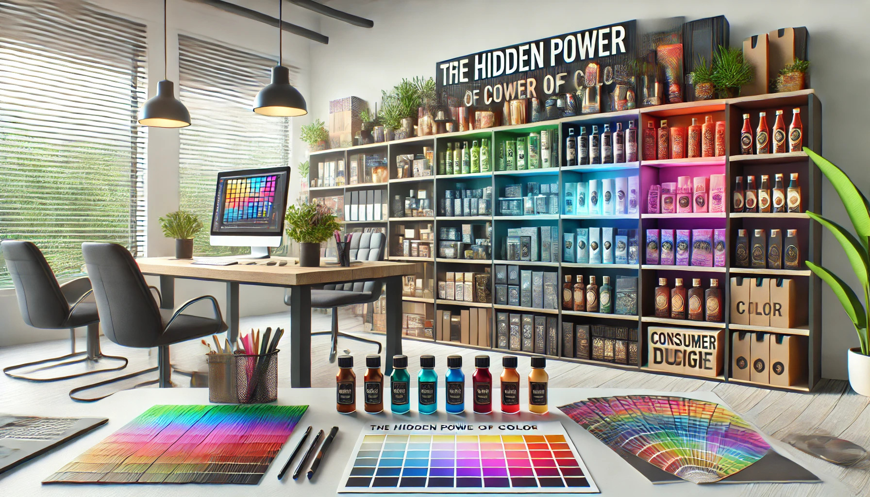
Color plays a powerful role in packaging that goes beyond mere aesthetics. The right colors can influence consumer emotions, boost brand recognition, and even drive purchasing decisions. For brands looking to stand out in crowded markets, understanding the impact of color is essential.
When a shopper looks at a store shelf, color is often the first thing they notice about a product. Research shows that up to 90% of snap judgments are based on color alone. This highlights how crucial it is for brands to choose colors carefully to create the desired impression.
As trends evolve, the significance of color in packaging becomes even more prominent. Brands must adapt to changing preferences while leveraging the emotional connections colors create. By recognizing the hidden power of color, companies can effectively engage consumers and enhance their market presence.
The Psychology of Color in Packaging
Color is more than just a visual element; it plays a crucial role in how consumers perceive products. Understanding the psychology of color helps brands connect with their audience and influence buying decisions. Different colors evoke specific emotions and associations that can shape consumer behavior.
Impact on Consumer Behavior
Colors can significantly affect how a consumer feels and reacts to a product. Studies show that up to 90% of snap judgments made about products are based on color alone. For instance, red often creates a sense of urgency, which makes it popular for clearance sales. Blue tends to evoke feelings of trust and reliability, making it a favorite for financial institutions.
A well-chosen color scheme can lead to increased sales and customer loyalty. When consumers feel positively about packaging colors, they are more likely to engage with the brand and make a purchase.
Color Emotions and Brand Identity
Colors can express a brand’s identity and connect emotionally with consumers. Each color has unique meanings and can reflect the essence of a brand. For example:
- Green symbolizes health and wellness.
- Yellow suggests optimism and cheerfulness.
- Black conveys sophistication and elegance.
When a brand uses consistent colors, it builds recognition and trust. This recognition reinforces a brand’s message and values in the eyes of consumers. By strategically using colors, brands can effectively communicate what they stand for, influencing consumer feelings towards their products.
Color Theory Fundamentals
Color theory plays a crucial role in packaging design. It helps designers choose colors that attract attention and convey the right message to consumers. Two key concepts in color theory are the color wheel and the ideas of color harmony and contrast.
Understanding the Color Wheel
The color wheel is a circular diagram that organizes colors in a way that demonstrates their relationships. It features primary colors like red, blue, and yellow, which cannot be made by mixing other colors. Secondary colors, such as green, orange, and purple, are created by mixing two primary colors.
Additionally, there are tertiary colors made from mixing primary and secondary colors. By using the color wheel, designers can visualize how colors relate to one another. This knowledge helps in selecting colors that evoke specific emotions or attract particular audiences.
Color Harmony and Contrasts
Color harmony refers to the combination of colors that look pleasing together. Harmony can be achieved through different color schemes, such as analogous or complementary colors. Analogous colors are adjacent on the color wheel and create a serene look, while complementary colors are opposite and provide a dynamic contrast.
Contrast is equally important in packaging. It highlights specific elements and creates visual interest. Using high contrast helps guide the viewer’s focus and improves readability. Understanding both harmony and contrast allows designers to create packaging that stands out and effectively communicates the brand’s message.
Cultural Influences on Color Perception
Color perception varies widely across cultures, affecting how people respond to products. Understanding these cultural meanings is essential for effective packaging design. It can influence consumer choices and emotional responses, making it a vital factor in marketing strategies.
Cultural Color Meanings
Colors hold different meanings in various cultures. For example, in Western cultures, white symbolizes purity and innocence, often seen in weddings. In contrast, white represents mourning in some Eastern cultures.
Similarly, red can evoke passion or love in many cultures, while in others, it signifies danger or caution. Marketers must be aware of these associations as they can impact how a product is perceived.
Understanding these meanings helps brands connect with their audience on a deeper level, ensuring that the chosen colors resonate well with potential customers.
Adapting Colors for Global Markets
When brands expand into global markets, adapting colors becomes crucial. For instance, while blue is widely accepted as trustworthy in many regions, its interpretation may differ.
Coca-Cola’s red branding is effective in Western markets but required adjustment in the Middle East. The company chose colors that align with local preferences to maintain a positive image.
Conducting research on cultural color perceptions helps brands choose appropriate colors for packaging. This can enhance brand recognition and consumer loyalty, showing respect for diverse cultural values.
Color Trends in Packaging Design
Color plays a significant role in how products are perceived in the market. Understanding current trends and future predictions can help brands make informed decisions about their packaging design. This knowledge ensures packaging remains appealing and relevant to consumers.
Influence of Current Trends
Right now, packaging design is seeing a shift towards bold and vibrant colors. Brands are moving away from muted tones to capture consumer attention effectively. This change is partly due to the growing preference for eye-catching designs.
Neon colors are also making a comeback, attracting younger audiences who seek excitement. Pastel shades remain popular for their calming effect and appeal to a more sophisticated market.
Brands should also consider cultural meanings of colors when designing packaging. Research shows that certain colors resonate differently across cultures, impacting consumer choice. This awareness helps brands create packaging that connects well with diverse audiences.
Predicting Future Color Trends
Looking ahead, color trends in packaging design will likely continue to evolve. Experts predict an increase in sustainable colors, such as earth tones, as consumers become more environmentally conscious. These colors align with the growing demand for eco-friendly products.
Another trend on the rise is the use of interactive or changing colors. For example, packaging that changes color with temperature can create a fun and engaging user experience.
Moreover, incorporating technology into color choices, such as augmented reality, may allow brands to create dynamic packaging that adapts based on consumer interaction. This innovative approach can enhance brand loyalty and customer satisfaction.
Selecting the Right Colors for Your Product
Choosing the right colors for product packaging can significantly impact customer perception and brand success. It involves understanding the target audience and knowing which colors resonate with different product categories.
Research and Target Audience
Understanding the target audience is crucial when selecting colors. Different groups respond to colors based on their preferences and cultural backgrounds. For example, younger consumers might prefer bright and vibrant colors, while older audiences may lean towards softer, more subdued tones.
Conducting surveys or focus groups can provide insights into color preferences. Brands can ask questions about how colors make consumers feel or what emotions they associate with certain shades. This research helps create packaging that appeals directly to the intended audience, enhancing the chances of attracting and retaining customers.
Product Category and Color Fit
Colors often have specific associations tied to product categories. For example, red is frequently used in food packaging because it can stimulate appetite. In contrast, electronics usually feature neutral tones that convey sophistication and modernity.
It’s essential to align the color choice with the product’s purpose. Brands can analyze competitors’ packaging to understand color trends in their category. This helps in selecting a unique color scheme that not only fits the product but also stands out on the shelf. Choosing colors strategically can create a strong visual identity that customers remember.
Color and Packaging Material Interplay
The way color interacts with packaging materials can significantly influence consumer perception and decision-making. Material choices can enhance or alter how colors are viewed, impacting the overall effectiveness of the packaging design.
Material Choices Affecting Color Perception
Different materials reflect and absorb light in unique ways, changing how colors appear. For instance, glossy surfaces often make colors look more vibrant. In contrast, matte finishes can soften hues, creating a different mood.
Common materials and their effects:
- Paperboard: This material can absorb colors differently, making them appear more muted.
- Plastic: Glossy plastic tends to enhance brightness, making colors pop.
- Glass: Transparent or tinted glass can provide a rich and luxurious appearance, altering the visual impact of the color beneath.
In the choice of materials, brands must consider how each option may complement or alter their selected color palette.
Sustainability and Color Considerations
Sustainability is becoming more important in packaging design. Many consumers prefer eco-friendly materials, which can also affect color choices. For instance, recycled materials might not achieve the same vibrancy as new ones.
Eco-friendly materials:
- Recycled Paper: Often has a more natural look, which can suit earthy color tones.
- Bioplastics: These can offer bright colors but may have limitations in certain finishes.
- Glass: While recyclable, the color options may be influenced by the type of glass used.
Brands need to balance appealing colors with sustainable practices. Choosing materials that align with color can enhance brand identity while meeting consumer expectations for environmental responsibility.
Testing and Refining Color Choices
Choosing the right color for packaging is crucial. Testing and refining these choices ensures that the colors resonate with consumers and effectively communicate brand values. This section highlights consumer feedback and the iterative design process that helps in selecting the most appealing colors.
Consumer Testing and Feedback
Gathering consumer feedback is essential in determining how colors are perceived. Surveys and focus groups can provide insights into emotional responses to various color palettes.
Designers often present multiple packaging color options to test groups. By asking targeted questions, they can identify which colors attract attention and encourage purchase decisions.
Using tools like online polls can also reach a wider audience. Analyzing this data allows brands to understand consumer preferences better and make informed decisions on color choices.
Iterative Design Process
The iterative design process involves continuous refinement based on testing results. Initial designs are created with specific colors, but consumer feedback often leads to adjustments.
Design teams should embrace a flexible mindset. They may discover that colors initially deemed ideal might not resonate with the target audience.
Prototyping and retesting are vital. By creating multiple versions of packaging with different colors, they can see which versions perform better in real-world scenarios. This approach helps ensure that the final product aligns with consumer desires and brand identity.
Real-World Examples
Color plays a significant role in how products are perceived and chosen. Looking at real-world examples can provide insight into effective color use in packaging and how different colors can impact consumer choices.
Case Studies on Effective Color Use
Coca-Cola is a prime example of effective color use in packaging. The iconic red color is not just eye-catching; it conveys emotions of excitement and happiness. This connection has helped foster strong brand recognition.
Another notable case is Tiffany & Co. The color Tiffany Blue is unmistakable and instantly associated with luxury and exclusivity. This specific shade enhances the appeal of their packaging, making it a sought-after experience for customers.
These examples show how companies strategically choose colors to align with their brand values and connect with consumers emotionally.
Comparative Analysis of Packaging Colors
Different colors can create contrasting emotions and perceptions among consumers. For example, blue often represents trust and reliability, making it a popular choice for brands like Facebook and IBM.
On the other hand, green is commonly used to signify health and freshness, which brands like Whole Foods effectively utilize.
Using a matrix can help visualize these differences:
| Color | Emotion/Meaning | Brand Examples |
|---|---|---|
| Red | Excitement | Coca-Cola |
| Blue | Trust | Facebook, IBM |
| Green | Freshness | Whole Foods |
| Yellow | Happiness, Cheerfulness | McDonald’s |
This analysis reveals how colors can impact brand identity and consumer behavior. Different hues attract different audiences and influence purchasing decisions in subtle yet powerful ways.