
Many artists are puzzled when their purple paint turns out muddy instead of vibrant. This issue often arises from improper mixing or combining the wrong hues, which can lead to dull and lifeless colors that detract from the overall art piece.
Understanding color theory is essential for creating rich purples. Mixing complementary colors or using too many shades at once can result in an undesirable outcome. Learning how to balance warm and cool tones can help avoid these muddy results.
By exploring simple techniques for mixing and layering colors, anyone can transform their purple into a beautiful, eye-catching hue. With just a few adjustments, bright and lively shades can replace those muddy colors in their artwork.
Understanding Color Theory
Color theory helps artists create the right shades and avoid muddy colors. It involves knowing the basics of the color wheel, identifying muddy colors, and understanding how colors interact.
The Color Wheel Basics
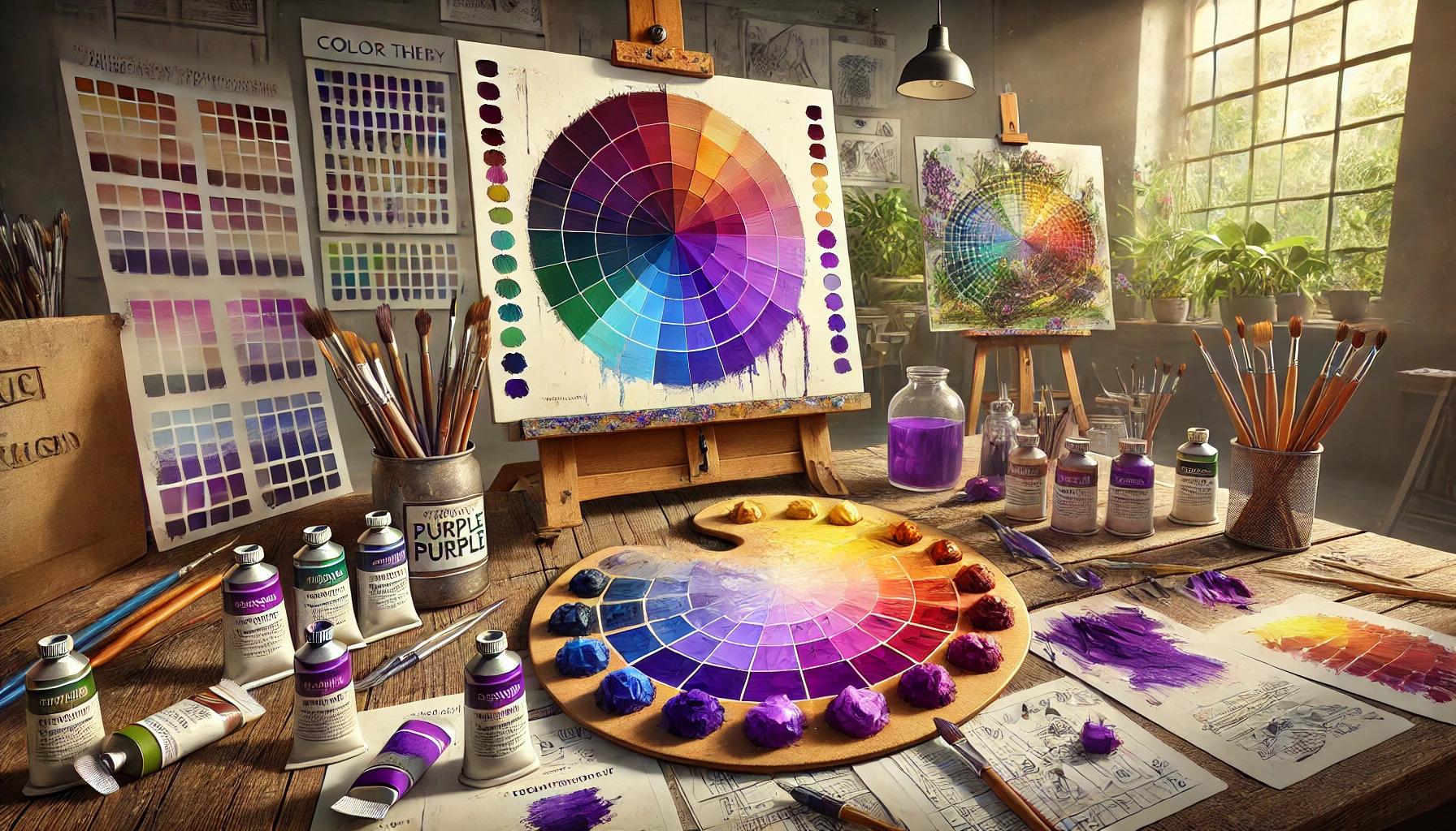
The color wheel is a circular diagram that shows the relationship between colors. Primary colors—red, blue, and yellow—cannot be made by mixing other colors. Secondary colors, like green, orange, and purple, are created by mixing two primary colors.
Tertiary colors are made by mixing a primary and a secondary color. Understanding this wheel helps artists pick the right colors for their artwork.
Knowing how colors sit on the wheel is key. Complementary colors, those opposite each other, create contrast. Analogous colors, next to each other, harmonize well. Selecting colors from these categories can help artists avoid muddy results.
Defining Muddy Colors
Muddy colors are dull, lifeless shades that lack vibrancy. They often result from over-mixing or using the wrong color combinations. When artists mix complementary colors too much, the result can become brown or gray.
Muddy colors confuse the viewer, making it tough to define what is painted. They can drain energy from the artwork, causing it to appear flat. To avoid muddy colors, artists should learn which colors work well together and limit their mixing.
Recognizing when a color is becoming muddy is important. Once it starts losing brightness and clarity, it’s time to stop mixing. Keeping a clean palette can also help maintain color purity.
Relationship Between Colors
Colors do not exist in isolation; they interact with each other in specific ways. The way one color affects another can determine whether a resultant color looks vibrant or muddy.
For instance, if an artist chooses a red that leans towards orange and a blue that leans towards green, the mixed result may look darker and less appealing.
One important principle is the saturation level of colors: using bright, saturated colors will help maintain vibrancy. Combining too many dull or muted colors often leads to a muddy look. Understanding these relationships can empower artists to make better choices when mixing colors.
By applying color theory knowledge, artists can create more dynamic and compelling artwork.
The Role of Pigment Quality
The quality of pigments plays a crucial role in how colors, like purple, appear on the canvas. High-quality pigments contribute to vibrant and clear colors, while lower-quality options can lead to muddy hues. Understanding pigment concentration, purity, and the binder’s impact helps artists make better choices.
Pigment Concentration and Purity
Pigment concentration refers to how much pigment is present in the paint. Higher concentrations usually mean more vibrant and intense colors. Conversely, lower concentrations can make colors appear diluted and less lively.
Purity is also important. Pure pigments produce brighter and more accurate colors. When artists mix paints with multiple pigments, they risk creating muddy colors if those pigments are not compatible. Using just a few, high-quality pigments reduces this risk.
To achieve the best results, artists should look for paints labeled with specific quality standards. Investing in professional-grade paints ensures better stability and more vibrant outcomes.
The Impact of Binder on Color Vibrancy
Binders are materials that hold pigments together and help them adhere to the canvas. The choice of binder influences how colors appear when dried. Some binders can dull the vibrancy of pigments, leading to unexpected muddy looks.
For example, oil-based paints often provide a rich, deep color because the oil allows for more light reflection. In contrast, some acrylics may dry with a more muted finish depending on the binder used. Artists can maximize color vibrancy by selecting paints with high-quality binders.
When choosing paints, pay attention to the binder type. Higher-quality options often yield the most beautiful, vivid colors on the canvas. A good balance of pigment and binder results in artwork that shines.
Mixing Techniques to Avoid Muddiness
Mixing colors correctly is key to preventing muddy purple shades. By understanding how complementary colors, controlling paint ratios, and layering colors can affect the result, artists can create vibrant hues without unwanted dullness.
Understanding Complementary Colors
Complementary colors are those that sit opposite each other on the color wheel. For purple, the complementary color is yellow. Mixing purple with a small amount of its complementary color can create a shadow or highlight effect. However, too much yellow will dull the purple.
Artists should be mindful of how they use these colors. A light touch can enhance a painting without creating muddiness. Using complementary colors wisely adds depth while maintaining vibrancy.
Controlling Paint Ratios
Controlling the amount of each color used in a mix is essential. When creating purple, combining red and blue in a balanced way will yield the best results. Too much of one color can overpower the other, leading to an unwanted muddy tone.
To ensure a bright purple, artists should experiment with small amounts until they find the right balance. Keeping a ratio chart handy can help track which mixes create the desired result. This technique limits the risk of creating dull colors.
Layering Colors Effectively
Layering is another technique to keep colors vibrant. Instead of mixing colors directly on the palette, applying them in layers can produce rich effects. For example, painting a thin layer of bright purple over a dry layer of white can give a luminous effect.
Using transparent glazes helps maintain color integrity. Artists can start with a base color and gradually add layers for depth. This method allows the underlying colors to shine through while avoiding muddiness.
The Importance of Lighting
Lighting plays a crucial role in how colors appear in artwork. The right conditions can enhance colors, while poor lighting can dull them. Understanding this can help artists achieve the desired look in their work.
Choosing the Right Lighting Conditions
Artists should prioritize natural light when possible. Daylight provides a balanced spectrum, which allows colors to be seen accurately. However, if natural light is not available, consider using full-spectrum light bulbs.
These bulbs mimic daylight, reducing color distortion. Avoid harsh overhead lights, as they can create unwanted shadows and alter the appearance of purple hues. It’s also helpful to adjust the light’s angle. Lighting should come from a side angle rather than directly overhead to minimize glare.
How Lighting Affects Color Perception
Colors can change dramatically depending on the lighting. For instance, purple under warm light may appear muted, while it can look vibrant under cool light. This is because different light temperatures affect how colors mix visually.
Artists should experiment by observing their colors in various lighting conditions. Keeping a sample of the color under different lights can help. This practice will create a reference point for how the colors will appear in different settings.
Taking note of these changes can lead to better color choices and a more vivid end result in artwork.
Maintaining Your Tools
Taking care of tools is essential for artists working with purple pigments. Proper maintenance ensures tools remain effective and that colors stay vibrant. Here’s how to keep brushes clean and palettes tidy.
Cleaning Brushes Properly
Clean brushes after every use to prevent pigment buildup. Leaving paint in a brush can ruin its shape and functionality.
Start by rinsing the brush under lukewarm water. Avoid hot water, as it can damage brush bristles. Use a mild soap or brush cleaner to wash the bristles gently.
Steps to Clean a Brush:
- Rinse the bristles.
- Apply soap and lather.
- Rinse thoroughly until the water runs clear.
- Shape the bristles and lay the brush flat to dry.
Cleaning brushes not only helps maintain their quality but also keeps colors true and clear. A well-cared brush can make a significant difference in artwork.
The Necessity of a Clean Palette
A clean palette is crucial for mixing paints and achieving the right shades. Residue from old colors can muddy new mixtures, leading to disappointing results.
Wipe the palette with a paper towel after each session. For stubborn stains, use a gentle cleaner that won’t harm the surface.
Tips for Maintaining a Clean Palette:
- Use a disposable palette or parchment paper for easy cleanup.
- Avoid mixing colors directly on the palette; instead, use a separate mixing area.
- Regularly check for leftover paint and clean it off before starting a new project.
By keeping the palette clean, artists can ensure their colors remain vibrant and true, enhancing the quality of their work.
Practical Exercises to Improve
Improving color mixing skills can be fun and rewarding. Here are two practical exercises that can help artists refine their techniques and avoid muddy colors in their artwork.
Creating a Color Mixing Journal
Starting a color mixing journal is an effective way to track progress. In this journal, the artist can record different color combinations and their results.
- Gather Materials: Use watercolor paper, a brush, and a selection of paints.
- Mix Colors: Experiment with various hues, especially purples. Note how different combinations work together.
- Document Results: Include swatches along with observations. For example, was the result vibrant or muted?
This process helps in understanding which colors blend well and which do not. Over time, it builds a personal reference guide for future paintings.
Daily Color Observation
Daily color observation encourages artists to notice colors in their environment. This practice can expand their understanding of color theory.
- Choose a Focus: Each day, pick a specific color to observe. For instance, a shade of purple found in nature or in objects around the home.
- Take Notes: Write down the color’s appearance in different lighting conditions. How does it change from morning to evening?
- Sketch or Paint: Try to recreate the observed color in a sketch or a small painting.
Regular practice boosts awareness and improves the ability to mix colors accurately, leading to more confident painting decisions.
Common Mistakes and How to Correct Them
When painting with purple in watercolors, several common mistakes can lead to muddy results. Here are some to watch out for and tips to fix them.
1. Mixing Too Many Colors
Overmixing colors can dull the vibrancy of purple. It helps to use a limited palette. Try to keep your mixes simple and stick to two or three colors.
2. Using Dirty Water
Dirty water can introduce unwanted hues. Always use clean water for rinsing brushes. A good practice is to have two jars: one for rinsing and one for clean water.
3. Ignoring Color Theory
Not understanding how colors interact can lead to muddy results. Learning basic color theory is essential. This will help in choosing complementary and harmonious colors.
4. Applying Too Much Water
Using too much water can wash out colors. Practice controlling water amounts on your brush. Experiment with different ratios to find the balance that works for you.
5. Layering Too Quickly
Painting layers too soon can create a muddy effect. Allow previous layers to dry before adding more. This will keep the colors fresh and vibrant.